
You're sitting at the table with a fresh coloring page, caps spread out in little clusters, and the first real decision isn't red dress or blue sky. It's temperature. Do you want this page to glow like late afternoon, or breathe like evening shade?
That choice matters more with markers than many beginners expect. Once alcohol ink hits the paper, your warm or cool direction starts influencing everything else. Shadows, highlights, skin, foliage, brick, water, metal, even the “neutral” gray you reach for. A page that starts warm usually asks for warm support colors. A page that starts cool usually wants cooler partners, or at least very intentional contrast.
Cool vs warm colors stops being abstract color theory and becomes a practical marker question. You're not just asking what red means emotionally. You're asking whether your peach skin base will stay healthy once you add shadow, whether that teal background will flatten your focal point, and whether the digital palette on your phone can be matched with real Ohuhu, Copic, or Prismacolor swatches without drifting off-course.
When Warm and Cool Choices Decide Your Whole Page
A warm palette and a cool palette can use many of the same color families, but they don't tell the same story. A sunset page built around apricot, coral, golden yellow, and red-brown feels close, active, and glowing. The same line art colored with slate blue, blue-violet, pine green, and cool gray feels farther away, quieter, and more reflective.
With markers, this decision affects more than mood.
What changes once you commit
- Your blending path changes. Warm blends often move through yellow, peach, coral, or red-brown. Cool blends often rely on blue, blue-green, lavender, or cool gray.
- Your shadows change. A warm object shaded with a very cool marker can turn muddy or bruised if the jump is too abrupt.
- Your neutrals change. Beige, brown, gray, and cream all lean somewhere. Two “similar” markers from different brands can sit on opposite sides of the temperature line.
A lot of frustration comes from deciding temperature too late. You may have a lovely focal object, then realize the background fights it. Or your skin tones look dull because the shadows belong to a different palette.
Practical rule: Pick the page temperature before you pick the accent color.
That doesn't mean every marker must match perfectly. It means you need a dominant temperature. Think of it as the climate of the page. You can still place a cool teal gem in a warm portrait, or a warm lantern in a cool night scene, but those accents work because the larger choice is already settled.
Here's a quick marker-friendly snapshot:
| Decision Area | Warm Choice | Cool Choice |
|---|---|---|
| Overall feel | Cozy, lively, sunny, intimate | Calm, airy, distant, moody |
| Common base hues | Red, orange, yellow, warm beige | Blue, green, violet, cool gray |
| Good for | Autumn scenes, cafés, candlelight, golden-hour portraits | Rainy streets, moonlight, winter scenes, underwater pages |
| Risk if overdone | Heavy, crowded, too loud | Flat, chilly, emotionally distant |
| Best save | Add a cool accent | Add a warm focal point |
If you've ever ruined a page by “fixing” it halfway through, this is usually why. The page didn't need more colors. It needed a clearer temperature plan.
Reading the Color Wheel Like a Map
The easiest way to understand cool vs warm colors is to stop treating the color wheel like a school diagram and start treating it like a map. Some areas are clearly warm. Some are clearly cool. A few are borderlands.
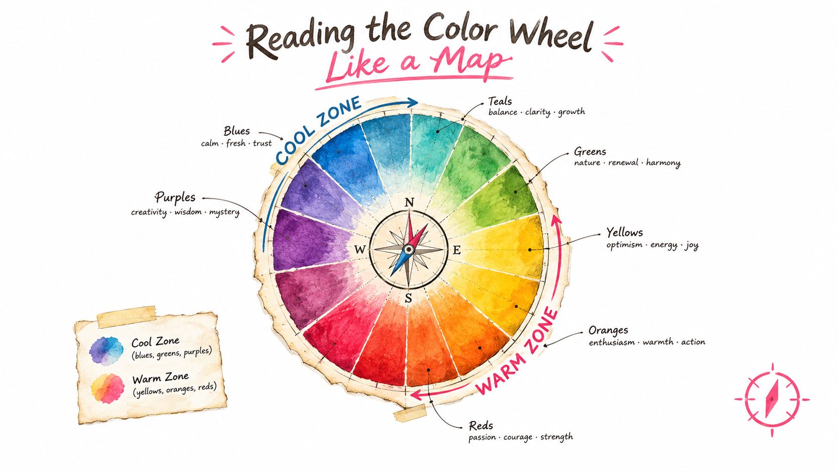
Where the warm and cool zones live
In broad practical use, reds, oranges, and yellows are treated as warm, while blues and greens are treated as cool. Research on color temperature traces this idea back to Dossie in 1758 and notes that the warm side usually aligns with the red-yellow end of the spectrum, while the cool side aligns with the blue-green end. The same research also notes practical wavelength ranges often used for planning: warm hues roughly 570 to 750 nm and cool hues roughly 450 to 570 nm in this review of color temperature research.
That broad split is useful, but marker work gets interesting at the edges.
The confusing boundary colors
Yellow-greens and red-violets often cause the most hesitation. One yellow-green marker may feel fresh and springlike. Another may look almost acidic and warm beside a blue sky. One violet may feel icy. Another may lean wine-red and instantly warm the page.
A perceptual study reported category turning points near green-yellow and red-purple, with peak warm-cool judgment near the orange-to-yellow region for warm colors and the blue-to-purple region for cool colors in this article on warm and cool perception. For a colorist, the practical takeaway is simple. The split isn't random, but the border colors need testing.
Border hues are where beginners trust the cap too much and the swatch not enough.
Neutrals are not neutral in temperature
Brown, beige, taupe, gray, and off-white always carry an undertone. A sandy tan can lean golden and warm. A stone gray can lean blue and cool. Even black can read warmer or cooler depending on what surrounds it.
This is why brand translation takes care. A Copic gray, an Ohuhu gray, and a Prismacolor gray with similar names may not feel the same on paper. If you're mapping a digital palette to real markers, look at the undertone first, then the name.
A quick way to judge a swatch:
- If it seems to glow or come forward, it likely leans warm.
- If it seems to settle back or quiet down, it likely leans cool.
- If you can't tell, compare it beside a known warm yellow and a known cool blue.
That side-by-side test usually reveals the lean immediately.
How Warm and Cool Colors Shape Mood
People often learn “warm is energetic, cool is calming” and stop there. That's a useful shortcut, but marker pages usually ask for something more specific. You're not coloring a theory chart. You're trying to make a bakery scene feel buttery and welcoming, or a balcony scene feel damp and midnight-blue.
Controlled research does show reliable emotional differences. A 2025 comparative analysis reported that warm colors were perceived as more positive overall than cool colors, with orange rated as the most positive hue and blue as the least positive. The same study also found that higher brightness and saturation generally produced more positive responses in this study on color and emotional perception.
What that looks like on a real page
A cozy autumn portrait often works with terracotta, honey, muted rust, and soft cream. Those colors feel near. They suggest warmth in the body, warmth in the air, warmth in the memory.
A rainy-night cityscape asks for a different emotional language. Blue-gray windows, deep navy pavement, cool violet shadows, and greenish reflections create distance and stillness. The page feels less like a conversation and more like a pause.
Hue tells the story, but value changes the tone
A bright orange café sign feels lively. A dusty orange blanket feels restful. A pale blue nursery wall can feel airy and gentle, while a dark blue alley can feel lonely or tense.
That's why mood comes from a combination of factors:
- Hue gives the temperature direction.
- Brightness affects how open or heavy the color feels.
- Saturation affects intensity and emotional volume.
So if your page feels “too much,” the fix may not be changing warm to cool. It may be lowering intensity within the same family.
A warm page doesn't have to shout, and a cool page doesn't have to whisper.
This is especially helpful for hobbyists who like soft palettes. You can keep a page warm without using loud orange. Peach, tea-stained beige, apricot gray, and muted rose still count as warm choices. In the same way, eucalyptus green, storm blue, lavender gray, and sea-glass teal can build a cool page without making it icy.
Lighting and Context That Flip the Feel
The same marker can look warmer or cooler depending on what's around it. That's one reason cool vs warm colors feels slippery when you're working from caps alone.
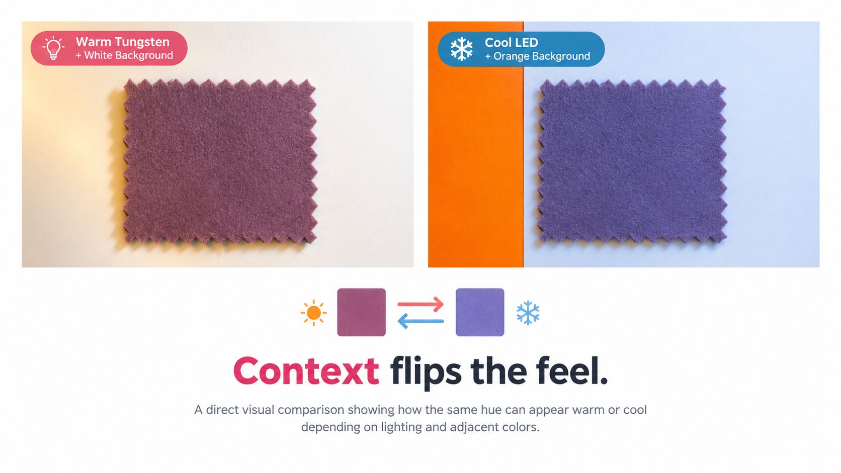
A purple that looks slightly rosy on white paper may turn cool beside a rich orange border. A gray-blue wall may seem neutral until you place a warm cream lamp next to it. Then the same wall suddenly reads cold.
Two skies, two stories
Take a simple sky on a printed page.
Version one uses peach near the horizon, then soft coral, then dusky violet, then indigo overhead. Even before you add details, the page reads as warm evening. The long-wavelength side of color is doing a lot of the storytelling.
Version two uses lavender, powder blue, icy blue, and a silvery blue-gray. Now the page feels moonlit or overcast. The line art hasn't changed. The emotional setting has.
If you want to test this before you commit, a digital preview tool can help. The Theme Preview tool is useful for checking whether a warm-light or cool-light idea matches the story you want before you start matching physical markers.
A short visual demo can help train your eye before you swatch:
Opposites can lower tension
One experiment found that negative affect was lower in the Warm Lighting x Cool Color and Cool Lighting x Warm Color conditions, with the difference reaching statistical significance at p = .046. The same experiment also found higher accuracy in the cool-color condition (p = .01) and in the cool-color x warm-lighting condition (p = .047) in this built-environment and color study.
For marker artists, that helps explain why a cool room with one warm lamp often feels balanced, and why a warm market scene with one cool shadow can feel believable instead of flat.
A single gold window, lantern, star, or candle can reframe a whole cool page. The reverse also works. One cool pond, ribbon, jewel, or night shadow can stop a warm page from feeling overheated.
Comparing Warm-Dominant and Cool-Dominant Palettes
Here's where the theory becomes useful. Let's keep the same subject in mind: a small storefront with flowers, windows, pavement, and a figure near the door. The line art stays the same. Only the palette changes.
What changes between the two versions
The warm-dominant version might lean on apricot walls, red-brown trim, golden lights, terracotta pots, and burgundy shadows. The cool-dominant version might shift the same shapes into misty blue walls, blue-violet trim, teal foliage, gray pavement, and indigo shadows.
The key isn't just hue. It's also matching luminance across roles. If your warm version uses a dark burgundy for shadow, your cool version needs a shadow with similar visual weight, such as indigo or blue-violet. That keeps the structure of the illustration intact while the mood changes.
Warm and cool judgments also align with opponent-color coding, where warm-cool values can be modeled through red-green and blue-yellow channel activations. In one cited measurement set, red and yellow landed on the warm side while blue and green landed on the cool side in this technical paper on warm-cool modeling.
Warm-Dominant vs Cool-Dominant Marker Palette Comparison
| Role in Illustration | Warm-Dominant Swatch (Ohuhu / Copic / Prismacolor) | Approx. Wavelength (nm) | Luminance Note | Cool-Dominant Swatch (Ohuhu / Copic / Prismacolor) | Approx. Wavelength (nm) | Luminance Note |
|---|---|---|---|---|---|---|
| Main wall area | light apricot / light peach / peach-beige | 570–750 | Mid-light, softly glowing | misty blue / pale blue / cloud blue | 450–570 | Mid-light, airy |
| Trim and wood | cinnamon brown / warm earth / sienna | 570–750 | Mid-dark, warm structure | slate blue / blue-gray / cool slate | 450–570 | Mid-dark, restrained |
| Flower accents | coral / salmon pink / poppy coral | 570–750 | Bright focal lift | teal / aqua teal / marine teal | 450–570 | Bright but cooler focal lift |
| Window reflections | golden cream / pale yellow / buttercream | 570–750 | Lightest note, advancing | icy blue / frost blue / pale aqua | 450–570 | Lightest note, receding |
| Deep shadows | burgundy / wine red / dark mulberry | 570–750 | Low luminance, rich | indigo / blue violet / deep denim | 450–570 | Low luminance, quiet |
You don't need exact one-to-one marker codes here to make good decisions. You need the role each marker plays. Once you know the role, you can compare similar shades across brands with a marker-matching tool such as the Marker Comparison tool.
Useful shortcut: Match by job first, name second. “Light warm wall” is more reliable than “some peach marker.”
Chroma decides how loud the palette feels
A muted dusty teal often feels calmer than a blazing lemon yellow, even though yellow is technically warmer. That's why some warm palettes feel gentle and some cool palettes feel dramatic. Temperature points the direction. Chroma controls the volume.
Building a Marker Set Step by Step
A lot of digital palette frustration comes from this gap: the screen gives you a mood, but your marker case asks for actual swatches. The fix is to build from function, not from perfect digital matching.
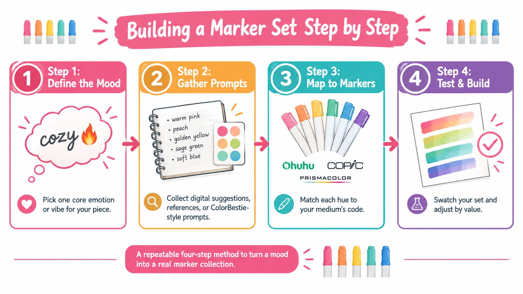
Step 1 and Step 2
Start with one sentence. “Warm bakery at sunset.” “Cool greenhouse after rain.” “Soft neutral bedroom with one sunny accent.” That sentence tells you whether the page is warm-leaning, cool-leaning, or mixed.
Then pick the largest color area. On most pages, that's background, clothing, foliage, sky, or skin. Choose a base hue that matches the sentence, then find the nearest real marker swatch in your brand chart.
If you want a digital starting point, the Palette Generator can help you explore a color direction before you pull markers. One option in this stage is ColorBestie, which generates marker-style palette previews and aligns suggestions with brands like Ohuhu, Copic, and Prismacolor.
Step 3 and Step 4
Choose one mid-tone and one shadow partner for that base. Keep them in the same temperature family unless you have a reason not to.
For example:
Warm base: pale peach wall
Add a deeper apricot mid-tone, then a soft red-brown shadow.Cool base: mist blue coat
Add a denim-like mid-tone, then a blue-violet or indigo shadow.Mixed setup: neutral beige room
Decide whether the shadows should drift warm or cool before you touch the page.
Then add a single accent from the opposite side. A warm page might need one teal bottle, one cool ribbon, or one blue window reflection. A cool page might need one gold lamp, one amber earring, or one coral flower pot.
Step 5 and the test swatch
This is the part people skip, then regret. Swatch every chosen marker on the exact paper you'll use for the final page. Alcohol marker ink shifts with paper absorbency, coating, and bleed behavior. Caps help, but the swatch tells the truth.
Use a tiny checklist:
- Write the brand and code under each swatch.
- Place colors side by side in the order they'll blend.
- Test a small overlap to see if the transition stays clean.
- Check undertones after drying because some shades settle warmer or cooler.
- Make one thumbnail first before you commit to the full illustration.
A tiny thumbnail often saves a full page.
Why Warm and Cool Are Not Always What They Seem
Warm doesn't always mean energetic. Cool doesn't always mean calming. A lot of what people call “temperature” is a response to saturation.
A recent review found that the warm-cool dimension overlaps strongly with perceived saturation in CIELAB space, which means many effects people describe as temperature are really driven by chroma rather than hue alone in this review on the warm-cool dimension.
Saturation vs Temperature How Mood Actually Shifts
| Swatch Type | Low Saturation Mood | High Saturation Mood |
|---|---|---|
| Warm peach | Soft, nostalgic, gentle | Bright, cheerful, active |
| Terracotta | Grounded, cozy, stable | Bold, earthy, intense |
| Cool blue | Quiet, airy, distant | Sharp, electric, commanding |
| Teal | Relaxed, mature, balanced | Fresh, vivid, attention-grabbing |
That's why a vivid cool blue can feel more forceful than a dusty warm rose. And it's why a muted terracotta can feel calmer than a bright aqua.
A simple paper test
Try this with one marker family and one neighboring family. Swatch a muted version and a more saturated version. Ask yourself two questions.
- Which one feels louder?
- Which one feels closer?
You'll often notice that intensity changes mood faster than hue family does.
Behavioral research also suggests warm color categories can be more narrowly recognized than cool ones, which can make warm palettes feel more specific while cool palettes may need tighter control of value and saturation to avoid ambiguity, as discussed in this summary of warm and cool color naming research.
For marker work, that means beginners sometimes switch from red to blue when the fix is simpler. They should keep the hue family and move one step softer, grayer, or darker.
Troubleshooting Common Warm and Cool Mistakes
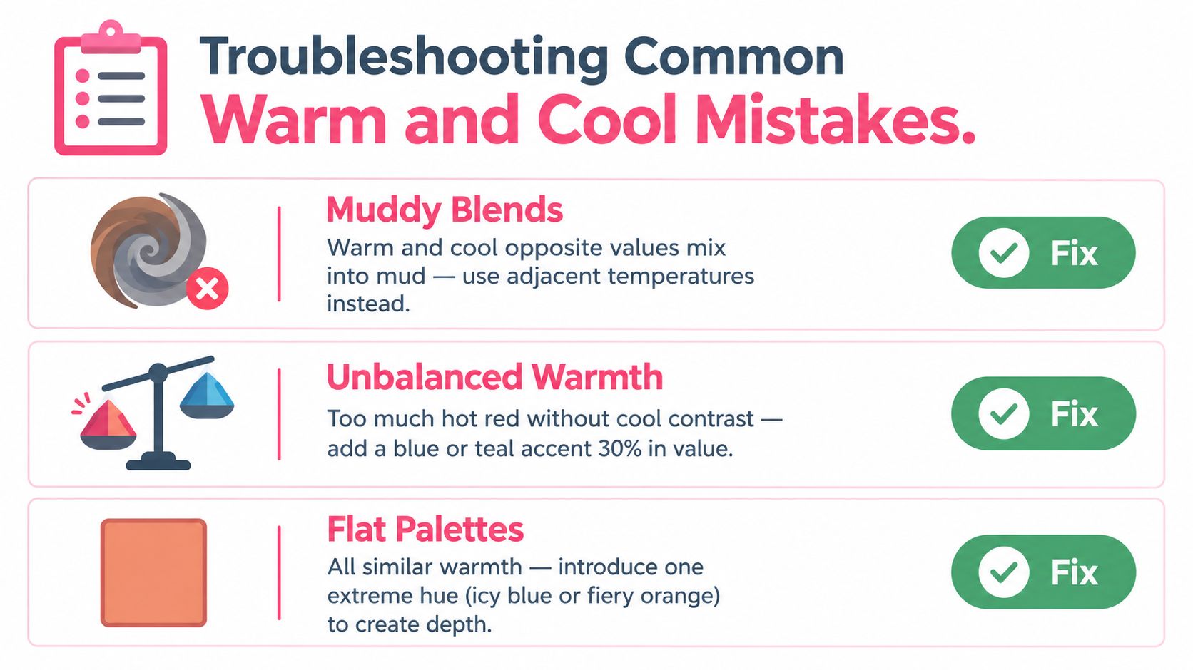
Most cool vs warm colors problems show up in three places: blends, shadows, and background balance.
Quick checklist for common problems
- Muddy blends: You layered a warm shade straight over a cool opposite, and the result looks dull. Fix it by choosing neighboring temperatures instead, or by using a neutral bridge shade between them.
- Gray skin tones: Your peach or tan base looked fine until the cool shadows went in. Swap the shadow for a warmer version of the same family, such as a soft rose-brown or warm beige-gray.
- Background steals the page: Your subject disappears because the temperature contrast is too aggressive. Lower the background saturation or move it closer to the subject's value range.
One more mistake people miss
Legibility and clarity don't come from temperature alone. They come from contrast. Practical accessibility guidance emphasizes contrast ratios, not just warm or cool preference, and WCAG calls for at least 4.5:1 for body text and 3:1 for large text in this guide discussing contrast and readability.
That matters even for marker planning. If you add hand lettering, signage, labels, or tiny book spines to a page, a warm-on-warm or cool-on-cool choice can still fail if the contrast is too low.
Swatch first on the real paper, then trust the marker. Most temperature mistakes are visible before the final page if you give yourself a small test area.
If you want help turning a warm or cool idea into something you can color, ColorBestie lets you preview marker-style palettes, test mood directions, and map digital suggestions to real brands like Ohuhu, Copic, and Prismacolor. It's a practical way to check whether your page wants sunset warmth, rainy coolness, or a balanced mix before the first stroke hits the paper.
