
You've got a page full of Copic swatches, a character sketch waiting for color, and no clear answer to the simplest question: which marker belongs in the highlight, which one builds the middle, and which one gives the shadow enough weight? The Copic color chart can look intimidating because it represents 358 alcohol markers, but you don't need to memorize every cap. You need a reliable way to read the chart, choose a color family, and build a small progression that behaves predictably on paper.
This guide treats the chart as a studio tool, not a poster to admire. You'll learn how the letters and numbers work, how to move through warm and cool families, how to plan from digital previews without expecting an exact screen-to-ink match, and how to assemble practical combinations for skin, hair, clothing, manga characters, and everyday coloring pages. You can read it from start to finish, or use the headings as a lookup system when you're already holding a marker and need a quick decision.
Introduction to Your Copic Color Chart Companion
A beginner often starts with a pleasant problem: too many beautiful colors. One yellow looks sunny, another looks creamy, and a third seems almost green. The caps suggest relationships, but the codes can feel like a private language. Then a drawing calls for a soft cheek shadow or a believable denim fold, and choosing by cap color alone suddenly feels risky.
The chart becomes easier once you stop treating it as a linear list. Think of it as a map with neighborhoods. Letters point you toward a color family, while the digits help you estimate where a marker sits in that family's tonal and saturation range. You're not searching for one magical “correct” marker. You're assembling a controlled path from light to dark.
Studio rule: Pick a family first, then choose the light, middle, and dark roles.
That order prevents a common mistake, buying isolated colors because each swatch looks attractive on its own. A coordinated group gives you more control than a larger pile of unrelated favorites. For manga work, that means you can repeat a character's hair or uniform colors from panel to panel. For adult coloring, it means you can shade flowers, clothing, and backgrounds without starting from zero each time.
Use the chart in three passes:
- Find the family: Start with Y, YR, R, E, B, BG, G, C, or another relevant group.
- Assign the role: Look for a pale highlight, a working midtone, and a deeper shadow.
- Test the paper: Make a hand-colored swatch because ink changes as it dries and interacts with the paper surface.
The most useful chart is partly official and partly personal. Keep the printed reference beside a swatch book labeled with the marker code, paper type, and intended use. That record will become more dependable than a digital preview alone, especially when you're translating a screen palette into real ink.
What the Copic Color System Is and Why It Matters
You are shading a manga character's face and reach for a skin shadow. A pale marker looks too weak, while the next darker one creates a hard stripe. The Copic Color System gives you more closely spaced choices, so you can build a highlight, midtone, and shadow with smaller visual jumps.
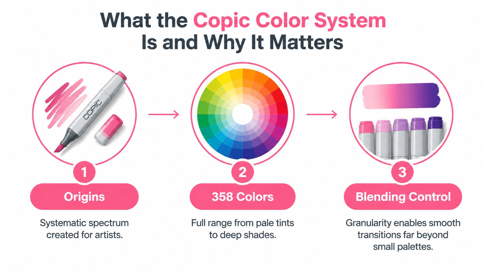
The official chart represents the full spectrum of 358 alcohol markers in the Copic line. Its detailed range lets you adjust hue, lightness, or saturation without changing the color direction abruptly. The official Copic Color System history and chart presents the chart as an evolving reference rather than a fixed product list.
Copic launched its first markers in 1987, and unified export specifications and color numbers by 1991. The color-wheel presentation was renewed in 2021, showing that the reference has been maintained as artists' needs changed. Shared family letters and numbers also make it easier for artists in different markets to identify the same marker without depending on translated color names.
Use the chart as a reference library
The system covers the Copic Sketch, Classic, and Ciao ranges, making the chart useful for planning sets, choosing refills, and matching colors across those product families. The naming framework stays consistent, although marker behavior can vary with paper. The Copic educational guide to the color system explains its organization through color family, blending group, and intensity value.
Begin with the subject you are coloring. For a sky, check B or BG. For wood, brown hair, or warm shadows, E may offer a better starting point. For a monochrome illustration, C, N, T, and W give different gray directions, so you can choose a cooler, neutral, warmer, or softer effect instead of reaching for one generic gray.
A ready palette might use a light skin tone for the highlight, a related midtone for the face, and a deeper warm marker under the chin. Hair can follow the same three-role pattern, while cloth can use a neighboring family to separate the garment from the character. This turns the chart into a tonal scale you can apply repeatedly.
Why granularity helps
A small palette teaches blending fundamentals. A broader chart helps you make transitions more controlled, soften a cheek shadow, distinguish similar fabrics, and keep a gradient from appearing striped. You do not need all 358 colors. Select a compact group whose members have clear highlight, midtone, and shadow roles.
For hobbyists, that structure reduces guesswork. For manga artists, it supports repeatable character colors across panels. The chart changes “this looks close” into a deliberate choice you can test on your paper.
How to Read Copic Numbers and Color Families
You are shading a manga character's face and have three markers with similar labels. Read each Copic code from left to right, then separate the information into two parts. The letter or letters identify the broad color family. The numbers place that marker within the family by indicating its tonal and saturation position. The official 358-color family chart maps this structure across groups such as Y, YR, BG, B, G, E, and the gray families.
A code beginning with Y belongs to yellow. YR shifts toward yellow-red, so it appears warmer and more orange-oriented. B means blue, BG blue-green, G green, E earth tones, and C cool gray. The letters do not show the exact color by themselves. They place you in a manageable visual neighborhood.
The numbers create a tonal route
The value axis has 12 levels, written as 0000, 000, 00, and 0 through 9. Chromatic hues use 10 saturation levels, numbered 0 through 9. In practical use, codes with lower-ending values usually sit nearer the light end, while higher-ending values generally produce deeper intensity and darkness.
Use the numbers as a planning scale:
- 0 through 3: likely highlights and light-building layers
- 4 through 6: midtone anchors that establish the subject's local color
- 7 through 9: stronger folds, cast shadows, interior accents, and dark details
This range helps you assign roles before blending. For skin, a light marker can sit on the forehead and cheek, a middle code can describe the face, and a deeper warm marker can define the area under the chin. Hair and clothing can follow the same highlight, midtone, and shadow pattern, even when they use different families.
Treat the scale as a guide rather than a guarantee. Yellow and yellow-green may look lighter than another family at a similar number, and E codes do not always form a perfectly predictable ladder. Swatch the actual markers on your intended paper before covering a large area.
Read adjacent codes as controlled changes
Nearby codes within one family often preserve the general hue while changing its visual weight. A pale blue can establish a lit plane, a middle blue can describe the object's body, and a darker blue can enter a fold or sit beneath an overlap. Paper, pressure, layering, and blending-group continuity all affect the result.
Some codes have separate jobs. 0 is the colorless blender, while 100 and 110 are reserved for black and special black. They are not ordinary steps in a chromatic family. Label those swatches clearly so a special-purpose marker does not get mistaken for a tonal neighbor.
Exploring Copic Color Families From Yellows to Grays
Color families are easier to choose when you connect them to the subject in front of you. Warm groups can make skin, wood, sunlight, and autumn clothing feel inviting. Cool groups can describe water, sky, foliage, glass, and reflected shadow. The best choice isn't always the family that matches the object's local color. Shadows often shift toward a neighboring family, which keeps the result lively instead of flat.
Warm families
Y is useful for sunlight, bright hair accents, flowers, and cheerful clothing. It can become harsh if used everywhere, so soften broad areas with a paler value or place it beside YR when you need warmth without a pure yellow effect.
YR bridges yellow and red. It works naturally for golden hair, peachy skin transitions, orange fabric, and warm light. If a yellow passage feels too lemon-like, stepping toward YR often gives it a more grounded appearance.
R brings the strongest direct warmth for lips, blush, red garments, flowers, and dramatic accents. Use lighter R markers to tint a form, then introduce a deeper red selectively rather than outlining every edge with the darkest option.
E is the broad earth family for skin, hair, wood, leather, and muted clothing. It's especially useful when you want a grounded palette, but don't assume every E code forms one perfectly predictable ladder. Test the chosen group together before coloring a finished face or garment.
Cool families
B handles skies, denim, uniforms, water, and cool shadows. A lighter blue can establish an open area, while a deeper blue gives folds and overlaps authority.
BG sits between blue and green, making it valuable for mint, turquoise, aquatic scenes, glassy reflections, and cool skin shadows. It can also temper a warm palette without turning the whole illustration gray.
G supports leaves, grass, forest scenes, and green clothing. YG can move a green toward a yellow, springlike character, while BG can pull it toward a cooler, more aquatic direction.
C gives you cool gray shading with a blue-leaning temperature. Neutral, toner, and warm gray families let you choose a different emotional temperature for a monochrome illustration. The family choice can matter as much as the number.
Practical rule: If the gradient feels lifeless, test a neighboring family in the shadow instead of reaching immediately for black.
Using Hex and RGB Approximations for Digital Planning
Digital color values are useful as planning notes, not as guarantees. A hex or RGB approximation can help you compare palette relationships on a screen, but the display, paper, ink saturation, and lighting all affect the final appearance. Treat the screen as a sketch of the harmony, then let a physical swatch make the final decision.
Build a screen-to-paper routine
Start with the subject and its roles. Choose a light color for the illuminated plane, a middle color for the main surface, and a dark color for the fold or recess. If you're designing a manga character digitally, record the intended Copic codes beside the digital palette. The codes are more useful than a screenshot because they remain searchable when you return to the project.
A simple workflow looks like this:
- Preview the harmony: Place your proposed colors beside the line art and check whether the warm and cool groups support the mood.
- Write down marker codes: Keep the family and number visible beside each digital swatch.
- Color a paper test: Use the same paper you'll use for the final illustration.
- Compare relationships: Ask whether the highlight still reads as lighter, the midtone still carries the subject, and the shadow still separates forms.
- Revise the group: Replace one role at a time instead of changing the entire palette.
You can use the ColorBestie Palette Generator as one digital planning option for testing harmonious color ideas before putting ink on paper. The important habit is recording both versions, the screen approximation and the hand-colored result.
Make a personal swatch card
Divide a card into labeled blocks for highlight, midtone, shadow, and accent. Write the marker code, paper, and date beside each swatch. Leave enough room to overlap the ink so you can see how the marker behaves in a second pass.
Don't judge a marker from a tiny cap image. A physical swatch shows the true relationship between neighboring colors, including whether the transition feels smooth, whether a shadow turns too dull, and whether a pale tone disappears on your chosen paper. Over time, your card becomes a translation key between digital planning and real materials.
Recommended Copic Combos for Skin Hair and Cloth
A useful combo gives each marker a job. The lightest marker protects the highlight or establishes a soft base, the middle marker carries most of the form, and the darkest marker describes selective depth. You can add a fourth color when the subject needs a transition, but a trio is often easier to control than a long sequence.
The combinations below are starting points, not rigid recipes. Test them on your paper, especially for faces, because a skin blend that looks gentle in a swatch can become much stronger when layered repeatedly.
Ready-to-use palette roles
For light skin, try E000, E00, and E11. Keep the palest marker on the forehead, cheek plane, and bridge of the nose, then use the middle tone around the hairline and under the chin. Add the deeper earth tone only where the form turns away from the light.
For medium skin, E11, E13, and E15 offer a warm progression. If the result feels too orange, use a cooler neighboring shadow from your own swatch collection rather than forcing the darkest earth tone into every contour. For deep skin, begin with a warm or neutral lighter brown from the E family, build through a richer middle brown, and reserve a deep brown such as E29 for the strongest recesses. The exact selection should follow your physical swatches and the lighting of the character.
Hair benefits from a deliberate temperature choice. Blonde hair can use Y21, Y23, and Y26, with YR added where reflected warmth is strongest. Brown hair can move through E31, E33, and E35 for a lighter chestnut direction, or shift deeper with E25, E27, and E29. Red hair often works through YR and R together, allowing a warm orange base with red accents instead of a single flat red. Black hair usually looks more dimensional when you build it with a dark blue, violet, brown, or cool gray and keep 100 or 110 for only the deepest marks.
Cloth needs the same role structure, but folds should remain selective. Denim can start with B21, B23, and B26. Soft pastel clothing may use a pale family color, a middle tint, and a muted shadow from a neighboring cool or warm family. Jewel tones need a saturated middle and a deeper shadow, with a small highlight left as paper or created with a very pale marker.
Popular Copic Blending Combos at a Glance
| Subject | Highlight | Midtone | Shadow | Best Use Case |
|---|---|---|---|---|
| Light skin | E000 | E00 | E11 | Gentle faces and soft indoor light |
| Medium skin | E11 | E13 | E15 | Warm portraits and manga characters |
| Blonde hair | Y21 | Y23 | Y26 | Golden hair with defined strands |
| Brown hair | E31 | E33 | E35 | Chestnut hair and warm accessories |
| Denim | B21 | B23 | B26 | Jeans, jackets, and blue uniforms |
| Cool gray cloth | C-1 | C-3 | C-5 | Minimal clothing and monochrome studies |
If a marker is missing, stay close to the same family and role. A slightly lighter midtone can be layered carefully, while a shadow that's too dark is harder to rescue. Record substitutions beside the original combo so your character palette remains repeatable.
Cross References to Ohuhu Prismacolor and Other Brands
Cross-brand charts can help you shop, but they shouldn't promise identical ink. A Copic code may have a visually similar option in Ohuhu, Prismacolor, Winsor & Newton, or Spectrum Noir, yet the match can shift because each brand uses its own pigments, naming system, nib design, paper response, and blending behavior. Treat an equivalent as a starting comparison, not an exact substitute.
The safest translation method is visual and functional. First identify the Copic marker's role, such as pale highlight, warm midtone, or cool shadow. Then find another brand's marker that matches the role and temperature on a hand-colored swatch. A label like “peach” or “blue gray” can point you in the right direction, but it can't replace testing the actual ink.
When hybrid palettes make sense
Mixing brands can work well for broad areas, underpainting, background gradients, and practice pages. You might use an affordable family for large color fields and keep Copic markers for character skin, small facial transitions, or passages where you already know the blend. The result depends on the specific markers and paper, so test the transition before using the combination on a finished illustration.
Staying within one brand is simpler when you need a tightly controlled gradient or want predictable refill planning. A hybrid set can be more practical when availability varies, when you already own several markers, or when you'd rather build a small subject-focused palette than purchase an entire range.
The ColorBestie Decotime Ohuhu Converter can support a first-pass comparison between Copic-oriented choices and Ohuhu options. Use any suggested pairing as a shortlist, then verify the result with physical swatches.
Shop by function, not by brand loyalty
Start with the subjects you draw. A manga artist may need skin, hair, uniforms, and background shadows. A coloring hobbyist may gain more from a small set of warm families, greens, blues, and grays. Buying one highlight, one midtone, and one shadow for a useful family often creates a more productive palette than collecting unrelated colors across several brands.
Keep a substitution record with three fields: original code, replacement code, and observed result. Note whether the replacement blends cleanly, dries darker, or changes temperature. That record turns approximate cross-brand guidance into a personal reference grounded in your own materials.
Quick Reference Lookup and Navigation Tools
A chart works best when you can make a decision quickly. Use the family letters as your first index, then scan the number for a likely role. The broad map below keeps the search focused:
- Y and YR: Light, golden, orange, and sunlit passages.
- R and RV: Red, pink, magenta, and expressive accents.
- E: Earth colors for skin, wood, leather, and warm hair.
- YG and G: Yellow-green through forest green for foliage and lively clothing.
- BG and B: Aqua, turquoise, sky, denim, and cool reflected color.
- V and BV: Violet and blue-violet for flowers, evening effects, and cool shadows.
- C, N, T, and W: Cool, neutral, toner, and warm gray directions.
- 0, 100, and 110: Special-purpose blender and black codes, not ordinary family steps.
The three-role checklist
Before you color, write three codes beside the subject. They don't need to be perfect on the first attempt.
- Highlight: Choose the lightest useful marker or preserve the paper where the light is strongest.
- Midtone: Select the color that communicates the object's main identity.
- Shadow: Choose a deeper value, then decide whether the shadow should stay in the same family or move warmer or cooler.
- Accent: Add only if the object needs a focal detail, reflected color, or stronger separation.
- Swatch: Test the sequence in the same order you'll use it on the drawing.
For a character sheet, keep the final codes in one place. Label skin, hair, eyes, clothing, and shadow temperature. This prevents accidental palette drift when you color multiple poses or pages.
Keep navigation physical and digital
A personal swatch book should include the marker code, a broad family label, and an example of the blend. Arrange pages by family rather than purchase date. Leave space for replacements, because a new marker may fit an existing role even when it doesn't belong beside the original set.
For digital comparison, use ColorBestie's Marker Comparison tool to review marker families and compare options before buying. You can also bookmark a few dependable combinations, save subject palettes, and use your table of contents to return directly to the family or combo you need. The chart becomes a daily studio companion when it helps you choose, test, and record, not when it displays every available swatch.
ColorBestie turns sketches into marker-style color inspiration, lets you test palette ideas, and includes tools for comparing brands and planning Copic-friendly combinations. Visit ColorBestie with a drawing you're working on, test a few themes, and record the physical marker codes that make the final blend work for you.
