
Artistic style is a repeatable profile of visual choices, including line, color, composition, technique, motifs, and subjects, that groups artworks into recognizable looks across time and culture. Art history traces those changing looks from prehistoric art through periods such as Ancient Art, Medieval Art, the Renaissance, Baroque, Impressionism, Modernism, and Postmodernism, spanning roughly 30,000 years of image-making (Study.com's artistic styles timeline).
You may be thinking about style while sitting with a coloring page, a handful of markers, and three different palette ideas open on your phone. One page feels soft and cottage-like, another feels dramatic, and a third has the clean, bright energy of a manga panel. You like all of them, so choosing one can feel less like making art and more like trying to choose a favorite sweater.
The useful answer isn't that you must pick one permanent identity. To define artistic style in a way that helps at the coloring table, look for the visual decisions you repeat, then translate those decisions into color, contrast, and marker choices. That turns a vague question into something you can observe, test, and enjoy.
When a Coloring Page Starts to Look Like You
You finish a coloring page, put the markers aside, and notice that its choices feel familiar. Perhaps you reached for muted green again, gave each shadow a cool violet edge, or kept more white space than usual. Nothing announces a new identity, yet the page carries a small trace of your preferences.
The next page makes the pattern easier to see. You choose similar warmth for the background, repeat the same kind of highlight, and outline objects with a darker version of their local color rather than black. The subject changes, but your decisions begin to rhyme.
That repetition matters because style isn't just what you draw or color. It also describes how you handle a visual problem each time it appears. Two people can color the same cottage, fox, or character and create different experiences. One may favor gentle transitions, while the other builds the image from sharp blocks of contrast.
Style can make decisions easier
A working sense of style narrows choices while leaving room to play. If quiet, earthy pages appeal to you, start with softened greens, browns, creams, and warm grays. If graphic drama feels more natural, begin with strong darks, clear light areas, and a small group of vivid accents.
For a practical test, open a marker-friendly scheme in ColorBestie before you color. Choose colors that support the mood you want, then check whether the page still resembles choices you have enjoyed before. The tool gives you a starting palette, not a verdict. Your markers, paper, reference image, and mood still shape the result.
Practical rule: Notice what you repeat because you enjoy it, not what you think you should repeat to look like an artist.
A personal look can remain flexible
You do not need to force every page into one appearance. A recognizable style can move across subjects because your approach to color temperature, composition, texture, and line may remain visible in a floral arrangement, character, or interior scene.
That flexibility makes style useful for hobby colorists as well as illustrators. It gives future pages a starting language while allowing experiments. You might keep a gentle palette for one project, then borrow its shadow treatment for a brighter design.
A finished page that makes you think, “This feels like something I would make,” offers useful evidence. Compare it with earlier pages, identify the repeated choices, and test those choices in your next ColorBestie palette. Style becomes easier to understand when you treat it as a pattern you can observe and practice.
A Working Definition of Artistic Style
Start with an ordinary comparison. Your wardrobe has recurring choices: perhaps soft fabrics, strong patterns, natural colors, or simple shapes. Your playlist has a mood created by repeated qualities, even when the songs differ. A favorite recipe has recognizable decisions about flavor, texture, and balance.
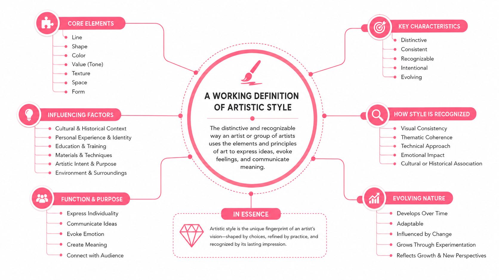
Artistic style works in a similar way. It is the distinctive manner in which an artist, period, school, movement, place, or culture makes visual decisions. The visual arts definition of style) describes style as something that makes works recognizable and classifiable, not merely by what they depict, but by how they look and operate as images.
Build the definition in layers.
Start with visible decisions
Ask what keeps returning in the artwork:
- Line behavior: Are marks smooth, broken, delicate, heavy, controlled, or expressive?
- Color handling: Does the artist use a narrow palette, vivid saturation, subdued hues, warm colors, cool colors, or dramatic opposites?
- Composition: Where does the subject sit? How much space surrounds it? What catches your eye first?
- Technique: Does the surface show layering, blending, hatching, flat fills, or visible strokes?
- Motifs: Do certain shapes, symbols, textures, plants, objects, or patterns recur?
- Subject choices: Does the artist return to faces, outdoor scenery, creatures, interiors, or particular kinds of stories?
These parts overlap, but separating them helps you see what you're responding to. A rose is subject matter. The way you frame it, simplify it, outline it, and color it can become style.
Keep style separate from medium
A marker is a medium. Blending is a technique. A forest is a subject. None of these alone defines an artistic style.
The same alcohol markers can produce a flat graphic look, a softly shaded illustration, or a textured effect built from repeated hatching. Likewise, a realistic face and a fantasy face can share the same line quality, palette logic, and composition. Style is the pattern formed by the decisions working together.
A useful sentence to keep in your notebook is this:
Artistic style is a repeatable pattern of visual choices that gives artwork a recognizable look, regardless of the particular subject or material.
Style also changes across history. Art historians use recurring formal qualities to distinguish movements such as Gothic, Renaissance, and Impressionism. The historical timeline at Study.com connects those shifts to changing approaches to reality, including Renaissance interest in classical ideals and perspective, and Impressionism's emphasis on visible brushwork and fleeting light.
The Core Components That Build Any Style
A style becomes easier to recognize when you examine its parts rather than relying on a feeling such as “cozy” or “dramatic.” Formal and stylistic analysis commonly considers composition, color, line, texture, scale, contrast, shape, value, form, and space (Florida International University's formal analysis guide). For marker work, these ideas become practical decisions about how you fill, shade, outline, and balance a page.

Line behavior
Line controls the page's energy. Thin, clean outlines can feel delicate and precise. Thick outlines can make shapes feel bold and graphic. Broken marks, sketchy edges, or repeated short strokes introduce movement and texture.
With an Ohuhu, Copic, or Prismacolor set, you can reflect a reference's line style without copying its exact drawing. A page with crisp contours may suit careful flat fills and controlled shadows. A page with lively marks may invite hatching, stippling, or deliberately visible overlaps.
Color handling
Color style includes more than the names of the colors. Look at temperature, saturation, value, contrast, and the range between light and dark. A warm palette can lean toward reds, oranges, and golden browns, while a cool palette may favor blue, green, and violet relationships.
For markers, ask whether the reference depends on gradual families or clear blocks. A soft illustration might use several neighboring colors and gentle value changes. A graphic look might use fewer colors, stronger separations, and one bright accent.
Composition
Composition is the arrangement of visual parts. Notice the focal point, framing, scale, symmetry, and negative space. A crowded image can feel abundant and energetic, while generous open areas can feel calm.
On a coloring page, composition also affects where you place contrast. You might keep the background quiet so a character stands forward, or repeat a darker value around the border to frame the central image.
Technique
Technique describes how the artist creates the appearance. Flat fill, layered marker passes, feathering, blending, hatching, and small texture marks each leave a different surface impression.
A marker-friendly translation doesn't need to imitate every medium-specific effect. Instead, identify the visual result. If a reference looks softly blended, test overlapping marker families. If it looks printed and graphic, try clean fills with selective shadows.
Motifs and subject choices
Motifs are recurring visual ingredients, such as scalloped edges, stars, checkerboards, botanical shapes, oversized eyes, or repeated decorative textures. Subject choices are the things an artist repeatedly chooses to depict, such as animals, rooms, gardens, or characters.
Subject can contribute to style, but it isn't the whole answer. The Routledge discussion of artistic style explains that style is often treated as form rather than subject matter, while also recognizing that subject matter can participate in style. That distinction helps you avoid calling every picture of a flower “floral style.”
When your marker collection feels confusing, use the marker comparison tool to check which available colors support the visual decisions you've identified.
How to Read Style in Any Reference Image
Don't begin by asking, “What is this picture of?” Subject is easy to notice, so it can take over your judgment. Begin with the overall visual atmosphere, then move toward the smaller decisions that create it.
Look from broad to specific
Use this quiet observation order:
- Sense the temperature: Does the image feel warm, cool, balanced, muted, or vivid?
- Study the line: Are edges smooth, heavy, delicate, angular, broken, or barely visible?
- Check the framing: Is the composition open, crowded, centered, asymmetrical, or strongly cropped?
- Notice repeated features: Look for motifs, shape families, textures, and recurring shadow patterns.
- Name the subject last: Now identify what the image depicts and ask whether the subject supports the look or merely happens to be present.
This order separates content from style without pretending they never interact. A cat doesn't automatically create a cute style. Rounded shapes, simplified features, gentle contrast, playful motifs, and a particular palette may create that impression.
Try a moody reference
Suppose you see an illustration of a person beside a rainy window. The subject is melancholy, but the style might come from cool blue-gray colors, narrow value changes, soft edges, a large area of negative space, and small reflective motifs.
For a marker plan, you could preserve the cool temperature and open composition while choosing a controlled group of blue, gray, and violet markers. You aren't copying the story. You're translating its visual decisions.
Try a cheerful animal print
Now consider a bright animal illustration. The cheerful feeling may come from warm yellow and coral accents, rounded linework, high contrast between the subject and background, repeated dots or leaves, and a centered composition.
If you only record “animal,” your palette remains vague. If you record the actual style fingerprint, you have useful instructions: warm accents, rounded contours, clear focal contrast, and repeated small motifs.
Ask yourself: If the subject changed completely, which visual choices would still make the reference recognizable?
That question is especially helpful when you move from a reference photo to a coloring page. The image may change, but the style profile can continue guiding your choices.
Three Styles Compared Side by Side
The same six components can produce very different results. A manga-inspired page, a cozy cottagecore scene, and a bold graphic-novel panel may all contain characters, plants, and interiors, yet their line, color, contrast, and composition choices point in different directions.
A manga-inspired approach often relies on controlled, expressive outlines, selective detail, clear facial features, and strong light-to-dark organization. A cozy cottagecore look usually favors gentle edges, warm or softened colors, botanical motifs, layered textures, and a welcoming sense of abundance. Graphic-novel boldness tends toward assertive contours, sharp value changes, limited color logic, and compositions that direct the eye quickly.
| Component | Manga Line | Cottagecore Cozy | Graphic Novel Bold |
|---|---|---|---|
| Line | Clean, varied, expressive | Soft, delicate, decorative | Thick, assertive, angular |
| Color | Balanced skin, hair, clothing, and accent families | Warm, earthy, softened | Limited, high-impact, strongly separated |
| Composition | Character-focused with purposeful framing | Layered, intimate, often filled with details | Cropped, directional, and dramatic |
| Technique | Controlled layering and selective shadows | Gentle blending and textured marks | Flat fills with decisive shadows |
| Motifs | Hair shapes, eyes, clothing details | Leaves, flowers, baskets, cottages | Panels, bursts, symbols, graphic textures |
| Subject | Characters, creatures, expressive scenes | Gardens, homes, food, animals | Heroes, conflict, action, urban settings |
The table isn't a set of boundaries. Artists mix these choices constantly. A manga character can live in a cottagecore palette, or a cozy scene can use graphic-novel shadows.
Use Theme Preview when you want to compare how a reference responds to different visual directions before you put marker to paper. Pay attention to what changes the feeling most. Sometimes the decisive factor is temperature, and sometimes it is contrast or the treatment of outlines.
Mapping Style Onto Marker Color Schemes in ColorBestie
Color planning becomes simpler when you treat a style as a set of questions rather than a label. ColorBestie offers five theme worlds, palette, mood, style, lighting, and genre, which can help you examine different parts of a reference before choosing marker colors.
Start with one reference image or a black-and-white coloring page. Upload the image, then use the theme worlds in an intentional order instead of clicking randomly.
Begin with the visual read
Open the style world first. Choose the direction that seems closest to the reference, then compare the result with the original. This is a check on your observation, not a verdict about your identity.
Move to mood next. Ask whether the reference feels calm, playful, mysterious, nostalgic, energetic, or another way. Mood isn't identical to style, but it can reveal whether your proposed palette supports the image's emotional temperature.
Use genre when the subject's storytelling conventions matter. A manga character, cozy home, fantasy creature, or comic scene may need different color priorities even when they share some formal traits.

Turn the reading into a marker plan
After the style and mood feel aligned, use palette to build the color relationship. Then use lighting to decide where the brightest areas, cast shadows, and temperature shifts should sit. This order keeps you from choosing attractive colors that fight the reference's structure.
ColorBestie is designed to create marker-style color inspiration from uploaded images and align suggestions with marker lines including Ohuhu, Copic, Prismacolor, Winsor & Newton, and Spectrum Noir. Start with the available free previews, then treat each result as a testable proposal. The Palette Generator can help you explore a balanced group of colors before committing ink.
For a practical test, write down:
- Anchor color: The main family that establishes the page's atmosphere.
- Shadow family: A darker or cooler group that gives forms structure.
- Light family: Creams, pale tints, or paper-preserving areas that keep the image open.
- Accent color: A smaller, more noticeable color that directs attention.
- Texture choice: Blending, hatching, flat fill, or layered strokes.
You can also compare the suggested colors against your physical set and use AI color guidance as a second opinion on harmony. Your eye remains the final judge. If the preview says “bright,” but your own page needs quiet, reduce saturation or leave more paper visible.
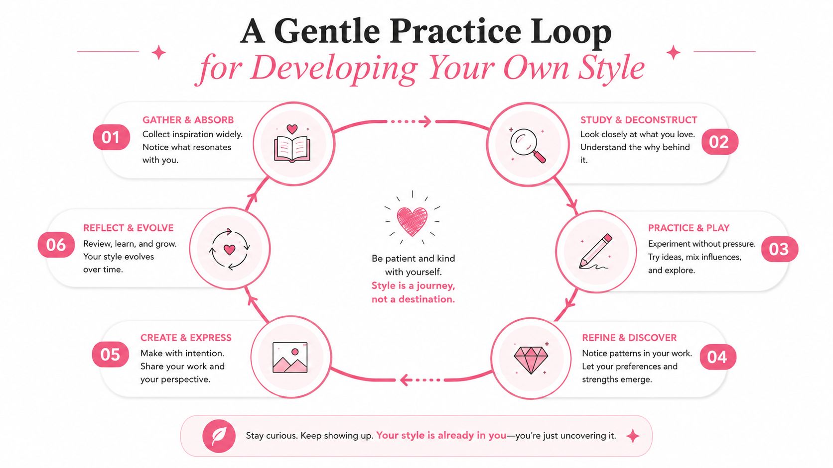
A Gentle Practice Loop for Developing Your Own Style
Style grows through repeated noticing, not through one dramatic decision. Keep the practice small enough that you can return to it without turning coloring into homework.
Choose one reference and one page. Then move through the following loop:
- Observe: Record the line, color, composition, technique, motifs, and subject choices.
- Name the direction: Describe the look in plain words, such as “cool and spacious” or “warm, layered, and decorative.”
- Test the theme: Explore ColorBestie's style, mood, palette, lighting, and genre worlds.
- Build a swatch strip: Try the proposed marker colors on the same paper you use for finished pages.
- Color a small area: Test a face, leaf cluster, clothing section, or background corner before filling the whole design.
- Notice your response: Mark what felt natural, what felt difficult, and what you want to repeat.
Let repetition teach you
Keep a small record of finished pages and test strips. Don't judge them only by polish. Look for recurring preferences: perhaps you consistently soften backgrounds, choose cool shadows, favor rounded motifs, or build contrast around faces.
ColorBestie includes 25 bite-size tips, daily streaks, XP, and milestone badges, which can make this kind of regular practice feel more like gentle encouragement than a test. You can use those prompts to keep experimenting while still watching for the choices that feel like your own.
Style categories have always changed and overlapped. One indexed collection lists 193,000 artworks, including 2,009 Art Nouveau works, 1,896 Early Netherlandish works, 702 abstract works, 614 academic works, and 490 Impressionist works (Artifact World Gallery's indexed art insights). Those figures show how large, flexible, and historically layered style classification can become. Your personal style doesn't need to be pure or isolated to be recognizable.
Choose one reference this week. Write six observations beside it, make one small marker test, and save the result. The next page doesn't need to look identical. It only needs to give you another chance to notice what feels like you.
ColorBestie turns uploaded sketches and images into marker-style color inspiration through theme worlds for palette, mood, style, lighting, and genre. Visit ColorBestie, test a reference with your marker set, and use the preview as a calm starting point for your next page.

