
You open a fresh marker set, test one nib on scrap paper, and the line feels narrower, smoother, or scratchier than you expected. That surprise is normal. Fine tip markers look simple from the outside, but the tip shape, ink system, and even the way you hold the barrel all change what lands on the page.
A lot of guides stop at a tidy width range and move on. That leaves buyers guessing when a fineliner-style pen, an alcohol marker with a fine nib, and a permanent marker labeled ultra-fine all behave differently in hand. The useful question isn't just “How thin is it?”, it's “What kind of line do I need, on what paper, with what ink?”
What Fine Tip Markers Are and Where They Came From
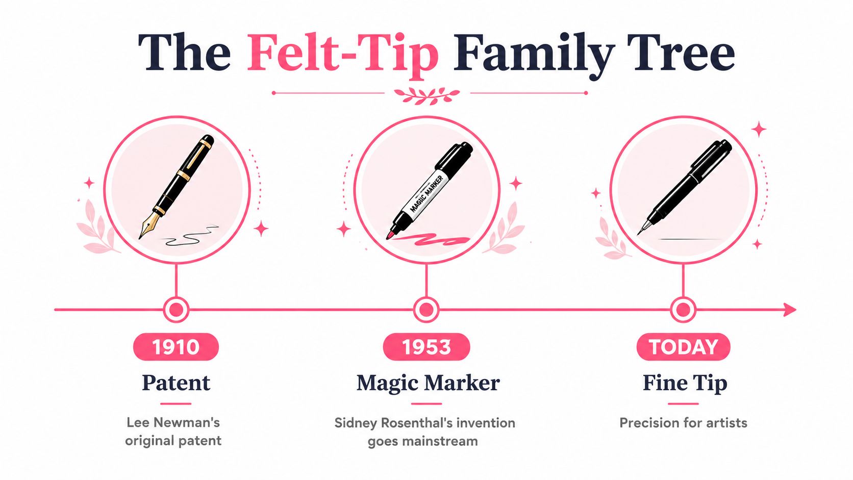
A hobby colorist opening an Ohuhu set may notice that the brush nib lays down a forgiving stroke, while the fine nib feels stricter and more exact. That difference comes from how marker families were built over time, not from a random marketing label. The modern marker family traces back to early felt-tipped marking pens, later commercial marker designs, and fiber-tipped tools that pushed markers toward the precision options people use now marker pen history.
Why the fine point became a separate tool
By the time felt-tip markers were being used for lettering, labeling, and posters, people already needed controlled, readable lines rather than only bold fills. That early use matters because it shows why the fine-point format developed as its own tool. Fine tips later became common for signatures, labeling, and detailed art, so precision became part of the category instead of a bonus feature.
The permanent-marker side of the family also kept narrowing toward cleaner detail work. Sanford introduced the Sharpie Fine Point black marker in the 1960s, and Sharpie later added an Extra Fine Point style tip, which shows how the market kept moving toward tighter line control. A modern buyer can choose between a broad expressive nib and a needle-like nib for tiny writing, which is why the label on the box matters less than the tip style inside it.
Reading the category like a buyer
The phrase fine tip sounds specific, but it is really a family name. It covers tools made for different jobs, from coloring-book outlines to technical marking and autograph work. Once you know that, the box starts to make sense, and “fine” stops being a vague promise.
Practical rule: if the marker needs to sign, label, sketch, or outline, the fine tip is doing precision work, not just “smaller version” work.
Use this tool guide to compare marker families and conversion details.
| Key Milestones in Fine-Tip Marker Development | ||
|---|---|---|
| Year | Milestone | Why It Matters |
| 1910 | Early felt-tip patent | Starts the felt-tip lineage |
| 1950s | Marker styles spread into everyday use | Shows how quickly marker writing became common |
| 1950s | Felt-tip markers used for lettering and posters | Shows the demand for controlled lines |
| 1960s | Modern fiber-tipped pens developed | Pushes the format toward today's precision tools |
| 1960s | Sharpie Fine Point introduced | Brings fine permanent marking into mass use |
Decoding the Three Main Fine Nib Shapes
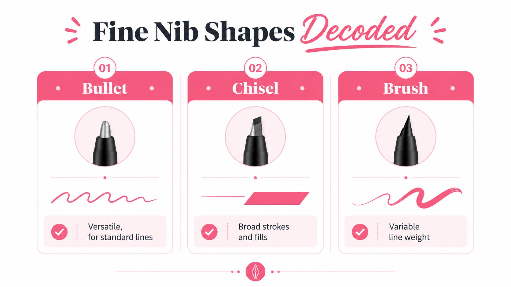
A box can say fine tip, yet the nib inside may feel very different from one marker family to another. That is why the nib shape matters first. It controls whether the mark lands as a tidy dot, a steady outline, or a line that changes width as your hand turns.
Bullet nibs feel like a rounded pencil point
A bullet nib is the rounded fine point many art markers use, including the dual-tip sets people often buy for coloring books. It keeps a stable shape from stroke to stroke, much like a sharpened colored pencil that has been carved to a smooth point. That makes it forgiving, predictable, and useful for outlines, small petals, lettering, and interior details where consistency matters more than razor-thin precision.
A bullet nib usually gives the kind of control hobby colorists want when they are tracing shapes or filling small spaces. It does not create the hairline touch of a needle nib, but it also does not react sharply to every small change in angle. That softer response makes it easier to keep a steady line when your hand position shifts.
Fineliner-style nibs behave more like drafting tools
A fineliner-style needle nib sits at the precision end of the range. The point is usually narrow and firm, which helps with tiny text, panel borders, facial details, and technical accents. A tip family guide shows that “fine” can cover a wide spread across products, from roughly 0.4-0.7 mm to 0.1 mm to 0.8 mm, so the box label by itself does not tell you how the nib will feel on the page marker tip ranges.
That difference matters when you compare marker types. A pigment pen and an alcohol marker can both be sold as “fine,” but one is built for crisp linework while the other is meant to support colored fills with detail. If you are sorting through product families, ColorBestie's Decotime to Ohuhu converter can help you compare naming and tip style before you buy.
Chisel-edge fine nibs give you two line moods
A chisel-edge fine nib looks broad at first, but the angled edge lets you switch between a narrow stroke and a wider one. The corner works for tight tracing, while the flat face covers more area or moves faster across the page. That makes it useful when you need one tool to handle both outline work and quicker fill-in sections.
The shape matters more than the marketing name. A chisel nib is less about one fixed line and more about how the nib meets the paper.
| Fine Nib Shapes at a Glance | ||
|---|---|---|
| Nib Shape | Typical Width | Best For |
| Bullet | Varies by brand | Outlines, labeling, general detail |
| Fineliner-style | Often very narrow | Technical linework, text, borders |
| Chisel-edge fine | Narrow on edge, broader on face | Switchable strokes, fills, varied marks |
If you want a broader side-by-side view before buying, ColorBestie's marker comparison tool lets you line up brands and compare how the categories differ.
How Ink Chemistry Changes the Way a Fine Tip Behaves
A fine nib only tells half the story. Ink decides whether the stroke stays crisp, dries fast, blends, feathers, or resists later layers. That's why two markers with similar-looking tips can feel completely different on the page.
Alcohol, water-based, and permanent ink each solve a different problem
Alcohol-based ink is the familiar choice in sets like Copic and Ohuhu. It blends smoothly, and many artists like it for layered shading, but it can bleed through thin paper and it asks more from the paper surface. On a coloring-book page, that means you get beautiful blends, but you need to respect paper weight and work from light to dark.
Water-based ink is common in many fineliners and kids' markers. It usually stays more controlled and is easier to handle for linework, but it doesn't behave the same way during heavy layering. If you keep passing over the same area, the page can start to look streaky or rough.
Permanent pigment ink is the durable option. A permanent fine-tip marker is designed to write on paper, plastic, metal, and most other surfaces with quick-drying, fade- and water-resistant ink, and commercial product data lists a line width of about 1.0 mm with at least 225 meters of writing length Sharpie fine-tip product data. That durability helps on nonporous surfaces, where slow drying can smudge details or cause edge feathering.
What happens on a coloring page
A hobbyist working in a floral page usually wants smooth color fields with clean edges. Alcohol ink is often the most flexible choice for that kind of page, while a pigment fineliner can sit on top to define veins, lashes, or small outline accents. Water-based ink is useful when you want tighter control and less bleed, especially on lighter paper.
Permanent ink protects linework well, but it doesn't behave like a blending marker. If you layer solvent-based color over it, test first on scrap paper.
A useful way to think about ink systems is this. Alcohol ink helps you move color, water-based ink helps you hold a line, and permanent ink helps you keep a mark. The right choice depends on whether you're filling spaces, defining them, or preserving them.
Angle, Pressure, and Layering Techniques for Fine Tips
Fine nibs get misunderstood because people assume the tip alone controls the line. In reality, your hand position changes the result a lot. A marker that looks “too broad” in one grip can become precise again in another.
Hold the marker more vertically for tighter lines
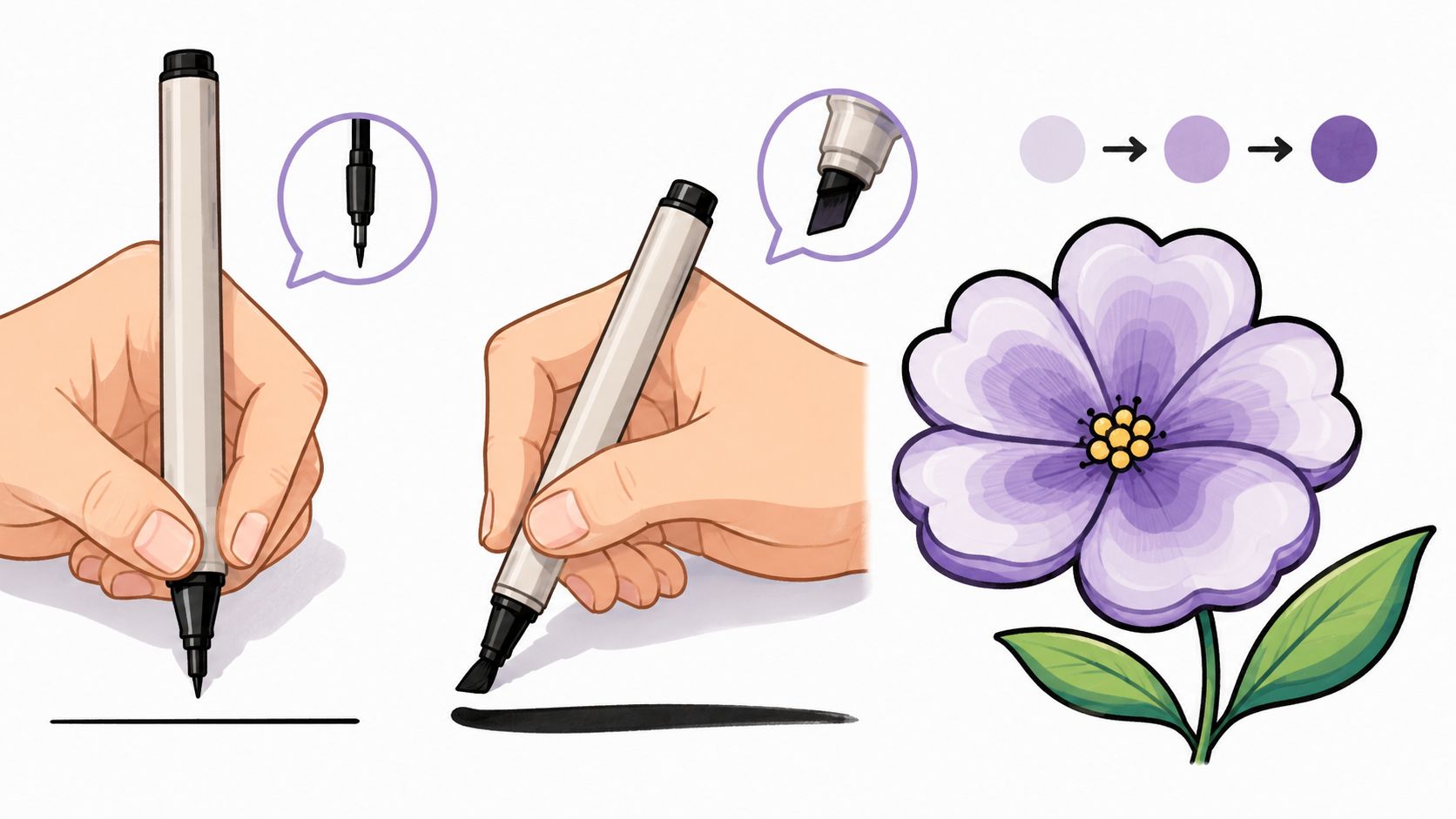
A more vertical hold gives you a smaller contact patch with the paper. That's the move you want for eyelashes, tiny leaf veins, panel borders, and pattern dots in coloring pages. If you angle the marker too much, the nib spreads the contact area and the line widens.
That same idea shows up in marker tutorials that explain how angle changes output, and it's one of the simplest control habits you can build. You don't need a different marker for every task. You need to change how you meet the page.
Use light pressure first, then commit
Layering works better when you start with a lighter pass. A soft pass maps the shape, and a second pass deepens the edge or shadow after you've checked the placement. That sequence is especially useful on petal shading and small illustrated objects, where one heavy stroke can take over the whole form.
You can also flip a chisel fine nib to use its edge for a thinner mark, then roll the barrel a touch to widen the stroke. That small rotation gives you more line variation without switching tools.
Practical move: if the line looks too wide, don't panic and buy a smaller marker. First, raise your hand position, reduce pressure, and try the same stroke again.
A good practice drill is to draw the same leaf, eyelash, or stripe three times. One pass with a vertical hold, one with a slight tilt, and one with a light second layer. The differences teach your hand faster than reading about it ever will.
Real Coloring Scenarios That Put Fine Tips to the Test
The easiest way to judge a fine tip is to watch it in a real workflow, not in a product photo. Two common coloring scenarios show why the same marker family can feel perfect in one job and awkward in another.
Manga linework needs crisp structure
In a manga-style page, a 0.3 mm fineliner is a clean choice for panel borders and very tight details. A 0.5 mm pigment pen can handle speed lines and small accents without visually overpowering the art. If those lines sit behind alcohol marker fills, the order matters, because the ink needs to stay readable once color goes in.
That means you usually want the linework down first, then the color passes carefully layered around it. The fine nib is doing structure work here, not decoration. In a comic page, a weak outline can make the whole panel look loose.
A floral coloring page asks for softer control
A cozy floral page from a book like Jade Summer usually asks for a different kind of precision. A 0.7 mm bullet nib on an Ohuhu marker can add delicate petal veins over a soft alcohol base without feeling too sharp or technical. The wider fine nib works because flowers often need curved, organic marks rather than strict geometry.
Paper choice changes the result too. On smoother coloring-book paper, the line stays cleaner and the nib glides more easily. On rougher paper, the same marker may look drier and less even, so your pressure needs to stay lighter.
A simple way to think about it is this.
- Manga: linework leads, color supports.
- Florals: color leads, fine tips add detail.
- Mixed pages: test one motif first, then repeat the same order.
If you want a digital dry-run before committing ink, a color preview tool can help you see how your palette will sit on the page. ColorBestie generates marker-style previews from sketches, which makes it easier to plan a page before you touch the paper.
A Practical Buying Guide for Hobby Colorists
A good fine tip marker purchase starts with the page you draw on, not with brand hype. If you color florals, manga, interior sketches, or planner pages, the useful tip size, ink system, and refill support won't be the same. The goal is to buy for your habits, not for the packaging.
Use this checklist before you buy
| Buying Criteria for a Fine Tip Marker | ||
|---|---|---|
| Criterion | What to Look For | Why It Matters |
| Tip size | A width that matches your detail level | Too broad, and tiny work gets clumsy |
| Ink type | Alcohol, water-based, or permanent | Controls blending, bleed, and durability |
| Refill support | Refills or replaceable nibs | Keeps a favorite marker usable longer |
| Brand alignment | Matches the color family you already own | Makes blending and replacement easier |
The most common mistake is buying by label alone. A marker marked “fine” can still feel broad if the family is built for coloring, or unexpectedly sharp if it's a technical pen. The practical fix is to check the listed stroke width and compare it to the kind of line you draw.
Watch for red flags on the package
Some packages hide the details you need. Unlabeled tip widths make planning harder, and one-way-only nib designs can be frustrating if you use the marker often. If you know you'll sketch regularly, refill support and nib replacement are worth paying attention to.
It also helps to look at the linework you already enjoy. If you like crisp labels and tiny flourishes, a needle-like nib may be your match. If you want a line that feels a little friendlier and less technical, a rounded bullet nib can be the better fit.
The buying shortcut is simple. Match the marker to the line, not the other way around. Then buy the set that supports the kind of paper and layering you already use.
Pairing Marker Choices With ColorBestie Color Previews
Marker decisions get easier when you can test color ideas before ink ever hits the page. That's where a preview workflow helps, especially if you're choosing between several fine tip marker families and want to avoid wasting paper on trial and error.
Use theme worlds to narrow the palette first
ColorBestie organizes previews around palette, mood, style, lighting, and genre, so you can look at the same sketch through different color moods before you commit to a pen. That matters for fine tip markers because detail work looks better when the underlying color plan is already settled. If the palette is still shaky, the linework often gets overworked.
A simple workflow looks like this. Upload a sketch or coloring-page photo, choose one of the theme worlds, review the marker-style preview, and then match the suggested hues to the markers you already own from brands like Ohuhu, Copic, Prismacolor, Winsor & Newton, Spectrum Noir, or Stylefile. That keeps the marker choice grounded in real materials instead of guesswork.
Use previews to protect your nibs and your patience
A dry-run doesn't replace the physical marker test, but it can save you from trying three color plans on the same sheet. It's especially useful for hobby colorists who want calm, low-pressure sessions and don't want to burn through fine nibs while experimenting. If the preview already shows that a palette is too busy, you can simplify before you open the cap.
ColorBestie's palette generator is useful here because it helps you build a color direction before you start inking. That makes fine tip work feel more deliberate, since the tiny marks are supporting a plan instead of improvising one.
Screenshot

The right preview can keep you from over-detailing a page that already has enough visual weight. It can also help you decide whether the fine nib should do all the work, or whether a broader marker should lay the base first.
A Cozy Five-Step Fine Tip Coloring Routine
A calm marker session works better than a rushed one. Fine tip markers reward small decisions, so a short routine helps you stay in control without turning coloring into a project management exercise. You don't need a complicated setup, just a repeatable order.
Step 1, Prep the paper
Pick the page and test a corner or scrap sheet if you're unsure about bleed. If you're using alcohol markers, that small test tells you quickly how the paper behaves and whether your fine nib will stay clean. It also keeps the first “real” stroke from becoming a surprise.
Step 2, Choose two or three nib sizes
Don't spread your attention across every marker in the tray. Pick one very fine option, one general fine option, and one broader marker if you need a base layer. That small set is easier to control and less distracting when you're mid-page.
Step 3, Do a quick dry-run
Use a preview tool or a simple scrap sketch to settle the palette. A few minutes here can stop a lot of backtracking later, especially when the page depends on small details. If the colors already feel balanced, your fine tip work will look cleaner.
Step 4, Block in light layers
Lay down the bigger shapes first with light pressure. Keep the fine nib for edges, veins, labels, and final accents, not for filling every inch of the page. That division keeps the page from looking overdrawn.
Step 5, Finish with detail passes
End with the smallest marks only after the page already has structure. Add outlines, tiny shadows, and the last little texture marks, then stop. A fine tip marker can do a lot, but it doesn't need to do everything.
Coloring works best when the hand stays relaxed. The page should feel calm, not like a test.
If you want a simpler way to choose fine tip markers, compare the nib, match the ink to your paper, and preview the palette before you start. ColorBestie lets you try that color planning step in advance, so you can spend more time coloring and less time second-guessing the page.