
You've filled the page with a rich brown, added a few darker streaks, and stepped back expecting glossy, dimensional hair. Instead, the hairstyle looks like a solid cap with stripes. That result is frustrating, but it usually isn't caused by a lack of expensive markers. It comes from losing control of value, light direction, and strand flow.
Learning how to color hair with markers becomes much easier when you treat the hairstyle as connected locks rather than hundreds of individual hairs. A compact family of related colors, a light-to-dark layering order, and strokes that follow growth can create shine and volume with far less ink. Alcohol markers are especially useful because they lay down smooth, transparent layers, but they also punish random coloring and repeated scrubbing.
Why Marker Hair Often Looks Flat and How to Fix It
Flat marker hair usually starts with an understandable mistake. You choose a brown, fill the whole shape, then reach for a darker brown and draw lines wherever the hair seems empty. The dark marks may look lively for a moment, but without a planned light source they compete with one another. The eye can't tell which locks sit forward, which ones turn away, or where the hair should catch light.
Realistic hair depends less on individual strands than on organized value groups. A light area describes the illuminated surface, a middle value gives the main body of the hair, and a dark value separates overlapping locks and deep recesses. You can create a convincing result with a small, related palette if those values support one another.
Practical rule: Mark the brightest area before you place a single shadow. Every later stroke should protect that decision.
Alcohol markers add another consideration. Their ink can overlap smoothly, but every pass increases saturation and may spread beyond the intended edge. A base that's uneven or a shadow added against the direction of growth can make the hair look streaky rather than textured. The fix is to plan the shape of each lock first, then use tapered flicks that begin inside the mass and finish toward the ends.
Historical hair-coloring practice and marker development come from very different traditions, yet both contribute useful ideas here. Sources trace hair dyeing to at least 1550 BCE in the Egyptian Ebers Papyrus, with additional Assyrian references from 2177 BCE and the 7th century BCE, while permanent-marker patents date to 1910 and felt-tip color markers became established in the mid-20th century. This history of hair coloring and marker technology helps explain the combined logic: choose tones deliberately, section the subject, and apply portable pigment with control.
The dependable process is simple: choose a narrow value family, swatch it, decide where light falls, lay a clean base, then build shadows along the direction of growth. Once that sequence becomes familiar, shiny hair stops feeling mysterious and starts feeling repeatable.
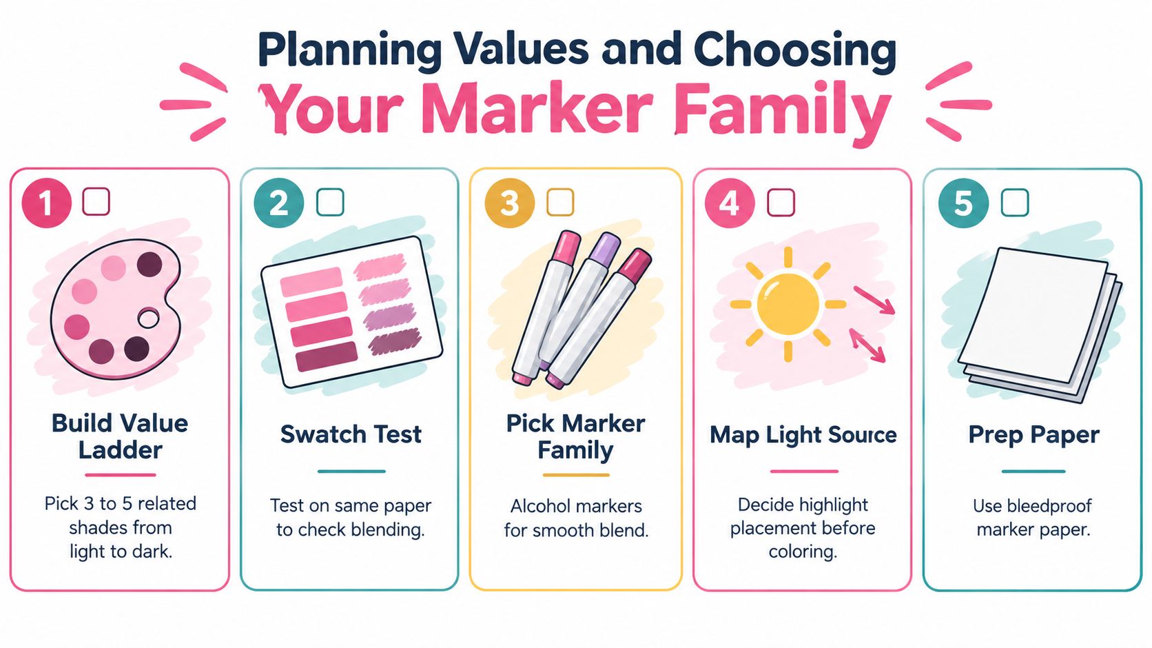
Planning Values and Choosing Your Marker Family
Before coloring, make a small plan on scrap paper. A neutral alcohol-marker rendering guide recommends selecting three to five related shades, arranging them in a swatch ladder, and working from light to dark to preserve shine and volume. The marker hair rendering guide also reflects a broader lesson from salon color charts, which historically relied on organized sample systems rather than one universal standard.
Build a compact value ladder
Choose one light marker for the base, one mid-tone for the main shadows, and one dark marker for depth. Add a fourth or fifth shade only when you need a softer transition or a stronger accent. More colors aren't automatically more realistic. Unrelated hues often create a muddy surface because the eye reads the hairstyle as disconnected patches.
For warm brunette hair, a honey or caramel light, a warm medium brown, and a deep chocolate can work as a family. For cool brown hair, use neutral or slightly gray-brown relatives instead of inserting an orange marker into the shadows. The same principle applies to blonde, red, blue, pink, and green hair. Keep the undertone consistent unless you deliberately want a color shift.
Swatch on the actual paper
Marker colors change with paper, and blending depends on how quickly that paper absorbs ink. Draw each swatch separately, then overlap the light and mid-tone and the mid-tone and dark tone. Test the exact flick you intend to use, because a smooth-looking block blend may not behave like a tapered strand.
ColorBestie's marker comparison tool can help compare compatible marker families before you commit to paper. Use it as a planning aid, then verify the physical result with your own swatch card.
Choose the light source
Pick one clear highlight direction. Light from above and slightly left might leave a bright ribbon along the upper-left curve of each major lock, while the underside and overlapping sections receive deeper values. Don't scatter pale marks everywhere. Protecting a few connected light shapes gives the hair a stronger shine than covering the entire surface with light ink.
Use bleedproof marker paper when possible. It gives broad strokes a cleaner edge and helps prevent ink from soaking unpredictably into the page beneath. Keep a spare sheet under the drawing, and test every new combination before it touches the finished hairstyle.
Laying Base Color and Placing Shadows and Highlights
Start with the lightest marker and fill the hair mass in one even base layer. Work in the direction the hair grows, using broad strokes that follow the major shape instead of coloring in random directions. Leave the planned highlight ribbon lighter, or avoid it entirely if the paper is already bright enough to serve as the highlight.
Work in manageable locks rather than treating the entire hairstyle as one flat silhouette. A lock is a grouped shape that bends, overlaps, and tapers. Keep the base relatively flat inside that shape. If the first layer already has dark stripes, later shadows won't read as structure.
Add the middle value with directional flicks
Use the mid-tone where locks turn away from the light, pass beneath another section, or gather near the part and roots. Begin each stroke slightly inside the lock and flick toward its end. This creates a tapered mark, so the shadow gradually releases into the base instead of stopping like a blunt bar.
The direction matters more than the number of strokes. Hair growing from a part may travel downward and outward, while bangs curve across the forehead and side sections sweep toward the jaw. Follow those paths. A vertical line through a sideways-swept lock breaks the illusion of flow.
A three-value workflow is reliable: light base, middle shadow, dark depth. An alcohol-marker hair tutorial recommends this sequence, along with testing blends on scrap paper and using flicking strokes that follow growth. It also warns against repeatedly working dried areas, because that can create hard edges and muddy color.
Reserve the darkest tone for structure
Bring in the darkest marker sparingly. Place it at the part line, between large overlapping locks, beneath lifted sections, and near the deepest root pockets. Avoid outlining every strand. If every boundary receives the same dark line, the hairstyle loses hierarchy and looks segmented.
For a soft transition, add the middle tone while the underlying area is still slightly damp, then taper outward. Let the layer dry when you want a deliberate, crisp cel-style edge. A colorless blender can sometimes soften a boundary, but it can't erase an overworked section, so use it as a finishing adjustment rather than a rescue plan.
A compatible color converter, such as this Ohuhu and Decotime reference tool, can assist when you're translating a planned family between marker systems. Keep the physical swatch test as the final authority.
The final pass should be light. Add a few narrow strands over selected locks, reinforce only the deepest recesses, and restore shine with untouched paper or a controlled highlight pen. Stop when the hair reads as grouped, flowing forms. More lines rarely fix a value problem.
Adapting Texture for Straight Wavy Curly and Coily Hair
The value system stays the same across textures, but the stroke rhythm changes. Straight hair needs long, confident movement. Curly and coily hair need shorter grouped marks that describe turns and volume without trying to draw every strand.
Straight hair
Use long, mostly parallel flicks that follow the fall from the part to the ends. Keep the highlight as a clean, elongated shape, then place mid-tone shadows beneath the crown, beside the face, and where one sheet of hair overlaps another. Taper the ends so they don't finish in a row of blunt marker bars.
Straight hair often looks polished when you simplify it. A few carefully placed strands over a broad value shape will suggest smoothness better than dense linework.
Wavy hair
Break the movement into gentle S-curves. Let each large lock widen at the crest of the wave and narrow as it turns inward. Place the middle value in the valleys of the wave, while the lightest areas sit on the raised curves that face the chosen light source.
Avoid making every wave identical. Vary the spacing and thickness of the clumps, then use a few directional flicks to connect them.
Curly hair
Think in overlapping curl groups rather than loose spirals. Use curved, comma-like strokes around the outer edge of a curl and reserve the dark tone where curls tuck behind one another. Keep the center of selected curl groups lighter so they remain readable.
Roots should feel denser than ends. Concentrate deeper values near the scalp and let the tips separate with shorter, lighter marks.
Coily and highly textured hair
Build the overall silhouette first with the light base. Add compact zigzags, hooks, or small curved flicks only where they help describe the direction of the coils. Use dark values in the interior mass and under lifted sections, not as a uniform outline around every coil.
For frizz, choose a few flyaways that cross the silhouette. Too many isolated lines make the texture noisy and weaken the larger shape. The strongest result combines a clear volume pattern with selective surface detail.
Complete Workflows for Natural and Fantasy Hair Colors
Different hair colors need different undertones, but they still benefit from the same light, middle, and dark structure. Select the family first, then decide whether the final look should feel airy, rich, fiery, or luminous.
| Hair Color Goal | Light Base Example | Mid Shadow Role | Dark Depth Placement |
|---|---|---|---|
| Blonde | Cream, pale yellow, or soft beige | Shape waves and turns without making them gray | Part, underside, and overlapping locks |
| Brunette | Warm tan or muted beige-brown | Establish the main brown body | Roots, gaps, and tucked sections |
| Red | Peach, copper, or warm orange-red | Model the bends while preserving warmth | Deep auburn or red-brown in recesses |
| Pastel or vivid fantasy | Pale tint of the chosen hue | Strengthen the hue in turning planes | Deep version of the same hue, or a controlled complementary accent |
Blonde
Lay down the palest warm base with plenty of paper left visible for shine. Use the middle tone under the crown, around the part, and inside curved locks. A dark golden beige or muted brown should appear only in structural recesses, because heavy dark lines can make blonde hair look dirty.
Brunette
Begin with a light tan or soft brown rather than jumping straight to the final deep shade. The mid-tone carries most of the volume, while the darkest brown belongs beneath layers and at the roots. Leave a connected light ribbon across the upper curves to prevent the mass from becoming a single dark shape.
Red
Warm colors can lose their glow if the shadows become neutral too quickly. Keep the base and middle values related through copper, russet, or warm red territory, then use the deepest red-brown at the part and interior overlaps. Highlights can be pale peach or warm cream rather than stark white if you want a softer result.
Pastel and vivid fantasy
For pastel hair, start with a very pale tint and build slowly. For vivid hair, the lightest marker still matters because it establishes where the color can appear brightest. Deepen the underside with a darker member of the same family, and use an accent color only in deliberate reflected-light areas.
A palette generator for marker color planning can help you compare family relationships before swatching. The important decision isn't the brand name or the size of the marker set. It's whether the selected colors can clearly separate the light, middle, and dark roles.
Finishing Touches and Mistakes That Dull Your Shine
Stop adding ink when the major locks already have volume. The last details should clarify texture, not cover uncertainty. Check that your highlights follow one light direction, your darkest values sit in believable recesses, and the silhouette still has clean edges.
Use detail with restraint
Add a few fine flicks with a lighter marker or white gel pen on the brightest locks. Soften a hard transition only where it interrupts the form. Don't use a blender across the entire hairstyle, because broad correction can flatten the carefully built value pattern.
The most common mistakes are predictable:
- Too many unrelated shades: A large, uncontrolled palette makes the hair look patchy.
- Repeated passes on dry ink: Scrubbing creates hard edges and muddy areas.
- Dark outlines everywhere: Uniform outlines turn individual locks into disconnected pieces.
- No protected highlight: If every part receives ink, the surface loses its shine.
- Ignoring the paper: Marker bleed can distort clean edges and affect the page beneath.
If marker ink has touched real hair rather than an illustration, treat removal as a safety issue, not an art correction. Safety guidance for hair dyes emphasizes patch testing, wearing gloves, and rinsing immediately if irritation occurs; removal-oriented advice also favors oil-based approaches or careful spot treatment over harsh scrubbing. This hair safety guidance is not a substitute for professional advice, so stop if the scalp or skin reacts.
Practice on small locks before starting a full portrait. A successful swatch should show a clean base, a directional middle shadow, and a dark accent that stays in the recess. Once those three roles are working, the hairstyle will usually improve faster by removing strokes than by adding them.
ColorBestie turns an uploaded sketch into a marker-style preview, with palette and theme options that help you test a hair-color direction before using physical ink. Visit ColorBestie to preview a hairstyle, compare color ideas, and start your next three-value study with a clearer plan.

