
You might be sitting with a fresh set of markers, a clean page, and that familiar mix of excitement and nerves. The colors look gorgeous in the barrel caps, but once it's time to add shadows, everything suddenly feels risky. One wrong stroke and the drawing can look streaky, too dark, or muddy.
That feeling is normal. Artists often don't struggle because marker shading is impossible. They struggle because they think shading has to feel technical and exact from the start, when it gets easier the moment you slow down and treat it like a rhythm instead of a test.
Marker shading can be relaxing. It can feel soft, intuitive, and satisfying, especially when you stop chasing perfection and start looking for simple patterns of light, shadow, and gentle layering. If you'd like a calm way to choose color families before you start, a marker-friendly palette generator can help you visualize combinations without committing ink to paper too early.
From Flat Color to Fabulous Dimension
Flat color has its charm, but shading is what makes marker art breathe. It turns a circle into a round object, a strand of hair into a ribbon of shine, and a simple shirt into fabric with folds and weight. Once you understand that, shading stops feeling like decoration and starts feeling like storytelling.
A lot of beginners think the secret is having a steady hand. That helps, but it isn't the main thing. The bigger shift is learning to see where light lands, where it fades, and where the darkest area should stay tucked in. When you know that pattern, your hand relaxes because you're not guessing anymore.
What matters most
The most comforting part of learning how to shade with markers is that you don't need dozens of tricks. You need a few repeatable habits and the patience to let them become familiar.
- Think in layers, not fixes. Markers work beautifully when you build color gradually instead of trying to nail the final shadow in one pass.
- Keep your shadows connected to the light. Every dark area should have a reason for being there.
- Let the page teach you. Each drawing gives feedback fast. You'll see right away when a shadow is too large, too sharp, or in the wrong place.
Practical rule: Great marker shading usually looks simple up close. Base color, gentle shadow placement, and a few preserved highlights do more than overworking every inch of the page.
There's also a mindset piece people rarely talk about. If you approach shading as a relaxing sequence, base tone first, then a softer middle step, then a small deeper accent, your work often improves because you stop fighting the medium. Marker ink likes confidence, but it also likes restraint.
That's why “fabulous dimension” doesn't come from making everything darker. It comes from choosing where not to color, where to blend softly, and where to let one small shadow do a lot of visual work.
Gather Your Marker Shading Toolkit
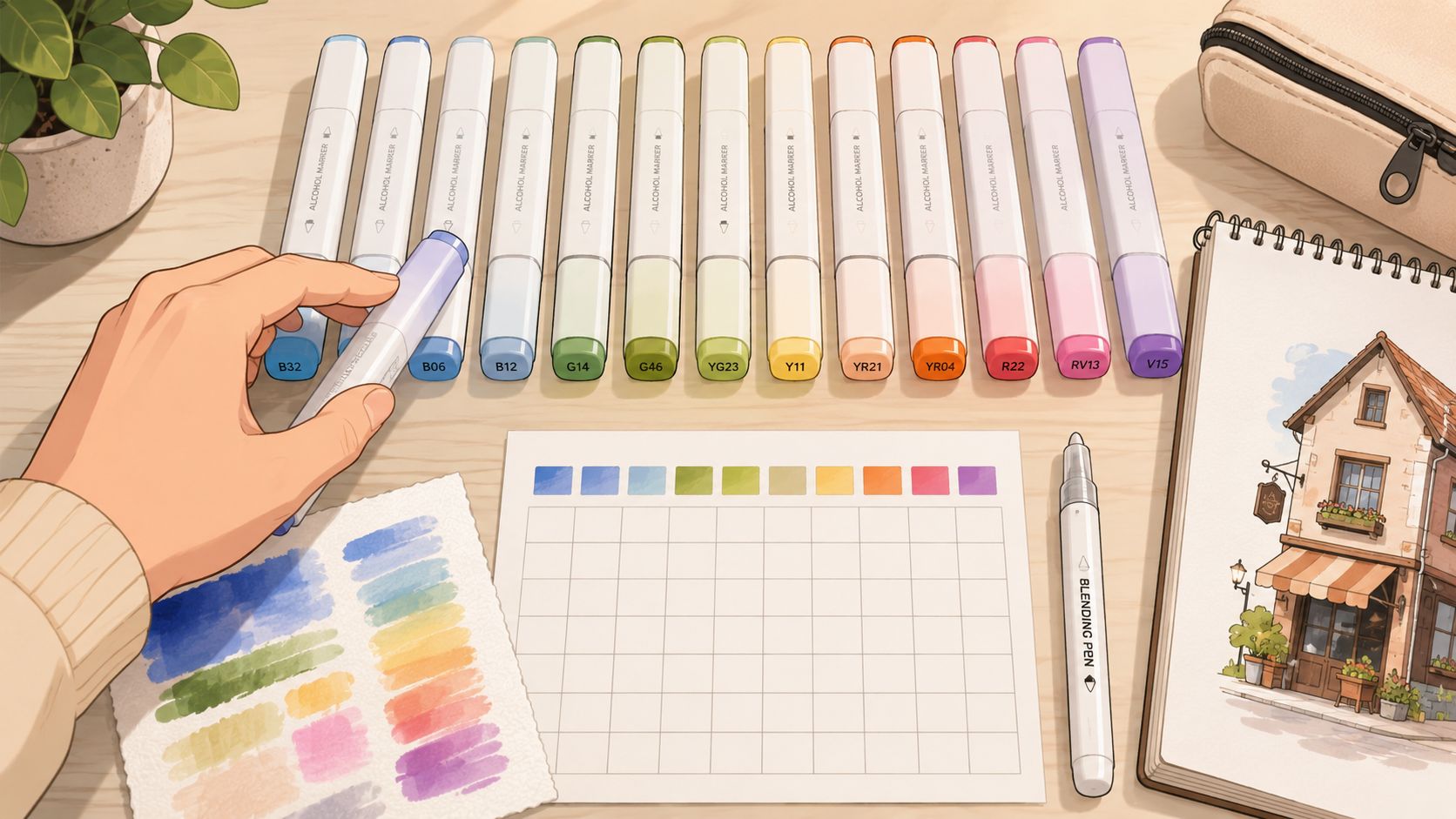
The right supplies won't magically teach shading, but they do remove a lot of unnecessary frustration. If your paper snags, feathers, or drinks up ink too fast, even good technique can feel messy.
What matters most
For alcohol markers, tutorials recommend smooth, thick cardstock because it lets ink glide and supports cleaner gradients, and beginner instruction also highlights preserving white space for highlights while using a colorless blender to reserve highlight zones and soften edges, as shown in this beginner alcohol marker shading tutorial.
That one fact explains a lot. If the surface is smooth, your nib moves more evenly. If the paper is thicker, your transitions stay cleaner. If you leave some white space on purpose, the drawing keeps its sparkle instead of turning heavy.
Here's the toolkit I'd hand to any hobbyist who wants smoother shading:
- Alcohol markers in related shades. A light, medium, and dark version of a similar color family will take you far.
- Smooth, thick cardstock. It supports blending better than rough or flimsy paper.
- A colorless blender. Useful for softening edges, lifting small areas of ink, and helping preserve highlights.
- Scrap paper for swatching. Barrel colors can be misleading, so a test area saves surprises.
A simple starter setup
You don't need a giant collection. Start with a few small groups of colors you enjoy using. Skin tones, warm browns, cool grays, greens, or pinks are all good choices depending on what you like to color.
A simple way to build confidence is to compare marker lines, nib styles, and compatibility before buying more. A marker comparison tool for popular alcohol marker brands can help you sort through options without turning supply shopping into homework.
Leave yourself one extra sheet underneath your artwork. It won't improve the blend itself, but it does make the whole process feel less stressful when ink passes through.
The colorless blender deserves a quick myth-busting note too. It isn't a magic eraser for everything. Think of it more like a shaping tool. It can push ink, soften a hard edge, and help open up a tiny highlight, especially if you act before the area gets too overworked.
If you've ever blamed yourself for ugly results on cheap paper, give yourself a break. Sometimes the page really is the problem.
Think Like a Light Bulb Understanding Form
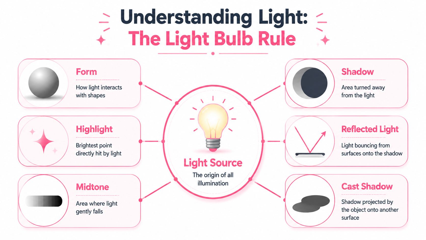
Good shading starts before the marker touches the page. If you can picture a tiny lamp shining on your subject, you're already halfway there.
One light source makes everything easier
Beginner guidance consistently recommends using 2–3 values of the same color and deciding the light source before drawing shadows, with a common example being light from the right and shade on the left, as shown in this marker shading lesson on light direction and value choices.
That's one of the most useful ideas in all of art. Pick one light source and stick to it. Once you do, your decisions become much calmer. You no longer ask, “Where should I put random dark bits?” You ask, “Which side turns away from the light?”
Try this with a sphere. If the light comes from the right:
- The highlight sits on the right side where light hits most strongly.
- The midtone covers most of the form.
- The shadow falls on the left side.
- The cast shadow drops onto the surface beside it.
A cube makes this even clearer. One plane faces the light, one turns partly away, and one turns away more fully. Suddenly, shading becomes a map.
Read simple forms before complex subjects
Most subjects are just simple forms wearing costumes. A face has rounded planes. Hair can be seen as curved ribbons. Clothing folds behave like tubes, wedges, and draped sheets.
That's why practicing with basic shapes helps so much. It teaches your eyes what light does before details start distracting you.
If your shadows feel confusing, simplify the object. Ask whether it behaves more like a sphere, cube, cylinder, or folded strip.
You don't need to memorize fancy terms to make this work. Just keep asking two questions while you color:
| Question | What it helps you decide |
|---|---|
| Where is the light coming from | Where highlights and soft areas belong |
| Which parts turn away from it | Where shadows should gather |
Once that clicks, shading starts to feel less rigid and more intuitive. You're following light, not memorizing rules.
Core Shading and Blending Workflows
Marker shading gets much easier when you stop treating every drawing as a fresh mystery. A dependable workflow creates room for flow. You know your order, your hand settles down, and the fun part takes over.
The basic flow that keeps shading calm
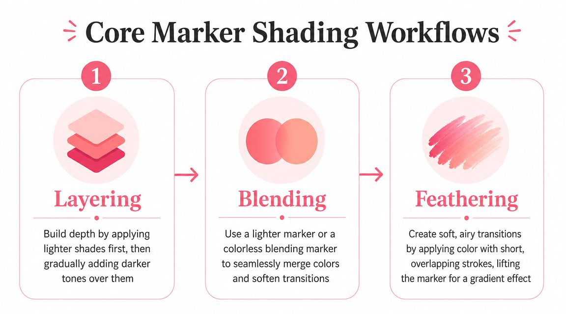
A practical marker-shading workflow is to map a single light source, place the lightest tone as the base, add a mid-tone shadow, and deepen only the core shadow with a third darker layer. Instructional demos also recommend moving quickly between layers while the ink is still wet for smoother gradients, as shown in this step-by-step marker shading workflow demo.
That order matters because it keeps you from overcommitting too soon. The lightest tone gives you a soft foundation. The mid-tone defines the form. The darkest value only goes into the most tucked-away places.
Here's a calm sequence you can repeat:
- Choose your light direction first. Decide this before uncapping anything.
- Lay down the base tone. Cover the area evenly, but leave highlight space where needed.
- Add the mid-tone on the shadow side. Think broad shape, not tiny details.
- Place the darkest shade sparingly. Reserve it for the deepest parts of the form.
- Blend the edges while the ink still moves. Work with purpose, not panic.
A short demo can help the motion click before you try it on your own piece.
Three blending methods that do the heavy lifting
Layering is the gentlest method. You place one light pass, then add more of the same family to deepen selected areas. Because alcohol ink is translucent, the color builds instead of fully covering what's underneath. This is perfect when you want soft form without harsh lines.
Feathering uses quick, light flicks. Start in the darker area and flick outward into the lighter area, lifting your hand as you move. That lift helps create a tapered fade. It works beautifully for hair, fur, petals, and fabric folds.
Blending between close shades is where your light and medium markers meet in the middle. Put down one, add the next while the edge is still workable, then revisit the transition with the lighter shade if needed to soften the seam.
If you want help previewing related color families before you start a page, ColorBestie's marker-style theme preview can show uploaded line art in different palette directions. That can make it easier to pick a light, medium, and dark grouping that feels coherent.
When to stop adding ink
The biggest beginner mistake isn't usually bad color taste. It's staying in one area too long.
More passes don't always create a better blend. Sometimes they just create a wetter, duller patch.
When an area is mostly working, let it rest. Come back only if the form needs more separation. Marker shading often looks better when you leave a little softness instead of forcing every transition to become invisible.
Putting It All Together Shading Skin Hair and Fabric
Technique makes the most sense when it meets real subjects. Skin, hair, and fabric each ask for a slightly different touch, even when the same shading logic stays underneath.
Skin that looks soft instead of patchy
Skin responds well to gentle transitions. Start with your lightest tone over most of the face or body area, then place your middle shade where the form turns away from the light. Think under the chin, along one side of the nose, beneath bangs, or near the edge of a cheek if that side faces away from the light.
Use the darkest value very carefully. On skin, less usually looks better. A tiny accent in the deepest spots often does more than a wide dark region.
Try this order:
- Base first. Keep it even and leave the brightest zones lighter.
- Add mid-tone in soft shapes. Avoid outlining every feature.
- Touch in the darkest shade only where forms overlap. Corners, undersides, and tucked areas are enough.
If you want to test a character palette before coloring, a theme preview tool for marker-style color planning can help you see how warm, cool, or muted choices might affect the mood.
Hair with shine and movement
Hair gets easier when you stop thinking strand by strand. Think in sections or ribbons. Each ribbon has a light side, a middle area, and a darker turn.
Place your base tone first. Then use flicking strokes with your mid-tone from the darker root area or underside toward the lighter area. Leave some uncolored or lightly colored space for shine. That break in value is what gives hair its glossy look.
A helpful way to keep hair lively:
| Hair area | Marker approach |
|---|---|
| Top planes facing light | Keep lighter and less worked |
| Underlayers and roots | Use deeper flicked shadows |
| Shine bands | Preserve lighter space instead of coloring over it |
Hair often looks better when your strokes follow the direction of growth. Curved strokes for curls. Longer sweeping strokes for straight hair. Shorter, broken flicks for textured styles.
Fabric folds that make clothes feel real
Fabric shading is all about where cloth bends, overlaps, and dips inward. Look for valleys in the fold. Those are your shadow homes.
Start by identifying the larger fold pattern before coloring details. A sleeve might have one big shadow under the arm and a few smaller fold shadows near the elbow. A skirt might have repeated vertical fold channels. Once you see the structure, the shading becomes much less random.
Fabric reads clearly when the darkest accents stay in the deepest fold creases, not spread evenly across the whole garment.
For soft fabric, blend shadows gently. For stiffer fabric, you can let some edges stay sharper. That small adjustment changes the material feel without needing extra tools.
The relaxing part is this. You don't have to render every wrinkle. A few believable shadows in the right places can make fabric feel dimensional fast.
Fixing Common Marker Mishaps
Every marker artist runs into trouble spots. Streaks happen. Ink slips past the line. A pretty shadow suddenly turns cloudy. None of that means you're bad at this. It usually means the marker, paper, and timing weren't working together yet.
Streaks bleeding and muddy shadows
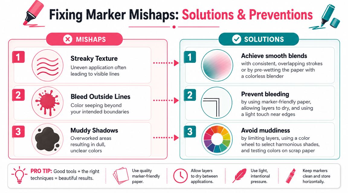
For alcohol markers, experts recommend gradual layering because the ink is translucent and blends best before it fully dries. They also note that using a colorless blender and building shadows from the same color family helps reduce muddy transitions, as explained in this alcohol marker shading guide from Altenew.
That guidance solves a lot of common problems.
- Streaky texture usually means the ink dried before you softened the transition, or your strokes didn't overlap enough. Work in smaller areas and let one pass connect to the next.
- Bleeding outside lines often comes from pressing too close to the edge with a very wet nib. Slow down near borders and let the side of the nib do less work there.
- Muddy shadows tend to show up when unrelated colors pile on top of each other. Stay within a close color family when possible.
A quick recovery chart helps when your brain blanks mid-project:
| Problem | Likely cause | Gentle fix |
|---|---|---|
| Visible streaks | Area dried too fast or strokes were uneven | Re-wet lightly and smooth with overlapping passes |
| Ink spread past line | Paper or edge pressure caused feathering | Use less ink near edges and clean small slips with blender |
| Shadow looks dull | Too many mixed layers | Let it dry, then rebuild with simpler related tones |
Low-pressure practice that actually helps
The fastest way to improve is to practice on subjects that don't carry emotional pressure. Don't start with your dream illustration every time. Start with something that lets your hand learn.
Try these:
- Shade a sphere. Focus only on highlight, midtone, and shadow.
- Color a cube. Give each plane a clear value difference.
- Practice on fruit. Apples, pears, and bananas are friendly forms for learning light.
- Make blending strips. Test light to dark transitions in a row before every session.
Your goal isn't flawless paper. It's familiarity. The more often you repeat simple shading decisions, the more natural they feel when you move to portraits, characters, florals, or coloring books.
If you want a calm way to test palettes before you commit to a page, ColorBestie lets you preview marker-style color ideas on your own sketches and line art. It's a practical option for hobbyists who enjoy planning colors, exploring different moods, and keeping the coloring process relaxed.
