You've just finished inking a manga face, chosen a soft skin tone, and started filling the cheek. The first pass looks fine. Then the second pass leaves a pale stripe, the shadow turns muddy, and color appears on the back of the page. By the time you reach the hair, you're pressing harder to rescue the skin, and the whole character starts looking darker than planned.
I've ruined enough pages this way to know that streak-free manga coloring isn't a matter of having perfect instincts. It's a controlled workflow. Paper, linework, ink timing, stroke direction, and palette choices matter more than owning the most expensive marker set. Once those pieces work together, clean cel shading becomes repeatable.
Why Manga Coloring With Markers Feels Tricky at First
Manga line art is unforgiving because it depends on clear shapes and deliberate contrast. A rough illustration can hide an uneven fill inside texture. A manga face usually can't. A streak across a cheek, a gray edge around the eye, or a shadow that crosses the wrong strand of hair changes the expression immediately.
Alcohol markers also behave differently from paint. They dry quickly, blend smoothly, and can cover broad areas without brush marks, qualities that made them useful for illustration. The modern workflow grew from industrial marker design rather than traditional comic painting. Sidney Rosenthal created the first Magic Marker in 1953, while Copic markers arrived in 1987 with refillable ink and replaceable nibs that helped establish the professional alcohol-marker standard. This marker history and its influence on illustration explains why today's manga coloring process feels fast, layered, and tool-driven.
The page exposes hesitation
The hardest moment usually comes when you place the first shadow. Beginners often hover over the paper, deciding whether the cheek shadow should be wider or darker. That pause creates a partially dry boundary, and the next stroke lands unevenly. Anime-style shading looks clean because the artist commits to a shape, not because every mark is blended away.
Alcohol markers are excellent at flat fills, controlled layering, and graphic shadow shapes. They're less forgiving when you keep revisiting a nearly dry area. Thin paper, soluble linework, and an untested palette make the problem worse, regardless of whether the barrel says Copic, Ohuhu, Prismacolor, or another brand.
Treat the process as a sequence
A reliable page moves in an order:
- Prepare the surface. Choose paper that can accept wet ink and test it before drawing.
- Protect the line art. Use ink that won't dissolve or smear under alcohol.
- Plan the palette. Decide the light, middle, and shadow colors before touching the final page.
- Lay the base. Fill each area with confident, overlapping strokes.
- Add shadows. Place cel-style shapes after the base has dried enough to hold a crisp edge.
- Finish lightly. Preserve highlights, correct only what can be corrected, and protect the finished sheet.
That sequence turns a disappointing page into useful information. If a fill streaks, you can identify whether the issue came from paper, pressure, timing, or color selection instead of blaming your hand. The goal isn't to eliminate every accident. It's to make the result predictable enough that accidents become manageable.
Prepping Your Line Art and Paper for Alcohol Markers
The best marker technique can't compensate for paper that saturates too quickly or ink that dissolves under alcohol. Manga pages often contain fine eyelashes, narrow clothing folds, and dense hair lines, so setup needs to protect both the drawing and the reverse side.
Choose and test the paper
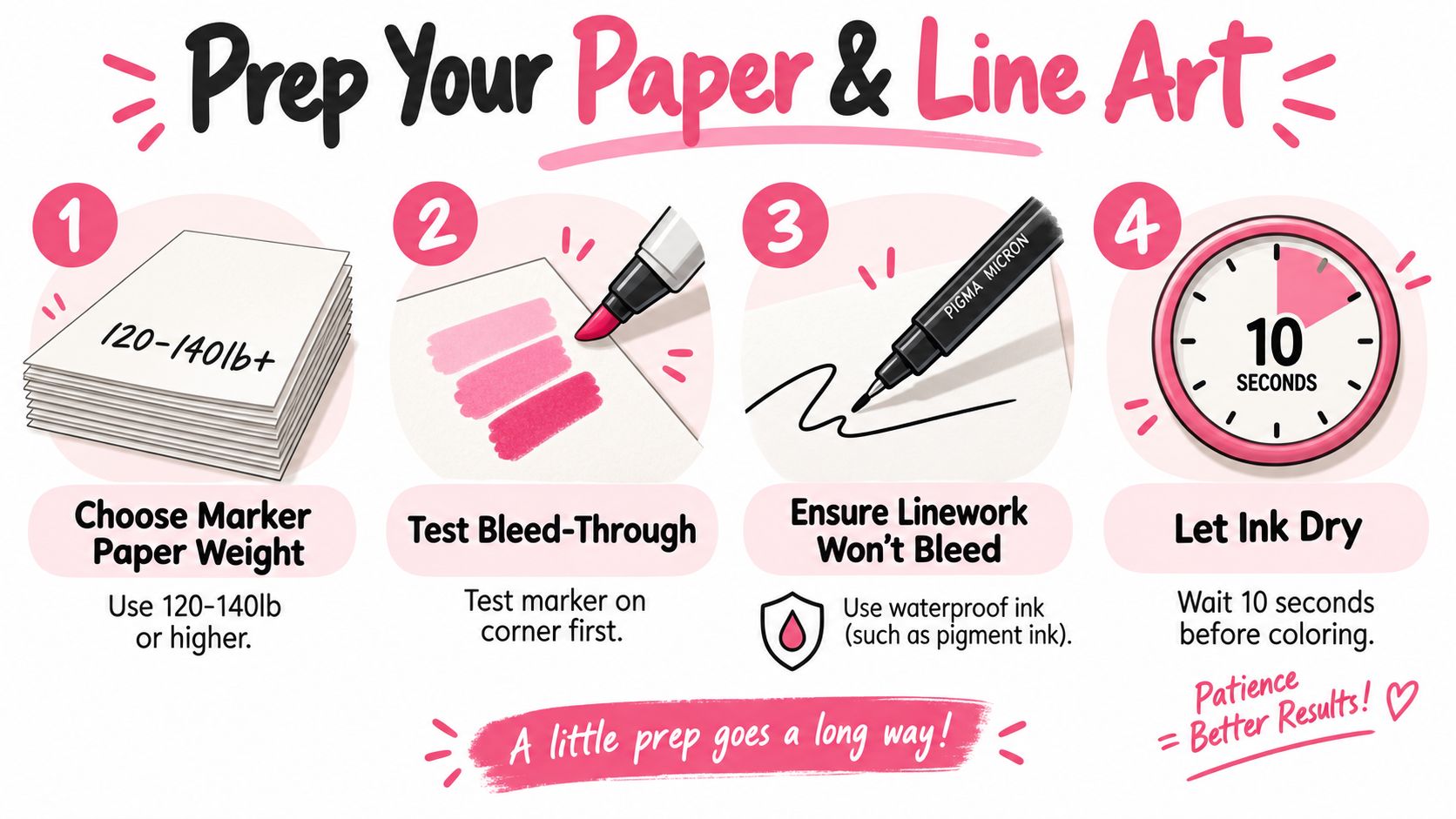
Start with heavier marker paper or cardstock, rather than a thin sketchbook sheet. Paper made for markers usually gives wet ink more room to spread through the surface, which helps reduce rough coverage and uncontrolled feathering. A practical preparation routine looks like this:
- Place a scrap sheet underneath. The extra sheet catches bleed-through before it reaches the next drawing.
- Test a saturated swatch in a corner. Fill a small patch, wait about 10 seconds, and inspect the reverse side. This paper-bleed guidance recommends treating visible color on the back as a warning that the sheet isn't suitable for double-sided work.
- Check the actual marker colors. Caps can mislead you, especially with pale skin and gray-brown shades. Swatch on the same paper you'll use for the illustration.
- Use single-sided marker pads when possible. They let you work without treating the reverse as a finished page.
Bleed-through isn't evidence that one brand has failed. All alcohol markers can bleed on thin or uncoated paper. Overworking causes further trouble because repeated wet passes increase bleed, ghosting, and streaking. Lighter pressure and fewer passes usually help more than switching brands.
Protect the linework
Use waterproof or marker-resistant fineliners for the final outline. Let fresh ink dry fully before applying alcohol ink, and test the pen beside the marker swatches rather than assuming a product labeled “waterproof” will behave identically on every paper.
If you're printing line art, choose a printer method and paper combination that won't leave a surface coating that smears. Print a small test first, then drag a light-colored marker across an unimportant line. If the outline turns gray or spreads, don't color the final page yet.
Pencil construction lines can also show through light markers. Erase them gently before coloring, but leave enough of the line art visible to guide you. Pressing hard with an eraser can roughen the surface, and a damaged surface often accepts ink unevenly.
Practical rule: Test the paper, marker, and line ink as a single system. A product that behaves well alone can still fail when all three meet.
Choosing Markers and Palettes That Work for Manga
You don't need a complete professional range to color manga effectively. You need nibs that match the shapes you draw, inks that layer predictably, and a small palette with enough separation between base and shadow colors.
A chisel nib is useful for broad flats because its edge can cover large areas with consistent contact. A brush nib handles tapered hair strands, curved cheeks, and organic edges more naturally. Bullet nibs can work for small details, though they're less efficient for filling larger shapes.
Refillability and replaceable nibs matter if you draw often. They increase the useful life of a marker, but they also raise the initial commitment. A non-refillable marker can still be a sensible choice for occasional coloring, especially if its ink flow and color selection suit your work.
| Marker Set | Best For | Blend and Coverage | Price Approach |
|---|---|---|---|
| Copic | Artists who value refillability, replaceable nibs, and a broad professional system | Smooth layering with flexible options for long-term color management | Premium investment |
| Ohuhu | Hobbyists who want approachable alcohol markers for manga flats and blends | Generally capable coverage with brush and chisel options depending on the set | Budget-friendly alternative |
| Prismacolor | Artists already working within the Prismacolor color ecosystem | Useful for coordinated palettes, with results depending on paper and nib configuration | Mid-range to premium, depending on the set |
| Winsor & Newton Promarker | Artists who prefer chisel and bullet formats or buy colors individually | Even-looking fills and practical open-stock replacement options | Mid-range |
| Low-cost twin-marker sets | Beginners testing whether alcohol markers suit them | Adequate for simple flats, but blending and layering can be less controlled | Lowest-cost entry |
These are trade-offs, not rankings. Copic's refillable design can make sense for someone building a lasting studio kit, while Ohuhu may be enough for a hobbyist practicing skin, hair, and cel shading. A low-cost set can handle a simple black-haired character with flat clothing, but you may notice limitations sooner when you need subtle transitions or repeated layers.
Build palettes by role
Choose colors by function rather than by the names printed on the caps:
- Skin base: a light, warm color that doesn't overpower the face.
- Skin shadow: a slightly deeper or warmer color reserved for the underside of the chin, hairline, nose, and neck.
- Hair base and shadow: two related colors with a visible value difference.
- Clothing base: the dominant local color.
- Clothing shadow: a darker or cooler partner.
- Neutral shadow: a gray, violet, or muted brown for cast shadows and grounding.
Swatch every candidate, then arrange the swatches beside the line art. If the colors look attractive separately but compete when placed together, remove one before coloring. For manga, a lean palette often produces a cleaner result than a large set used without a plan.
Before buying a set, compare its nib format, refill policy, open-stock availability, and the actual spacing between its light and dark colors. A marker comparison tool can help you inspect those choices side by side instead of relying on packaging promises.
Blending and Shading Manga Skin Hair and Clothes
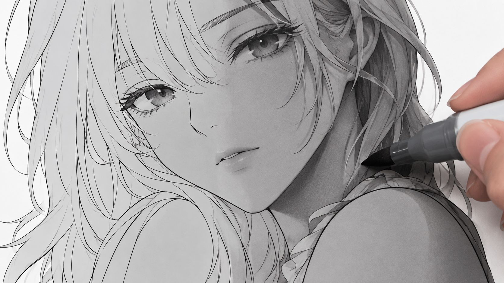
Start with the base color, not the shadow. Fill the entire shape with a consistent first layer, then add the shadow as a deliberate graphic form. On marker paper, allow the base to become dry enough for a hard cel edge, usually about 30 to 60 seconds. This manga and anime alcohol-marker method emphasizes the same order, along with confident chisel-nib coverage and one-directional overlapping strokes.
Lay the flat base cleanly
Hold the marker so the broad face of the chisel nib meets the paper. Work in one direction, overlapping each stroke while the previous stroke is still wet enough to merge. Don't scrub back and forth across a drying area. That movement creates visible bands and pushes extra ink into the edges.
For a face, work from one side of the shape toward the other. Leave tiny highlight areas uncolored when they belong to the design, such as a bright forehead spot or a glint near the cheek. You can add highlights later, but preserving paper white usually looks cleaner than trying to restore it.
If the shape is large, divide it into natural sections, such as forehead, cheek, and neck, while keeping the direction of your strokes consistent. Keep the marker moving at a steady pace. Hesitation is often more damaging than a slightly imperfect first pass.
Add cel shadows with intention
Once the base has dried enough, identify one light direction. Put shadows where the form turns away from that light:
- Under the fringe and along the hairline
- Beneath the chin and jaw
- Inside the ear
- Under the nose
- Along the neck below the face
- On the far side of a sleeve or fold
Place the shadow in one connected shape where possible. A clean shadow boundary gives the character an anime-style separation. If you need more depth, add a darker accent only in small areas, such as the deepest fold or the narrow space between overlapping locks.
Don't feather every edge. Manga coloring often benefits from a mixture of hard cel edges and a few soft transitions. Blend only where the form calls for it, such as a cheek gradient or a rounded shoulder.
Skin needs restraint
Skin becomes muddy quickly because the face contains small shapes and light values. Use the lightest practical base, then reserve the shadow for structural areas. A second shadow layer under the bangs can connect the face to the hair, but it shouldn't cover every contour.
For a soft cheek, apply the base, let it settle, then place a small amount of the shadow near the hairline or side of the face. While the area remains workable, soften the inner edge with the base marker. If the ink has dried, stop adding passes unless you're intentionally creating a stronger shadow. The paper can only absorb so much liquid before the patch becomes glossy or blotchy.
Hair works best in grouped shapes
Don't color every strand individually from the start. Treat the hair as a large mass, lay a flat base, and divide it into locks with a darker shadow color. Keep the highlight path consistent across neighboring locks. A broad light band usually reads more clearly than many random white gaps.
Use the brush nib for tapered ends, then switch to the chisel edge for larger sections if your marker allows it. Vary pressure only after the base is established. Heavy pressure on the first pass can flood narrow gaps and make it difficult to preserve the white linework between strands.
Let clothing folds explain the pose
Fabric shadows should follow the body, not form a collection of arbitrary stripes. Place a darker shape inside a fold, beneath an overlapping sleeve, or where the garment turns away from the light. A cool shadow can separate clothing from skin, while a warmer shadow can keep a soft outfit from looking disconnected from the character.
Test a small area before committing to a dark accent. If the shadow dominates the base color, use it sparingly as an outline-side accent rather than a full fold.
For a visual demonstration of marker handling and layering, use the video below as a reference while practicing on a separate swatch sheet.
You can also compare marker families when you're trying to replace a missing shade or build a similar palette across brands with this Ohuhu and Decotime marker converter. The important part isn't matching a brand label perfectly. It's finding a base, shadow, and accent that maintain the same visual relationship on your paper.
Mapping Digital Palettes to Real Markers With ColorBestie
A digital preview can save a finished page, but only if you treat it as a planning reference rather than a promise of exact ink behavior. Screens emit light. Paper absorbs alcohol ink. The same pink can look brighter on a phone than it does on a warm marker sheet.
ColorBestie turns uploaded black-and-white sketches or line art into marker-style color previews. You can upload an image up to 10MB, choose among five theme worlds covering palette, mood, style, lighting, and genre, then inspect a proposed scheme before committing to the physical page. Those product details come from the ColorBestie overview, not from a performance claim.

Use the preview as a decision board
Upload the same line art you plan to color. Try one restrained palette for natural skin and dark hair, then a more stylized option with colored shadows. Look for relationships rather than exact screen values:
- Does the skin remain lighter than the hair?
- Does the shadow separate the face from the bangs?
- Do the clothes support the focal point?
- Are the darkest areas limited to useful accents?
- Does the background compete with the character?
The preview can reveal that a purple shadow makes the face feel cooler, or that a bright jacket steals attention from the eyes. Those decisions are difficult to judge from loose marker swatches alone.
Translate the idea to your case
ColorBestie aligns suggested colors with marker families including Ohuhu, Copic, Prismacolor, Winsor & Newton, and Spectrum Noir. Use the suggested marker codes as a starting point, then verify them on your own paper. The Palette Generator can help you create a coordinated group before you begin the final illustration.
Make a physical test strip containing the skin base, skin shadow, hair base, hair shadow, and clothing colors. Label every swatch on the barrel or beside the sample. If your exact marker isn't available, preserve the role of the color instead of chasing a perfect match. A slightly different pink can work if it remains the light skin base, while a darker substitute may be better reserved for the hair shadow.
Save the selected preview beside your drawing while you color. It gives you a visual checkpoint when the page starts accumulating layers. You're less likely to improvise a new shadow halfway through the face, which is where many otherwise careful pages lose harmony.
Finishing Touches and Mistakes to Avoid for Lasting Color
The last stage should clarify the drawing, not reopen every decision. Put the marker down when the page already reads well, then inspect the whole character from a distance. Manga coloring often improves through subtraction, meaning fewer extra strokes and stronger preservation of the original line art.
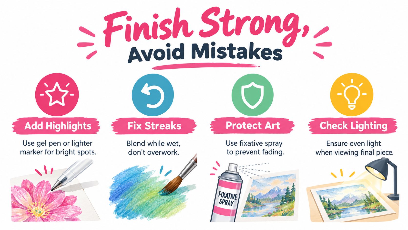
Add highlights only where they support the form. A white gel pen, paint pen, or lighter marker can restore bright points in the eyes, hair, jewelry, and glossy fabric. Use small marks with a clear purpose. Random white lines can flatten the image just as quickly as excessive shadows.
Repair without making the damage larger
A streak that's still wet may soften when you pass the original base color over it once. A dry streak usually gets worse when you keep rubbing at it. If an edge is uneven, convert it into a deliberate shadow boundary, cover it with a clothing fold, or reserve the area for a highlight.
Common late-stage mistakes include:
- Overworking a fill: Stop after the area is even enough. More ink can create saturation, ghosting, or a shiny patch.
- Darkening every shadow: Keep the deepest value for overlaps and focal accents.
- Ignoring the reverse side: Store finished pages with a protective sheet, especially when the paper shows bleed-through.
- Trusting the cap color: Check the swatch sheet before selecting a replacement marker.
- Spraying carelessly: If you use fixative, follow the product instructions, ventilate the space, and test it on a separate sample first.
Fewer passes, lighter pressure, and a clear shadow plan will beat frantic correction on almost every manga page.
Store markers capped tightly and keep them arranged so you can find related colors quickly. Practice on small character studies instead of using every new palette on a finished illustration. A quick swatch before each session helps you notice whether a nib is drying, a color is stronger than expected, or the paper is behaving differently.
The most useful habit is to review the page without judging yourself. Ask which pass caused the streak, where the ink crossed the line, and whether the shadow needed a different shape. That turns a ruined cheek into a technique adjustment for the next drawing.
Use ColorBestie to preview marker-friendly palettes for your manga sketches, compare skin, hair, and clothing combinations, and map ideas to familiar marker families before you ink the final page. Visit ColorBestie to try the free previews and build a calmer, more deliberate coloring routine.

