You've got a box of colored pencils, a fresh page, and one stubborn problem. The drawing in your head looks smooth, rich, and realistic. The drawing on the paper looks streaky, flat, or oddly muddy. That gap frustrates a lot of beginners, and it usually has nothing to do with talent.
The struggle isn't because they picked the wrong red or don't own enough pencils. It's because colored pencil works differently than crayons, paint, or markers. It rewards patience, light pressure, and smart decisions about light and shadow. If you learn those choices early, your work improves fast.
Gathering Your Essential Colored Pencil Toolkit
A beginner's toolkit should feel like a small, dependable workbench. If you have too many supplies, it gets harder to tell whether a problem comes from your technique, your paper, or the pencil itself. A simple setup makes your choices clearer, and that matters because realistic colored pencil work depends on decisions. You are constantly judging when to keep a layer light, when to sharpen, and when the paper still has room for more color.
Start with the pencils
Colored pencils usually fall into two broad groups: wax-based and oil-based. Wax-based pencils often feel softer and put down color faster. Oil-based pencils usually feel firmer, which can make details and slow layering easier to control.
Neither type is automatically better for beginners. The useful question is how each one changes your decisions on the page. A softer pencil helps when you want quick coverage in larger shapes, like the first pass on an apple or flower petal. A firmer pencil helps when you need to creep into darker values little by little without filling the tooth too soon.
Your pencil works like a brush with a built-in personality. Some pencils encourage speed. Others reward patience. If your early layers tend to get heavy before you notice, a firmer set often gives you more breathing room.
Practical rule: Pick one small set and learn it well before buying another. Familiarity beats variety.
Choose paper that can hold layers
Paper decides how long you can keep building color. Colored pencil needs tooth, which is the fine texture that catches pigment. If the surface is too slick, later layers slide around instead of stacking. If the surface is too rough, the drawing can look grainy longer than you want.
That is why paper choice is not just a materials question. It affects strategy. Smooth-ish Bristol can be helpful for crisp edges and clean detail. A slightly more textured drawing paper gives you more room for gradual layering, which is often easier for beginners learning light and shadow. If your goal is realism, choose paper based on how many layers you expect to need, not just how the blank sheet feels in your hand.
A short shopping list is enough:
- Pencils: a beginner set from a brand you can replace open stock if needed
- Paper: a lightly textured sheet made for drawing
- Sharpener: one that produces a clean point without chewing the wood
- Eraser: a kneaded eraser for lifting light pigment or softening edges
- Optional helper: a blending stump for limited cleanup or gentle softening
Don't overlook the sharpener
A sharpener seems minor until your point keeps breaking or flattening. Then every layer gets harder to place cleanly. A dull tip spreads pigment too widely, which makes it easier to lose small shapes in shadow and harder to control transitions.
That matters because realistic drawing is often about saving your darkest darks and smallest accents for the right moment. If the point is blunt, you may press harder to force accuracy, and that closes the paper surface earlier than you intended.
If you also use other art tools and want a clearer sense of how different brands handle, a marker comparison tool for art supply planning can help you compare feel, finish, and buying habits in a more organized way.
Keep your first setup modest. A few pencils, workable paper, and a reliable sharpener teach you more than a drawer full of supplies you do not yet know how to use.
Mastering Fundamental Strokes and Pressure Control
Smooth colored pencil work starts in your hand, not in your blending tools. If your pressure is too heavy in the first minutes, the drawing gets waxy, patchy, and hard to fix. If your pressure stays light, you keep your options open.
Think of pressure like speaking volume. A whisper leaves room to build. A shout fills the page too early.
Learn the three strokes that solve most beginner problems
Start with these foundational marks:
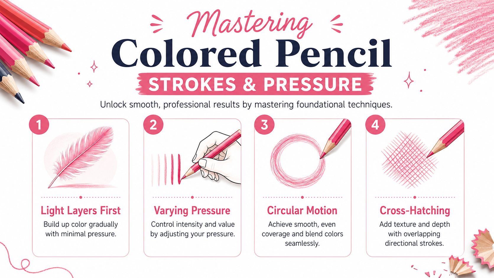
- Circular strokes: tiny overlapping circles create even coverage and help hide line direction
- Directional strokes: lines that follow the form work well for hair, wood grain, cloth folds, or leaves
- Cross-hatching: layered lines crossing each other build darker value and visible texture
For skin, fruit, petals, and other smooth surfaces, circular motion is usually the safest place to start. For bark or woven fabric, visible directional strokes can make the texture look intentional instead of accidental.
Build a pressure scale
Take one pencil and make five small swatches. The first should barely tint the paper. The fifth should be close to your heaviest usable pressure. This simple drill teaches your fingers what your eyes are trying to judge.
When beginners ask me how to color with colored pencil more smoothly, this is often the missing step. They're using only two settings: too light to see, or so hard the paper fills instantly. You want a full range in between.
A detailed tutorial recommends keeping the pencil sharpened and the pressure low in the first passes, then increasing pressure only after enough pigment is laid down. It also notes that layering works best with the pencil held farther back, using small overlapping circles for smooth results, as explained in Faber-Castell's colored pencil techniques guide.
Change your grip to change your result
Try this quick comparison:
| Hold | Best for | What it does |
|---|---|---|
| Near the tip | small edges and details | gives control but can tempt you to press too hard |
| Farther back | early layers and larger areas | keeps your touch lighter and your marks looser |
| Side of the point | broad coverage | helps lay soft, even tone |
| Sharp point upright | accents and crisp lines | defines edges and dark details |
Hold the pencil farther back when you want softness. Move closer only when the drawing actually needs precision.
A good practice page includes a sphere, a leaf, and a strip of fabric. Use circles on the sphere, directional strokes on the leaf, and cross-hatching on the fabric shadow. That one page teaches your hand more than a dozen random doodles.
Building Rich Color with Layering and Glazing
You sketch an apple, choose a red pencil, and fill it in. The shape looks right, but it still feels flat. That usually happens because realistic color is built in stages, the same way real light reaches the eye in stages. Light bounces, shifts temperature, and softens into shadow. Your pencil work has to do the same.
Layering is how you build that complexity on purpose. Each light pass changes what sits underneath, so color develops more like stained glass than house paint. You are not trying to finish the area in one trip across the paper. You are deciding, layer by layer, whether that part of the object needs to get warmer, cooler, darker, duller, or more unified.
That decision-making step is what many beginner lessons skip.
What layering is really doing
A layer is a transparent film of pigment. Put yellow under red, and the red often feels brighter and warmer. Put a muted blue or violet into the turning shadow of that same red object, and the form starts to round instead of looking cut out.
So the question is not just, “What color is the apple?” Ask two better questions:
- What color is the light hitting the apple?
- What color is the form as it turns away from that light?
Those answers guide your layers.

A practical apple example
Say your apple sits under warm indoor light. The lit side may carry yellow or cream before it ever needs a strong red. The middle area may need a cleaner red. The shadow side may need a cooler red, plus a touch of violet, because shadows often shift temperature instead of just becoming “more dark.”
Try a simple sequence:
- Lay in pale yellow or warm cream on the lightest half.
- Add a light red across most of the apple with gentle pressure.
- Strengthen the middle tone with a slightly deeper red.
- Cool the shadow side with a small amount of violet or blue-red.
- Protect the brightest highlight so the paper can keep doing that job.
Early on, the drawing can look underpowered. Keep going. Colored pencil often looks unimpressive right before it starts to look convincing.
A small test strip helps here. Stack your planned colors in the same order you intend to use them in the drawing. You will see very quickly whether the combination stays fresh or turns muddy. For palette planning and testing color families before you commit, a theme preview tool for testing color directions can help you compare warm, cool, and muted options side by side.
A quick demonstration can make the process easier to see in action:
When to glaze, and why it helps
Glazing is a specific kind of layer. You use it after an area already has some structure. Instead of building from blank paper, you place a thin color veil over existing layers to shift the whole passage in one direction.
Glazing helps when your drawing is technically correct but the color relationships still feel disconnected.
Use a glaze when you want to:
- warm a light area that feels chalky
- cool a shadow that looks too brown or dull
- unify several reds so they read as one surface
- soften a transition where two colors meet too abruptly
Here is a good way to judge it. If neighboring colors feel like separate pieces of paper taped together, a glaze can stitch them back into one form.
How to choose the right glaze
Choose the glaze by the problem you see, not by habit.
If the apple's lit side looks pale and lifeless, a light yellow, peach, or warm red glaze can bring back the sense of light passing through the skin. If the shadow side feels heavy but not believable, a cool glaze can push it back in space without making it dirty. If the whole apple feels patchy, one thin pass of a middle red over the larger form can unify the surface.
This is why restraint matters. Too many strong colors too early can clog the paper and confuse the light logic. Start with a small family of pencils and let each one have a job. One pencil establishes warmth. Another deepens value. A third shifts the shadow temperature.
That is how rich color happens. Not from using more pencils, but from making clearer choices with each layer.
Achieving Smooth Finishes with Blending and Burnishing
Blending and burnishing get lumped together, but they aren't the same move. They solve different problems, and choosing the wrong one at the wrong time is a common reason beginners get stuck.
Blending softens transitions
Blending is about merging layers so they read as one smooth area rather than separate strokes. You can blend with a lighter pencil, a colorless blender, or a tool such as a blending stump depending on the surface and the effect you want.
Use blending when:
- edges between colors look scratchy
- the form is correct but the surface feels grainy
- you want a softer, more gradual transition
- you're still developing the area and may need more layers later
A lighter pencil works well when you want to smooth and brighten at the same time. A stump or similar tool can help when your hand is getting tired and you don't want to keep pressing with the pencil itself.
Burnishing compresses the surface
Burnishing is the late-stage move. It uses heavy pressure to press pigment down into the paper tooth so the surface becomes smoother and more saturated. It can create a glossy, finished look, but it also reduces your ability to keep layering afterward.
That's why timing matters.
According to Mont Marte's guide to coloured pencil techniques, a high-control workflow is to build color in light layers first, then use a burnishing pass at the end. The guide also notes that heavy final pressure can fatigue the hand, which is one reason artists may use a blending stump or tool to reduce strain.
When to choose which one
This quick comparison helps:
| If your problem is... | Use | Why |
|---|---|---|
| visible pencil grain | blending | it softens the surface without sealing it too soon |
| weak color intensity | more layers first | the surface may not be ready for final compression |
| nearly finished area needs polish | burnishing | it deepens saturation and smooths the tooth |
| hand getting tired | blending tool | it can reduce repeated heavy pressure |
Burnish only when you're confident about the values underneath. If you flatten the surface too soon, the drawing loses flexibility.
A lot of frustration disappears once you see the sequence clearly. Early stage: light layers. Middle stage: more layers and selective blending. Final stage: burnish only where the drawing is ready to stop.
Creating Realism with Value and Color Theory
Technique makes marks. Value makes form. If a drawing looks flat, the problem usually isn't the pencil brand. It's that the light, middle, and dark shapes aren't clear enough.
This is the part many beginners skip because it feels less exciting than color. But realism depends on it.
See the object as light shapes first
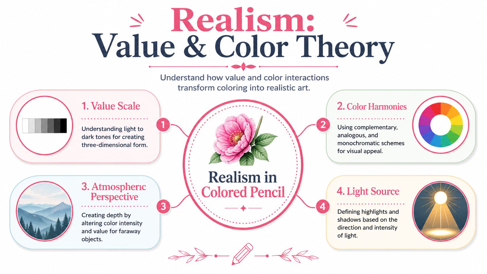
Before you worry about whether the apple is scarlet or crimson, ask four questions:
- Where is the light coming from?
- What is the lightest shape?
- What is the darkest shape?
- Which areas turn gradually, and which edges change sharply?
A major gap in beginner instruction is the decision-making around highlights and shadows. As noted in Jerry's Artarama's discussion of mastering light and shadow in colored pencils, many tutorials list techniques like layering or burnishing but don't help learners decide where highlights belong, how dark shadows should get, or when blending starts to kill contrast.
That's the fundamental shift from coloring to drawing. You stop asking, “What pencil should I use?” and start asking, “What is the light doing here?”
Make a simple value plan
Before adding full color, sketch a quick map in your mind or on scrap paper:
- Highlight: preserve the paper or barely tint it
- Midtone: the main local color lives here
- Core shadow: the darker band where the form turns away
- Cast shadow: the shape the object throws onto the surface
- Reflected light: a softer light area inside the shadow family
This doesn't need to be fancy. Even a rough plan helps you avoid the beginner habit of making everything equally bright.
For experimenting with color relationships before you draw, a palette generator for harmonious color schemes can be useful when you want to test complementary or analogous ideas without guessing blindly.
Shadows aren't just black or gray
Beginners often darken shadows by reaching for black too early. That can deaden a drawing fast. A more natural approach is to ask whether the shadow feels warmer or cooler than the lit area.
Try these ideas:
- A warm red object may take a cooler shadow
- Yellow light can make nearby shadows feel more violet
- Green foliage may look richer with blue-green and muted red-brown interplay
- Skin often needs temperature shifts, not just darker flesh tones
Preserve highlights instead of chasing them later
Colored pencil is not forgiving about bright highlights once you've covered them heavily. The cleanest highlight is often the paper you intentionally leave alone.
That's where negative drawing helps. Instead of drawing the highlight itself, you draw around it. You darken the surrounding area carefully so the light shape stays bright and crisp.
Save your brightest whites early. They're easier to protect than to rebuild.
A shiny cherry is a good practice subject. If the highlight sits on the upper left, leave that shape almost untouched. Build the red around it. Deepen the opposite side. Then soften the edge on only one side of the highlight so it looks embedded in the curved surface rather than pasted on top.
Realism comes from these choices. The right highlight placement. A shadow dark enough to turn the form. Enough blending to unify, but not so much that every edge becomes sleepy.
Troubleshooting Common Issues and Planning Your Next Steps
Every colored pencil artist runs into the same handful of problems. The good news is that most of them come from process, not lack of ability.
Fix the issue by naming it correctly
If your drawing looks dull or smeary, check which of these sounds familiar:
- Colors turned muddy: you probably added too many competing hues before the form was clear
- Paper won't take more layers: the tooth is likely filled, often from pressing too hard too soon
- Surface looks cloudy on dark areas: that can happen after heavy buildup and usually signals that the finish needs attention
- Highlights disappeared: they were covered instead of preserved
When you know the cause, the fix gets simpler. Muddy color usually calls for fewer pencils and cleaner early layers. A filled surface means you need better pressure control next time. Lost highlights usually mean planning them earlier.
Keep going through the awkward stage
Most drawings look clumsy halfway through. That's normal. Colored pencil develops slowly, and the middle stage often looks less polished than either the beginning or the end.
If you stop every drawing at that awkward point, you'll never see what the later layers can do. Stay with it a little longer. Refine one area. Compare values. Sharpen the pencil. Keep the decisions small.
This is also a solid foundation for other media. The same habits that improve colored pencil work also help with markers, pastel, and mixed media planning: lighter starts, cleaner value structure, and better color restraint.

If you'd like an easy way to plan marker-friendly color ideas before you commit to the page, try ColorBestie. It gives you cozy, fast color previews for sketches and helps you explore palette, mood, style, lighting, and genre in a low-pressure way. That makes it especially handy for hobby colorists, adult coloring fans, and artists who want to bridge traditional drawing skills with practical color planning.
