You've probably done this before. You pick a bright pencil, press hard, fill a section fast, and then wonder why the colour looks flat, streaky, or chalky instead of rich and smooth.
That frustration is common, especially if you also use alcohol markers. Markers make it easy to get that even, saturated look. Colored pencils can do something similar, but they get there differently. The secret isn't pressing harder. It's building colour patiently, keeping the paper surface open, and avoiding the thin-layer trap that makes blended areas turn pale and patchy.
If you're learning how to colour with pencils, think of it less like painting a wall and more like glazing a dessert. Each light layer changes what sits underneath. Done well, those layers create depth, softness, and that almost marker-like finish many beginners want.
Choosing Your Creative Tools for Coloring
Walking into an art store can make pencil colouring feel more complicated than it is. You don't need everything. You need tools that match the way you want your finished piece to look.
Pick pencils for the result you want
The first big choice is wax-based versus oil-based colored pencils. Both can produce beautiful work, but they feel different in your hand and behave differently on paper.
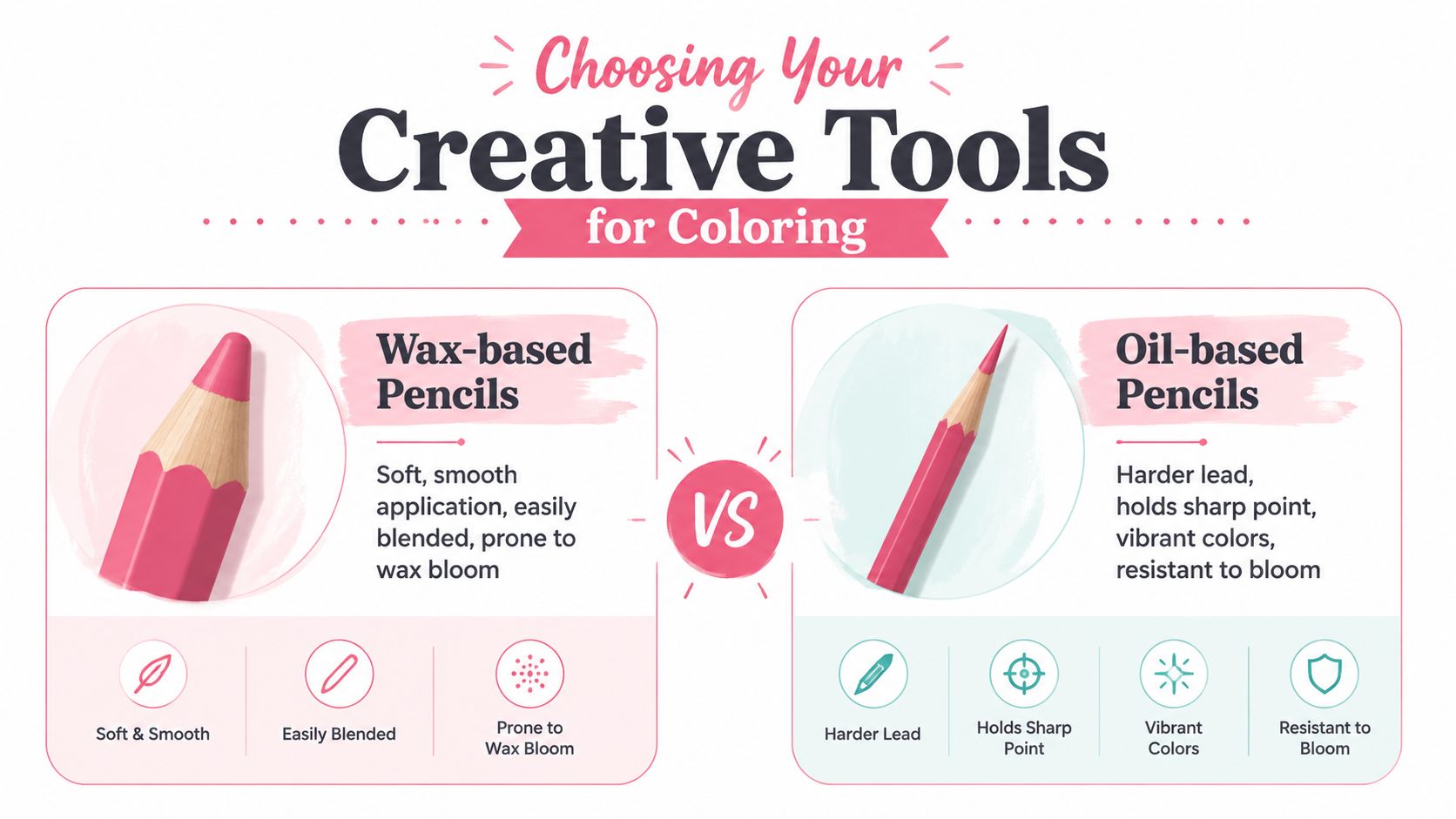
Wax-based pencils, such as Prismacolor Premier, usually feel softer and creamier. They lay down colour quickly and blend easily, which is lovely for soft gradients, florals, skin, and coloring-book pages.
Oil-based pencils, such as Faber-Castell Polychromos, usually feel firmer. They hold a sharp point longer, so they're excellent for fur, eyelashes, tiny patterns, and crisp edges.
| Feature | Wax-Based Pencils (e.g., Prismacolor Premier) | Oil-Based Pencils (e.g., Faber-Castell Polychromos) |
|---|---|---|
| Feel on paper | Soft and smooth | Firm and controlled |
| Best for | Blending, layering broad areas | Fine detail, precise edges |
| Point retention | Wears down faster | Stays sharp longer |
| Surface look | Creamy, often fuller coverage sooner | Cleaner texture, easy to layer |
| Common issue | Can develop wax bloom in heavy layers | Can feel less buttery to beginners |
If you want easy blending, start with wax-based. If you love detail and neat edges, start with oil-based. Many artists eventually use both.
Practical rule: Choose pencils based on the finish you want, not on how big the set looks.
Artist-grade colored pencils also offer much wider colour ranges than basic school sets. Standard professional sets commonly include 72 colours, and premium sets can include 120 or more according to the verified industry data provided for this article. That matters because you can reach nuanced colours with less guesswork and less heavy-handed mixing.
Paper matters more than most beginners expect
Beginners often blame their pencils when paper is the problem. Colored pencil needs tooth, which is the slight texture that grabs pigment. If the paper is too slick, colour skates around. If it's too rough, blends can look grainy.
The verified technical guidance for this article recommends vellum or medium-surface paper in the 120 to 160 gsm range for strong pigment grab and smoother layering. That range gives you enough texture to hold layers without feeling like sandpaper.
A few simple guidelines help:
- For smooth blends: choose a medium-surface sheet with enough tooth to accept repeated light layers.
- For detail work: use a surface that isn't overly rough, so your pencil point doesn't bounce.
- For practice: keep scrap paper from the same pad nearby so you can test colours before touching your drawing.
If you struggle to choose colours that work together, a digital planning tool can help you test harmony before you start. A palette generator for color planning can make that decision easier.
A simple beginner kit that works
A beginner kit doesn't need to be fancy. It needs to be dependable.
Start with:
- A small quality pencil set: A modest set gives you enough range to learn layering and value without overwhelming you.
- A reliable sharpener: You want a clean point, not a splintered core.
- A putty eraser: This lifts pigment gently instead of scraping the page.
- A sheet of glassine or clean scrap paper: Rest your hand on it to stop smudging.
- A white or cream pencil: Useful later for soft blending and burnishing.
The average colored pencil is capable of drawing a continuous line of over 30 miles, based on the verified manufacturing data supplied for this article. That's a good reminder that you don't need a giant stash to practice seriously. One pencil can go a very long way.
Mastering Foundational Pencil Pressure and Layering
Most beginner problems start with pressure. If you press hard too soon, you flatten the paper's tooth and block later layers from sticking. That's why early colouring can look bold at first and disappointing by the end.
Start lighter than feels natural
Good colored pencil work usually begins with a touch so light it feels almost too gentle. The verified guidance for this article describes the first stage as light pressure at roughly 10 to 15% of your maximum force. A useful mental image is petting a cat, not scrubbing a pan.
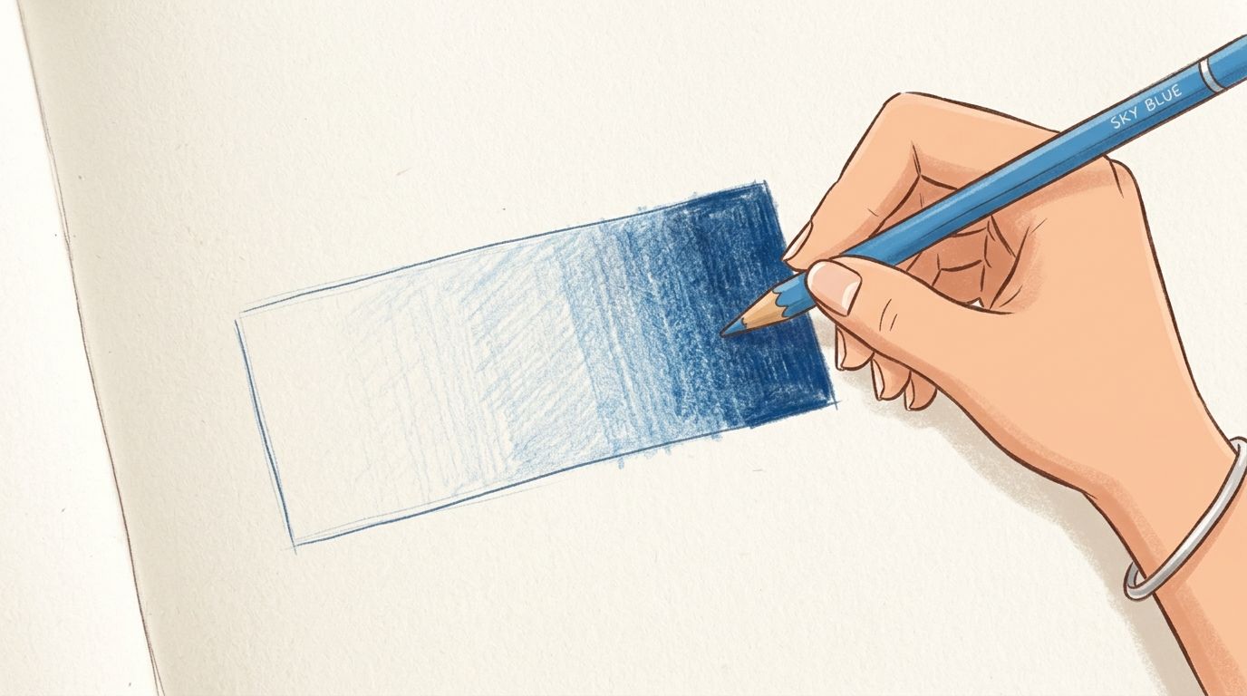
That first layer shouldn't look finished. It's only a base. You're tinting the paper, not sealing it.
Try this on a simple circle:
- Use a pale blue with very light pressure over the whole shape.
- Add a second light layer on the shadow side only.
- Add a darker blue in the deepest shadow.
- Keep the highlight area mostly untouched.
This feels slow at first. It works because each pass stays transparent enough to interact with the next one.
Keep your stroke direction consistent
The same verified data notes that success in smooth blending correlates 85% with maintaining consistent stroke direction across early layers. In plain language, your pencil marks should move in a regular way instead of changing direction every few seconds.
That doesn't mean you must always shade in straight lines. It means choosing a motion and sticking with it for that area.
Here are three useful options:
- Small circular strokes: Great for skin, fruit, petals, and soft surfaces.
- Unidirectional strokes: Good for skies, walls, and clean gradients.
- Hatching that follows form: Helpful for fur, fabric folds, or wood grain.
Keep the motion consistent long enough for the layers to knit together visually. Random marks create patchiness that blending can't fully hide later.
Build colour in clear stages
A lot of beginners try to jump from pale to finished in one pass. Colored pencil usually rewards a staged approach instead.
Think in three phases:
| Phase | What to do | What it feels like |
|---|---|---|
| Initial layering | Light colour placement, preserve tooth | Barely-there pressure |
| Intermediate blending | Add related hues, deepen shadows | Controlled and patient |
| Final burnishing | Compress and fuse the top layers | Firm pressure, like signing your name |
The verified technical notes describe a progressive pressure gradient from the light opening layers to heavy pressure in the burnishing phase, often around 80 to 90% force. Burnishing comes last, not first. If you do it too early, the paper can't accept much more pigment.
A good beginner exercise is a value strip. Pick one pencil and make five boxes from light to dark using only added layers, not harder pressure at the start. This trains your hand to separate layer count from pressure.
Blending Techniques for Seamless Color Transitions
You finish a bright area, step back, and it still looks more like colored stripes than a rich block of colour. That is the moment many beginners start pressing harder, hoping the pencil will behave like a marker. Usually, the actual fix is simpler. Build enough pigment first, then blend.

Dry blending for control and polish
Dry blending stays entirely within pencil. You overlap neighbouring colours, then use a lighter pencil, a colourless blender, or a pale version of the local colour to soften the join between them.
It helps to picture the paper tooth like tiny cups. If those cups still have lots of empty space, blending will only push around a small amount of pigment. That is why early blending often creates a dusty, weak result instead of the rich, smooth finish people want.
A peach is a good practice subject. Start with pale yellow across the whole fruit. Layer warm orange through the middle areas. Add red where the blush is strongest. Then use cream or white with controlled pressure to merge those colours so the shift feels gradual rather than striped.
Dry blending works well because it offers:
- Precise edge control: Helpful for colouring books, petals, eyes, and other tight spaces.
- A tidy process: No drying time and no extra mixing tools.
- A classic pencil finish: Smooth, but still easy to keep detailed.
Its limit is speed. On rougher paper, or in large backgrounds, dry blending alone can leave visible speckling unless you have already built solid layers.
Solvent blending for an almost marker-like finish
If you enjoy markers and want that fuller, more even coverage, solvent blending is the closest match in colored pencil. A small amount of solvent softens the binder and lets the pigment settle into the paper more evenly, which reduces the grainy look.
The mistake beginners make is falling into the thin-layer trap. They add a whisper of colour, reach for the solvent, and end up with a faded patch because there was not enough pigment on the page to begin with. Solvent does not create saturation out of nothing. It fuses what is already there.
A simple order helps:
- Lay down your main colour lightly.
- Add two or three related colours so the area already looks established.
- Check for enough pigment before blending. If the paper still shows strongly through, add another layer.
- Apply a tiny amount of solvent with a clean brush or cotton bud.
- Blend with light circular motion.
- Let the area dry, then add more pencil if you want stronger colour or sharper details.
That clean tool matters. A dirty brush drags old pigment into new areas and turns bright colour muddy fast.
If you also switch between markers and pencils, this marker comparison tool for matching sets is useful for choosing pencil families that blend in a similar way.
For a visual walkthrough, this video gives you a useful demonstration pace to compare with your own hand pressure and layering rhythm.
When to choose each method
Dry blending suits detail, control, and smaller shapes. Solvent blending suits broader areas, stronger saturation, and that smooth, almost marker-like surface many hobbyists are after.
The key idea is simple. Blending is not a shortcut for thin colour. It is the finishing step that helps already-present pigment join together.
If your transitions still look streaky, check the layer buildup before you blame the blending method. In many beginner pieces, the problem starts earlier than expected.
Using Color and Value to Create Depth
Smooth colour isn't enough on its own. If everything is equally bright and equally dark, the drawing still feels flat. Depth comes from value, which means how light or dark a colour appears, and from smart colour relationships.
Think in light and dark before hue
Many beginners focus on choosing the perfect pencil name. In practice, the stronger question is, “Is this area lighter or darker than the one next to it?”
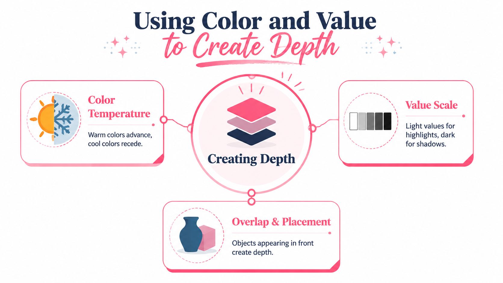
If you colour an apple with one flat red, it reads as a sticker. If you create a light side, a middle tone, a core shadow, and a reflected light edge, it starts to feel round.
Try building a quick value scale before a drawing:
- Box one: barely tinted
- Box two: light local colour
- Box three: middle tone
- Box four: shadow
- Box five: deepest accent
The average colored pencil can draw a continuous line over 30 miles, according to the verified data supplied for this article. That kind of longevity is reassuring for practice because value control takes repetition. You have plenty of pigment available to make swatches, scales, and test pieces without feeling wasteful.
Use complementary colours for livelier shadows
A common beginner habit is to darken everything with black. That usually deadens the colour. Shadows get more interesting when you shift temperature or use a complementary colour lightly underneath.
The verified guidance for this article notes that underpainting with complementary colours creates optical depth. A simple example is placing a whisper of green under red areas, or a muted blue into the shadow side of orange.
That approach helps because shadows in real life often carry colour, not just darkness.
A few pairings to try:
- Red object: soften shadows with green-based tones
- Orange object: cool the shadow side with blue
- Yellow object: deepen with violet-leaning notes
- Green leaves: warm selected shadow areas with red-browns
A theme preview tool for testing color direction can be helpful when you want to experiment with mood before committing to a full page.
Practice depth with one simple object
Start with a sphere, leaf, or piece of fruit. Limit the drawing to one main colour plus one supporting shadow colour. That keeps your attention on depth instead of complexity.
Try this test: If you squint at your drawing and the form still looks round, your values are doing their job.
You don't need a complicated scene to learn this. A single shaded plum can teach more about depth than a crowded page filled with flat local colour.
How to Fix Common Colored Pencil Mistakes
You finish a section, blend it, and instead of that rich, marker-like finish, the color suddenly looks weak, chalky, or patchy. That moment frustrates many beginners because the mistake seems to appear out of nowhere. In practice, colored pencil problems usually come from a small habit you can spot and correct.
When colours look pale after blending
Pale color after blending usually starts before the blender ever touches the page. The pencil layers were too thin, so the solvent had very little pigment to soften and spread.
This is the thin-layer trap. The page may look colored at first glance, but the surface is still carrying a light stain rather than a solid build of pigment. If you want colored pencils to act more like markers, the paper needs enough color packed into it first. A good check is simple. Before blending, the area should already look convincing on its own, just a little grainy.
If it still looks faint, add more light-to-medium layers in the same color family. Then blend.
When your drawing turns muddy
Muddy color often happens when too many pigments get mixed in one small area. Colored pencil behaves a bit like stirring paint. A few related colors can stay bright. Too many competing colors quickly turn dull.
Three causes show up again and again:
- Too many unrelated colours: Keep each section built around a small group of neighboring hues.
- Dirty blending tools: Clean brushes, stumps, or cotton buds before switching colors.
- Overworking one spot: Repeated scrubbing pushes pigments together until they lose freshness.
For example, if you want a vivid peach or sunset orange, build it with reds, oranges, and warm yellows. If green, purple, and heavy darks get worked into that same patch without a clear reason, the brightness drops.
When the paper stops taking colour
This means the tooth of the paper is full. The tiny hills and valleys that catch pigment have been pressed flat or packed with wax and binder.
Beginners often hit this point by using heavy pressure too early because they are chasing strong color fast. It feels logical, but it usually blocks the smooth saturated finish they want.
Look for these signs:
| Symptom | Likely cause | Best response |
|---|---|---|
| Pencil slides without depositing much colour | Surface is burnished too early | Stop layering and work in a different area |
| Speckled gaps won't fill | Paper texture is too rough or packed awkwardly | Use lighter early layers on the next attempt |
| Dark area won't deepen | Too much heavy pressure too soon | Save burnishing for the final passes |
Paper works like a sponge with limited space. Fill it gently at first. Compress it only near the end, once the color is already where you want it.
When bloom and smudges show up
Wax bloom appears as a cloudy film, especially in dark wax-based areas. Smudges happen when your hand drags loose pigment across finished passages.
Both are fixable.
- For bloom: wipe the area gently with a soft tissue and avoid forcing too much wax into dark passages early on.
- For smudges: keep a clean sheet of scrap paper or glassine under your drawing hand.
- For fuzzy edges: sharpen the pencil and restate the edge with small controlled strokes.
One more helpful habit is to pause before “fixing” a problem with pressure. Pressure can hide an issue for a minute, but it often creates the next one. More layers usually solve more than more force.
Mistakes are part of learning how your pencils respond. Once you can identify whether the problem is thin pigment, too many colors, packed paper, or surface residue, your results get brighter, smoother, and much closer to that polished marker-style look many hobbyists are after.
Your Path to Becoming a Confident Colorist
Confidence with colored pencils doesn't come from finding a perfect set or memorising every colour theory rule. It comes from seeing, through practice, that light layers really do build into rich colour.
Start small. Colour one leaf, one berry, one ribbon, or one simple sphere. Focus on light pressure first, then cleaner layering, then smoother blending. When that feels natural, add solvent for that more unified, marker-like finish.
Be patient with the pace. Colored pencil rewards calm repetition more than speed. A bright, polished drawing often comes from many quiet passes that barely looked impressive on their own.
If you're learning how to colour with pencils, remember this one idea most of all. Don't rush to blend. Let the pigment build. That one habit changes almost everything.
If you'd like help planning cozy, marker-style palettes before you start colouring, ColorBestie makes that process simple. It turns sketches into colour inspiration, helps you preview moods and themes, and supports the kinds of brand-friendly palettes many hobbyists already use with Ohuhu, Copic, Prismacolor, and similar tools.