You're probably here because your colored pencils aren't doing what you imagined. You put down a bright red, and it looks chalky. You try to blend a shadow, and it turns streaky. You press harder, hoping the color will get richer, and the paper starts looking tired before the drawing even starts to come alive.
I've been there. Most beginners don't struggle because they lack talent. They struggle because colored pencil looks simple, but it behaves more like a slow, layered conversation with the paper. If you miss that part, everything feels harder than it should.
The good news is that colored pencil is worth learning. It can be soft, luminous, precise, and surprisingly expressive. It's also a medium with growing interest worldwide. The global colored pencils market reached USD 2.14 Billion in 2024 and is projected to surpass USD 4.35 Billion by 2034, expanding at a 6.8% CAGR according to Zion Market Research's colored pencils market report. That growth reflects how many hobbyists and working artists keep choosing this medium for its flexibility and detail.
If you also like planning color digitally before touching paper, tools such as ColorBestie can make that part feel less intimidating. But the key breakthrough still happens at the paper surface, when you understand how layers, pressure, and paper tooth work together.
Your Vibrant Journey into Colored Pencil Art
A lot of people begin colored pencil with the same little heartbreak. They buy a fresh set, open it with real excitement, pick a pretty subject, and then hit three frustrations almost at once. The colors look weaker on paper than they looked in the box. The shading turns scratchy. The highlight disappears because the whole area got filled too fast.
That doesn't mean you're bad at drawing. It usually means no one told you the central rule of how to draw in colored pencil. Don't fight the paper. Build with it.
Colored pencil rewards patience in a very visible way. A light first layer gives later layers somewhere to sit. A thoughtful choice of paper gives pigment tiny places to catch. A restrained hand gives you options. Once you feel that relationship, the medium gets a lot more fun.
Why this medium pulls people in
Colored pencil has a special mix of control and richness. You can draw a whisper-soft gradient, then turn around and add a crisp eyelash, a reflected highlight, or the edge of a leaf with the same basic tool. It's great for realistic work, but it's also lovely for stylized illustration, botanical studies, comics, and sketchbook experiments.
Colored pencil isn't about forcing a bright result in one pass. It's about letting many quiet passes add up to something vivid.
There's also room to grow with it. Some artists keep it as a relaxing personal hobby. Others build a professional practice from it. You don't need to decide that today. You just need a process that makes the next drawing better than the last one.
What usually changes everything
Beginners often assume success comes from buying the most expensive pencils or pressing harder. In practice, the bigger change usually comes from understanding three things:
- Paper tooth matters: the surface can only accept so much pigment before it stops cooperating.
- Layer count matters: more isn't always better if the paper is already full.
- Pressure timing matters: heavy pressure belongs near the end, not the beginning.
If you keep those ideas in mind, the usual frustrations start making sense. That scratchy look has a cause. That muddy shadow has a cause. That waxy, lifeless area has a cause too. And once a problem has a cause, it usually has a fix.
Gathering Your Essential Drawing Tools
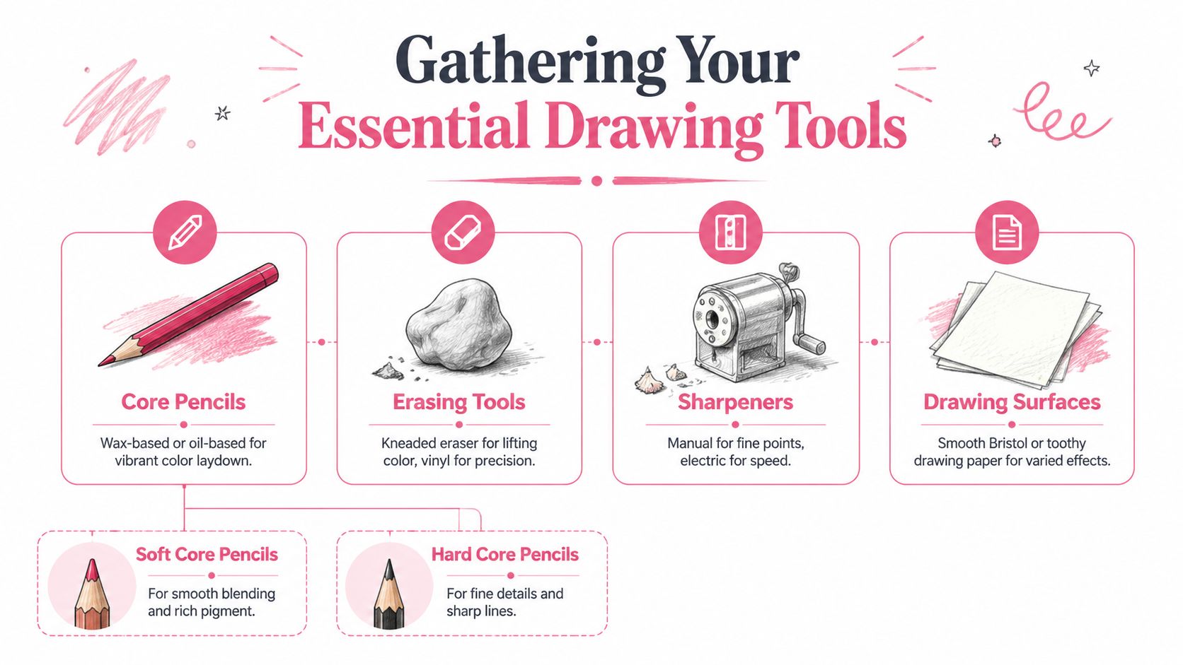
The right tools don't make the art for you, but they remove a lot of beginner friction. When someone asks me how to draw in colored pencil, I don't start with a giant shopping list. I start with a short set of supplies that make layering easier, sharpening cleaner, and mistakes less stressful.
Choose pencils for the kind of mark you want
Your pencil type affects everything from blending to edge quality. Some pencils feel creamy and generous. Others feel firmer and more precise.
| Characteristic | Wax-Based (e.g., Prismacolor Premier) | Oil-Based (e.g., Faber-Castell Polychromos) |
|---|---|---|
| Feel on paper | Softer, smoother | Firmer, slightly drier |
| Best for | Rich laydown and quick blending | Clean detail and controlled layering |
| Edge quality | Can blunt faster | Holds a sharper point longer |
| Common beginner experience | Easy to get bold color fast | Easier to keep lines neat |
| Watch out for | Can get waxy sooner | May feel less immediately vibrant |
Neither type is “better.” They address different problems. If you love soft blending and saturated color, wax-based pencils often feel friendly. If you want crisp fur lines, lashes, textures, and careful detail, oil-based pencils can feel easier to control.
If you're comparing brands and sets before buying, a marker and art supply comparison tool can help you sort through options without guessing.
Pick paper with enough grip
Paper is not a passive background. It's the surface that physically holds your layers. That slight texture is called tooth, and it's one of the biggest reasons a drawing succeeds or stalls.
For colored pencil, many artists enjoy surfaces such as Bristol vellum or pastel mat because they support repeated layering while still allowing control. A very smooth paper can be lovely for delicate detail, but it may fill quickly. A toothier paper can hold more pigment, though it asks you to be patient while covering the texture.
A simple approach is this:
- Smooth surface: cleaner detail, fewer layers before the paper feels full
- Medium tooth: balanced for most subjects
- Toothy surface: great for many layers and richer buildup, but slower to cover
Practical rule: Match the paper to your goal. Smooth for crisp edges. More tooth for deeper layering.
Small tools that solve big problems
A few supporting tools make a bigger difference than people expect.
- Kneaded eraser: lifts pigment gently without scraping the paper. Great for soft highlights and cleanup.
- Vinyl eraser: useful for firmer, more precise correction.
- Sharpener: a reliable manual sharpener gives you control and helps preserve a long point.
- Colorless blender: helpful when you want to soften transitions without adding more color.
- Paper stump: handy for controlled blending in small areas.
- Scrap paper: use it under your drawing hand so skin oils don't interfere with the surface.
One more habit matters as much as any tool. Keep your pencils sharp. A long point lets you use the side or edge of the core for broad, soft coverage, then switch to the tip for detail.
Mastering Foundational Colored Pencil Techniques
You sketch the outline, press a little harder because the color looks faint, then a little harder again. Ten minutes later the drawing still looks patchy, but the paper already feels slick and uncooperative. I have been there, and that moment confuses a lot of beginners. The problem usually is not talent. It is surface management.
Colored pencil works best when you treat the paper tooth like limited storage space. Every layer uses some of that space. If you spend it too early with heavy pressure, the pencil stops grabbing and the drawing becomes much harder to control. That is why good technique is less about force and more about timing.
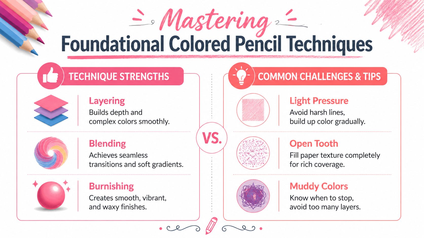
This visual guide shows the core ideas at a glance.
Start lighter than you think
The first layers should look almost underdone. That is correct.
According to Art Is Fun's guide to drawing realism with colored pencils, realism improves when you build color through many light layers instead of trying to reach full intensity right away. That advice matters because beginners often confuse faint with wrong. In colored pencil, faint early layers are a foundation, not a failure.
A useful sequence looks like this:
- Lightly map the shape.
- Add a pale base layer of the local color.
- Build shadows with darker related colors.
- Protect the lightest highlight areas until late in the process.
Notice what is missing. Heavy pressure.
If you see a dark area, resist the urge to grab black immediately. A richer shadow often comes from layered color. On a red apple, that might mean burgundy, violet, or dark brown. On blue fabric, it may mean indigo or blue-violet. Shadows usually feel more believable when they stay connected to the local color family.
This is also where digital planning can save paper tooth. If you preview a reference with a color palette generator for testing shadow and accent families, you can decide on your likely layer stack before your pencil ever touches the page. That keeps you from wasting layers on random corrections later.
Use motion to control texture
Stroke direction leaves evidence. If your hand keeps moving in the same straight path, the paper records every pass.
Small circular strokes, often called scumbling, help spread pigment more evenly and hide obvious lines. Figure-eight motions can do the same thing. For rougher textures, dots or short broken marks work well because they let a little paper show through instead of forcing a smooth finish where one does not belong.
Your grip changes the result more than many beginners expect:
- Hold the pencil at a flatter angle for softer, wider coverage.
- Use the side of the core in early layers so you do not carve lines into the surface.
- Rotate the pencil as you draw to keep the wear even.
- Sharpen often when you need clean edges or small accents.
A flat hold works like painting with the broad side of a brush. The point is still there when you need it, but you are not scratching every mark into the paper.
Here's a useful demo if you like seeing motion and pressure in action while learning.
Burnish only after the structure is working
Burnishing is firm pressure applied late so pigment fills more of the tooth and the surface looks smoother and richer. It feels satisfying, which is exactly why beginners tend to do it too soon.
A helpful way to picture it is this: layering is editing, burnishing is committing. Once the tooth is heavily compressed, new layers have less room to settle in cleanly. You can still add color sometimes, but your options shrink.
A reliable order is:
- Keep early layers light.
- Build transitions through repeated passes, not force.
- Push darks and color relationships close to where you want them.
- Burnish near the end, when the passage already reads well.
If a drawing suddenly turns waxy, dull, or resistant, the paper has likely reached its layer limit in that area. Many beginners blame the pencils. More often, the surface is full.
Glazing adds subtle shifts without overworking
Glazing means laying a light veil of one color over another to shift temperature or mood. It is one of the smartest ways to make colored pencil feel lively without grinding more pigment into the page.
A yellow glaze can warm a green leaf. A soft blue glaze can cool a gray shadow. A red glaze over brown hair can bring warmth back after too many neutral layers. Small changes matter here.
Practice this on scraps before you try it in a finished drawing. Make little test boxes and stack colors in different orders. Blue over yellow does not behave quite the same as yellow over blue. Those experiments teach you how your pencils interact, and they also train you to protect the paper tooth for the layers that matter most.
Planning Your Palette and Color Harmony
Many colored pencil drawings go wrong before the first mark because the artist hasn't decided how the colors will relate. They know the object is “red” or “blue,” but they haven't chosen the supporting colors that make that main color believable. That's why a drawing can feel disconnected even if the shading is decent.
A better approach is to work with a small palette family instead of the whole pencil tin.
Build a small working palette
Pick one main color, one lighter helper, one darker helper, and one shadow color that adds interest. For a blue sphere, that might be a light blue, a middle blue, a deep blue-violet, and perhaps a cool gray. For a red apple, you might use a warm red, a pinkish light, a dark burgundy, and a cool shadow accent.
This does two useful things. First, it stops random color decisions halfway through the drawing. Second, it keeps your layers visually related, which is one of the biggest secrets behind harmony.
You can also think in relationships:
- Analogous colors sit near each other in feeling and blend smoothly.
- Complementary colors can make shadows richer and more lively.
- Neutrals calm down overly intense passages.
Limit your first test palette. Too many pencils can create confusion faster than they create beauty.
Plan colors before the first layer
One smart habit is to preview a palette from a reference image before you touch the paper. That's especially useful if you think digitally first and physically second.

A palette generator for color planning can help you pull a simpler set of likely working colors from an image so you're not guessing at every stage. Even if you later adjust on paper, that early planning reduces wasted layers and keeps you from filling the tooth with corrections.
If you come from markers or digital coloring apps, this matters even more. Those workflows often train your eye to expect smooth transitions quickly. Colored pencil can create beautiful gradients too, but only if you plan for the layer buildup the paper can hold.
A practical routine looks like this:
- Choose a reference.
- Identify the local color.
- Pick a shadow color that isn't automatically black.
- Test your small palette on scrap paper.
- Start drawing only after the color family feels coherent.
That tiny pause before starting saves a surprising amount of frustration later.
Your First Drawing A Simple Sphere Walkthrough
A sphere is one of the best first projects because it teaches almost everything that matters. You get light, shadow, edge control, layering, and blending without the complication of anatomy or tiny details. If you can make a sphere feel round, you're already learning to think like a colored pencil artist.
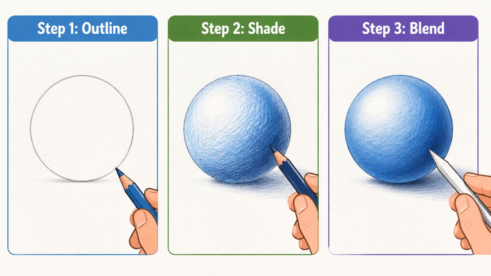
Use this image as a simple visual reference while you work.
Step 1 Place the form and the light
Lightly draw a circle. Don't carve it into the paper. Keep the line faint enough that you can soften or adjust it later.
Now decide where the light is coming from. Let's say it comes from the upper left. That means your brightest highlight will sit there, the middle tones will wrap around the form, and the deepest shadow will move toward the lower right. Sketch the cast shadow under the sphere too, because that shadow helps the form feel grounded.
At this stage, I like to pause and label the zones in my head:
- highlight
- light midtone
- core shadow
- reflected light
- cast shadow
That sounds simple, but it stops you from shading randomly.
Step 2 Build color slowly
Take your light blue and begin with tiny circular strokes over the lit side and middle of the sphere. Leave the highlight nearly untouched. Keep your pressure soft. If you hear the pencil scraping loudly or see shiny wax appearing right away, back off.
Add your middle blue over a slightly smaller area, still using circular motion. Let the edge of the lighter blue show so the transition stays gradual. Then introduce a darker blue or blue-violet in the core shadow area, the point at which the form begins to turn.
If the dark side looks harsh, don't mash harder. Instead, overlap the colors more gently.
The smoothest spheres usually come from patient overlap, not from one perfect blending pass.
For the cast shadow, use a cooler and slightly duller approach than the sphere itself. That helps separate the object from the surface. Soften the shadow edge as it moves away from the sphere. Keep it sharper nearest the object.
Step 3 Finish without overworking
Once the form already looks round, you can start refining. Deepen the core shadow with another light layer of your darkest color. If the lit side feels too cold, glaze a very light warm color over a small area to make the surface feel more natural. If you want a polished look, this is the moment to burnish selected areas, not the whole drawing at once.
Use a sharp point to clean the contour. A crisp edge on the light side and a slightly softer edge in the shadow side can make the sphere feel more real. If you need to lift a little highlight, press a kneaded eraser gently rather than rubbing aggressively.
A few last checks help:
- Is the highlight preserved? If not, lift lightly and stop.
- Does the shadow wrap around the form? If it looks like a stripe, soften the transition.
- Is the cast shadow helping? If it's too dark or too outlined, ease it back.
- Did the paper tooth disappear too soon? If yes, stop layering and evaluate before adding more.
This little exercise teaches a lot. You learn that realism in colored pencil is mostly about control. Not heroic effort. Not hard pressure. Control.
After one sphere, try three more with different color families. A green sphere, a red sphere, a warm gray sphere. Repeating the same simple form with different palettes builds confidence fast because you can focus on technique instead of inventing a whole drawing every time.
Avoiding and Fixing Common Drawing Mistakes
Most colored pencil mistakes are technical, not mysterious. That's encouraging, because technical problems can be diagnosed. If a drawing turns dull, shiny, muddy, or oddly fuzzy, the paper is usually telling you something specific.
When wax bloom sneaks in
One of the most frustrating issues is wax bloom, that cloudy, hazy film that can appear on heavily layered passages. A key reason it happens is that artists keep adding layers after the paper has stopped accepting them cleanly.
According to The Virtual Instructor's article on colored pencil success, standard papers such as Strathmore 400 series often support only 6 to 8 layers before wax bloom can cause irreversible muddiness. The same source notes that using a colorless blender after the first 4 layers can reduce wax buildup by 30% while maintaining vibrancy.
That's a huge shift in thinking. Many tutorials tell beginners to “keep layering until the tooth is filled,” but they don't mention that each paper has a practical limit.
Why muddy color happens
Muddy color usually comes from one of three causes:
- Too many unrelated hues: the drawing loses clarity because every correction adds another color family.
- Heavy pressure too early: the tooth fills before your color structure is established.
- Over-blending: transitions become waxy and plastic instead of dimensional.
If your drawing starts going muddy, stop adding random rescue colors. Test your next move on scrap paper first. Often the best fix is restraint. Sharpen the relationships between light, middle, and dark rather than adding more pigment everywhere.
A muddy drawing often needs fewer new decisions, not more.
How to rescue fuzzy edges
Edges get fuzzy when the pencil point is dull, the strokes cross the contour carelessly, or the surrounding values are too similar. Clean edges aren't only about outlines. They come from placing one shape clearly against another.
Try this:
- Sharpen the pencil.
- Redraw the edge with the local color, not a dark outline.
- Adjust the background or neighboring value so the form separates cleanly.
- Use a kneaded eraser to lift any color that drifted too far.
This matters a lot for reflective objects, petals, fur clumps, and facial features. Small edge improvements can make the whole drawing feel more polished.
Preserving Your Art and Developing Your Skills
A finished colored pencil drawing needs protection. Pigment can smudge, surface wax can shift, and unprotected paper can pick up damage from handling. A workable fixative made for colored pencil can help stabilize the surface, and proper framing behind clean glass adds another layer of protection. Always test any spray on a practice piece first, because surfaces react differently.
Protect the drawing you worked for
Store finished pieces flat, with clean interleaving sheets if needed. If you stack drawings directly on top of each other, friction can dull the surface. If you frame them, keep the artwork from pressing directly against the glazing when possible.
Practice like a patient builder
Your next drawings don't need to be masterpieces. They need to teach you one thing at a time. Draw metal for highlights, fabric for folds, wood for directional texture, fruit for rounded form, and leaves for edge control. A small color journal helps too. Swatch combinations, test glazes, and write down what worked on each paper.
There's real room to grow in this medium. In North America, which accounts for 38% of the colored pencil market, high-quality artwork on premium surfaces can sell for $1,500 to $4,500 according to Cognitive Market Research's North America color pencil market report. You don't need to chase that right away. But it's worth knowing that careful technical skill can support both a satisfying hobby and a professional path.
Frequently Asked Questions
A lot of beginner frustration with colored pencil comes from one simple problem. The pencil is not always the issue. The paper is often full before you realize it.
That is why these questions matter. Colored pencil gets much easier when you stop judging every problem as a blending failure and start reading the surface. Paper tooth works like shelf space. Each layer takes up room, and once that space is crowded, the next layer will not behave the way you want.
Which is better for beginners, wax-based or oil-based pencils
Both can work well for beginners.
Wax-based pencils usually feel softer and lay down color faster, which can be encouraging when you are still learning pressure control. Oil-based pencils usually keep a sharper point a little longer, so they can feel easier for edges, fine lines, and small details. If you press too hard with either type, you can flatten the tooth early and run out of layering room.
A good beginner question is not only, “Which pencil is better?” It is, “Which pencil helps me use the paper more wisely?” If you like rich color quickly, wax-based pencils may feel friendlier. If you like a firmer, more deliberate build, oil-based pencils may suit you better.
What should I do if wax bloom already appeared
First, check whether it is really wax bloom and not just glare from a shiny, heavily worked area. Turn the drawing under a light and look for a cloudy film sitting on top of the color.
If it is wax bloom, gently wipe the area with a very soft tissue or clean cloth. Use a light touch. Rubbing hard can disturb pigment that is still loosely sitting on the surface. Then pause before adding more layers, because wax bloom often shows up when the drawing already has a lot of material packed into the tooth.
I have been there. You think one more layer will fix it, and instead the surface gets slicker. At that point, the better move is often to reconsider the drawing, not force it.
How do I create texture without harsh lines
Start with methods that build texture in small pieces rather than long outlines. Scumbling gives you a broken, natural surface. Pointillism lets you place color in tiny controlled notes, almost like planting seeds instead of dragging trenches through the paper.
The key is pressure. Light pressure keeps the tooth open, which gives you room to soften, glaze, or adjust later. Heavy pressure creates harsh marks partly because it burns a path into the surface too soon. If texture starts looking scratchy, sharpen less aggressively, slow down, and let repeated light layers do the work.
Can colored pencil work with other media
Yes, and the order matters.
Colored pencil works well with light marker underpaintings, dry watercolor washes, ink, and other dry media, but only if the surface still has enough grip left for the pencil to attach. If an underlayer seals the paper too much, your colored pencil will skate across the top instead of settling in. That is why digital planning can save you so much trouble. Testing palette ideas first in ColorBestie helps you make color decisions before you spend your paper tooth on trial and error.
Mixed media is often most successful when each material has a job. Let the underlayer establish broad color or value. Let the colored pencil handle refinement, edges, and subtle shifts.
Why do my colors stop getting brighter after a few layers
Usually, the paper is running out of tooth.
Beginners often assume they need to press harder for more intensity, but harder pressure usually closes the surface faster. Try building color with lighter layers, cleaner pencil points, and a clearer plan for which colors go down first. Bright results come less from force and more from saving enough tooth for your final layers.
Do I need to plan colors before I start drawing
You do not need a complicated system, but a little planning helps more than people expect. Colored pencil is a slow medium, so random color choices can cost you precious layers.
A simple digital test can help you decide on your main lights, mids, and darks before the pencil ever touches paper. That bridge between screen planning and physical layering is easy to overlook, but it is one of the smartest ways to keep your drawing clean, intentional, and easier to finish well.