
You might be sitting at your table with a fresh tin of pencils, a coloring page or sketch in front of you, and one annoying question in your head: why doesn't my work look smooth the way other people's does? Maybe your color looks patchy. Maybe your shadows turn muddy. Maybe the paper seems to fight back the moment you press a little harder.
That frustration is common, and it usually isn't about talent. It's about matching your method to the result you want. If you want a soft, glowy finish, you need one setup. If you want crisp detail and visible texture, you need another. Learning how to color with colored pencils gets much easier when every choice has a reason behind it.
Choosing Your Pencils and Paper
A lot of beginners focus on buying more pencils. The more important decision is often the paper under your hand. Many tutorials explain layering, but they don't really answer which paper makes colored pencils easier to control, even though the number of layers you can build depends on the paper's surface texture, or tooth, as noted in Mont Marte's guidance on coloured pencil techniques.
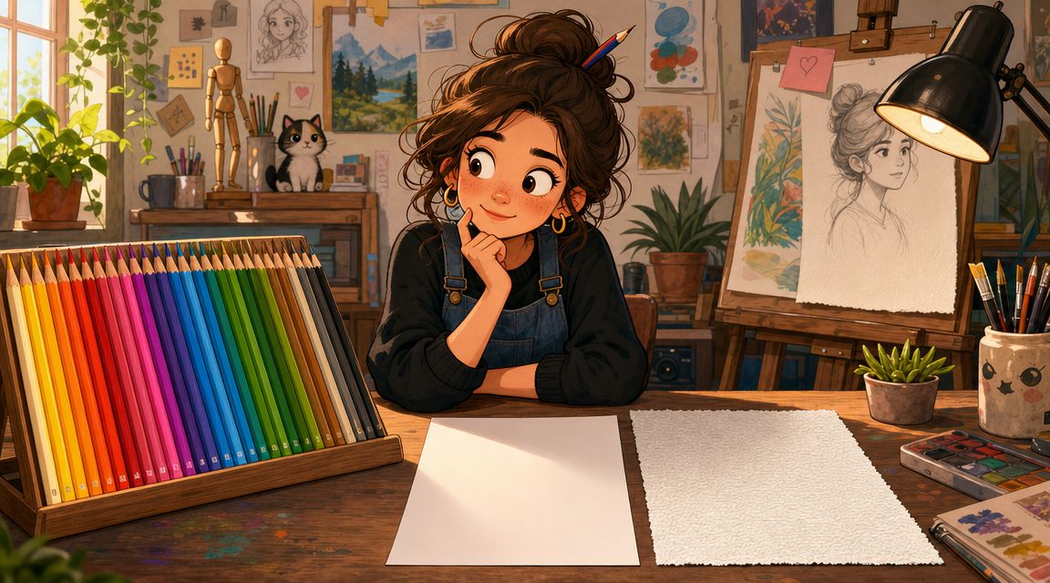
Start with the surface, not the color chart
Think of paper tooth like the tiny grooves in a towel. Those little spaces catch pigment. If the paper is very smooth, your pencil glides nicely and details stay sharp, but the surface may fill up faster. If the paper has more texture, it can hold more layers, but you may see more grain unless you work patiently.
Here's the practical version:
- For soft gradients: choose a surface that can accept repeated light layers without getting slick too fast.
- For crisp edges and tiny details: choose a smoother sheet.
- For visible texture like fur, bark, or fabric: a bit more tooth helps the pencil leave interesting broken marks.
You'll often hear artists compare surfaces such as Bristol vellum and hot press paper. The useful beginner takeaway is simple. A smoother sheet usually helps with clean line work and neat edges. A slightly toothier sheet usually makes layering easier and gives you more room to build color slowly.
Practical rule: If your pencil seems to stop working after only a few passes, the problem may be the paper surface, not your pencil set.
Pick a small palette on purpose
When you're learning how to color with colored pencils, fewer choices can help you see value and temperature more clearly. Instead of dumping out every pencil you own, test a small group that suits the subject.
Experienced artists often keep a drawing to 8–12 pencils and spend about 5 minutes selecting and testing a small palette before they begin, which supports the long-established layering approach described in Draw Awesome's coloured pencil technique guide.
That matters because beginners often confuse more colors with better color. Usually, better color comes from clearer planning.
A simple prep routine looks like this:
- Choose the local color first. If you're coloring a red apple, start with the family of reds and red-oranges that match it.
- Add one light option. This helps you build the early passes without trapping yourself.
- Add one darker option. This gives you room for form and depth.
- Include a support color. This might be a cool tone for shadows or a warm tone for glow.
- Test on scrap paper. The same pencil looks different on different paper.
If you like planning color digitally before touching the page, a tool like the ColorBestie palette generator can help you sort through combinations before you commit.
Foundational Strokes and Layering Basics
You shade a leaf, an apple, or a cheek, and the color looks streaky even though you picked the right pencil. In many cases, the problem is not the color choice. It is the stroke pattern and the order of your layers.
Colored pencil works like tinted window film. One light sheet changes the look a little. Several controlled sheets create depth, softness, or glow. If you press hard in the first pass, you flatten the paper tooth too early. Paper tooth is the tiny texture on the surface, and it works like shallow grooves that catch pigment. Once those grooves fill up, later color has a harder time sticking where you want it.
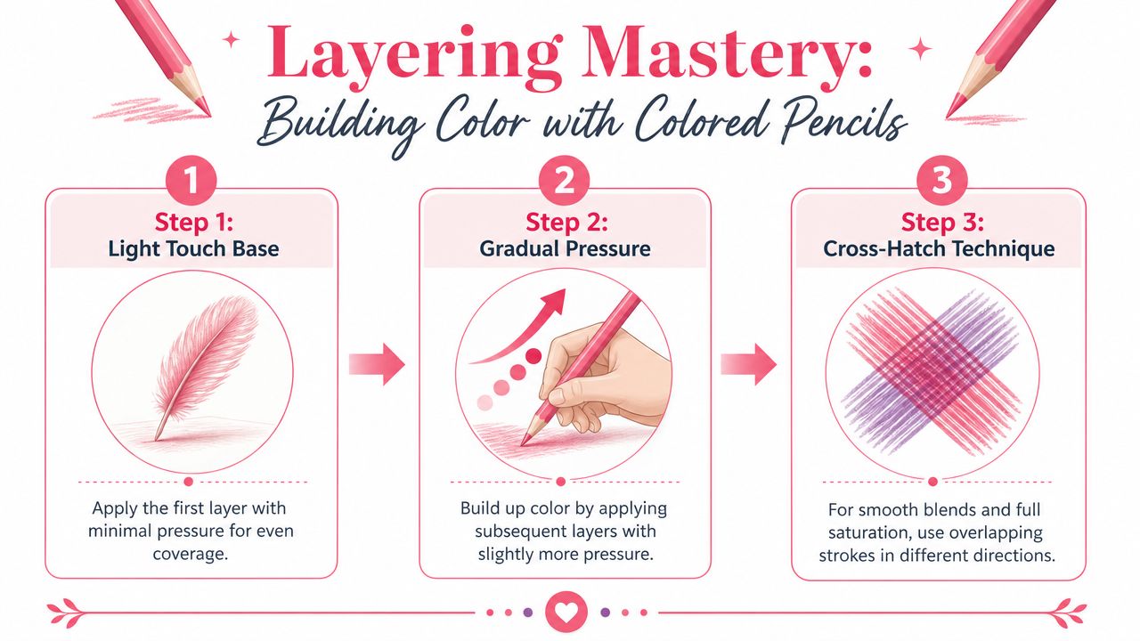
Why the first layers should feel almost too light
To get that soft, glowy look, your opening layers should feel gentle enough that you can still see a little of the paper through them. That light coverage leaves room to adjust value, temperature, and edges later.
Beginners often worry that light pressure means weak color. It does not. It means flexible color. A pale first layer is easier to deepen than a waxy, shiny patch that refuses to accept more pigment.
A few hand changes help right away:
- Hold the pencil farther back for lighter, less cramped pressure.
- Use the side of the point a little more when you want broader, quieter coverage.
- Keep your pressure even so one corner of the shape does not turn darker by accident.
If you want a quick visual way to compare how different tools lay down color and texture, this marker and tool comparison guide can help you notice coverage differences more clearly.
Choose strokes based on the finish you want
Strokes are not just motions. They leave a surface behind.
Use straight strokes when you want direction to show. They are useful for grass, fur, hair, wood grain, or anything that should feel pulled in one path.
Use back-and-forth strokes when you need faster coverage in a broader area. Keep them short and controlled. Long sweeps often create visible bands that are hard to hide later.
Use crosshatching when an area looks patchy and you want a more woven, even build-up. One layer goes in one direction. The next crosses it. That crisscrossing helps fill gaps without forcing heavy pressure.
Small circular strokes are another beginner-friendly option. They work well when you want skin, sky, fruit, or petals to look softer and less lined.
Layer with a job in mind
This is the part many beginners miss. Each layer should do one clear job.
One layer can map the local color. The next can darken the shadow side. Another can warm the lit area or cool the shadow. When you work this way, you are not just adding more pencil. You are steering the final look.
For example, to get a round apple that looks smooth instead of flat:
- Start with light circular strokes in the main red.
- Add a slightly darker red on the shadow side with the same stroke.
- Use a few directional strokes around the curve if you want the form to feel more wrapped.
- Leave the brightest highlight mostly untouched so it stays clean.
That sequence gives you control. It also keeps the color from turning muddy too soon.
If your layers keep looking rough, check one thing before blaming your pencils. Match the stroke to the surface you want. Visible lines can be useful in bark or hair, but they fight against a velvety petal or a smooth cheek. Choosing the stroke for the finish you want is what makes layering start to feel predictable instead of frustrating.
Blending and Creating Smooth Gradients
The scratchy look that frustrates beginners usually comes from one of two things. Either the layers were rushed, or the blending method didn't match the finish they wanted.
There are two common paths to smoother color. One physically presses pigment into the paper. The other softens the binder so the color settles more like paint.
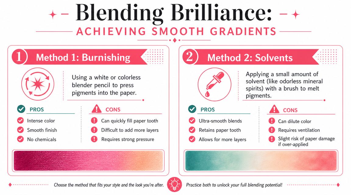
Burnishing for a polished finish
Burnishing means using firm pressure to push pigment down into the paper tooth until the surface looks smoother and more solid, much like flattening the pile of a carpet. The fibers are still there, but they don't stand up the same way.
This is useful when you want:
- a glossy or polished look
- strong saturation
- fewer visible paper specks
- a more finished appearance at the end
But burnishing has a cost. If you do it too early, the paper tooth gets filled. Then new layers may skip across the surface instead of settling in cleanly.
Experts recommend preserving the paper's tooth with light to medium pressure in early layers because heavy pressure can burnish the surface smooth and cause later pigment to deposit irregularly, as explained in John Muir Laws' layering and blending guide.
Solvents for a softer transition
Some artists use a small amount of solvent to soften and spread pigment. This can create a more painterly gradient, especially across larger areas like skies, skin, or softly lit fabric.
The advantage is that you can often get a smoother transition without pressing as hard. The caution is control. Too much liquid can disturb the paper or dilute the neat structure you built with earlier strokes.
A simple way to decide:
- Choose burnishing if you want dense color and a sleek finish at the end.
- Choose solvents if you want softness sooner and room for a more painterly feel.
- Skip both for a while if the texture itself is part of the charm.
Blending Methods at a Glance
| Technique | How It Works | Best For | Potential Drawback |
|---|---|---|---|
| Burnishing | Firm pressure pushes pigment into the tooth | Polished color, strong finish, fewer grain holes | Fills the tooth quickly |
| Solvents | Liquid softens binder so pigment spreads | Smooth gradients, softer large areas | Can be harder to control |
| Layering alone | Repeated light passes build transitions gradually | Natural texture, flexible value control | Takes patience |
One more detail makes a big difference. For shadows, many artists get a more natural result by using complementary colors instead of reaching straight for black, which can look disconnected from the object. If you also work in markers, a marker comparison tool can help you think through how a shadow color family might translate across supplies.
Shading Highlights and Adding Depth
Value gives an object its sense of form. It decides whether a lemon looks round, whether an apple skin looks glossy, and whether a shadow feels soft or heavy. Once you start controlling value on purpose, your colored pencil work begins to feel more solid and believable.

Think in light and value first
A good place to begin is the light source. If you know where the light is coming from, you can place each value with more confidence instead of guessing your way around the form.
On a simple sphere, the light creates a small bright area, a middle zone where the color turns gradually, and a darker side where the form rotates away. That change is what makes the shape feel round. Beginners often assume smooth blending alone creates realism, but a clean value pattern usually matters more. If the light side, midtone, and shadow are in the wrong places, even very smooth pencil work can still look flat.
Artists use different sequences to build realism, and this colored pencil realism video reference shows that clearly. Some start with pale layers, some place darks early, and some rely on circular strokes. The useful lesson is not to copy one exact order. It is to choose marks and value placement that match the effect you want.
A simple map helps:
- Highlight is the area you protect so the surface keeps its glow.
- Midtone carries the main local color.
- Shadow shows where the form turns away from the light.
- Accent dark is the deepest small note that adds weight and contrast.
If your highlight disappears too early, the object can lose its sparkle. Leaving a bit of paper showing in the brightest spot often gives a cleaner, fresher result than trying to dig the light back out later.
Save the brightest area on purpose. It is much easier to darken gradually than to rebuild a crisp highlight after the paper is packed with pigment.
Use color in shadows, not just darker pressure
Shadows usually need a color shift, not just heavier pressure with the same pencil. That is a point beginners miss all the time.
To get a shadow that feels rich instead of muddy, change the mixture as the form turns. A yellow object may need a cooler, duller yellow-green or muted violet note in shadow. A red object often looks more convincing when the shaded side cools slightly rather than becoming a harder, heavier version of the same red.
Pressure changes value. Color choices change mood, temperature, and realism.
Try a lemon as practice. Start with the light local color in the lit area. Then build the turning part of the form with a slightly deeper related yellow. In the shadow, add a cooler or complementary note with light control. Small circular strokes can help if you want a soft, velvety transition, while directional strokes can keep the form feeling firmer.
If the lemon still looks flat, the problem is often not blending. It is usually one of two things: the shadow is not dark enough compared with the light side, or the highlight was covered and lost its contrast. Fix those relationships first, then judge the surface.
A helpful habit is to squint at your drawing for a second. Squinting simplifies detail and lets you check the big light and dark shapes. If the form reads clearly while you squint, you are building depth in the right places.
Creating Textures and Finishing Touches
Colored pencil offers many creative possibilities. Smooth blending is only one kind of beauty. Texture gives a drawing personality.
A rabbit's fur, a weathered branch, and a shiny apple skin all need different marks. If you use the same smooth stroke everywhere, the piece can feel lifeless even when the colors are correct.
Fur, wood, and leaf textures
Try thinking of texture as a language of direction.
For fur, use short strokes that follow the growth of the hair. Around the face, those marks might curve. On the body, they may lengthen. Leave tiny breaks so the surface doesn't turn into a solid helmet of color.
For wood grain, let your pencil travel in longer, uneven lines. Layer related browns and grays so the grain looks built, not outlined. A knot in the wood can be suggested with curved rings rather than a hard cartoon circle.
For leaves, the outer shape matters less than the fold and vein pattern. A gently darker band along one side can make a flat leaf look like it bends in space.
A few texture reminders help:
- Follow direction first. Texture looks believable when the stroke path matches the form.
- Vary edge quality. Some edges should stay crisp. Others should soften.
- Don't fill every gap. Small breaks often make fur, bark, and fabric feel more natural.
The most convincing texture usually comes from restraint. Leave some marks visible so the viewer can feel the surface.
Clean edges and protect the piece
Finishing touches are often subtle. Lift stray color carefully with an eraser rather than scrubbing. A kneaded eraser is useful when you want to lighten softly instead of cutting a sharp white mark back into the page.
If you want impressed details such as whiskers or leaf veins, many artists press those lines in before layering color so the pigment skips over the groove. It's a small trick, but it creates delicate detail without overdrawing.
When the piece is done, store it with a protective sheet or use a fixative made for dry media if that fits your process. The goal isn't to change the drawing. It's to keep your layers from smearing after all that patient work.
Practice Projects and Common Mistakes to Avoid
You finish a practice drawing, step back, and something feels off. The apple looks flat. The sphere looks patchy. The colors seemed right in the pencil tray, but on the page they do not create the look you wanted.
That moment frustrates a lot of beginners. It usually does not mean you lack talent. It means your choices for color, pressure, and surface are not working together yet.
A better way to practice is to give each study one visual goal. If you want a soft, rounded form, choose a simple subject that lets you focus on gradual value changes. If you want a fresher, more natural color look, pick a subject with small temperature shifts, like fruit. You can even test mood ideas first with a color theme preview for warmer or cooler directions before you commit to a full drawing.
Two simple studies that teach a lot
Start with a sphere if your goal is smooth form. A sphere is like a training ground for light. It shows you whether your shading changes gently enough to turn a flat circle into something that feels solid.
Keep the color family limited. One or two related pencils are enough. That helps you see the problem when the drawing feels flat. In many cases, the issue is not blending. It is that the light side, middle, and shadow side are too close in value to create a clear turn.
Then move to an apple or other simple fruit if your goal is more lifelike color. Fruit teaches you how color shifts across a curved surface. One side may feel warmer where the light hits. The turning side may look cooler, duller, or deeper. Those shifts are what make colored pencil work feel alive instead of filled in.
A useful apple study often includes:
- A warmer light side
- A darker side that still stays within the apple's color family
- A small, clean highlight left on purpose
- A cast shadow that makes the fruit sit on the table instead of float
Mistakes that block the result you want
Many beginner mistakes make sense once you connect them to the outcome on the page.
- Pressing hard too early: This flattens the paper tooth, which works like tiny hills and valleys that hold pigment. Once those spaces fill up, adding soft layers gets much harder. If you want a glowy, layered look, save heavier pressure for late in the drawing.
- Using black for every shadow: Black can make shadows look cut out instead of connected to the object. To get richer, more natural depth, darken with cooler or deeper versions of the local color first.
- Blending every area until it looks slick: Smooth blending suits some subjects, but not all. Wood, fabric, leaves, and skin often look better when a little stroke texture stays visible.
- Skipping swatches on the same paper: Colored pencil changes from surface to surface. A pencil that looks soft and dusty on rough paper may look denser on smoother paper.
- Grabbing too many pencils at once: Too many options can hide a simple value problem. A small set makes it easier to see whether your drawing needs a darker shadow, a cleaner highlight, or a warmer middle tone.
One more point matters here. Practice works faster when you judge it by the look you were aiming for, not by whether it resembles a finished illustration. If your goal was a smooth sphere and you can see a clearer light-to-shadow turn than last time, the study did its job.
Colored pencil gets easier when each choice has a reason behind it. You choose smoother paper for cleaner blending. You keep strokes visible when you want texture. You avoid early heavy pressure when you want more layers later. That is how practice starts to feel less random and much more controllable.
