You've got your pencils out, the page is waiting, and somehow the first few strokes already look rougher than you hoped. Maybe the color looks streaky. Maybe the paper is fighting back. Maybe you've watched tutorials, tried “light layers,” and still ended up with a patchy apple or a waxy-looking flower.
That's a normal place to start.
Learning how to color with pencils isn't about finding one magic technique. It's about understanding a few simple ideas, then noticing what your paper, pressure, and color choices are doing. Once that clicks, colored pencils become much less mysterious and much more fun. You stop grinding color into the page and start building it.
A good first project doesn't need perfect realism. It needs a plan, a calm pace, and a way to recover when things go wrong. That's what this guide is for.
Choosing Your Pencils and Paper
The fastest way to make colored pencils feel difficult is to blame yourself for a supply problem. Beginners often press harder when the paper itself is the problem, or they buy a giant set when a smaller one would teach them more.
Historically, the difference between student-grade and artist-grade pencils has shaped how people learn. Student pencils use lower-quality pigments and have lower lightfastness, while paper choice, including smooth Bristol board for cleaner coverage and sharper detail, can affect results more than heavy pressure alone, as noted in this history of colored pencils overview.
Start with fewer supplies
You don't need a giant wall of color. A smaller set teaches you to mix with layers instead of hunting for a perfect pencil every time.
Here's a practical beginner kit:
- A small pencil set: Start with colors you'll use often. Reds, yellows, blues, greens, browns, a white, and a dark neutral are enough for plenty of projects.
- Two kinds of paper if possible: One smooth, one slightly textured. Testing both teaches you faster than reading descriptions.
- A sharpener you trust: A dull point creates broad, uneven strokes sooner than many beginners realize.
- Scrap paper: Keep a test sheet next to your artwork for checking pressure and color order.
If you're comparing brands across marker and pencil-friendly workflows, a marker comparison tool for popular art brands can help you think through how different product lines fit your style and planning habits.
Practical rule: If your hand feels tense in the first minute, loosen your grip before you add more color.
Wax-based pencils and oil-based pencils feel different on paper. Wax-based pencils often feel softer and can fill the page quickly. Oil-based pencils usually feel firmer and can hold a point longer. Neither is “correct” for everyone. For a first major piece, what matters more is noticing how each one responds to pressure and surface texture.
A simple paper and pencil comparison
| Category | Wax-Based (e.g., Prismacolor Premier) | Oil-Based (e.g., Faber-Castell Polychromos) | Recommended Paper |
|---|---|---|---|
| Feel on paper | Softer, often fills tooth quickly | Firmer, often easier for crisp detail | Smooth Bristol for clean coverage and sharper detail |
| Good for | Rich coverage, soft blends | Controlled layering, fine edges | Slightly textured paper if you want more visible layering |
| Beginner caution | Easy to overfill the surface too soon | Can tempt you to press harder than needed | Rough paper may require more pressure to fill the grain |
A useful word here is tooth. That means the tiny texture of the paper surface. More tooth grabs more pigment, but it also shows more grain. Less tooth gives cleaner detail, but you can fill it up quickly if you push too hard.
If your coloring looks scratchy, don't assume your technique is bad. Smooth paper, a sharper point, and lighter pressure often solve the problem faster than trying to “blend harder.”
Prep Work and Planning Your Color Palette
A lot of frustration happens before the coloring even starts. You pick nice pencils, begin confidently, and halfway through you realize the shadows don't match, the mood feels off, or one area is much more saturated than the rest.
That's why experienced colored pencil artists plan light, shadow, and undertones before they begin. They use reference photos and pre-color previews to create a repeatable decision process, which helps them keep a harmonious palette and more predictable results, as explained in this beginner's guide to underdrawings.
Get the drawing ready
If you're working from your own sketch, keep your lines light and clean. Dark graphite can muddy pale pencil colors, especially yellows, pinks, and skin tones. If you're using line art from a coloring page, look at the image before you choose a single pencil. Ask three questions:
- Where is the light coming from
- What is the overall mood
- Which areas should stay soft, and which should stand out
That short pause saves a lot of reworking.
If the drawing is complex, make a tiny test version on scrap paper. You don't need a polished thumbnail. A few rough shapes with trial colors are enough to show whether your plan makes sense.
Plan color before you commit
Digital previews are useful here because they let you test mood and harmony before you touch the final page.

One option is a palette generator for sketch-based color planning, which can help you preview combinations and then translate those ideas into your pencil choices. Even if the preview is marker-style, it still helps you answer the main question beginners get stuck on: what goes where.
Try planning in this order:
- Choose a dominant family: Warm reds and oranges feel different from cool blues and violets.
- Pick an undertone for shadows: Instead of defaulting to gray, consider a color that supports the mood of the piece.
- Reserve your lightest areas: Don't color everything evenly. Leave room for highlights and softer transitions.
- Test pairs, not singles: Colored pencil work depends on layers, so test colors on top of each other, not one at a time.
A strong palette often looks simple at the start. The richness appears later, when the layers interact.
This planning stage is especially helpful for flowers, portraits, manga art, and coloring pages with repeated elements. If six petals all need to belong to the same flower, a pre-decided shadow color keeps them related. If a face needs soft form, thinking about undertones first prevents that flat “filled-in” look.
When beginners say they want realistic color, they often mean they want coherent color. Planning gets you there.
Mastering Core Coloring Techniques
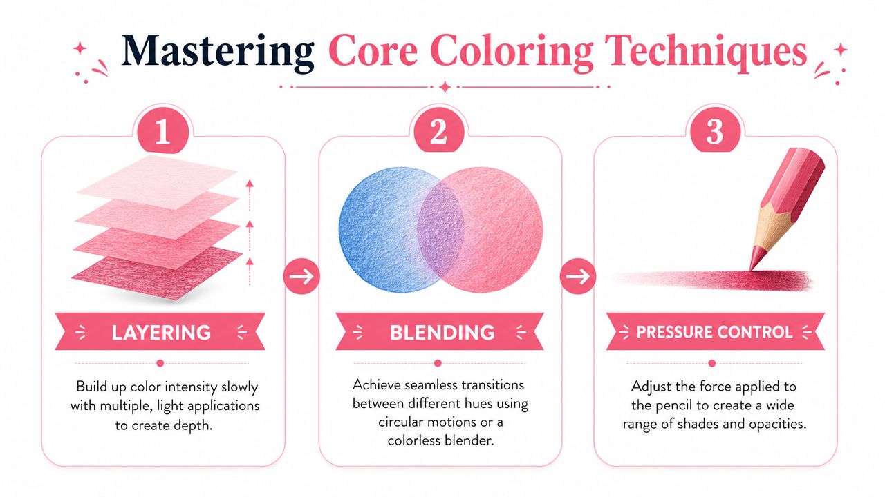
The heart of learning how to color with pencils is physical. Your hand needs to learn a rhythm. Press too hard, too soon, and the paper surface fills before the color has depth. Stay too timid for too long, and the drawing can look pale and unfinished.
A widely taught workflow is to build tone gradually with multiple light layers, then use burnishing on the final layer with strong pressure to push pigment into the paper tooth for a smoother, shinier finish. This approach also helps artists expand a limited set, since a beginner set of 30 to 50 colors can produce a much larger usable range through layered combinations, as described in this colored pencil techniques guide.
Layering for smooth color
Layering means you don't try to reach the final color in one pass. You build it slowly.
For beginners, the most useful habits are simple:
- Keep the pencil sharp: Not needle-sharp to the point of scratching, but sharp enough to stay controlled.
- Use light pressure: Let the paper keep some tooth for later layers.
- Move in small circular strokes: That helps reduce visible lines and harsh directional marks.
- Work light to dark: It's easier to deepen color than to pull it back out.
If you're coloring a red apple, don't begin with your darkest red and mash it into the page. Start with a light warm base. Add a second red in the mid-tones. Save the deepest shadows for later, once the form is clear.
Colored pencil rewards patience. The first layer often looks underwhelming, and that's exactly how it should look.
After a few passes, the page starts to unify. That's when beginners often get excited and press harder. Wait a little longer.
A helpful demonstration can make this easier to see in motion:
Blending without muddying
Blending with pencils usually means overlapping colors through layers, not smearing them around. If you want a peach tone, for example, you might layer a light yellow, then a soft orange, then a gentle pink in selected areas.
The mistake that causes mud is adding unrelated darks too early. If the colors don't belong to the same family or transition, they can turn dull fast.
Try this sequence instead:
- Lay down your lightest local color.
- Add the neighboring color lightly where the transition begins.
- Return with the lighter color to soften the overlap.
- Deepen only the areas that turn away from the light.
Blending gets smoother when you revisit areas instead of trying to force them in one sweep.
Burnishing at the right moment
Burnishing is the stage where you use firm pressure with a light pencil, white pencil, or blender pencil to press pigment deeper into the tooth. It creates a polished, almost creamy surface.
Burnishing is powerful, but it's not an early-stage move. Once you burnish, you flatten the paper surface and reduce how many new layers it can hold.
Use it when:
- the color relationships already look right
- the form is established
- the area needs a smoother, fuller finish
Avoid it when:
- you're still deciding where the shadows go
- the area looks muddy
- you need more texture later
A lot of beginner disappointment comes from burnishing too soon. If you remember one thing from this section, let it be this: build first, polish later.
Advanced Blending and Creating Textures
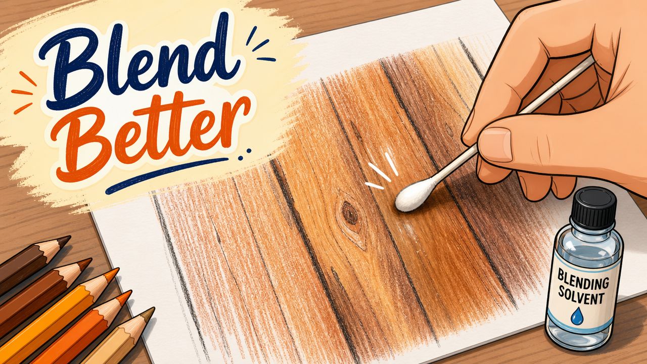
When basic layering starts to feel comfortable, a few advanced methods can change the look of your work quickly. The biggest one is solvent blending. It can soften pencil strokes into a more unified surface, especially in backgrounds or larger areas where visible grain feels distracting.
Expert solvent blending is taught as a sequence: layer 3 to 4 hues with light pressure, apply a solvent like Gamsol with a fine brush, let it dry for 15 to 20 minutes, and then add a final burnishing layer. The method works best on 150 to 200 gsm paper, because thinner sheets can tear under solvent stress.
Using solvent carefully
Think of solvent as a level-up tool, not a shortcut. It won't rescue poor color choices, but it can smooth well-planned layers beautifully.
A safe beginner approach looks like this:
- Build dry layers first: Use several light applications instead of one dense patch.
- Use a small amount of solvent: A fine brush gives you more control than flooding the page.
- Touch the paper gently: Let the solvent do the work. Scrubbing can damage the surface.
- Let it dry fully: If you go back in too soon, the area can become messy and unstable.
If you've ever wanted a marker-like finish from pencils, this is one of the closest ways to get it. It's especially useful on backgrounds, fabric, petals, and softly blended skin passages.
Don't test solvent on your main artwork first. Test the exact paper and pencils on a scrap piece from the same pad.
Adding texture and crisp details
Realistic art isn't smooth everywhere. That's why texture matters.
A few classic texture methods:
- Indent before coloring: Use an embossing stylus or empty ballpoint pen to press lines into the paper for whiskers, veins, or bright hair strands. When you color over them, those grooves stay light.
- Use directional strokes: Fur, wood, leaves, and fabric all need different mark-making. The stroke should describe the surface, not just fill the shape.
- Lift highlights sparingly: A white gel pen or paper stump can help add small highlight details after the main coloring is done.
- Scratch only with caution: Gently scratching away pigment can create fine highlights, but it's easy to damage paper if you get aggressive.
One good beginner texture exercise is a leaf. It has a clear center vein, branching side veins, soft color shifts, and a surface that isn't completely glossy. You can practice smooth layering, reserved highlights, and directional strokes on one small subject.
Another is wood grain. Instead of coloring it as flat brown, vary the direction and value of your strokes. Let some paper texture show through. That irregularity is what makes it believable.
Creating Depth with Light and Shadow
A drawing starts to look three-dimensional when the light makes sense. That doesn't require complicated theory. It requires consistency.
Pick one light source and stick to it. If the light comes from the upper left, then the highlights, mid-tones, core shadows, and cast shadows all need to respond to that choice. Once you start moving the light around from object to object, the page flattens out.
Pick one light source
Use a simple object first. An apple works well because the form is clear.
Break it into four zones:
| Area | What to look for | How to think about it |
|---|---|---|
| Highlight | Brightest spot facing the light | Leave this lightly colored or nearly untouched |
| Mid-tone | Main local color | This is the body color of the object |
| Core shadow | Darker band where the form turns away | Deepen with layered color, not instant black |
| Cast shadow | Shadow falling onto the table or nearby surface | Usually softer at the outer edge than beginners expect |
There's also reflected light, which is a small lighter area inside the shadow side, caused by light bouncing back from nearby surfaces. You don't need to exaggerate it. Just don't make every shadow area equally dark.
Use color for shadow
Many beginners reach for black or gray as soon as they want depth. That often makes colored pencil work look dull.
A more lively approach is to shift shadows with related or complementary colors. A yellow object might lean toward a cooler or deeper hue in shadow. A red object may benefit from a darker, cooler note instead of plain black. The exact choice depends on the mood and the surrounding colors, but the principle stays the same: shadows usually have color in them.
That's also why planning helps so much. If you decide your shadows will lean cool before you start, the whole drawing feels more unified.
Shadows describe form. They aren't just darker outlines around the edges.
If your work looks flat, ask yourself one question before changing anything else: Have I made the light direction obvious? Very often, that's the primary issue.
Troubleshooting Problems and Practice Exercises
Most beginners don't fail because they skipped a named technique. They struggle because they don't know how to diagnose what went wrong. Many guides teach layering, burnishing, and shading, but they don't explain why a page still turns streaky or waxy. Practical troubleshooting usually comes down to pressure, pencil sharpness, gradual layering, and the fact that the same pencil behaves differently on different paper grains, as explained in this practical colored pencil troubleshooting guide.
Fixing the issues beginners hit most
If your page looks rough, ask better questions.
Why is my coloring streaky
Your pressure may be uneven, your pencil may be too dull, or your strokes may be too long and linear. Shorter circular strokes and lighter early layers usually help.
Why does it look patchy
You may be trying to finish the area in one pass. Patchiness often means the layers haven't had time to build into each other yet.
Why does it feel waxy
You may have overfilled the paper tooth too early. Stop adding pressure. Move to another section, then come back only if the surface still accepts more pigment.
Can I fix muddy color
Sometimes partially. If the surface still has tooth, glaze a unifying color lightly over the area. If it's fully packed and dull, it may be better to leave it and learn from it than to keep scrubbing.
A useful habit is keeping a test sheet nearby and matching your paper to your final project. Even the same pencil can feel completely different across surfaces.
If you want a simple digital starting point before choosing real colors, ColorBestie lets you upload a sketch or coloring page and preview a marker-style direction before you commit to the physical page.
Three simple exercises that build skill fast
Try these in order. Keep them small.
Shade a sphere
Use one local color and one darker supporting color. Focus only on highlight, mid-tone, core shadow, and cast shadow.Color a piece of fruit
An apple, pear, or lemon teaches form, subtle texture, and restrained highlights.Blend a cloud or soft background shape
Practice smooth transitions without obvious line marks, making pressure control visible fast.
Don't judge these studies by whether they look frame-worthy. Judge them by what they teach your hand.
A lot of the joy in colored pencil comes from noticing that your next layer sits better than the last one did. That's real progress. Not dramatic. Not flashy. But very real.
If you want help deciding on palettes before you start, ColorBestie is a simple way to preview color ideas from a sketch or coloring page, then carry those decisions into your pencil work with more confidence and less guesswork.