You've got a fresh set of markers on the table, a clean page in front of you, and one big question in your head. How do you color with markers without turning that page into a streaky, muddy, bleeding mess?
That feeling is normal. New alcohol markers are exciting, but they can also feel oddly high-stakes. The colors look so beautiful in the caps, yet once the ink touches paper, it moves fast. A little too fast if you're still figuring out what to do first.
The good news is that marker coloring gets much easier when you stop trying to solve everything at once. Most beginners struggle with two things more than anything else. Choosing colors and getting smooth blends. Once those click, the whole process feels calmer, more playful, and far less intimidating.
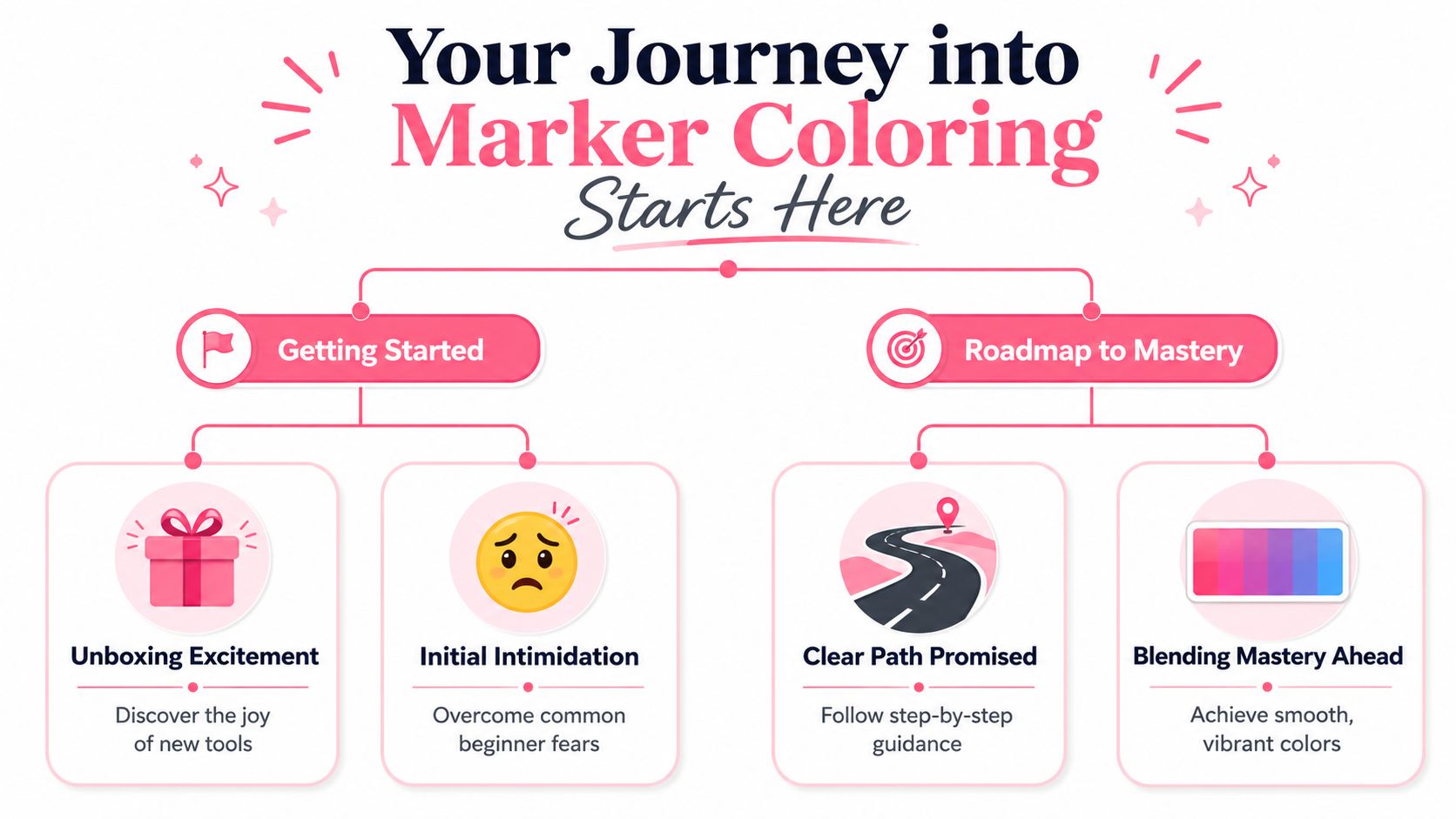
Your Journey into Marker Coloring Starts Here
Opening a new marker set can feel like opening possibility itself. You line up the colors, test a few caps, maybe swatch one or two, and then hesitate. That pause usually isn't about talent. It's about not knowing which supplies matter and which ones can wait.
For a first alcohol marker project, you don't need a giant studio setup. You need a few dependable basics that help the ink behave the way you want.
The three tools that matter most
Start with this short checklist:
- Alcohol markers: Ohuhu, Copic, Prismacolor, and similar marker lines all give you the smooth, saturated look many beginners want.
- Marker-friendly paper: This matters more than is commonly assumed. Good paper gives you more control and a cleaner blend.
- Waterproof fineliner pens: If you're drawing your own line art, your outlines need to stay put when marker ink passes over them.
That's the core kit. If you have those three things, you can make polished work right away.
Practical rule: When beginners say their markers “aren't working,” the paper is often part of the problem.
You can absolutely add extras later. White gel pens, colorless blenders, replacement nibs, storage racks, swatch books. Those are fun and useful, but they aren't the starting line.
A simple first-project mindset
A first project should feel manageable. Pick something small. A flower, a mushroom house, a simple anime portrait, a cupcake from a coloring page. Tiny wins build confidence faster than a complicated scene packed with folds, hair, glass, and patterned fabric.
It also helps to let go of the idea that every piece must be frame-worthy. Alcohol marker practice works best when you treat it like repetition with intention. Try a leaf three times. Try one face with two different skin palettes. Try the same scarf in warm reds, then cool reds.
Here's what beginners usually need to hear. You don't have to use every marker in the set. In fact, a smaller color selection often gives better results because it keeps your choices clear and your blends more believable.
A good first palette might be:
| Area | Simple choice |
|---|---|
| Base color | 1 light marker |
| Form shading | 1 mid-tone |
| Shadow | 1 darker marker |
| Accent | 1 optional contrasting color |
That little structure keeps your hand steady and your decisions light. When you learn how to color with markers this way, the process becomes much less about guessing and much more about noticing what the ink is doing.
Setting Up for Success with Your Artwork
A lot of marker frustration starts before coloring even begins. You can have lovely markers and still struggle if the paper pills, the ink lines smear, or you haven't decided where the light is coming from. Preparation sounds boring until you realize how many problems it prevents.
Why paper changes everything
Alcohol markers are widely described as a strong choice for rich saturation, fast layering, and minimal streaking, and many guides also recommend using a feather-light touch in small sections because the ink spreads quickly and can bleed if you press too hard or linger too long, as explained in this alcohol versus water marker guide.
Regular printer paper usually can't keep up with that behavior. It soaks unevenly, feathers at the edges, and often makes smooth color much harder. Marker paper or marker-friendly cardstock gives the ink a more predictable surface, so your strokes stay cleaner and your blends stay softer.
If you're comparing supplies and trying to figure out what matches your working style, a marker comparison tool for popular sets can help you sort through options before you buy more than you need.
Prepare your lines and your light source
If your artwork has line art, make sure the lines are fully dry and made with waterproof, alcohol-safe ink. Otherwise, the marker will pick up that line and drag it into your color. That's how crisp outlines become gray smudges.
Then choose one light source before you color anything. Top left is a comfortable default. Top right works too. What matters is consistency. If the light is coming from the upper left, keep your shadows on the lower right side of forms. Keep highlights facing the light.
Use this quick setup before the first stroke:
- Test your marker on scrap paper so you can see the color.
- Place a sheet behind your artwork because alcohol ink usually passes through.
- Mark the light direction lightly in pencil if you tend to forget midway through.
- Start with less pressure than feels natural because the ink travels on its own.
A light hand gives the ink room to move. A heavy hand often floods the paper before you notice.
Many beginners think smooth marker work comes from pressing harder or coloring more slowly. It's usually the opposite. A gentle pass, steady direction, and small area give you far more control than a scrubby, overworked layer.
Creating Smooth Blends and Layers
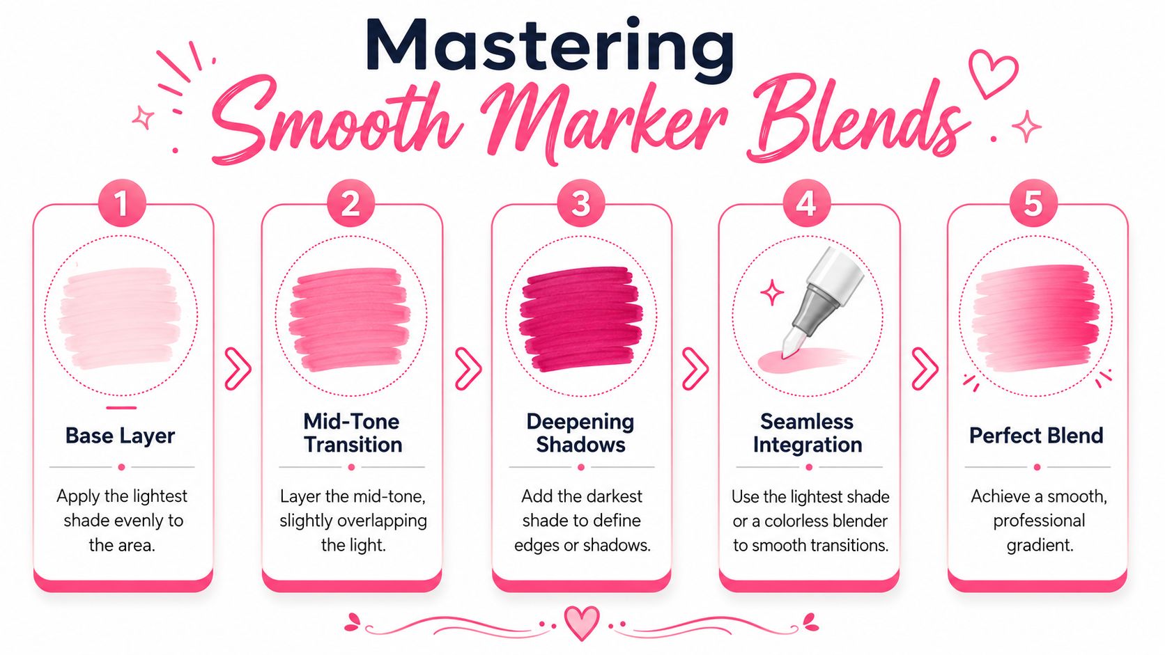
If you only learn one blending method at first, make it this one. It's the light-to-dark blend that shows up in countless alcohol marker tutorials because it's dependable, simple, and easy to repeat.
The easiest blend to learn first
A beginner-friendly blend uses three related markers. Think pale peach, medium peach, and soft terracotta for skin. Or light mint, mid green, and deep olive for leaves. Close color families are easier to merge than dramatic jumps.
Guides focused on alcohol marker technique consistently recommend working light-to-dark in small sections while the ink is still slightly wet. The common sequence is to start with the lightest shade, add mid-tones and shadows quickly, then go back with the light marker to re-wet the transition. They also note that the blend often settles a few seconds after application, which is why patience matters as much as hand motion in this beginner alcohol marker blending guide.
That last part matters a lot. Many beginners stop too soon because the blend looks rough for a moment. Then they panic and keep layering. A few seconds later, the transition softens on its own.
What your hand should actually do
Here's a reliable sequence you can practice on a simple circle or leaf shape:
- Lay down the lightest color first. Fill the whole shape evenly.
- Add the mid-tone where the form turns away from the light. Overlap it slightly into the light area.
- Place the darkest color only in the deepest shadow. Use less than you think.
- Go back with the lightest marker and “kiss” the edge between colors. You're not repainting the whole area. You're gently re-wetting the seam.
- Wait a moment before judging it. The softness often appears after the stroke is finished.
That phrase, “kiss the edge,” helps many beginners. It reminds you to touch the transition lightly instead of bulldozing over the whole blend.
Here's a short demo if you want to watch the motion in action:
A quick practice exercise
Use three markers and draw five small circles. Color each one with the same blend. Don't change the palette yet. Just repeat the same movement.
- Circle one: Focus on speed.
- Circle two: Focus on lighter pressure.
- Circle three: Make the shadow area smaller.
- Circle four: Overlap the mid-tone a little more.
- Circle five: Pause before deciding whether it needs more blending.
By the fifth one, your hand starts to understand the timing. That's when marker coloring begins to feel less slippery.
Smooth blends come from timing, overlap, and restraint. Not from endless reworking.
If your blend still looks a little patchy, shrink the area you're coloring. Large sections dry faster than beginners expect. Working in smaller pockets gives you a better chance of catching the ink while it's still open enough to merge.
Choosing Colors Without the Guesswork
For many beginners, color choice feels harder than blending. You can learn a hand motion through repetition, but color can feel personal, subjective, and strangely permanent. Once that warm brown goes onto the fox instead of the cooler one you meant to use, it's easy to feel like the whole page is off.
Why color choice feels so hard
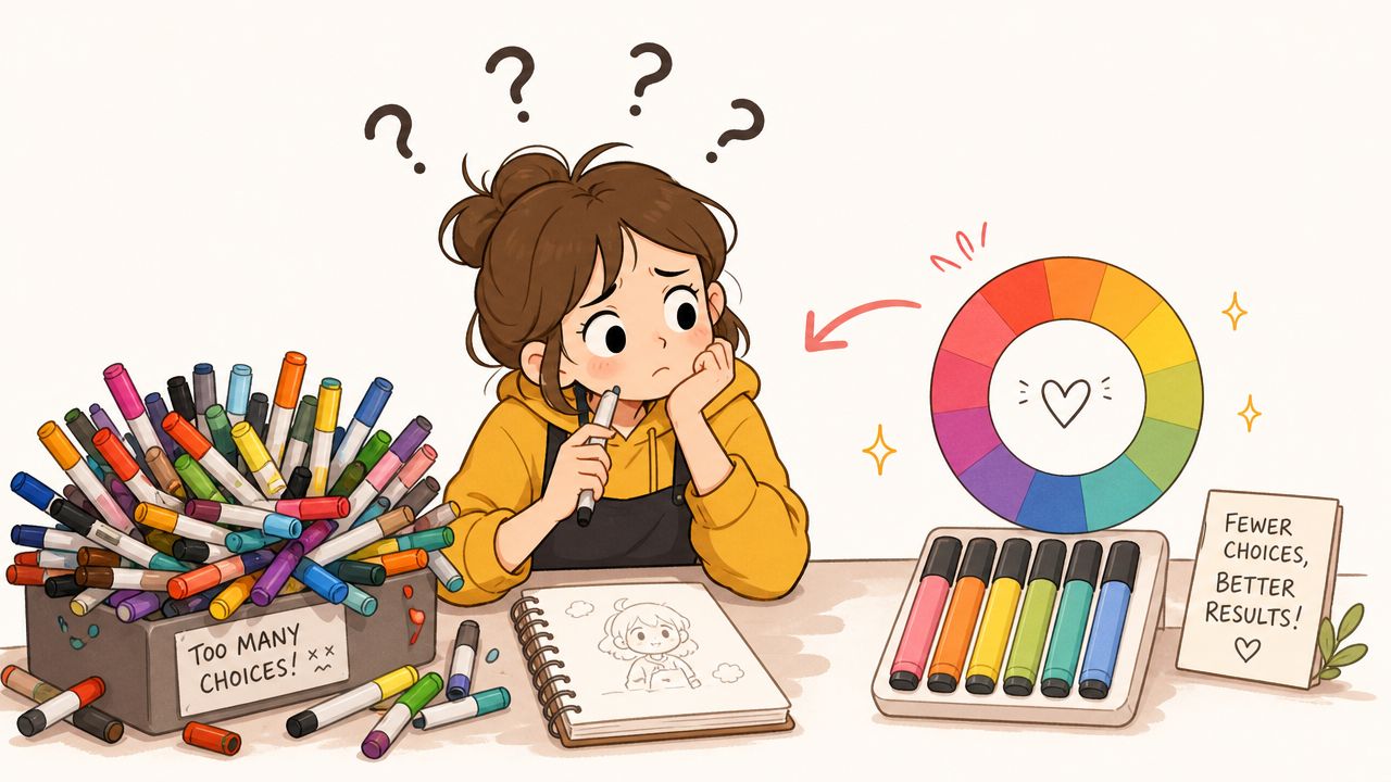
The problem usually isn't a lack of creativity. It's too many options.
A marker case full of similar pinks, greens, and neutrals can make every decision feel bigger than it is. Should the shadows be cooler? Should the background contrast or blend in? Should the skin tones lean peach, beige, or rose? That's a lot to solve while also trying to keep your hand steady.
Basic color theory helps, but beginners don't need a lecture on every scheme under the sun. A few simple ideas go a long way:
- Analogous colors sit near each other in feeling. Blue, blue-green, and green tend to look harmonious together.
- Complementary colors create contrast. A red flower against a green background will stand out more.
- Limited palettes are calming. Fewer markers usually produce a cleaner final page.
A practical way to start is to choose one “star” color, one support color, a neutral, and one dark accent. That gives the page enough variety without turning your marker tray into a decision spiral.
One relaxed way to build a palette
If you want help translating a mood into actual marker choices, one option is the marker palette generator. It can take line art or a general concept and turn it into a marker-friendly palette mapped to brands like Ohuhu, Copic, and Prismacolor, which is useful when you know the feeling you want but not the exact markers to pull.
Think about a coloring page of a tiny bookstore. You might choose a warm, sleepy mood with dusty reds, wood browns, muted greens, and soft cream. For an enchanted forest page, you might lean into mossy greens, cool grays, mushroom reds, and misty blue shadows.
Try this small decision table when you feel stuck:
| Mood you want | Color direction |
|---|---|
| Cozy and warm | Browns, rusts, muted golds, soft reds |
| Fresh and bright | Clear greens, sky blues, light yellows |
| Dreamy and soft | Lavender, blush, pale teal, cool gray |
| Moody and dramatic | Deep teal, wine red, charcoal, dark olive |
If you can name the mood, you're already halfway to choosing the palette.
That's often the shift beginners need. Instead of asking, “Which marker is correct?” ask, “What do I want this page to feel like?” Once you answer that, the color family gets much easier to narrow down.
Adding Professional Polish with Advanced Effects
Once your basic blends feel steady, small effects start making a big difference. These effects transform flat color into something more descriptive. Wood looks fibrous. Fur looks soft. Metal catches light. Fabric folds feel clearer, even if you only used a few markers.
Texture makes flat color feel alive
Let's say you're coloring a little barrel in a fantasy scene. A flat brown fill works, but it can look plain. Instead, lay down your light brown base, then use a slightly darker brown in thin, parallel strokes that follow the curve of the barrel. Leave tiny slivers of the base color visible between some lines. That broken pattern suggests grain without needing complicated realism.
For fur, use short flicking strokes that grow outward from the shadow area. For stone, dab uneven patches of close grays rather than blending everything into one perfect gradient. For cloth, keep your strokes following the fold direction so the viewer feels the fabric turning.
A colorless blender can help here too. Not as a magic eraser, but as a shaping tool. You can lift small bits of ink for softer highlights, push back an edge that feels too harsh, or create a faint texture by tapping instead of dragging.
Working small without losing highlights
Tiny spaces are where many beginners tense up. Eyes, jewelry, manga hair sections, patterned coloring-book details. Those little pockets don't give you much room for a full three-color performance.
A recurring beginner issue is how to choose and preserve highlights and shadows in small or crowded spaces. Guidance for this kind of detail often suggests limiting yourself to a few related shades and coloring in one direction to avoid patchiness, especially in intricate designs where a full blend can become cramped, as noted in this guide to coloring with alcohol markers.
Here's how that looks in practice:
- For tiny hair sections: Use two shades instead of three. Let the paper act as your brightest highlight.
- For small leaves or petals: Shade only at the base or one edge. Don't force a gradient across the whole shape.
- For eyes or shiny objects: Leave a speck of white paper if you can. Add a white gel pen later if needed.
- For patterned spaces: Keep strokes in one direction so the texture looks intentional instead of choppy.
If you want to test different moods on detailed artwork before committing to real ink, a theme preview tool for marker-style concepts can help you compare lighting and palette directions first.
A final pass with a white gel pen or paint marker can sharpen the whole piece. One crisp highlight on a lip, a bottle, a polished boot, or a bead of water can make the image feel far more finished. Use it sparingly. One or two bright notes usually look more convincing than covering the whole page in white accents.
Common Mistakes and How to Fix Them
Marker mistakes have a way of feeling dramatic in the moment. The ink is bold, the color is visible, and paper doesn't always forgive. Still, most problems follow patterns. Once you know the symptom, you can usually spot the cause.
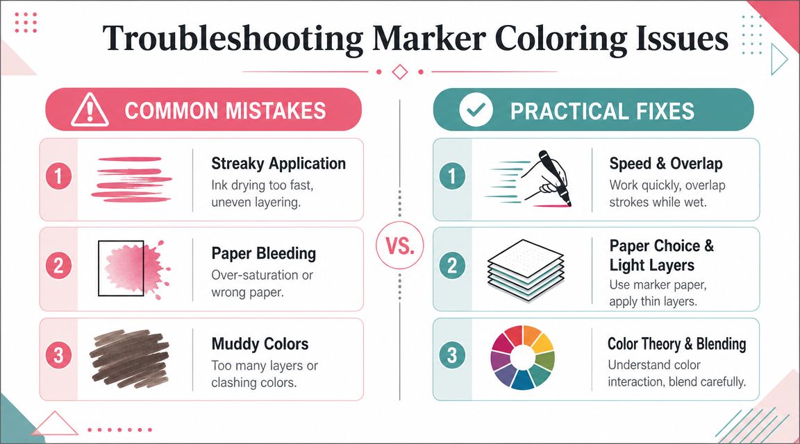
When your color looks streaky
Streaks usually come from one of three things. The paper dried before you could overlap the next stroke. Your marker strokes were scattered in different directions. Or you tried to fill too large an area all at once.
Try this fix:
- Shrink the section size. Work one petal, one cheek, one fold at a time.
- Overlap strokes slightly. Don't leave dry gaps between passes.
- Keep one stroke direction. This makes the texture look intentional even if the area isn't perfectly blended.
If a section still looks rough, let it dry and add another light layer rather than scrubbing at it while wet.
When ink bleeds or blends too far
Bleeding outside the line often means too much ink collected in one place. Sometimes the nib sat too long on the paper. Sometimes the paper couldn't hold the ink where you wanted it.
A gentler approach helps more than a faster one. Use less pressure, move steadily, and stop before the area becomes glossy-wet. If you know an edge is risky, keep your darkest shadow slightly away from the outline and let the lighter color carry the blend toward the border.
Here's a simple troubleshooting view:
| Problem | Likely cause | Helpful fix |
|---|---|---|
| Bleeding past outlines | Too much saturation | Use lighter layers and better paper |
| Harsh blend line | Colors too far apart or dried too fast | Re-wet the seam lightly |
| Muddy area | Too many passes | Let it dry, then simplify the next layer |
| Tiny details look messy | Too many shades in small space | Reduce to two related markers |
Most marker problems get worse when you keep poking at them.
When finished art changes over time
Alcohol markers have one tradeoff that surprises many beginners. They are a dye-based medium, which helps explain why they blend so smoothly, but it also means finished artwork can fade. One marker tutorial specifically notes that these colors are fugitive, meaning they can still fade even under good conditions, and many artists scan or photograph completed marker work to preserve a stable digital version in this educational alcohol marker video.
That doesn't mean marker art isn't worth making. It just means you should match your method to your purpose. If you're making a study page, a sketchbook piece, or a coloring-book spread for joy, fading may not matter much. If you want a long-term record, capture it digitally after you finish.
That habit also takes pressure off. You can enjoy the physical object now and still keep a clean version of the colors as they were on the day you completed the piece.
Marker coloring gets easier when you stop reading mistakes as proof that you're bad at it. A streak tells you about timing. A bleed tells you about pressure or paper. A muddy shadow tells you to simplify. Every page teaches your hand something.
If you want a calmer way to plan palettes before you touch the page, ColorBestie lets you upload black-and-white art, preview marker-style color ideas, and translate those ideas into marker-friendly palettes for brands many hobbyists already use.
