
You've got a blank sketchbook, a sharpened pencil, and perhaps one very ambitious reference image open beside you. The paisley looks complicated because its surface is full of curls, petals, and tiny details. The underlying shape is much friendlier: one curved teardrop, repeated with care and decorated without losing its outline.
This guide will show you how to draw a paisley pattern from the first light pencil mark through a coordinated repeat and a practical alcohol-marker color plan. You'll learn not only how to make one motif, but how to arrange several motifs so they belong together on a page, card, fabric study, or journal spread.
What a Paisley Motif Actually Is
Before you draw, look at the motif as a silhouette. A paisley is a curved teardrop or comma shape, usually with a rounded belly at one end and a lifted, curling tip at the other. You may also hear it called boteh or buta, names connected with Persian-language meanings such as “flower bud” or “spray of leaves” in historical accounts of the design (historical overview of the paisley design)).
The familiar English name came much later. Related forms developed across Persia, Iran, India, and neighboring regions, and the design spread into Kashmir before appearing on luxury garments during the Mughal period. Imported Kashmir shawls brought the motif into Europe by the late eighteenth century, and British manufacturers in Paisley, Scotland, produced local versions around 1800, giving the pattern its enduring English name (history of the paisley pattern).
For your first drawing, forget the ornate textile and focus on three visual ideas:
- A clear outer silhouette: The shape should still read as paisley before you add decoration.
- A directional tip: The narrow end bends or curls rather than ending as a blunt triangle.
- An organized interior: Echo lines, petals, dots, and curls should support the outer form.
The rounded end doesn't have to point in exactly the same direction every time. What matters is that the motif has a long axis and a soft turning motion. Every elaborate paisley arrangement begins with this single shape, then gains character through repetition, rotation, and controlled detail.
Building the Basic Teardrop Shape
Use a hard or reasonably light pencil for the construction. You're not trying to produce a finished line yet, so keep your pressure gentle enough that you can adjust the curve without damaging the paper.
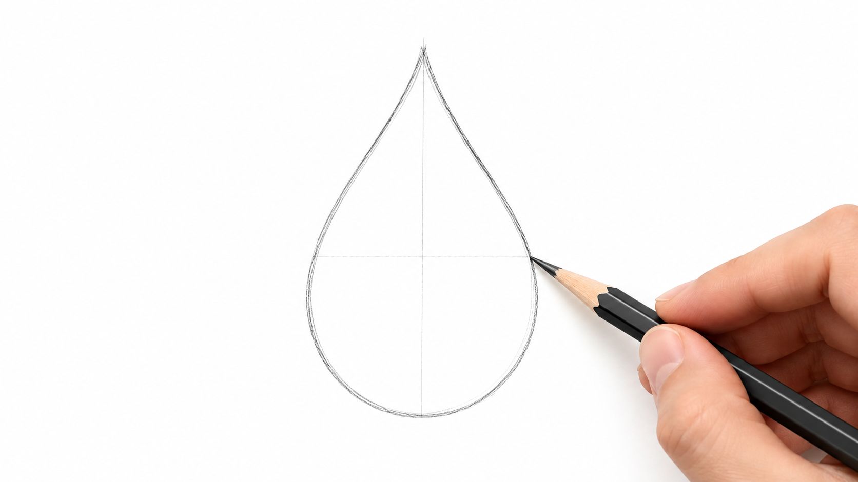
Mark the two ends
Place a small dot where you want the curled tip to finish. Then place a larger imaginary anchor above and slightly to the right. This second point represents the rounded belly, so leave enough space around it for the outline to swell.
Connect the points with two different curves. On one side, draw a relaxed S-curve that narrows toward the tip and expands toward the belly. On the opposite side, use a gentler C-curve. Don't build the outline from short, scratchy strokes. A slow, continuous movement usually produces a more natural contour, even if you need to redraw it lightly.
Add the inner echo
Once the outside feels balanced, draw a second line inside it. This echo line should follow the outer contour without squeezing against it. Leave a comfortable strip of open paper between the two lines, especially around the rounded belly. That gap will later hold small curls, dots, or a border accent.
Finish the lower portion with a soft base curve. Think of it as the place where the paisley could meet a stem or rest against another motif. A sharp corner makes the shape feel stiff, while a shallow curve keeps the design flowing.
Practical rule: Preserve the outer silhouette first. Interior decoration can be changed later, but a crowded or flattened outline is harder to rescue.
If the first attempt looks uneven, trace the construction again on scrap paper. Paisley depends on smooth relationships between curves, not on one perfect pencil stroke. The basic paisley drawing sequence also emphasizes building from the outer contour to the inner border before adding decorative fills, which is a useful order for beginners.
Filling the Motif With Petals and Curls
An empty paisley often looks unfinished, but filling every patch of paper makes it muddy. Start with one main decorative direction, then add smaller elements that echo it.
Begin near the rounded belly. Draw a small lotus-like petal whose point aims toward the curled tip. The petal gives the eye a path to follow along the long axis. Beside it, add two or three narrow comma shapes that fan from the same general anchor. Keep their bases close, but let their tips separate so the group feels intentional rather than tangled.
Build a small interior rhythm
Use the inner echo line as a guide for secondary details. Tiny spirals can sit along the wider curve, while dots can fill short gaps between them. Vary the size slightly, but keep the marks small enough that they don't compete with the main petal.
A smaller teardrop nested along the main curve creates depth. It should be simpler than the outer motif, perhaps just an outline with one short echo. If you decorate the small shape as heavily as the large one, the hierarchy disappears.

Leave deliberate breathing room
The open areas are part of the design. Leave a slim channel between the inner decoration and the outer border, and allow some paper to show around the tip. This negative space makes the silhouette recognizable after you ink or color it.
Try each spiral on a separate scrap before placing it in the final motif. If a swirl feels too tight, widen its turn. If a petal points in a different direction from the rest, redraw it so the interior marks follow the paisley's long axis.
A useful test is to cover the interior with your hand and inspect only the outline. Then cover the outline and inspect the decorative rhythm. Both views should feel balanced independently. If the interior looks attractive but the silhouette has disappeared, erase one or two small elements rather than adding another border.
Repeating Paisley Into a Pattern
A single motif becomes a pattern when you control spacing, direction, and scale. For a simple circular arrangement, lightly draw a guide circle with a compass. Mark the edge at clock-like positions, then use those marks to divide the page into clear placement zones.
Start with three motifs rather than filling the entire circle immediately. Place the first paisley in the upper portion, with its rounded base near the guide and its tip turning clockwise. Put a second motif along the next arc, rotating it so the two shapes share a visual direction without touching. Add the third lower down, and mirror its direction so the tip turns back toward the open space.
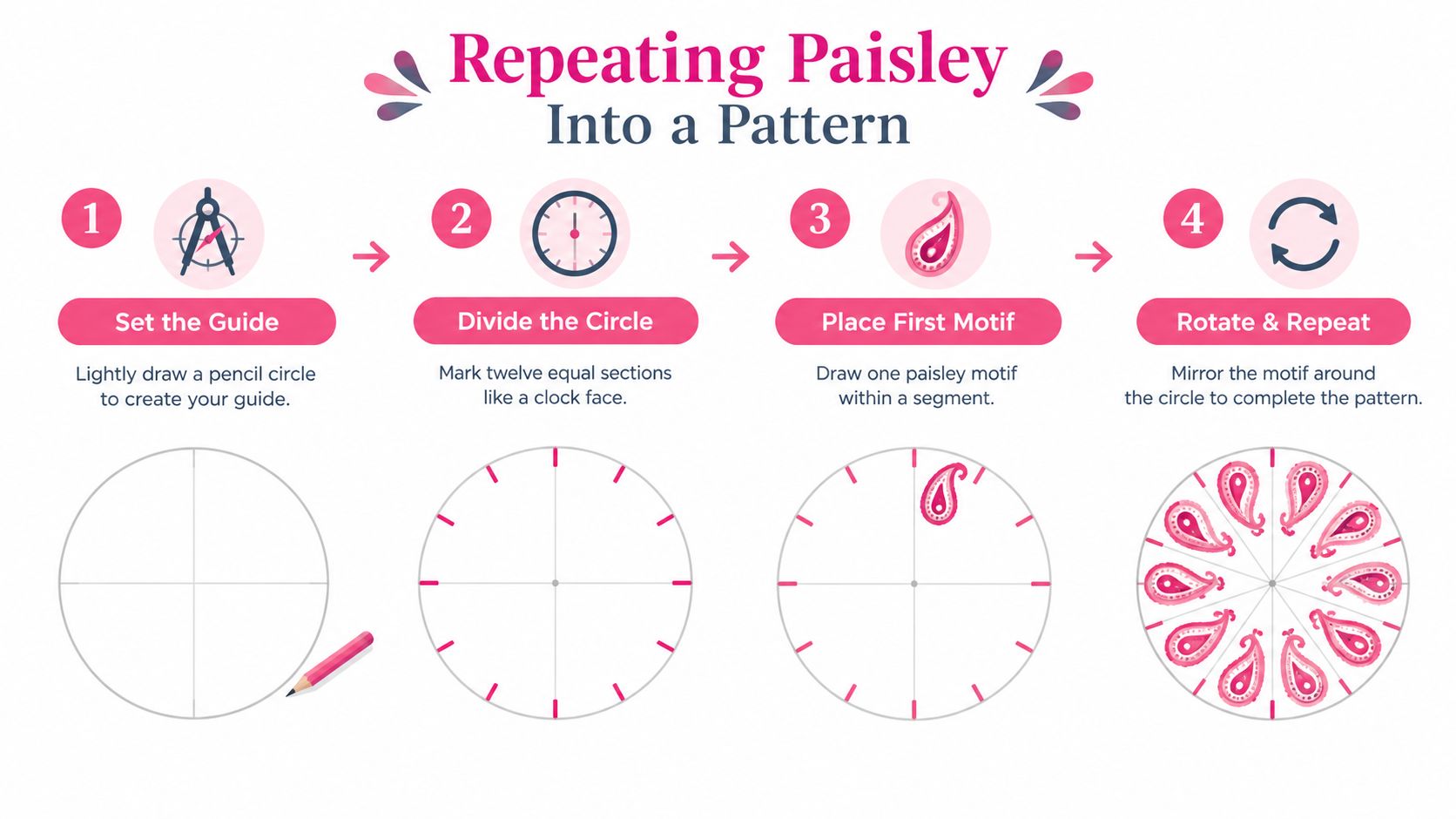
Imagine the three motifs as people walking around a round table. They don't all need to face the center, but their paths should feel related. Keep a small gap between neighboring tips. If two points nearly collide, rotate one motif before you commit to ink.
Use a controlled family of shapes
Your repeated motifs don't need to be identical. They do need to share visible traits:
- Keep the outer curve style consistent.
- Repeat the same type of echo line.
- Use matching line weight when you ink.
- Simplify smaller motifs instead of shrinking every detail until it becomes unreadable.
- Mirror a motif when the tip direction would otherwise make the ring feel one-sided.
For a border, place the paisleys along a curved baseline and alternate their lean. For a full page, let some motifs rotate while others remain upright. A modular scaffold, such as a circle or droplet framework, helps keep proportions repeatable in both hand-drawn and digital work (modular paisley construction guidance).
The most common gap in beginner instructions is the jump from one decorated teardrop to a coherent repeat. A circular guide makes that jump manageable because it gives every motif a location before you worry about detail. You can also explore a theme preview tool to test the overall visual mood of a completed arrangement before choosing your final marker colors.
Place the three motifs first, step back, and squint. Your eye should travel around the ring smoothly instead of stopping at a crowded tip or an awkward empty wedge.
Planning Marker-Friendly Colors
Alcohol markers reward restraint. A paisley filled with many unrelated colors can lose its rhythm, especially when several motifs sit next to one another. Choose two anchor colors from one family, then add one cool shade for selective depth.
A warm example is Copic YR18, a stronger orange, paired with Copic YR04, a lighter yellow-orange. Reserve Copic B23 for cool shadow accents. The exact appearance will depend on your paper and marker condition, so swatch each color before you begin.
| Color Role | Suggested Marker | Coverage Area | Coverage % |
|---|---|---|---|
| Base fill | Copic YR04 | Large petals and broad interior fields | Qualitative, use for most open areas |
| Warm accent | Copic YR18 | Selected petals, curls, and focal details | Qualitative, use selectively |
| Cool shadow | Copic B23 | Lower curves and tucked recesses | Qualitative, keep limited |
The table uses coverage guidance rather than a numeric percentage because marker saturation varies with paper, nib pressure, and the number of passes. The important relationship is simple: the light warm shade should occupy the largest areas, the darker warm shade should create emphasis, and the blue should remain an accent rather than becoming a second main color.
Layer light to dark
Lay down the light base first. Let it dry before adding the stronger warm accent, then place the cool shadow only along a lower edge or tucked curve. Keep gradients restrained, because repeated wet passes can create streaks or bleed beyond a fine outline.
A marker-friendly paisley plan might look like this:
- Large petals: Fill with YR04 so the motif has a unified foundation.
- Inner curls and dots: Use YR18 for small points of contrast.
- Curved base shadows: Add B23 sparingly where one form appears to sit behind another.
For more palette options, use a marker palette generator as a planning aid, then compare its suggestions with your physical swatches. The best color plan is one you can repeat across the whole pattern without changing the visual language halfway through.
Fixing Common Paisley Mistakes
A paisley doesn't fail because every line isn't symmetrical. It fails when the viewer can no longer read the main teardrop beneath the decoration. Most frustrating problems have a small structural cause and an equally small correction.
When the tip looks flat
A blunt tip often comes from turning the curl too tightly. Instead of forcing the point inward, loosen the spiral and give the curve a little more space before it closes. A rounded, lifted tip feels softer and keeps the motif connected to the traditional comma-like silhouette.
When the center feels crowded
Artists often assume every empty area needs a mark. It doesn't. Erase one inner petal, dot cluster, or secondary teardrop from the busiest area and inspect the result again.
A readable gap is not wasted space. It's what separates the interior ornament from the outer identity of the motif.
If the design still feels dense, simplify the smallest elements first. Keep the main petal and one echo, then rebuild only if the open spaces support another detail.
When line weight changes accidentally
Use the fine liner's side or a lighter touch for echo lines, and reserve the fuller nib or firmer pressure for the outer silhouette. This gives the eye a clear order of importance. If you're using a brush pen, practice the pressure change on scrap paper before touching the finished pattern.
When repeated tips collide
Don't immediately redraw the whole arrangement. Shift one motif slightly outward or rotate its tip away from the neighboring shape. Small spacing changes often solve a collision while preserving the structure you already built.
For marker shadows that look like blobs, replace a solid patch with small dots and let them spread toward the lighter area. A colorless blender can soften the transition, but test it on the same paper first because blending behavior varies.
Your Reusable Paisley Workflow
Keep the process short enough that you'll use it again. A reliable workflow turns paisley from a one-time experiment into a repeatable design skill.
Sketch the base. Lightly construct the teardrop, its lifted tip, and the inner echo. Warm up with a few S-curves and C-curves before starting the final page.
Commit the silhouette. Trace the outer contour with a fine liner only after the proportions feel stable. Leave the pencil construction visible until the ink has dried.
Layer the interior. Add the main petal first, then curls, dots, and any smaller teardrop. Stop while the negative space still feels intentional.
Build the repeat. Rotate, mirror, and resize your motif family around a guide. Check the gaps between tips before adding elaborate details to every shape.
Color from light to dark. Choose a two-color family plus a shadow shade, swatch first, and apply the broad base before selective accents. A marker comparison tool can help you judge similar marker families before committing to a palette.
Take a reference photo before inking if you're working on a complex layout. It gives you a record of the construction and lets you compare the finished pattern with the original spacing. This same five-part flow works for a greeting card, a fabric swatch, a mandala border, or a journal spread.
Paisley rewards repetition more than perfection. Each new motif teaches you where a curve needs room, how much interior detail the silhouette can carry, and which colors stay clear after layering. Keep the workflow nearby, and your next coordinated set will feel less like starting over and more like continuing a conversation with the shape.
ColorBestie helps you turn black-and-white paisley sketches into marker-style color inspiration, with palette, theme, and marker comparison tools designed for hobby artists. Upload your drawing, explore a practical color direction, and visit ColorBestie before you commit ink to your next repeating pattern.

