
You've got a finished sketch on your desk, a fresh digital canvas open, and the first color still hasn't touched the page. Maybe you're looking at a clean line drawing, a photo that feels emotionally flat, or a partly colored sketch whose shades don't quite belong together. That pause is normal. Recoloring isn't just a technical edit. It's the bridge between the lines, textures, or lighting you already like and the palette you've been imagining.
The trick is to stop treating color as a single decision. Choose the mood first, prepare the image, test a small palette, and apply color in an order that protects the original values. The history of recoloring itself moved from hand-colored photographs to industrial color processes and then computer-assisted workflows, with key developments stretching from monochrome photography in 1839 through the Autochrome patent in 1903, Kodachrome in 1935, and the introduction of the term “colorization” in 1970 (historical overview of recoloring).
This guide shows how to recolor an image for both digital artwork and physical marker planning. You'll see when manual tools make sense, how AI theme workflows can help, and how to turn an on-screen palette into a practical shopping list for Ohuhu, Copic, Prismacolor, and similar marker sets.
Staring at a Blank Line Drawing and Wondering Where to Start
A black-and-white cat sketch can look finished and unfinished at the same time. The lines may already capture the expression, paws, and fluffy tail perfectly, yet the blank spaces invite a dozen possible directions. Should the cat be warm gray with green eyes, orange with blue shadows, or part of a soft cottagecore scene?
That uncertainty usually comes from trying to solve too many color problems at once. Instead, separate the decisions. First decide whether you're recoloring for realism, atmosphere, character design, or marker practice. Then choose a limited group of colors that supports that purpose. A cozy illustration might need warm fur, a muted background, and one accent color. An anime-style drawing may benefit from clearer separation between base tones and shadows.
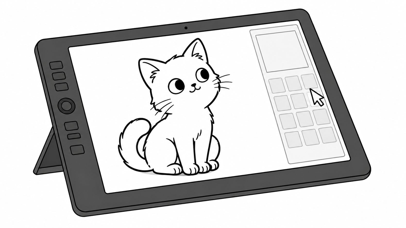
Think of a tested palette as a decision filter. You don't need to ask whether every individual shade is beautiful. You only need to ask whether it belongs to the small color family you've chosen.
Practical rule: Start with the largest visual areas, then reserve your strongest color for a focal detail.
The same idea works beyond line art. A finished photo might need a cooler, quieter mood without changing its composition. A sketch with rough block-in colors might need harmony, perhaps by shifting several unrelated shades toward the same warm or cool family. In each case, recoloring works better when you preserve the image's structure and change its color relationships deliberately.
Digital recoloring also has a long technical history. Modern reviews describe image and video colorization as a substantial computer-vision field, used in restoration, historical documentation, visual effects, and industrial applications. Deep-learning methods have accelerated the move away from purely manual brushwork toward systems that infer plausible hues from grayscale information (survey of image and video colorization).
You don't need to understand every model behind a color tool. You do need a clear order of operations. Prepare the source, choose a theme, preview the relationships, apply the color, and then check whether the result still reads at a glance.
Setting Up Your Image Before the Color Goes On
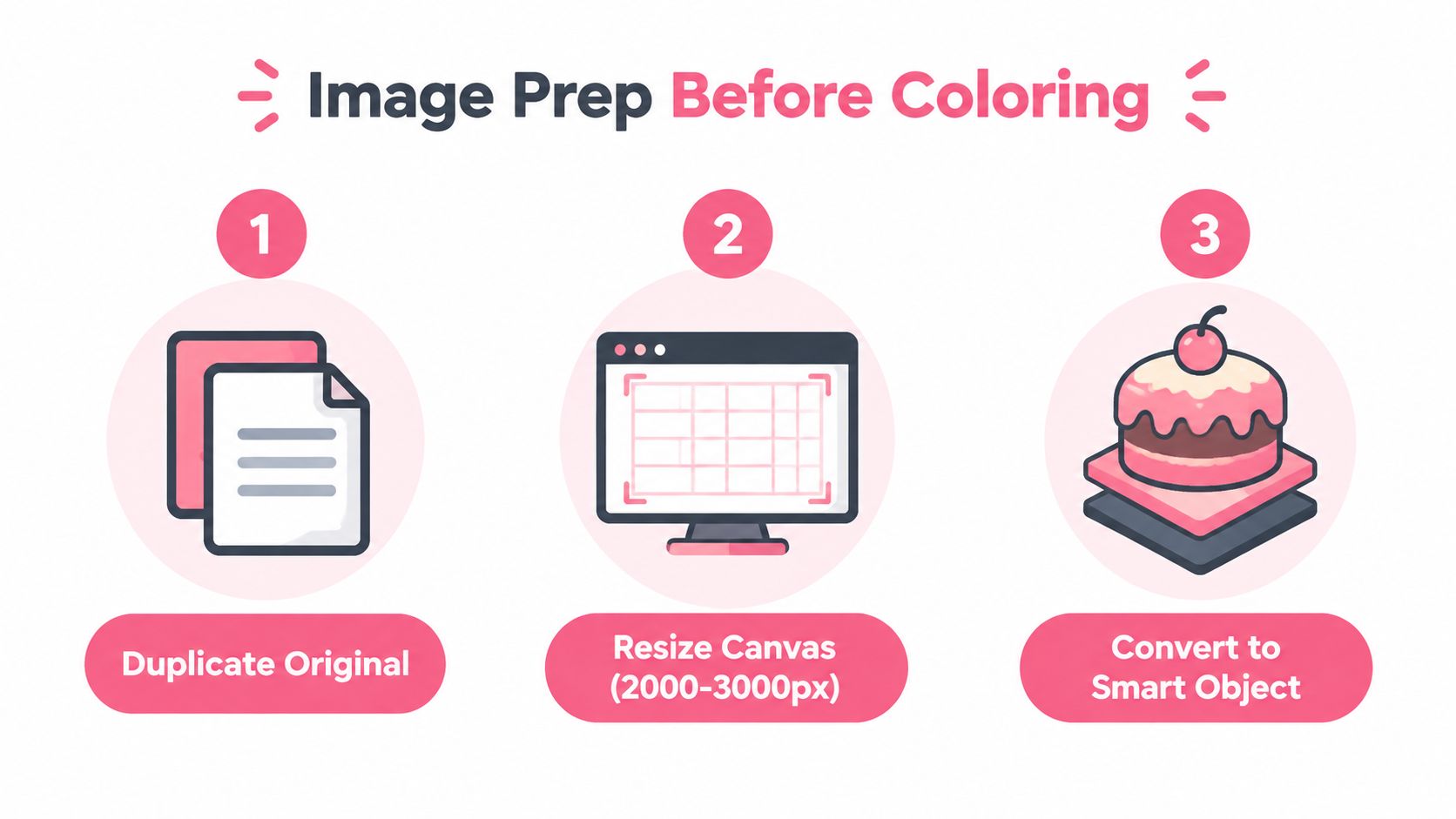
Good preparation prevents the kind of small problem that becomes an hour of cleanup later. Before changing a single hue, save a duplicate of the original file. Keep one untouched source, then work from a copy with a clear name such as cat-lineart-color-test.
Clean the source and protect the structure
For a digital edit, choose a canvas size that leaves enough room for clean edges and export. A long edge between 2000 and 3000 pixels is a practical working range for many digital illustrations, while a scan intended for marker planning can be prepared at 300 DPI. These specifications come from the workflow brief rather than an external source, so treat them as working guidance, not a universal requirement.
Check the source at normal viewing size before zooming in. Bright, even lighting helps with photos, while a clean white background makes line-art gaps easier to spot. Remove dust, scratches, and stray pencil marks with a healing brush, spot-removal tool, or a small hard-edged eraser.
For AI-assisted experiments, flatten a duplicate rather than flattening your only layered file. If you're working manually, keep the line art on its own layer and lock it. Place fills underneath whenever possible, so the original contours stay crisp while you test colors.
Organize regions before experimenting
Name layers by visual region, such as:
- Hair: Keep the base, shadow, and highlight layers together.
- Skin or fur: Separate these from clothing so palette changes stay targeted.
- Clothing: Use masks or selections for individual garments.
- Background: Keep it independent from the subject.
- Accents: Save eyes, jewelry, buttons, and small props for last.
If you want a quick starting palette, the ColorBestie Palette Generator can help you collect related colors before you begin filling areas. Use the output as a reference, not as a command. A palette still needs to suit the image's lighting and value structure.
Finally, turn the image grayscale for a moment. If the subject disappears into the background in black and white, color probably won't rescue the composition. Adjust contrast, separate the main shapes, or lighten the background before you build the final palette.
Choosing Between Manual Editors and AI Theme Workflows
You open a line drawing, know the jacket should change, but have no clear palette in mind. Manual editors and AI theme workflows answer different parts of that decision. Photoshop, Procreate, Affinity Photo, and GIMP provide close control over masks, adjustment layers, gradient maps, selections, and brushwork. That control helps when an object must change while its texture, lighting, and identity stay stable.
AI theme workflows help with the earlier question: which colors belong together? A curated theme can suggest coordinated colors for line art or photo regions, giving you a starting point for mood tests, alternate versions, and a physical marker plan. Recoloring research also treats the task as more than a global hue shift. Strong methods account for objects, boundaries, nearby colors, and spatial continuity (peer-reviewed recoloring method).
Pick the path that matches the job
| Factor | Manual Editors | AI Theme Workflows |
|---|---|---|
| Control | Precise masks, curves, selections, and brush edits | Fast coordinated suggestions across regions |
| Best use | Hero artwork, detailed photo edits, brand palettes | Moodboards, variations, and beginner guidance |
| Learning curve | Higher, especially for masks and color adjustments | Lower starting barrier |
| Marker planning | Requires manual swatch research | Gives you a clearer palette reference |
| Fine correction | Excellent for object edges and texture | Often needs manual cleanup afterward |
| Speed of exploration | Slower for many alternatives | Faster for testing different themes |
Choose a manual workflow when the target color is already clear and subtle details need protection. Changing a blue jacket to olive, for example, usually calls for a carefully painted mask and selective adjustment layer so folds, reflected light, and stitching remain visible.
Choose an AI workflow when you are comparing dusty rose, autumnal brown, and cool night colors. A theme preview lets you test those directions before committing to detailed edits. The ColorBestie Theme Preview can show how a theme behaves against your image, then you can translate its swatches into real alcohol-marker families from Ohuhu, Copic, Prismacolor, or similar sets.
The practical middle path often causes the least frustration. Use a theme workflow to generate palette ideas, treat the on-screen colors as a shopping guide rather than an exact marker match, and refine the chosen version manually. You keep the speed of exploration while retaining control over the edges, textures, and small color decisions that make the artwork yours.
Mapping Digital Palettes to Ohuhu, Copic, and Prismacolor Markers
A digital swatch is only useful to a marker artist if it can become a real-world color decision. Screens use light, while alcohol markers depend on paper, layering, nib pressure, and the color already underneath. Treat a digital color as an anchor, not a guaranteed physical match.
ColorBestie's theme worlds give you a useful way to sort that decision:
| Theme World | Best For | Marker Match | Example Swatch Code |
|---|---|---|---|
| Portrait | Grounded skin, hair, and natural clothing palettes | Copic Sketch, Ohuhu Skin Tone, Prismacolor Premier | Digital peach anchor matched to a pale peach or blush marker |
| Anime | Saturated cel-style schemes and readable accents | Copic, Ohuhu Honolulu, Spectrum Noir | Digital red anchor matched to a vivid scarlet family |
| Marker | Practical alcohol-marker planning and blend families | Ohuhu, Copic, Winsor & Newton, Spectrum Noir | Digital warm gray anchor matched to a marker gray family |
| Fine Art | Painterly, earthy, and expressive combinations | Prismacolor Premier, Copic muted families | Digital ochre anchor matched to an earth-tone marker |
| Photo | Gradient-heavy references and natural lighting | Copic, Ohuhu, Winsor & Newton | Digital shadow anchor matched to a darker blend partner |
Build a physical match instead of chasing perfection
Start by importing the generated palette into a swatch chart or creating a simple reference card. Label each digital swatch with its hex value, then add the nearest marker codes you own. If you're shopping, record the brand and series beside the color so you don't accidentally compare a marker name from one range with a code from another.
For example, a digital peach such as #F4C7B8 can be treated as an anchor and compared with a light Ohuhu peach family or a Copic skin-tone family. The exact appearance depends on paper and layering, so swatch the physical markers rather than assuming the screen match is exact. Do the same with a digital rose, sage, blue-gray, or warm brown.
Marker habit: Test every important match on the paper you'll actually use, under the light where you'll usually color.
Use the ColorBestie Marker Comparison to compare available marker families, then verify your shortlist with your own swatch book. Daylight is helpful because indoor bulbs can make warm neutrals appear more yellow or red than they are.
For cross-brand matching, choose one digital anchor, find its nearest equivalent in two brands, and write both codes on a printable card. Add a lighter blend partner and a darker shadow partner when the subject needs dimension. That card turns an abstract screen palette into a practical shopping list for Ohuhu, Copic, Prismacolor, or another set you already have.
Practical Recoloring Techniques for Photos and Line Art
A charcoal coat can become burgundy without losing its wool texture, while a grayscale sketch can take on a clear anime-inspired palette. The first move depends on the source. Photos already contain texture, reflections, and lighting variation. Line art needs clean fills beneath the contours before you add softer shading.
Recolor a selected object in a photo
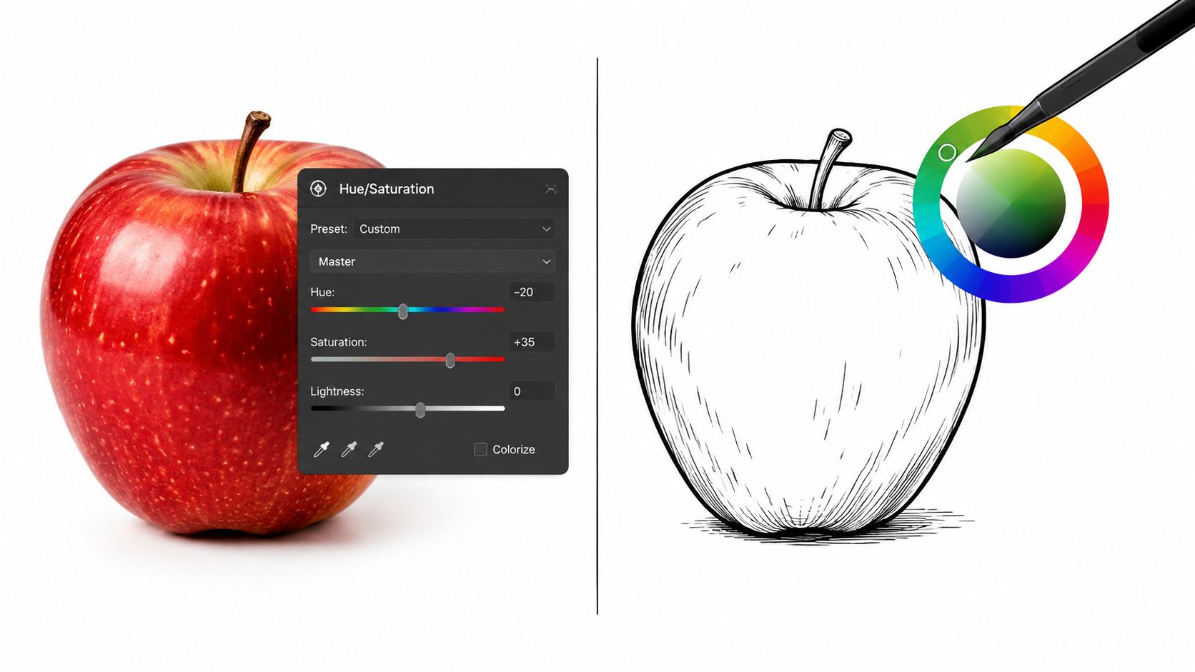
Start with a selection or mask around the object. Add a Hue and Saturation adjustment layer, clip it to that region, and sample the original color with the eyedropper. Make small hue changes rather than dragging the control widely. Gradual shifts preserve believable shadows and highlights.
For the charcoal coat, move the hue toward red while preserving luminosity so the fabric detail remains visible. Lower saturation slightly if the burgundy looks synthetic. Leave the background alone unless it clashes with the new coat color.
A study of theme-aware recoloring tested whether edited images moved toward intended color distributions across seven themes, reporting two-tailed p-values below 0.05. It used a dataset of 1,820 images and compared the results with baseline methods, reporting significance at p < 0.001 against GMM and p < 0.0001 against hue-blend (theme-aware recoloring study). The practical lesson is to judge the selected region and its relationship to the intended palette, not just the whole-image histogram.
Line drawings need a different order. Lock the line layer, then add flat fills below it. Begin with large shapes such as the background, hair, clothing, and skin. Leave eyes, accessories, tiny highlights, and decorative marks until the main color relationships feel right.
Three flat tones and one soft shadow layer can give a grayscale sketch an anime-inspired look. Keep the base colors distinct, place shadows where the form turns away from the light, and avoid assigning a different blend mode to every small area. A limited palette usually reads more clearly.
Use this finishing sequence:
- Add a restrained gradient overlay if the image feels flat.
- Inspect edges at 100 percent zoom and clean spills.
- Check the complete image at normal size.
- Export a flattened PNG.
- Save the layered source separately.
This video compares practical editing controls with the resulting image:
Troubleshooting Muddy Tones and Other Common Recoloring Mistakes
A recolor can look fine at first, then turn dull, harsh, or uneven when you inspect the finished image. Name the visible problem before changing settings. Muddy shadows, flat highlights, banding, and bleeding edges usually need different fixes. Global adjustments affect every region at once, so they can damage boundaries and lighting relationships that were working. Local masks, separated regions, and spatial controls keep those changes contained.
Diagnose the visible symptom
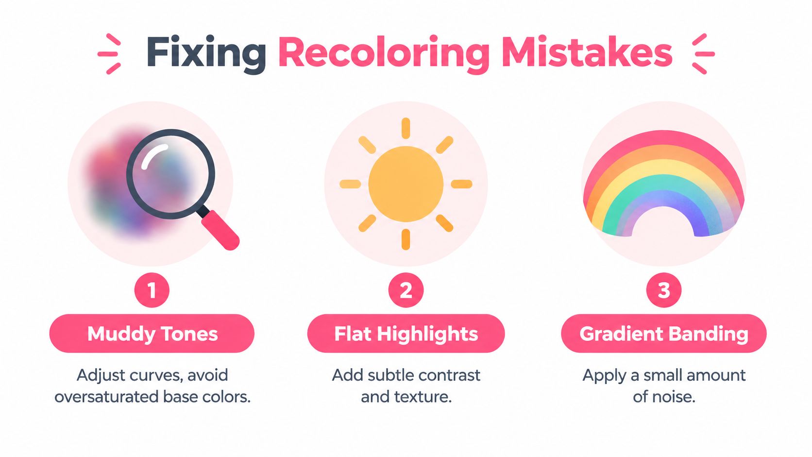
- Muddy shadows: A hue shift may have reduced saturation or pushed dark colors toward gray. Restore some of the original color intensity, then try a cool tint rather than adding more black.
- Flat highlights: A solid white layer can cover surface detail. Lower its opacity, choose a softer blend, or paint highlights only where light would catch.
- Gradient banding: A stretched tone may lack enough intermediate colors. Sample nearby shades and paint a transition between abrupt steps. A restrained texture layer can also break up visible bands.
- Clashing edges: Bleeding between objects usually points to a mask problem. Refine the boundary and inspect hair, fingers, leaves, and thin accessories first.
- Overheated skin: Shift the hue closer to neutral and reduce saturation slightly. Skin color depends on the surrounding light, so judge it beside the background and nearby objects.
Zoomed-in views reveal spills and rough edges, but they can make tiny tonal differences seem more serious than they are. Review the full image at 50 percent zoom on a calibrated display, then inspect the flattened export separately from the layered source.
Diagnostic habit: Compare the changed region with the original in grayscale before adjusting the hue again.
Grayscale separates value problems from color problems. If the light and dark structure has collapsed, saturation changes will not restore the form. Rebuild that separation first, then return to the palette. This check also helps keep a digital theme aligned with real alcohol markers, since a close hue match can still look wrong when its value is too light or too dark.
Your Repeatable Recoloring Routine and Next Steps
A reliable routine keeps color decisions from turning into improvisation. Use the same five-part rhythm for a photo, a line drawing, or a marker reference: prepare, palette, preview, paint, polish.
Prepare
Duplicate the source, clean distracting marks, organize layers, and confirm that the grayscale values still read. Lock the line art or create a protected mask before experimenting.
Palette
Choose a small group of base, shadow, highlight, and accent colors. If you're working toward physical markers, record the digital anchor and the closest codes from the brands you use.
Preview
Test the palette on the largest regions first. Compare the subject and background together, not as isolated swatches. If the mood feels wrong, change the palette before doing detailed rendering.
Paint
Apply base colors, then shadows, then accents. For photos, use selective masks and adjustment layers. For line art, keep fills below the ink and preserve clean contours.
Polish
Clean edges, protect texture, inspect gradients, and export both a flattened PNG and the layered source. Make a marker-friendly cheat sheet with the final color names and codes.
Your final checklist is short:
- Color count: Can you explain the role of each major swatch?
- Contrast: Does the subject remain readable in grayscale?
- Marker list: Have you tested the physical matches on your actual paper?
- Original backup: Is the untouched source still available?
- Export: Did you review the flattened file at normal viewing size?
Start with an uncomplicated sketch or photo rather than the piece you've been saving for months. A free preview from ColorBestie can help you test a theme, compare a marker-style direction, and create a reference before you commit to a full coloring session.
ColorBestie turns uploaded sketches or photos into marker-style color previews, with theme options and marker color guidance for planning a real piece. Visit ColorBestie to test a low-pressure palette workflow, then take the swatches to your Ohuhu, Copic, Prismacolor, or similar marker set.

