
You know the moment. You've got a page in front of you, the flat color looks fine at arm's length, and then you step back and it still feels like a sticker. The shape is there, but the form isn't. That's usually where marker shading techniques stop being about “making it darker” and start being about controlling value, light, and edge quality so the page finally reads like something with weight.
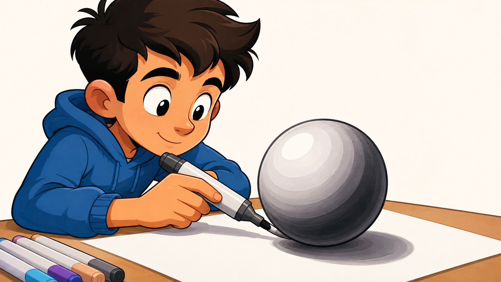
The big shift happened when modern felt-tip markers made controlled shading practical for artists. Sidney Rosenthal's 1953 “Magic Marker” is widely cited as the first usable modern marker, and by the 1960s permanent markers had moved from labeling into everyday drawing and illustration; the 1970s and 1980s brought dedicated rendering markers, and Copic's 1987 introduction became a milestone because refillable alcohol ink and replaceable nibs made layered shading more economical and repeatable (Alabama Art marker history). That history still shows up in the way artists shade today, because marker work rewards patience, layering, and deliberate value steps more than a single opaque pass.
Why Marker Shading Makes Your Coloring Look Dimensional
A flat fill can be clean and still feel lifeless. The eye reads value changes before it reads detail, so marker shading techniques work by placing those value shifts where a round cheek, a folded sleeve, or a curved mug turns in space. When the light source is vague, the whole piece starts to guess, and that guesswork is what makes the form feel soft in a bad way.
Start with the light, then build the shadow
The strongest marker shading begins with a clear decision about where the light is coming from. Once that is set, the highlight stays on the light-facing side, the shadow side deepens in small steps, and the midtone carries most of the form. That approach gives the drawing a readable structure before the darker ink ever goes down.
Practical rule: if you cannot point to the light source in one second, the shading usually drifts.
Marker shading also connects cleanly to older draftsmanship methods like hatching and cross-hatching. Those methods are still useful here because they show the same principle, form comes from controlled tonal steps, not from flooding an area with one uniform color (visual arts drawing reference). Alcohol markers just ask you to make those steps with overlapping strokes and wet-ink blending instead of pencil lines.
The patience part shows up in the values
This medium rewards artists who build depth in layers. Light colors go down first, shadows build on top, and the transitions get softened while the ink is still workable. That is why experienced marker work often reads as calm rather than overworked, the values are doing the heavy lifting, not a stack of noisy passes.
The useful shift is simple. Hold the lightest-first order, then use darker strokes to soften the edge of the value family where the form turns away from the light. If you start too dark, the paper saturates faster, the surface fights back, and the blend loses room to breathe. On marker paper, that threshold matters, because once the fibers are loaded, re-blending turns muddy fast.
By the time that value map is in place, the drawing has more weight and more depth without relying on heavy outlines. A sphere reads as round, fabric reads as folded, and a face starts turning in space instead of sitting flat on the page.
Essential Supplies and Setup Before You Shade
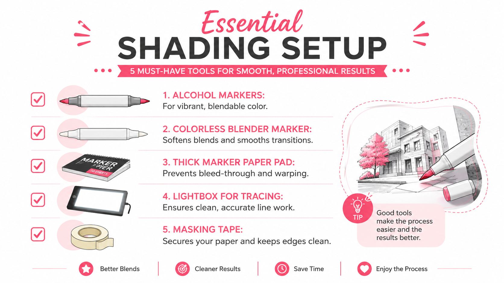
Before the marker touches the final page, the setup has to do some of the control work for you. Marker shading quality is strongly affected by how the paper and ink interact, and experienced guidance keeps coming back to the same habits, scrap paper underneath, swatching and labeling first, and choosing adjacent values from the same hue family instead of jumping straight to gray or black for shadows (marker paper guidance). That advice matters because alcohol ink can spread fast, and once a layer sinks in, the paper's giving you less room to negotiate.
Build the page before you commit ink
Start with a light pencil map of the light source and the major shadow zones. You don't need a full graphite drawing, just enough to know where the brightest side lives and where the shadow side starts to turn. If the form is a sphere, a cheek, or a folded blanket, that quick map keeps you from accidentally shading against your own lighting logic.
A good setup also keeps your markers organized by value. Put the lightest tones first, then the middle values, then the darkest accent colors. That order matters because marker shading works best when you can grab the next step without hunting for it.
- Scrap paper under the sheet: It helps catch bleed-through and lets the nib glide more evenly.
- Swatched and labeled colors: Hand-drawn swatches show the true ink behavior, not the barrel cap.
- Adjacent hues for shadows: A nearby color from the same family usually blends more naturally than a sudden jump to neutral gray.
- Light pencil map: It keeps the value structure visible after you commit to marker.
- Paper test corner: It shows how fast the paper saturates before the finished area gets stressed.
If you want to compare marker sets or check how one family behaves beside another, this marker comparison tool is useful for planning before you start a page. I'd treat it as a preflight check, not a substitute for swatching on the paper you're using.
Use the paper to tell you when to slow down
The wrong setup makes people overblend. The right setup makes the paper easier to read. When the sheet starts resisting the nib, or when the same area starts looking shinier and less even, that's your cue to stop pushing and let the layer settle.
The most useful habit here is boring in the best way. Test the palette, label the swatches, mark the light source, and keep the page clean enough that each new layer has a job.
Core Marker Shading Strokes You Should Master
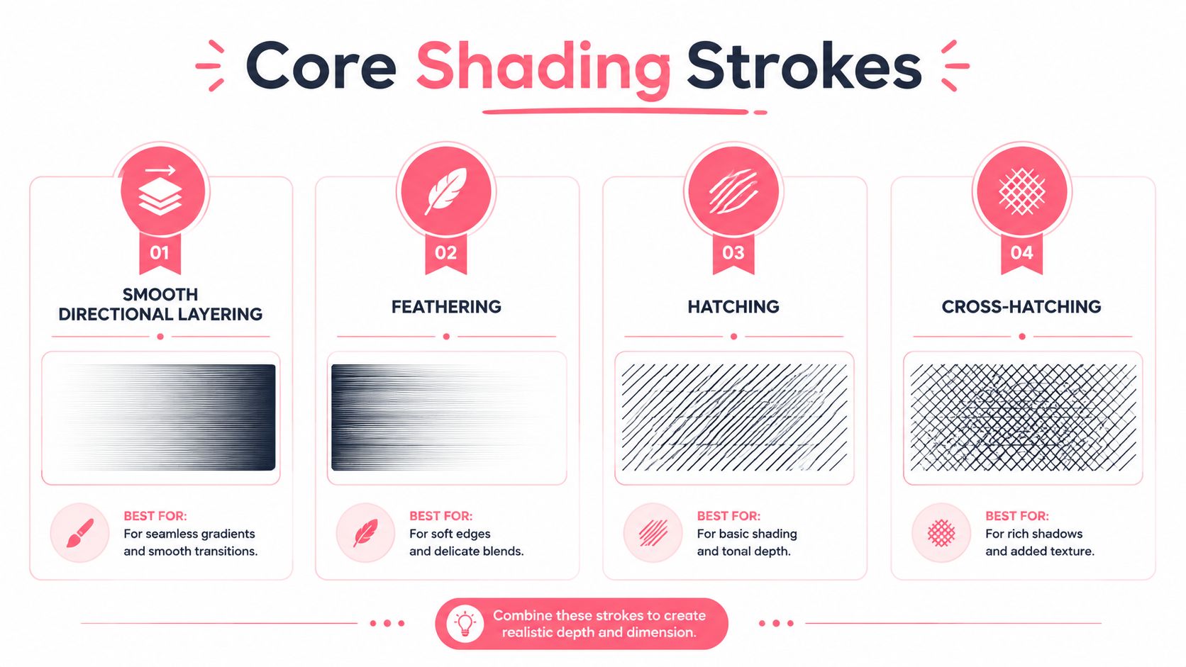
Different strokes solve different problems. Smooth directional layering gives you clean gradients, feathering softens an edge without making it disappear, hatching builds visible structure, and cross-hatching adds a tighter value step when you want texture instead of polish. The trick is not using one stroke for everything, because that's usually where marker work starts to look repetitive.
Smooth directional layering for flat, controlled fades
For broad areas, keep the stroke direction consistent and overlap lightly. A single direction keeps the fill calmer, especially on smoother marker paper, because the nib isn't fighting itself by changing angles every few millimeters. Use this when you want a shirt panel, a cheek, or a background wash to read as one continuous surface.
Feathering for soft transitions
Feathering works best when you're easing from one value band into another. Shorter strokes with lighter pressure let you pull pigment toward the transition edge without carving a hard line into the paper. It's the move I reach for when the form needs a rounded shift, not a visible edge.
Hatching and cross-hatching for texture
Hatching gives you precise control when the subject can tolerate visible linework. Cross-hatching tightens that control and can suggest fabric grain, wood texture, or a sketchier finish without forcing everything into a smooth blend. These methods are especially handy when the paper is already getting worked, because you're building value with structure instead of flooding it.
The cleanest stroke is the one that matches the surface. Hair doesn't want the same treatment as glass, and paper pulp doesn't want the same treatment as skin.
The practical version is easy to remember. Keep the strokes directional, lighten the pressure as the area fills, and blend while the ink is still active if you want soft edges. If the paper starts dragging, the stroke has probably outlived its best blending window.
The Layering Workflow for Smooth Blends and Soft Edges
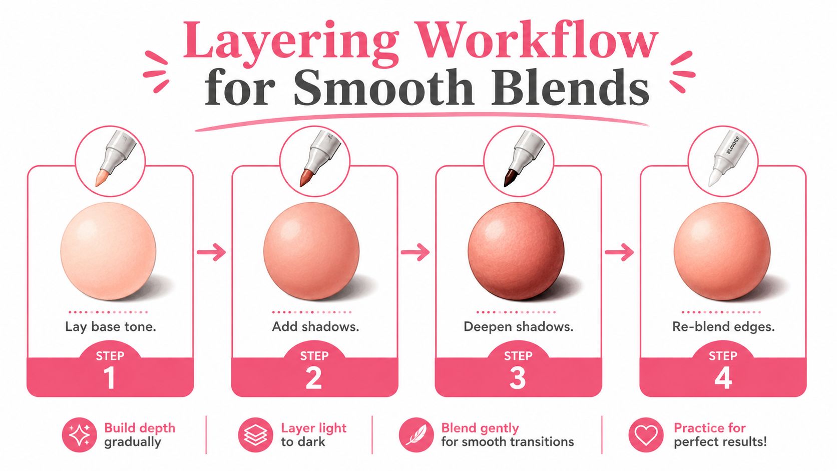
The best alcohol-marker shading usually starts lighter than people expect. Set the light source first, lay down the lightest/base tone, add the shadow color from the darkest area outward, then revisit the midtone and lightest marker to soften the transition. That layered dark-to-light reblend approach helps avoid the ugly little cliff where one value band slams into the next (step-by-step marker workflow).
Base tone first, shadow second, softening last
The lightest pass should cover the full form, except for the highlights you're intentionally preserving. From there, place the shadow color where the form turns away from the light, then pull that shadow outward with shorter overlapping strokes so the edge doesn't freeze in place. The final pass with the lighter marker is what relaxes the transition and keeps the blend from looking overworked.
Practical rule: if the shadow edge is already crisp, your next pass should soften it, not deepen it.
Stroke pressure matters more than most beginners expect. Broad fills work best with single-direction movement, while deeper values usually need repeated passes with less pressure so the paper doesn't saturate too quickly. If you bear down early, the surface gives you streaks, and once streaks set in, the fix is usually more restraint, not more ink.
Reserve highlights early
Leaving highlights for later is risky. Marker ink tends to saturate paper quickly, so once a zone has been filled, pulling it back to clean paper white becomes much harder. It's usually better to protect the highlight from the start and build around it.
That's where a colorless blender can help, but only when the timing is right. It's a tool for easing transitions, not a rescue device for a page that's already flooded. If you reach for it too late, you often end up spreading the problem instead of solving it.
A clean workflow feels almost slow at first. Lay the base, place the shadow, soften the edge, then stop before the paper starts looking thirsty in all the wrong ways.
Shading Walkthroughs for Skin Hair Fabric and Backgrounds
The same value system works across subjects, but each surface asks for a different rhythm. Skin needs gentle transitions and controlled highlights, hair reads best when shadow masses are grouped around roots, overlaps, and the heavier sections of the shape, fabric needs you to follow the fold structure, and backgrounds should usually stay quieter than the subject. Keep those jobs separate and the page starts to organize itself.
Skin and facial forms
Use the sphere logic here, because it keeps the value placement honest. The highlight belongs on the light-facing side, the core shadow sits opposite the light, and the reflected light should stay a little lighter than the core shadow so the cheek, forehead, or shoulder still feels round. A common mistake is making the shadow too broad too soon, which flattens the form and leaves no room for the middle values to breathe.
For skin, I keep the darkest accent small and deliberate, usually where the form tucks under another form or meets a contact shadow. That keeps the face from going muddy. The rest of the skin can stay in a narrower value range than people expect and still read as dimensional, especially if the lightest-first layering is doing the heavy lifting instead of forcing every pass darker.
Hair fabric and backgrounds
Hair reads best when shadow masses are grouped together, especially near roots, overlaps, and occluded areas. Lay a base tone in the direction the hair flows, then deepen the densest sections after the lighter layer has set. If every strand gets equal attention, the hair loses shape and starts looking frayed. The trade-off is clear, more strand-by-strand detail can add texture, but it also eats contrast fast and can make the whole passage look busy.
Fabric asks you to follow the fold structure. Thin cloth can take sharper shadow edges, while heavier fabric usually needs wider shadows with softer turns. The cleanest results usually come from mapping the fold, placing the lightest value first, then letting darker passes settle into the creases instead of outlining each wrinkle. A small change in pressure makes a big difference here, because saturated cloth areas can turn blunt fast if you keep pushing ink into the same spot.
Backgrounds are different again, because they support the subject instead of competing with it. Broad single-direction fills usually keep them calm, and if you want atmosphere, keep the background a little less contrasty than the foreground. That gives the subject room to hold the viewer's eye without the whole page fighting for attention.
The small contact shadow is doing more work than the broad dark patch ever will.
If you're planning a palette before you commit to a page, ColorBestie's palette generator can help you test marker combinations first. That is especially useful when you want the shadows to stay in family with the base color instead of drifting into a random gray.
Pro Tips and Fixes for Clean Marker Shading Every Time
A lot of marker trouble comes from trying to fix a layer before it's finished drying. Advanced guidance keeps warning artists to let layers dry between passes and to avoid pure black, while beginner-level work often runs into uneven saturation when the page gets pushed too hard (advanced marker shading guide). That's not a sign that marker shading is impossible, it just means the stop rules matter.
What to do when the page starts fighting back
If the blend turns streaky, stop adding pressure. A heavier hand almost never fixes a nib that's already dragging on saturated paper. Let the layer settle, come back with the lighter marker, and soften the transition with fewer passes than your instincts want.
- Patchy fill: Rework the area with lighter pressure and shorter overlap, not harder scrubbing.
- Hard edge: Revisit the transition with the midtone before adding more dark.
- Over-saturated paper: Pause and move to another section while the surface dries.
- Shadow too broad: Pull it back by tightening the dark accent instead of darkening the whole area.
- Value looks muddy: Test the next color on scrap first, especially if you're tempted to jump to black.
The other habit that saves pages is simple. Swatch the palette on the same paper, then compare the adjacent values before you commit. If you're using a mixed marker set and want to preview how a palette translates across brands, ColorBestie's Ohuhu converter can help you map similar color families before the nib hits the page.
The cleanest marker pages I've seen usually come from artists who stop early, pause often, and trust the value structure more than the urge to keep blending. That takes some nerve at first, but it's the difference between a page that looks polished and one that looks overcooked.
If you want to keep improving fast, pick one small subject, a sphere, an eye, a cupcake, a leaf, and practice the same light-first, dark-to-light reblend until your hand stops chasing the ink. Then visit ColorBestie to preview marker-style color ideas, compare palettes, and plan your next shading pass before you open the marker set.

