
You've colored the flowers, filled the character's sweater, and added a cheerful background. Then you look at the page and feel something's wrong. Nothing is technically unfinished, yet the picture feels crowded, heavy, or oddly difficult to read.
The missing ingredient may not be another color. It may be a shape you haven't colored at all.
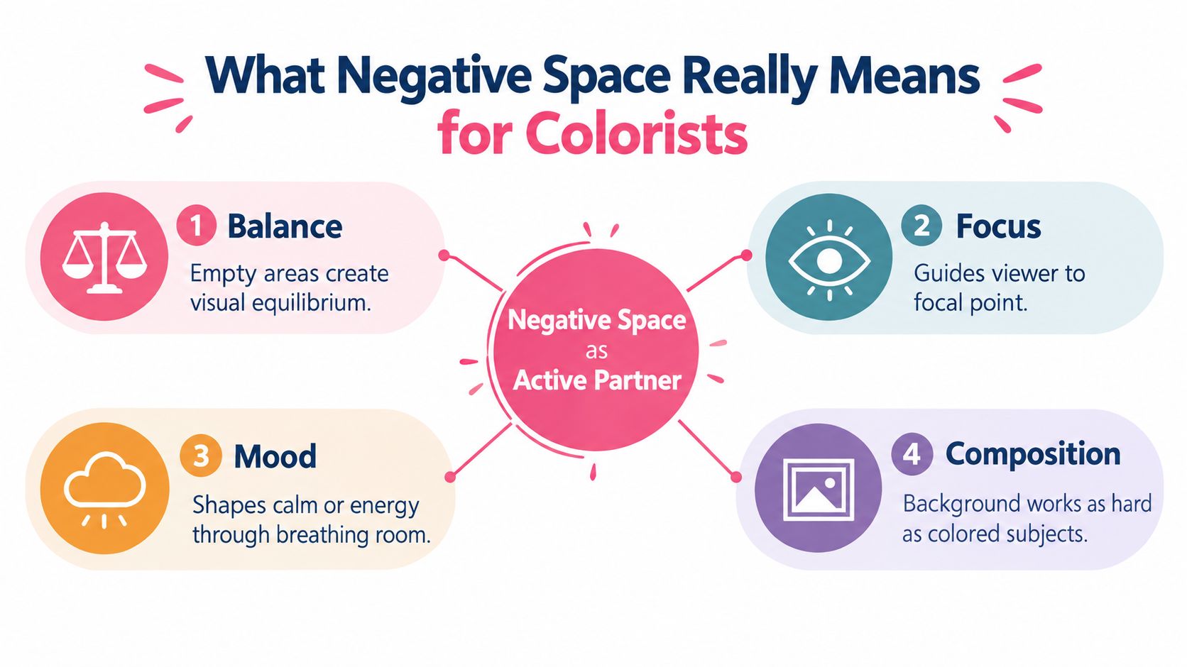
What Negative Space Really Means for Colorists
Negative space is the area around, between, and inside the subjects in an artwork. In marker coloring, it might be the paper around a bouquet, the gap between a character's arm and body, or the quiet patch behind a focal object. It isn't just leftover background. It helps decide where the eye rests, how quickly it moves, and whether the whole page feels peaceful or busy.
Historical art gives us a useful reminder. Some of the earliest documented uses of negative space appear in cave art from Argentina and France, where artists placed hands against cave walls and applied pigment around them, allowing the hand silhouette to emerge as the empty area. Much later, Swiss Style designers such as Josef Müller-Brockmann and Adrian Frutiger used generous whitespace to support legibility, simplicity, and information hierarchy. You can read more about this history in Jae Johns' overview of negative space.
Treat gaps as shapes
Try looking at a coloring page without naming the objects. Don't see “flower,” “mug,” or “cat.” See a pale wedge, a rounded pocket, a narrow channel, or a broad open field. This small change makes it easier to notice whether the surrounding shapes support one another.
A gap can be passive, giving a subject room to breathe, or active, deliberately shaped to become part of the visual message. Active negative space might form a second image, clarify a silhouette, or point toward the focal subject. Interaction Design Foundation's explanation of negative space makes this distinction useful for deciding how much openness your composition needs.
Studio reminder: The uncolored paper has a job. Give it one before you cover it with marker.
A calm page rarely leaves every area equally empty. Instead, it creates relationships. A large open background can make a small colored subject feel important, while a carefully preserved gap can separate two dark shapes and stop them from merging. That's why planning emptiness first often makes coloring feel less frantic. You're making fewer decisions after the ink is already down.
How to See and Plan Negative Space Before You Color
Start with a reference or line-art page and a soft pencil. Before choosing a palette, inspect the uncolored areas as carefully as you'd inspect the subject.
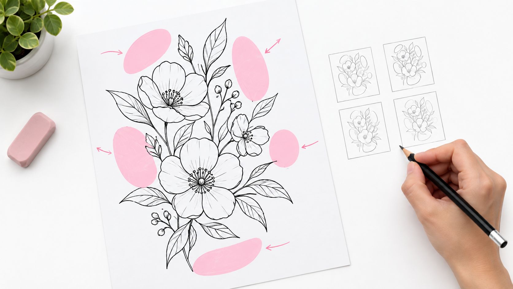
Use a five-part scan
Position: Mark the empty areas above, below, beside, and inside the subject. A gap near the focal point usually matters more than a distant patch of background.
Direction: Notice whether each space points inward, outward, upward, or diagonally. Long directional gaps can lead the eye, while cramped angles may make the page feel tense.
Form: Trace the boundaries of the empty area as if it were a solid object. Is it a crescent, triangle, soft oval, or irregular pocket? If you can't describe its shape, you may not be seeing it clearly yet.
Structure: Check which lines create the gap. A space enclosed by several contours may read as a distinct figure, while an open area may act more like a quiet field.
Size: Compare the spaces with one another. Several tiny gaps can create visual noise, while one broad interval can provide a strong pause. You're not searching for a formula. You're checking relationships.
This classification approach aligns with a practical workflow described in an RIT thesis on negative-space analysis, which recommends studying empty areas by position, direction, form, structure, and size.
Now make three thumbnail sketches. Use small boxes, simple silhouettes, and only a light mark for the main subjects. In the first thumbnail, preserve the largest open area. In the second, shift the focal subject slightly. In the third, simplify the background and remove one secondary shape.
Flip the reference upside down if the objects keep distracting you. Your brain will begin to read abstract boundaries instead of familiar things. You can also outline the gaps in a darker pencil and ignore the objects completely. If the empty shapes look balanced on their own, the finished coloring page will have a stronger foundation.
For a quick palette test, compare possible color families with the ColorBestie Palette Generator, then return to your pencil thumbnails. A palette can support the negative space, but it can't rescue a crowded arrangement.
This video can help you observe shapes through a drawing-focused process:
Keep the sketches loose. You're not making miniature finished art. You're checking whether the page still reads when detail disappears.
A Practical Marker Workflow That Protects Negative Space
Markers make it easy to keep adding. A soft shadow leads to a darker shadow, then a texture mark, then a background pattern to “finish” the area. A planned sequence gives you a stopping point.
Begin with value, not color
Make two or three tiny value thumbnails using a graphite pencil or gray marker. Reduce the page to light, middle, and dark areas. Reserve at least one clear light zone around the focal subject, then decide where the deepest darks will sit.
Block the lightest areas first. On alcohol-marker paper, test the marker on a scrap before touching the page because ink can spread differently across surfaces. Build light layers gradually, and leave the planned gaps untouched. If you need a soft transition, place the light edge near the negative space rather than flooding the whole background.
Next, add your middle values. Keep an eye on the boundaries between colored forms and paper. Those boundaries create the figure-ground relationship that lets the subject read quickly.
Translate previews carefully
A digital preview can suggest a direction, but your physical markers still need their own test strip. Compare the suggested relationships with the colors in your Ohuhu, Copic, or Prismacolor set. Look for a light family, a supporting middle value, and a dark accent that won't swallow the open areas.
Use a mobile preview before committing to details. Shrinking the image reveals whether the main subject remains clear and whether the negative shapes still separate neighboring forms. The ColorBestie Marker Comparison tool can help you compare marker families before you begin layering.
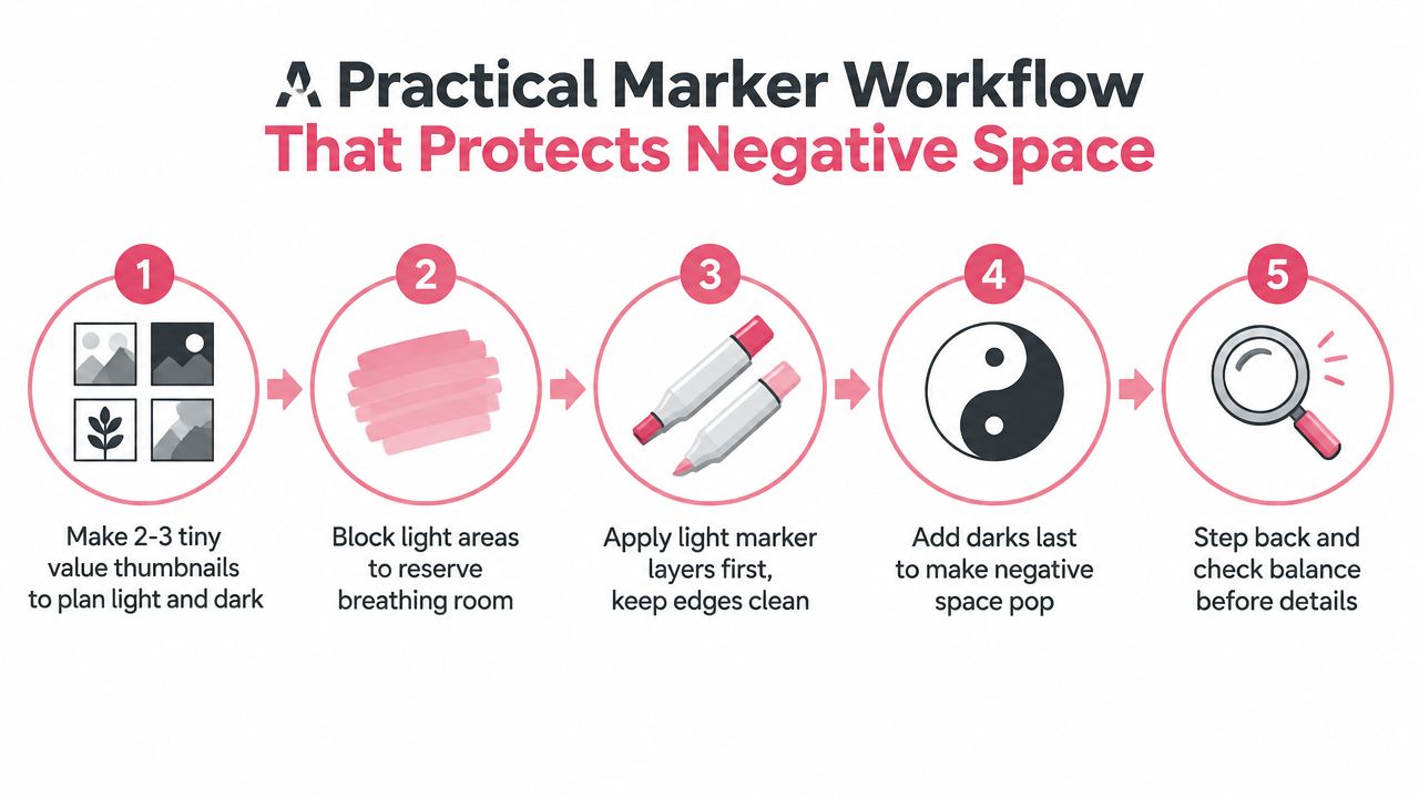
Put your darkest accents in last. Dark contrast can make a pale gap appear sharper, but too much dark ink around a narrow opening can close it visually. Step back, rotate the page, and cover sections with a clean sheet of paper to judge the composition in parts.
| Goal | Use Passive Space When | Use Active Space When |
|---|---|---|
| Give the subject room | You want a relaxed background or a gentle pause | You want the gap to point toward the focal object |
| Separate forms | The subjects already have clear silhouettes | Two shapes need a deliberate channel between them |
| Add meaning | The open area should remain quiet | The empty shape should suggest a symbol or second image |
| Support small viewing | The design needs simple, readable intervals | The gap must carry recognition at a reduced size |
A useful technical check comes from logo-design research on Gestalt principles. Proximity and closure help viewers complete partial forms, but too many competing shapes can weaken that effect. If your design stops reading when reduced to a simple silhouette, subtract before you add.
Common Mistakes That Crowd Your Composition and How to Fix Them
The most common mistake is treating every uncolored patch as unfinished. A patterned background may look tempting, especially when the subject feels simple, but filling each opening removes the pauses that separate one form from another.
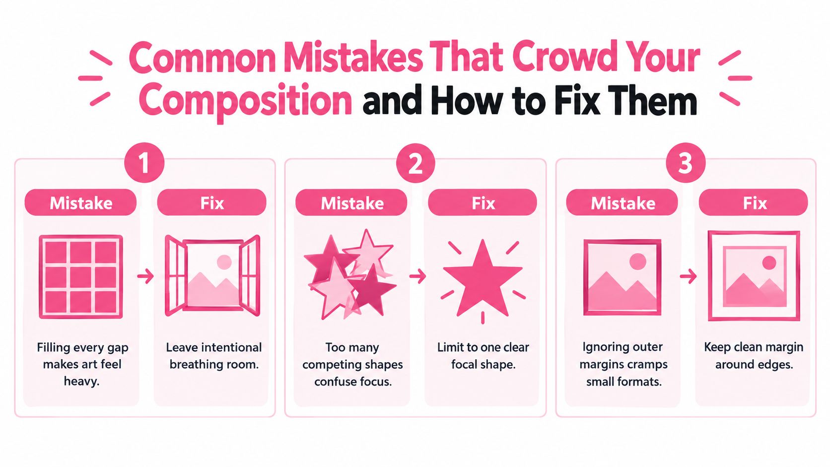
Compare the symptom with the repair
The page feels heavy: Cover part of the background with plain paper or a digital white layer. If the image becomes easier to read, restore only the shapes that support the focal point.
The focal point keeps moving: Find the strongest contrast and the busiest pattern. Soften one of them, then preserve a clearer opening around the subject you want viewers to notice first.
Two forms merge: Erase or leave a clean channel between them. Stronger contrast at the boundary can restore separation, but simplify nearby details if the gap is still hard to see.
The edges feel cramped: Check the outer margin before adding decoration. On a small page, a border pattern can compete with the subject and make the whole image feel pressed against its frame.
One-minute fix: Reduce the artwork to a flat silhouette. If the subject disappears into the background, reshape the empty areas before refining texture.
Gestalt closure can help a viewer understand an incomplete shape, but closure needs cooperation from the surrounding forms. Too many stars, leaves, dots, or decorative marks give the eye several unfinished messages at once. A simpler gap often communicates more clearly than a detailed one.
Try a subtraction pass. Use removable digital overlays, tracing paper, or a clean scrap sheet to hide one background element at a time. Don't ask whether the removed detail is attractive on its own. Ask whether the composition becomes clearer without it.
The same test works for a logo-style icon, sticker, or phone preview. If the mark needs a long explanation after reduction, the empty shapes aren't doing enough work yet.
Adapting Negative Space for Mobile Previews and Small Pages
A design that feels spacious on paper can look crowded on a phone. The screen reduces the viewing area, compresses small gaps, and makes nearby details compete more strongly. That's why you should judge negative space at the size where you'll share, reference, or display the artwork.
Mobile layouts also need comfortable outer margins. Recent design guidance recommends keeping mobile outer margins at least 5% of the width to preserve touch comfort, as described by Progression Agency's guide to negative space in design. Treat this as a practical starting point, not a substitute for checking your specific page.
Use a quick preview routine
- Photograph or scan the line art in even light.
- View the image at normal phone size, not only zoomed in.
- Check whether the focal subject still separates from its surroundings.
- Look for gaps that have collapsed into dark bands.
- Compare a calmer version with a more decorated version before choosing.
Spacing should follow relationships and final viewing size rather than instinct alone. Making the main subject larger isn't always the best answer. Sometimes a quieter background or a clearer interval creates hierarchy more reliably.
AI-assisted layout suggestions can offer useful alternatives, but inspect them like thumbnails. Reject any version that fills every opening, creates awkward tangencies, or leaves no comfortable margin for a small screen. The ColorBestie Theme Preview can support this kind of comparison while you decide which areas should stay quiet.
For touch-based viewing, keep important visual separations obvious. Tiny enclosed spaces may disappear under a finger or become hard to judge while scrolling. Preview early, before you commit to fine marker texture.
Starter Projects and Before After Checks to Practice Today
Practice negative space with subjects that have clear silhouettes. You'll learn faster when the project is small enough to finish and simple enough to inspect.
A floral vignette
Draw or choose one large flower with a few leaves. In the first version, color every background pocket. In the second, leave a broad field around the bloom and preserve one deliberate gap between overlapping leaves.
Compare the two at a reduced size. Does the flower feel more prominent when the background stays quieter? Then try active space by shaping one leaf opening into a clean curve that directs attention toward the center.
A cozy character spot
Use a small character sitting beside a mug, plant, or book. Keep the character's silhouette simple, then protect the spaces beneath the arms, around the legs, and beside the accessory. Color the character with a restrained marker family and let the surrounding paper provide separation.
For the after check, cover one decorative background detail. If the pose becomes easier to understand, the removed detail was competing with the figure.
A logo-style icon
Create a simple heart, animal head, leaf, or cup from a few bold shapes. Draw the positive form first, then design the cutout that sits inside or beside it. Test the icon as a solid silhouette and remove any narrow detail that disappears.
Use this checklist before adding final ink:
- Silhouette: Can you recognize the main subject without interior texture?
- Focal point: Does one area receive the clearest contrast or detail?
- Intervals: Are the important gaps distinct instead of pinched or merged?
- Margins: Does the composition have comfortable room around its outer edge?
- Reduction: Does the design remain readable in a small preview?
- Subtraction: Would removing one decoration improve clarity?
Keep the original and revised thumbnails beside the finished page. The comparison will show you where you protected space successfully, and where you filled an opening because it was available. That awareness is the skill. With each small project, you'll get better at deciding which blank areas should stay quiet and which deserve a deliberate shape.
Use ColorBestie to turn your black-and-white sketches into marker-style previews, compare palettes and marker families, and test negative-space decisions before you ink. Visit ColorBestie and make your next coloring session calmer, more planned, and easier to enjoy.