
You bought the pastel set for a reason. Maybe it was a row of soft pinks, dusty lilacs, and milky blues that looked like a dream in the box. Then you tried them on paper and got a surprise. Instead of airy, glowing color, the page looked flat, streaky, or oddly dull.
That's such a normal first experience with alcohol markers.
Pastels ask for a different mindset than bold marker colors. They're quieter. They're more translucent. They show every layering choice you make. A palette that looks beautiful on a phone screen can suddenly feel washed out on paper, especially when several pale colors sit side by side with no structure.
The good news is that pastel color palettes aren't mysterious. Once you understand how these colors behave in real marker ink, they become much easier to control. You don't need a giant set, and you don't need to memorize a hundred rules. You need a few dependable ideas, a better swatching habit, and a simple way to turn abstract color theory into actual marker choices you can trust.
Your First Step into a Softer World of Color
A lot of marker artists hit the same wall. They choose pastel color palettes because they want softness, calm, and that velvety look you see in finished illustrations. Then they color a flower, a face, or a sky, and the result feels weak instead of delicate.
The page usually isn't failing because the colors are bad. The problem is that pale marker colors don't behave like bold ones. They don't announce themselves. They need support from value shifts, thoughtful layering, and a small amount of contrast in the right places.
I see this all the time with new Ohuhu and Copic users. Someone picks six sweet shades of pink and peach, expecting them to blend into magic. On paper, those colors can merge into one blurry zone if their lightness is too similar. Another person copies a digital pastel palette exactly, then wonders why the marker version looks chalky. The screen showed glowing light. The paper shows ink soaking into fibers.
Pastels are gentle, not passive. They still need structure.
That little shift helps a lot. When you stop treating pastel markers like faint versions of bright markers, everything gets easier. You start asking better questions. Which shade is my lightest base? Which one carries form? Which one adds a tiny accent without breaking the soft mood?
That's when pastel color palettes become fun instead of frustrating.
Understanding the Language of Pastels
If pastel palettes ever feel slippery, it's usually because three color ideas are getting mixed together: value, saturation, and temperature. Once these click, choosing marker combinations gets much less random.
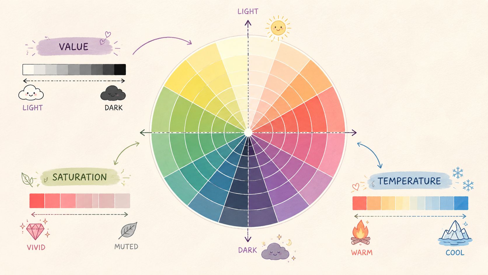
If you like testing ideas before touching paper, a theme preview tool for color moods can help you see whether a palette leans airy, cozy, cool, or warm.
Value gives pastels their airy shape
Value is how light or dark a color appears.
With bold markers, you can often see a value jump right away. With pastels, the jumps are quieter. That's why a drawing can look flat even when you technically used different colors. If those colors all live in a very similar light range, the form gets lost.
Think of value like pillows on a bed. If every pillow is the exact same pale cream, the arrangement feels soft but shapeless. Add one slightly deeper beige and one pale gray-blue, and suddenly you can see layers and depth.
For marker art, your pastel palette should include:
- A true light base for clean paper coverage
- A middle shade that can model form
- A slightly deeper note for folds, edges, or shadow zones
Without that spread, pastel work often reads as unfinished.
Saturation controls softness without turning muddy
Saturation is the intensity of a color.
People often assume pastel means “add white.” In practice, marker pastels can also drift toward gray, beige, or dusty undertones. That can be beautiful, but it can also make a palette collapse if every color is too muted.
A useful way to think about it is this:
- Low saturation with clean undertones feels airy
- Low saturation with too many mixed undertones starts to feel muddy
- One slightly clearer accent can wake up the entire palette
Practical rule: If your page looks sleepy in a bad way, your colors may not need to be darker. They may need one cleaner, slightly less muted partner.
This matters a lot for alcohol markers because ink layers physically mix on the page. If you stack too many dusty tones in the same area, the softness can turn stale.
Temperature changes the mood fast
Temperature means whether a color feels warm or cool.
Warm pastels include peach, butter yellow, blush pink, and soft coral. Cool pastels include mint, lilac, powder blue, and pale aqua. Neither group is better. They just tell a different emotional story.
A warm pastel palette can feel cozy and nostalgic. A cool one can feel quiet and misty. Mixing both can work beautifully, but you need a dominant side. If the balance is unclear, the piece can feel undecided.
A simple comparison helps:
| Mood | Typical pastel direction |
|---|---|
| Gentle spring feeling | Warm pinks, soft yellow, light leaf green |
| Dreamy evening feeling | Lavender, blue-gray, dusty rose |
| Fresh and crisp feeling | Mint, pale aqua, cool pink |
When you understand these three controls, pastel color palettes stop being a guessing game. You're not just picking pretty pens anymore. You're deciding how light, how quiet, and how warm the whole page should feel.
Crafting Harmonious Pastel Palettes
Pretty pastel sets tempt you to use everything at once. That's where many pages lose clarity. Harmony usually comes from restraint, not quantity.
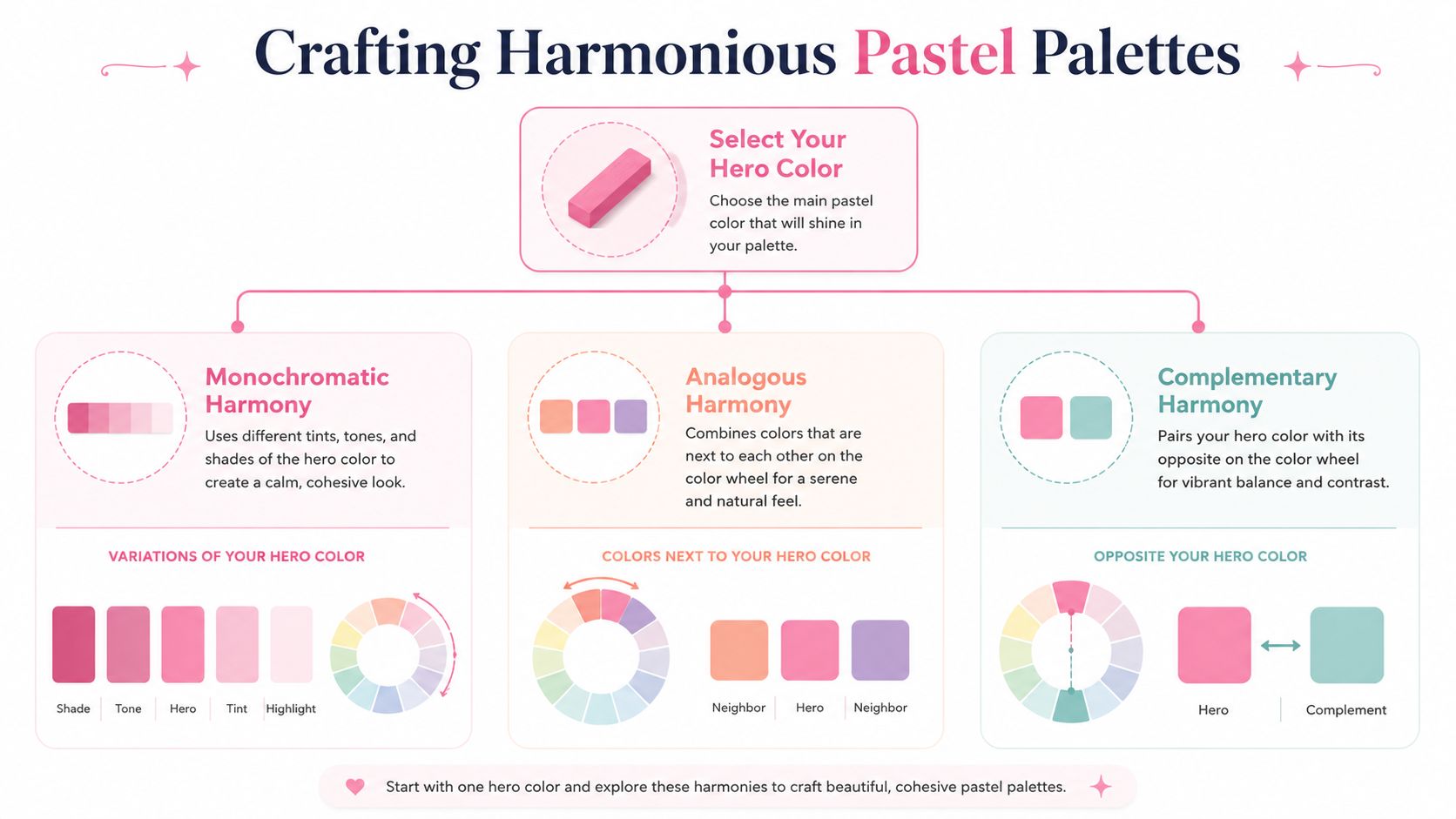
A pastel-friendly palette generator can give you a starting point, but the most useful skill is learning how to build a palette by eye and by purpose.
Start with one hero color
Pick one color to lead. That's your hero color.
If you choose powder pink, the rest of the palette should support powder pink. They don't all need to match it exactly. They just need to make it look intentional. This one decision keeps a palette from turning into a random handful of nice markers.
A hero color works best when you ask three questions:
- Where do I want the eye to rest first?
- Do I want the page to feel warm or cool?
- Will this color cover a large area or a small one?
A mint hero color behaves differently from a peach one. Mint often likes neighboring cool shades and a muted warm accent. Peach often likes warm neighbors with one cool balancing note.
Use simple harmony recipes
You don't need advanced theory to build strong pastel color palettes. A few classic recipes are enough.
Monochromatic
This means several versions of one family, like pale lavender, mid lavender, and dusty violet.
It's one of the safest choices for soft marker art because everything already relates. The risk is blandness, so include a small shift in value.
Analogous
These are neighbors on the color wheel, such as pink, peach, and soft yellow, or mint, aqua, and blue.
Analogous pastel palettes feel natural and calm. They're great for florals, clothing, backgrounds, and cozy scenes because the transitions are easy to blend.
Complementary
These pair opposites, such as pink with soft green, or lavender with pale yellow.
With pastels, complements need a delicate hand. You usually don't want equal amounts of both. Let one lead and use the opposite as a quiet accent. That's how you get sparkle without losing softness.
A complement in pastel work should whisper, not shout.
Why fewer colors often look better
This is the part many marker artists find relieving. You do not need a giant pastel lineup for a page to feel rich.
Cognitive research notes that the true limit for distinct, pop-out color recognition is 5–7 colors, and for alcohol marker hobbyists using pastels, going beyond that can create a wash-out effect where low-intensity hues become harder to distinguish, especially in low light, as explained in this discussion of color limits in palette design.
That idea translates beautifully to marker work. If you put too many pale colors together, your eye stops reading them as separate choices. They blend into a haze.
A practical pastel palette often looks like this:
- One hero color
- Two close partners
- One lighter support shade
- One darker anchor
- One small accent, if needed
That keeps the page readable while still feeling gentle.
Here's a sample thinking process for a cozy character illustration:
| Role in palette | Example direction |
|---|---|
| Hero | Dusty peach |
| Partner | Blush pink |
| Partner | Butter cream |
| Light support | Soft ivory |
| Dark anchor | Warm taupe |
| Accent | Pale sage |
That palette gives you softness, enough separation, and one grounding note so the page doesn't float away.
When your palette feels boring, the answer usually isn't “add ten more colors.” It's “choose better jobs for the few colors you already have.”
From Screen to Paper Translating Palettes to Markers
A digital palette can look perfect and still fail once you try to match it with real markers. Screens glow. Marker ink absorbs. Digital swatches can also look smoother and cleaner than a pastel marker stroke on paper.

Digital palettes and marker ink are not the same thing
This is the bridge most color guides skip.
A hex color on a screen gives you an idea, not a guarantee. A marker's physical appearance depends on the paper, the nib, the layering, and how translucent that marker is in practice. That's why a “dusty rose” inspiration image may need one answer in Copic, another in Ohuhu, and a different compromise in Prismacolor.
One option is to use a tool that compares marker families directly. ColorBestie's marker comparison tool is built for matching palette ideas across brands like Ohuhu, Copic, and Prismacolor. If you prefer working manually, you can still get very close with printed or handmade swatch charts.
A simple translation table
The names below are conceptual. They're placeholders for the kind of soft colors artists often want to match across systems.
| Sample Pastel Palette Translation (Copic, Ohuhu, Prismacolor) | Copic Sketch | Ohuhu Honolulu | Prismacolor Premier |
|---|---|---|---|
| Light lavender | Match from your swatch chart | Match from your swatch chart | Match from your swatch chart |
| Dusty rose | Match from your swatch chart | Match from your swatch chart | Match from your swatch chart |
| Pale mint | Match from your swatch chart | Match from your swatch chart | Match from your swatch chart |
| Powder blue | Match from your swatch chart | Match from your swatch chart | Match from your swatch chart |
That might look simple, but it reflects an honest reality. Marker translation is not exact enough to fake with made-up codes. Your own swatch chart is the trustworthy part.
A reliable manual matching method
When you want to translate pastel color palettes from phone or tablet to paper, use this sequence:
- Start with the mood, not the code. Ask whether the source color feels milky, dusty, cool, or creamy.
- Compare in families. Don't hunt across your whole marker case. Pull all your pinks, or all your blue-violets, then compare within that group.
- Check the dried swatch, not the fresh stroke. Alcohol marker ink often shifts as it settles.
- Test next to neighbors. A pastel can look right alone and wrong inside the full palette.
- Accept close matches. With physical media, harmony matters more than exact duplication.
The goal isn't perfect translation. The goal is a believable family resemblance once the colors live together on paper.
That mindset saves a lot of frustration. Digital color theory gives you a map. Marker swatching gives you the road.
Techniques for Flawless Pastel Application
A soft palette only works if the application stays soft. This makes pastel marker work a physical process. Your hand pressure, layering order, and swatching habits matter just as much as your color choices.
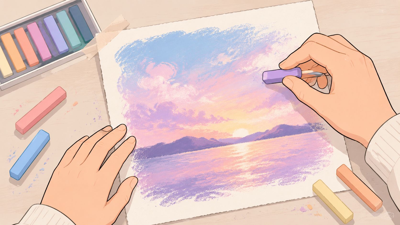
Swatch before you color
If you skip swatching with pastels, you're working blind.
A validated benchmark for pastel alcohol marker swatching uses a strict light-to-dark order within each color group, followed by a test run of the swatch chart to verify chromatic order. That same benchmark notes that pastel hues are easy to misorder because of their translucency, and that misordering can reduce color harmony success by about 35% if it isn't corrected, according to this pastel marker swatching reference.
That sounds technical, but the practical lesson is simple. Your eye can confuse pale shades very easily.
Try this swatching setup:
- Make separate rows for pinks, peaches, mints, blues, violets, and neutrals.
- Place each family from lightest to darkest.
- Add a second pass beside each swatch if you commonly layer.
- Do a quick mini-gradient with neighboring colors to check whether the order really works.
Many artists discover that two markers they assumed were different are almost identical once dry. Others find that a slightly deeper shade blends more smoothly than the one they thought belonged in the middle.
Blend with a light hand
Pastels can turn streaky or cloudy when you overwork them.
A cleaner approach is to let the first layer dry slightly, then add the next shape with intention. Use the lighter marker to soften the seam rather than flooding the whole area again and again.
A few reliable methods help:
- Feathering: Pull small strokes from dark into light, then soften with the lighter marker.
- Tip-to-tip charging: Touch a darker marker to a lighter one briefly, then apply for a tiny gradient effect.
- Layered glazing: Build color slowly in transparent passes instead of chasing full saturation at once.
The swatching reference above also notes that pastel markers are more translucent than standard colors and often need 2–3 additional layering steps for full saturation in background shading applications. That's useful because it explains why pale backgrounds often look patchy at first. The answer isn't panic. It's patient layering.
Here's a quick visual demo to study before practicing your own blends:
A soft pastel skin method
Pastel skin is where many artists either fall in love with these colors or give up on them. The trick is realizing that skin in pastel marker work isn't one flat peach.
A useful expert method for skin rendering starts with a light base layer, such as powder pink light, marker 27, across the entire portrait to remove the white of the paper. Then a slightly darker pink, such as gladiolus, marker 415, goes only in vascular areas like the eyelids, ears, cheeks, and lips. After that, cool blue tones such as pale azure, marker 401 establish shadows and separate contours. That process is described in this pastel marker skin rendering demonstration, which also notes that success rates exceed 90% when artists avoid black outlines that break the organic pastel look.
That last point is gold. Harsh black linework can make delicate marker skin look pasted together instead of living and soft.
Use this order when practicing:
- Base first. Cover the full skin area lightly so no paper specks interrupt the softness.
- Warmth second. Add pink only where blood flow naturally shows through thinner skin.
- Cool shadows third. A pale cool blue can create believable form without dirtying the face.
- Edges last. Keep them soft where possible. Let color separation do more of the work than heavy outlines.
Soft skin usually needs warmth and coolness at the same time. If you use only pink, the face can look flat. If you use only gray shadows, it can lose that fresh pastel glow.
This method works for portraits, manga coloring, fairy characters, and even stylized fashion art. The exact marker numbers may vary by brand, but the logic stays the same.
Keeping Pastels Fresh and Accessible
Pastels have a lovely reputation. They feel calm, sweet, and easy to live with. But that reputation can hide two common problems. First, pastel pages can go muddy or washed out. Second, they can become hard to read for some viewers.
When colors turn muddy
Muddy pastels usually come from one of three habits. You layered too many neighboring dusty tones, you blended back and forth too long, or your palette didn't have enough value separation.
The fix is usually small, not dramatic.
- Pause earlier: Let one pass dry before deciding it needs more.
- Separate undertones: If your peach, beige, and pink all lean gray-brown, trade one out for a cleaner version.
- Protect your lightest area: Leave at least one region that stays pale and open.
When the whole page looks washed out
Wash-out feels different from mud. The colors aren't dirty. They just don't stand apart.
That often happens when every color is equally light and equally quiet. A soft page still needs one anchor. It might be a muted taupe, a cooler shadow, or a small accent that gives the eye something to hold onto.
A good rescue move is to add contrast through value, not through harsh color. Instead of grabbing a loud bright marker, deepen one existing family slightly and repeat it in a few strategic spots.
Making pastel palettes easier to read
Accessibility matters here more than many art guides admit.
Research confirms that pastel palettes can evoke calmness, but they are also the least accessible for people with color vision deficiency because of low contrast and close hue relationships, as discussed in this overview of accessible color palettes and CVD concerns. That same discussion notes that mainstream pastel guides for artists usually don't include CVD testing or “bridge colors” that help connect hues more clearly.
That gives you a helpful challenge as an artist. Don't judge your pastel color palettes only by how soft they look to you. Judge them by whether their shapes remain readable.
Try these habits:
- Check lightness differences: Two soft colors can share a mood but still differ clearly in value.
- Use bridge colors: A muted neutral or softened in-between tone can connect neighboring hues without making them collapse.
- Test your palette in a simulator: If a combination becomes confusing, adjust lightness before changing everything else.
Inclusive color choices don't make pastel art less dreamy. They usually make it stronger.
If you want a quicker way to test pastel color palettes before committing ink, ColorBestie lets you preview marker-style color ideas and compare them against real marker brands, which can make the jump from inspiration image to swatched palette much easier.
