
You've collected a beautiful folder of warm interiors, muted portraits, paper textures, and color swatches. Then you open your coloring page, sketchbook, or room project and freeze. Which orange belongs in the shadows? Is that soft sage compatible with the brown you saved? Should the finished piece feel rustic, nostalgic, dramatic, or all three?
That's where mood board creation becomes useful. A good board isn't a decorative collage you admire once and abandon. It's a compact decision system that helps you choose, remove, compare, and translate visual ideas into materials you can use.
Why Mood Boards Work and When You Need One
A mood board gives scattered preferences a visible structure. Instead of holding “cozy autumn” or “quiet futuristic city” in your head, you place colors, objects, textures, images, and words side by side. That makes conflicts easier to spot before they reach the final artwork.
The distinction matters. Inspiration gathering asks, “What do I like?” Visual communication asks, “What should this project feel like, and how can another person understand that quickly?” A client board needs to create shared direction. A personal coloring board needs to reduce hesitation. A concept board for a character or setting needs to establish relationships between palette, texture, lighting, and atmosphere.
I've found that boards save the most time when a project has several decisions that could drift. You might begin with a soft, low-contrast palette, then add a bright accessory, a saturated background, and a dramatic shadow. Each choice can look fine alone, but together they may no longer support the original mood. A reference board gives you something concrete to check against.
For brand and client work, the same principle applies to imagery. A focused visual direction can help keep selected images aligned with the intended identity, an idea explored further in this guide to why on-brand imagery makes a real difference in SEO.
Decide what job the board must do
Before opening Pinterest, Canva, or a sketchbook, name the board's purpose.
- Client presentation: Make the intended style understandable without a long explanation.
- Coloring project: Turn a vague atmosphere into usable color, value, and blending choices.
- Character design: Connect clothing, environment, props, and lighting.
- Interior concept: Compare furniture, surfaces, textiles, hardware, and paint direction.
- Open exploration: Collect possibilities first, then narrow them into a direction.
Mood boards have roots in early twentieth-century design practice, while the standardized term became associated with the 1980s. Digital tools made boards easier to create, share, and revise, helping them move beyond specialist studios into everyday creative workflows, as described in this design history of mood boards.
A board becomes overkill when the project has no meaningful choices left. If you're coloring a small object with a palette you already know, a full collage may slow you down. If you're developing a whole scene, client concept, or coordinated room, the board can prevent far more rework than it creates.
Key takeaway: Build a mood board when you need to make visual decisions, not simply when you want to collect pretty images.
Define Your Direction Before You Collect Anything
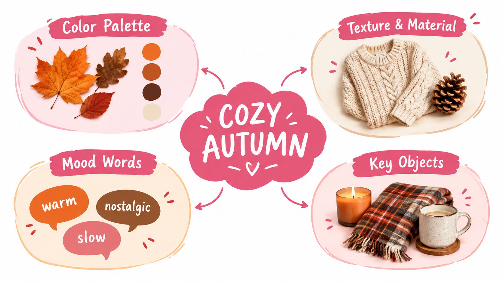
The fastest way to create a messy board is to begin collecting before you know what you're asking the board to solve. “Cozy autumn” sounds clear until you have to decide whether it means candlelit amber, foggy olive, rustic brown, faded denim, or deep berry.
Start with a short brief. Keep it practical rather than poetic.
- Purpose: What will this board guide? A coloring page, character, room, illustration, client pitch, or material study?
- Feeling: What should the finished work make someone feel?
- Audience or setting: Who is it for, and where does it belong?
- Non-negotiables: Which colors, objects, materials, characters, or constraints must remain?
- Avoid list: What would push the work away from the intended direction?
Then reduce the idea to three to five concrete keywords. Choose words that can influence a decision. “Warm,” “nostalgic,” and “slow” are more useful than “beautiful,” because they suggest color temperature, texture, pacing, and object choice. For a manga character, “rainy,” “restless,” and “neon-reflected” point toward different lighting and edge decisions than “cool anime style.”
Turn vague moods into constraints
A useful direction usually contains a relationship, not just a list. Try pairing an emotional word with a physical quality:
- Nostalgic plus faded paper
- Energetic plus sharp contrast
- Calm plus matte stone
- Playful plus rounded shapes
- Dramatic plus directional light
For a hobby coloring project, you might write: “Quiet woodland kitchen, warm but not orange, aged wood, cream ceramics, one muted green accent.” That brief already guides collection. It tells you to look for wood grain, ceramic highlights, restrained greens, and a warm palette that won't turn every surface orange.
For an interior project, define the materials early. “Rustic cabin” could mean rough timber and wool, or polished dark wood and leather. Those choices create different color behavior. Markers also react differently to the same conceptual palette depending on whether you're representing fabric, foliage, glass, or painted metal.
A direction is specific enough when it can reject an image. If your keywords approve everything, they aren't doing enough work. Ask of each potential reference, “Which word does this serve, and what decision could I borrow from it?” If you can't answer, save it elsewhere rather than weakening the board.
Research on the mood board process describes a cycle of collecting, constructing, then reflecting and iterating. It also emphasizes defining keywords and editing diverse references into a cohesive visual whole that communicates color, shape, materials, and finishes for the next phase, as outlined in this study of mood board creation as a design process.
Gather and Curate Imagery Palettes and Textures That Tell One Story
Collect broadly for a short while, then curate firmly. Your source pool can include photographs, fabric scans, paint chips, packaging, typography, architecture, objects, line drawings, shadows, and physical samples. A board built only from finished artworks may look polished, but it often gives you less practical information about surface, scale, lighting, or material behavior.
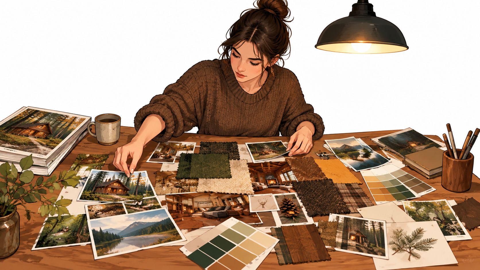
I like to collect palette seeds early. A palette seed might be the muted blue of a shadow, the ochre in old paper, or the green-gray of eucalyptus. It doesn't need to become a final color. Its job is to reveal a relationship worth exploring.
Use three filters before anything earns a place
Relevance: Does the reference support the stated mood, setting, or material?
Information: Does it teach you something about color, shape, texture, lighting, proportion, or atmosphere?
Compatibility: Can it sit beside the other references without pulling the project into a competing story?
Cut images that repeat information you already have. If six photographs all say “wooden table,” keep the one with the clearest grain or most useful lighting. Remove images that are attractive but too specific to reproduce. A highly styled photograph may inspire an atmosphere, but a close view of fabric, plaster, foliage, or ceramic can give you more actionable material guidance.
Group your collection in several passes. First sort by feeling, then by color family, and finally by material or visual behavior. This reveals whether the board is coherent or merely crowded with individually appealing pieces.
A useful board often needs contrast. Include light and dark values, broad and fine textures, quiet areas and focal details. Without that range, a marker palette can become flat. With too much range, the finished work may lose its mood.
The ColorBestie Palette Generator can help you explore relationships from a visual starting point, but treat generated suggestions as prompts to evaluate. Your paper, marker set, blending habits, and desired finish still determine what belongs in the final system.
Studio rule: Keep the reference that gives you a decision. Cut the reference that only gives you a feeling you already understand.
Digital boards are convenient for swapping, cropping, and comparing. Physical boards are valuable when you're working with actual paper, fabric, printed swatches, or objects whose texture and reflectivity matter. Don't force one format to do everything. A digital board can establish direction, while a small physical test strip can tell you whether your chosen markers behave well on the surface you'll use.
Use the following video as a visual prompt for observing how arrangement and material references work together:
After collecting, step away and return with a cutting mindset. Remove anything that introduces an unrelated era, lighting condition, saturation level, or material language. The finished board should feel like one conversation, not a group chat where everyone is speaking at once.
Compose a Balanced Layout That Guides the Eye
Arrangement changes meaning. The same images can suggest a calm, considered project when aligned with space between them, or an energetic scrapbook when layered and tilted. Composition should serve the board's job, especially when someone needs to understand the direction quickly.
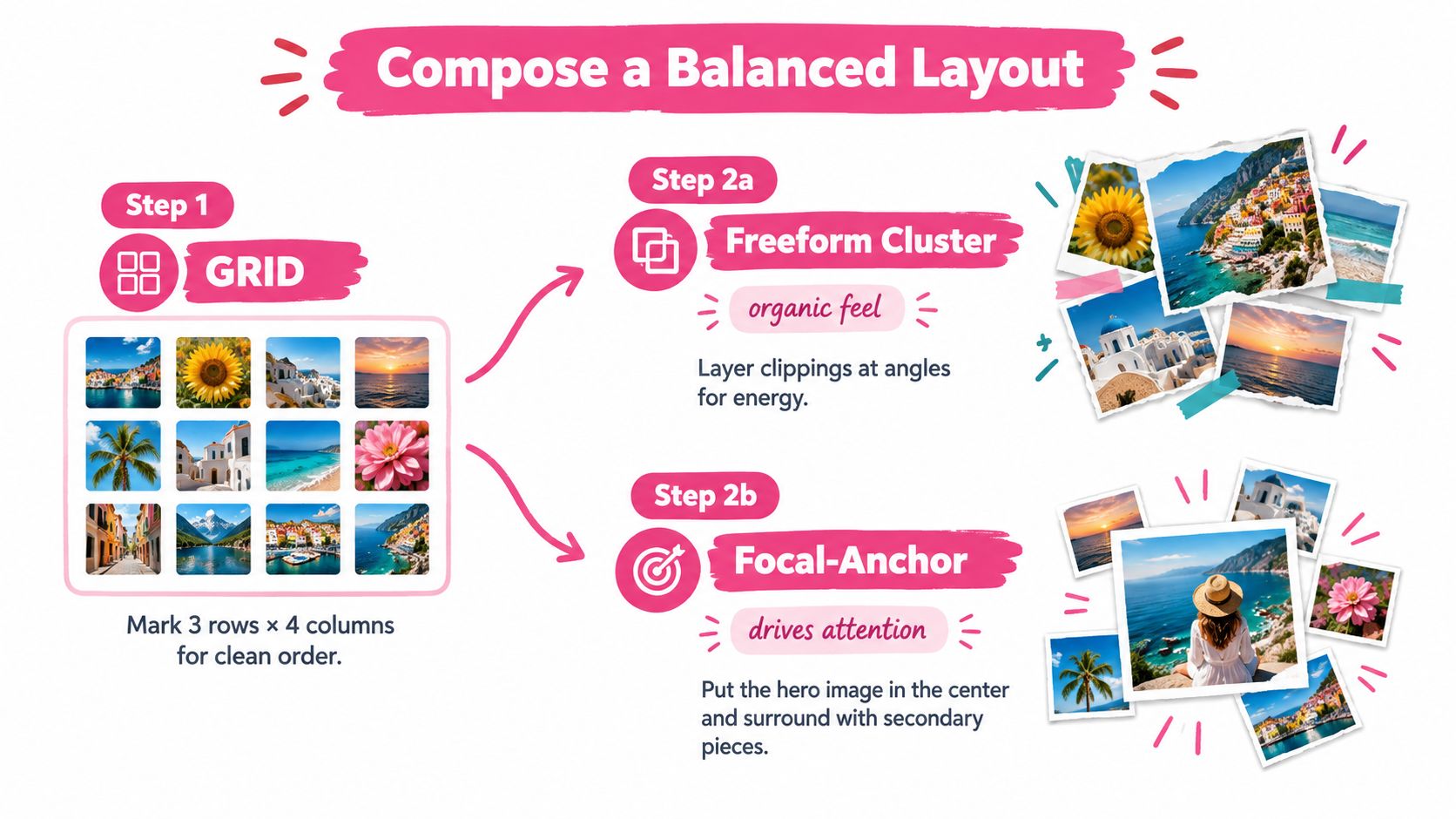
Choose a layout before placing every item. A grid works well for client communication, palette studies, and material comparison. A freeform cluster creates a more tactile, expressive feeling. A focal-anchor layout uses one dominant image to establish the emotional center, then surrounds it with supporting references.
Build hierarchy instead of equal volume
Start with the hero image or central reference. It might show the intended lighting, the main room atmosphere, the character's silhouette, or the emotional temperature of the coloring project. Make it large enough to establish direction immediately.
Add secondary images to answer practical questions:
- What materials are present?
- Which colors repeat?
- What kind of edges, shapes, or patterns matter?
- Where does the light come from?
- Which object or detail provides contrast?
Place swatches near the references they explain. A row of color chips at the bottom is easy to ignore. A small set positioned beside the fabric, foliage, or object that inspired it creates a stronger connection between idea and application.
White space is an active tool. Crowding every corner makes references compete and makes small color differences difficult to judge. Empty space also gives the eye a resting point, which helps a focal image carry more weight.
Try a three-second read. Glance at the board briefly, then look away and name the first mood, color family, and material you remember. If your answer is “a little bit of everything,” simplify the composition.
Choose the right format for the viewer
A physical board benefits from real samples, layered edges, and visible surface changes. A digital board needs clean cropping, readable labels, and enough resolution to judge detail. If the board will be viewed on a phone, test it at a small size. If it will be printed, check whether pale colors disappear or dark areas merge.
For digital work, create a version that can be edited and a presentation version that is visually clean. Keep the source images and notes in a separate folder. That way, you can revise the board without damaging the file you share.
A quick refinement often makes a bigger difference than another hour of collecting. Reduce the size of a secondary image, align mismatched edges, move the palette closer to the central reference, or remove a texture that dominates the page. A board should guide the eye from broad mood to useful detail.
Practical check: Squint at the board. If the hero image doesn't remain clear and the value structure collapses, the layout needs editing before the palette does.
Translate Your Board Into Marker Ready Color With ColorBestie
A mood board becomes useful for coloring when it tells you what to do with ink. Digital inspiration often contains more colors than your marker set can reproduce cleanly, and a screen can make neighboring hues appear more distinct than they will on paper. Palette translation turns that visual abundance into a controlled working plan.
Begin by extracting a small group of functional colors, rather than copying every visible shade. Choose a light base, a middle local color, a deeper shadow family, an accent, and any neutral needed to calm the composition. You can add supporting colors when the material requires them, but every added marker should have a job.
Map colors by function
Think in roles instead of isolated names:
- Base color: The main family for a surface, garment, object, or background.
- Shadow color: A darker or cooler relative that establishes form.
- Light color: A pale marker, paper reserve, or lighter adjacent family.
- Accent color: A controlled point of attention.
- Neutralizer: A gray, beige, brown, or muted companion that prevents saturation from spreading everywhere.
Mark the light direction directly on the board with a small arrow. Note whether shadows should lean warm or cool. Write the blending order beside each material. For example, a wood area may need a pale base, directional grain, a darker edge, and a restrained shadow. A soft sweater may need broader layered strokes and less hard contouring.
ColorBestie can turn a sketch or board image into a marker-style color preview, with theme choices organized around palette, mood, style, lighting, and genre. It supports marker-oriented exploration across series including Ohuhu, Copic, Prismacolor, Winsor & Newton, and Spectrum Noir. Use the preview as a planning reference, then verify the result with your own marker swatches on the paper you'll use.
Compare palette approaches before committing
| Board Need | Best Marker Approach | When to Use It |
|---|---|---|
| Soft, nostalgic atmosphere | Muted base families with gentle value steps | When the board relies on aged paper, warm neutrals, faded fabric, or quiet light |
| Strong focal character | Restrained surrounding colors with one clearer accent family | When clothing, face, prop, or central object must attract attention |
| Natural materials | Layered earth colors with separate shadow and texture choices | When representing wood, foliage, stone, leather, or ceramic |
| Neon or graphic contrast | Clear dark structure with selective saturated accents | When the board depends on signage, reflected light, technology, or bold shape language |
| Limited marker collection | Choose versatile families that can serve several material roles | When you need flexibility more than exact screen matching |
Use Marker Comparison to examine how different marker families may cover the same board direction before buying or opening a set. Similar-looking colors can behave differently in saturation, transparency, nib response, and blend quality, so a digital match is only the beginning of the decision.
The most reliable test is physical. Make a swatch strip with the paper, layering order, and pressure you expect to use. Put the strip beside the board, not in a separate notebook. That lets you judge the relationship in context.
Research on structured digital mood boards describes iterative cycles that connect user requirements with designer output. It also reports that consistent image sizing and title formatting improve comparison, while semantically aligned references can improve perceived board quality, as documented in this research on digital mood-board systems. For marker work, the practical translation is simple: consistent swatches, clear labels, and a palette tied to the board's meaning make choices easier to compare.
Don't chase a perfect screen match. Your goal is a repeatable marker system that preserves the board's mood while respecting real ink, paper, blending, and drying behavior.
Templates Checklist and Inspiration to Keep You Creating
A reusable template keeps mood board creation from becoming a fresh organizational puzzle every time. Make one version for each recurring kind of work, then adjust only the parts that change.
For a coloring page, include the subject image, mood keywords, light direction, background family, skin or material notes, and marker swatches. For character design, reserve areas for silhouette, clothing references, props, expression, environment, and accent color. For an interior concept, include flooring, wall direction, large furniture, textiles, hardware, lighting, and small objects that establish scale.
Keep a one-page review checklist
- Purpose: Can you state what the board will guide?
- Direction: Do the keywords describe decisions rather than vague approval?
- Curation: Does every image contribute information or a necessary feeling?
- Hierarchy: Is one reference clearly leading the eye?
- Materials: Can you identify the surfaces, textures, and objects that matter?
- Palette lock: Have you selected functional marker roles and tested them physically?
- Lighting: Is the light source and shadow temperature written down?
- Removal pass: Did you delete anything that introduces a competing story?
- Final read: Can another person understand the intended direction quickly?
Save the final board with its swatch strip, notes, and rejected references. The rejected folder can become useful later, especially when a new project needs a different mood. Archive by project name and theme, then add a short note explaining what worked and what caused trouble.
Reflection is part of the process, not a sign that the first board failed. The established workflow of collecting, constructing, reflecting, and iterating gives you permission to revise the board after you test colors or materials. A board that changes in response to evidence is doing its job.
Find inspiration through ordinary sources too, such as packaging, weather, shop windows, old books, tiled floors, plants, and clothing. Study relationships rather than copying a finished image. Ask why a combination feels calm, lively, worn, elegant, or tense, then rebuild that logic with your own references.
Build a small library instead of waiting for one perfect board. Create one modest board today, translate its palette into swatches, and use the checklist before you start the final piece.
ColorBestie helps you turn sketches and visual references into marker-style color inspiration, then compare palette ideas with tools for palette building, theme previews, and marker sets. Visit ColorBestie and create one board-backed color plan for your next page, character, or illustration.

