
You've spent an evening copying a portrait from a photograph. The drawing is careful, the colors seemed close on the palette, and yet the finished face looks flat, chalky, or strangely plastic. Adding smaller details only makes the problem more obvious.
That frustration is normal. Oil painting realism isn't pixel copying. It's the controlled organization of value, temperature, edges, surface, and drying layers so the viewer's eye accepts a painted surface as a believable form. By the end of this guide, you'll have a practical workflow for building a confident value structure, mixing convincing color from a limited palette, controlling edges, and using glazes and scumbles without burying your painting under mud.
Why Realism in Oil Paint Still Feels Hard
Oil paint gives you an unusually broad working range. You can spread a transparent wash, lay down an opaque stroke, soften a transition, or scrape back a passage while the paint remains workable. That flexibility is powerful, but it also makes it easy to keep adjusting the wrong problem. Acrylic tends to set faster, while watercolor asks you to preserve the light of the paper. Oil lets you revisit almost everything, which can become endless tinkering without a firm structure.
The medium's history helps explain its reputation for detail. The Met describes oil painting in Northern Europe as developing as early as the 12th century, then becoming faster and more economical in the later 15th and early 16th centuries while preserving the benefits of fine detail, transparent glazes, and layered modeling in its overview of oil painting in the Low Countries. Those qualities support realism, but they don't create it automatically. A perfectly rendered eyelash can't rescue a misplaced eye socket or a shadow that's too light.
Realism depends on decisions, not detail
A believable painting usually rests on four decisions:
- Value structure: The large light and dark relationships must read before you refine surfaces.
- Edge hierarchy: Some boundaries should be crisp, while others should dissolve into surrounding shapes.
- Color temperature: Warm and cool shifts often describe form more effectively than constant hue changes.
- Layer control: Lean passages, opaque body color, transparent glazes, and broken scumbles need to work in a deliberate order.
Traditional realism can also mislead beginners when the reference is a modern photograph. LED-lit images often contain intense chroma and clipped shadows that look exciting on a screen but are difficult to mix convincingly in oil. A camera may record a brilliant blue reflection or a neon skin highlight that doesn't belong to the visual logic of the subject. If you chase every saturated pixel, you can produce a painting that's technically colorful but visually disconnected.
Studio rule: If the painting looks wrong, inspect the value pattern and edge pattern before buying another pigment.
Build a studio that supports observation
Start with a mid-grit linen or cotton canvas that has been properly sized and primed. The slight tooth gives a beginner enough grip for blocking and blending. Choose a smooth, prepared panel when you want very fine detail, clean drawing transfers, or a surface that won't interrupt small brush marks.
Keep the first palette focused. Titanium white supplies strong opacity. Yellow ochre gives you a restrained earth yellow for skin, fabric, and muted light. Cadmium yellow light adds cleaner warmth, while cadmium red light handles bright warm passages. Alizarin crimson deepens reds and cools mixtures toward wine and violet. Ultramarine blue builds cool shadows and atmospheric mixtures. Burnt umber accelerates drawing and underpainting decisions, and ivory black offers a controlled neutral dark when you need to lower value without excessive chroma.
For brushes, use hog-bristle filberts for the initial block-in, softer synthetic rounds for small transitions, and a detail liner for selective accents. Linseed oil adds body and flow, while odorless mineral spirits keep the early underlayers lean. Liquin can help only after the underlying passage is dry to the touch. Don't use medium as a substitute for sound paint handling.
| Category | Recommended Item | Role in Realism |
|---|---|---|
| Surface | Mid-grit linen or cotton canvas | Holds broad strokes while allowing controlled blending |
| Fine-detail surface | Smooth prepared panel | Supports precise drawing and crisp small marks |
| Light pigment | Titanium white | Builds opaque lights and adjusts value |
| Earth pigments | Yellow ochre and burnt umber | Keeps flesh, fabric, and shadows believable |
| Color accents | Cadmium yellow light, cadmium red light, alizarin crimson | Adds warm chroma without relying on a huge palette |
| Cool structure | Ultramarine blue | Mixes shadows, violets, and atmospheric cools |
| Dark neutral | Ivory black | Lowers value and helps organize neutral mixtures |
| Blocking brushes | Hog-bristle filberts | Places broad, decisive masses |
| Blending brushes | Soft synthetic rounds | Softens transitions without erasing every mark |
| Mediums | Linseed oil and odorless mineral spirits | Controls fatness, flow, and layer behavior |
A useful palette-planning workspace can help you preview relationships before you commit them to canvas, but the final test is always physical paint under the light where the work will be viewed.
Building Structure Through Value First Underpainting
Begin with a small thumbnail or a graphite transfer. Keep the drawing economical. You're locating the main proportions, not describing every fold or pore.
Mix a thin imprimatura from diluted burnt umber and ultramarine. It should stain the ground without creating a slick sealed surface. Let the brush reveal the canvas in places, then map the composition using three to five value groups. Squint hard at the reference until small details collapse into larger shapes of light, middle, and shadow.
A practical sequence looks like this:
- Place the darkest major masses.
- Add the broad light family.
- Connect the middle values between them.
- Check the silhouette and cast shadows.
- Remove distracting detail until the form reads clearly.
Keep this stage lean. Odorless mineral spirits can thin the initial paint, while later layers should gradually contain more oil or appropriate medium. That fat-over-lean progression helps the layers bond and reduces the risk of a brittle upper film over a flexible lower one.
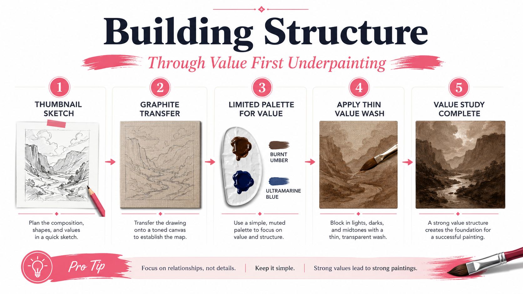
The most common beginner error is chasing hue before structure. Expert guidance on realist light and shadow makes the same practical point: if the tonal structure is wrong, accurate hue still produces a weak image, as explained in this value-first oil painting lesson.
Photograph the canvas with your phone and switch the image to grayscale. If the subject stops reading, don't correct the color. Correct the value map.
Mixing Believable Color From a Limited Palette
A compact palette encourages you to solve color relationships instead of collecting isolated matches. For many studies, titanium white, ivory black, yellow ochre, cadmium red light, ultramarine blue, and burnt sienna or another transparent earth pigment are enough to handle skin, cloth, ceramic, and atmospheric haze.
Start with the local color, then adjust its temperature and value. For skin, yellow ochre and cadmium red light establish a warm base. Add titanium white carefully, then cool selected passages with ultramarine or a restrained neutral. Don't make every shadow redder or every light yellower. Flesh becomes convincing through controlled temperature variation across planes, not through one universal “skin tone.”
Fabric needs the same discipline. A blue cloth may require a muted ultramarine mixture in the middle, a warmer reflected passage near a neighboring object, and a cooler, darker fold where the light turns away. Atmospheric haze usually loses contrast and chroma together, but a warm or cool bias can keep it alive instead of gray.
| Pigment | Best For | Temperature Lean |
|---|---|---|
| Titanium white | Opaque lights and value adjustment | Neutral to cool in mixtures |
| Ivory black | Deep neutrals and controlled value reduction | Cool, especially beside warm earths |
| Yellow ochre | Skin, muted yellow, aged fabric | Warm, restrained |
| Cadmium red light | Warm flesh, coral, red fabric | Warm and relatively clean |
| Ultramarine blue | Shadows, violets, atmospheric cools | Cool and slightly violet |
| Burnt sienna | Transparent earth, warm underlayers, skin variation | Warm and earthy |
Test mixtures on a scrap of prepared canvas under the same lamp or window used for painting. A palette surface can make a mixture appear lighter, darker, warmer, or cooler than it will look beside the actual underpainting.
For a focused mixing exercise, choose one target color and make it three ways. First shift the hue, then shift the temperature, then shift the value. Compare the swatches on the finished panel. You'll often find that a temperature change preserves the identity of the color better than an aggressive hue change, while a value change determines whether the passage belongs to the form at all. A digital palette generator can help you plan combinations, but physical paint remains the authority.
Brushwork and Edge Control for Convincing Form
Brushwork and edge control are one discipline. The mark you make determines not only the texture of the paint, but also how sharply one plane meets another and where the viewer's attention settles.
Think in four edge types:
- Hard edges hold a clear boundary and tend to advance. Use them for a catchlight, the corner of a collar, or a deliberately important contour.
- Soft edges transition gradually. They describe turning form, reflected light, and gentle changes across rounded surfaces.
- Lost edges disappear where adjacent values merge. A jawline can dissolve into a dark neck passage, or a shadow-side fold can vanish into the surrounding drapery.
- Found edges reappear selectively after a boundary has softened. They guide the eye without outlining everything.
The brush changes the result. A bristle filbert breaks a boundary gently and leaves a lively transition. A synthetic flat can place a crisp plane or a clean architectural stroke. A fan brush can feather a passage almost to air, although overuse quickly produces a fuzzy, artificial surface.
Practical drill: Paint one sphere three times. Keep the value and color arrangement similar, but change only the edge pattern. Use hard edges throughout once, soft edges throughout once, and a lost-and-found hierarchy in the final version.
The third sphere usually feels more convincing because realism doesn't require equal definition everywhere. The eye expects information to be prioritized. A sharp accent surrounded by quieter transitions creates depth and directs attention, while uniform outlining makes every part compete at the same volume.
Watch this short demonstration of edge handling before trying the sphere drill:
Glazing and Scumbling the Realist Way
Oil paint dries through oxidation, not simple evaporation. That distinction matters because a surface can feel dry while the deeper paint remains soft. Thin glaze layers may be ready for overpainting in about 24 to 48 hours, while heavy impasto can remain soft in the core for months or longer, as detailed in this guide to oil drying, glazing, and impasto.
Build the surface in an order that respects that chemistry:
- Lay in the lean underpainting and let it dry.
- Add an optional scumble with a mostly dry brush and semi-opaque lighter paint.
- Apply thin transparent glazes one at a time.
- Allow each glaze to dry completely before adding another.
A glaze is transparent pigment carried in a small amount of suitable medium. It shifts color while preserving much of the value structure beneath. Use it to warm a cheek, deepen a red cloth, or unify a shadow family. A glaze shouldn't become a thick, glossy coat that hides the painting.
A scumble drags broken, semi-opaque paint across the texture below. It's useful for atmospheric haze, dry skin texture, worn fabric, and cool-warm transitions. Keep the pressure light. If you scrub, you'll grind the lower layer into the upper one and create grayness.
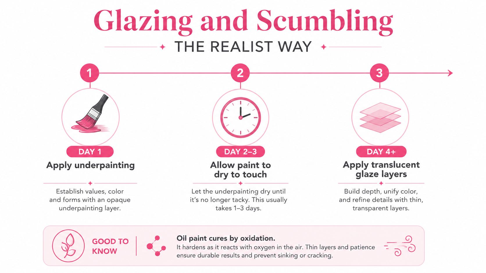
The classic failure is glazing over paint that hasn't cured enough. The upper film can seal a tacky layer, leading to wrinkling, sinkage, or a surface that stays sticky long after the painting appears finished. Keep multiple canvases in rotation if necessary. Wait, or use a quick-drying medium according to its instructions, but don't abandon fat-over-lean logic to meet an arbitrary deadline.
Common Pitfalls and How to Fix Them
Most realism problems aren't caused by a lack of detail. They come from a structural choice made too early, then protected with more paint.
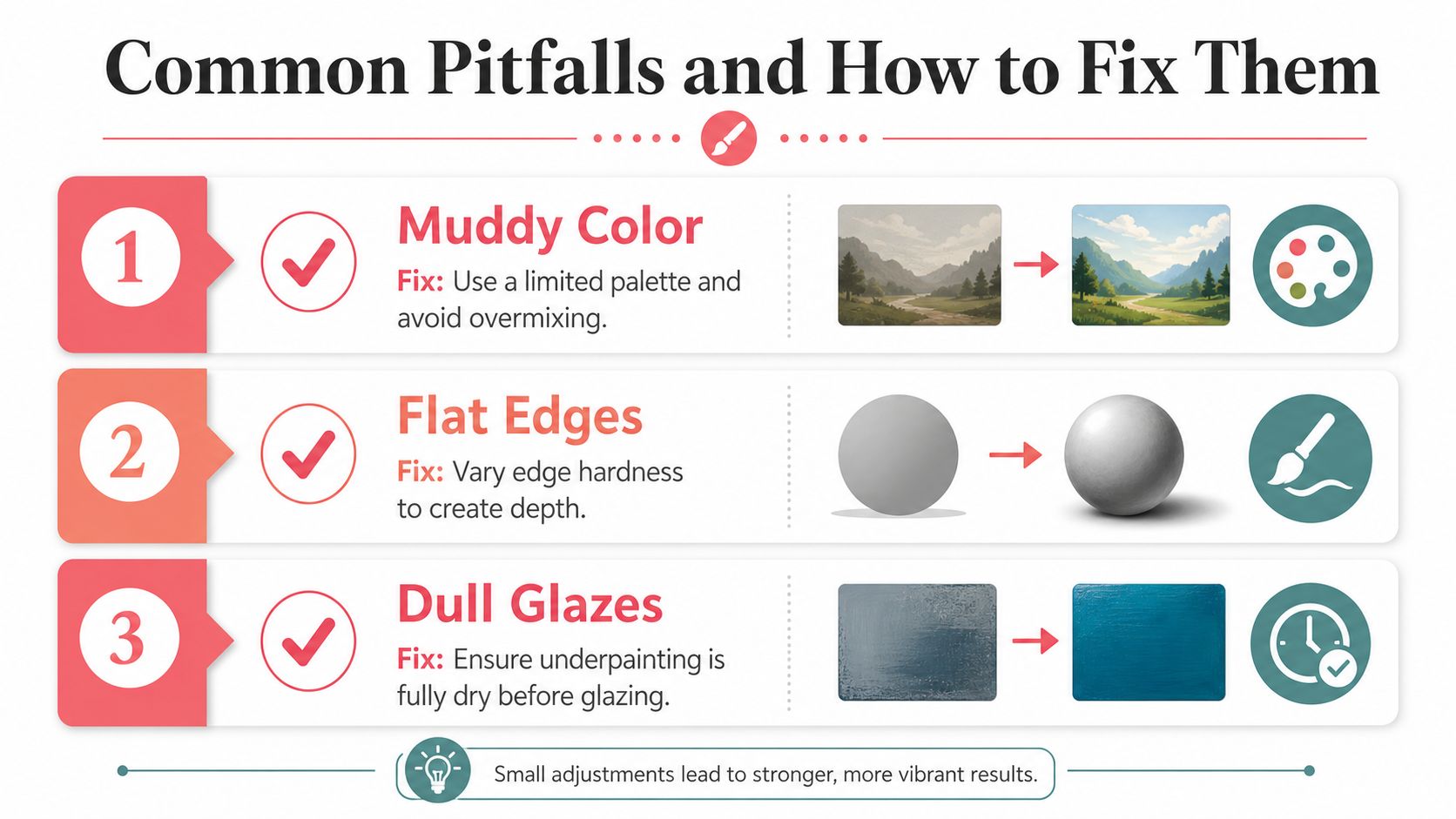
Muddy color
Overmixing on the palette destroys clean temperature differences. Mixing every correction into the same pile creates a neutralized, lifeless middle.
Fix: Scrape away the contaminated mixture with a palette knife, rebuild a fresh pile, and place it beside the existing passage before deciding whether it belongs.
Prevent it: Mix only as much as you need. Use complementary relationships deliberately, rather than adding random opposites whenever a color feels too bright.
Dead edges
If every boundary has the same softness, the painting loses depth and hierarchy. A face, collar, background, and shadow fold start speaking at the same volume.
Fix: Reset the focal area with a clean brush. Restore one or two firm edges, then soften neighboring boundaries so those accents have somewhere to act.
Prevent it: Decide where the viewer should look first, and reserve the sharpest transitions for that area.
Detail before structure
A beautifully painted eye can sit in the wrong skull. A convincing button can reinforce a badly drawn jacket.
Fix: Stop detailing and compare the canvas with the reference at a distance. If the silhouette or large value shapes fail, scrape back the unstable passage rather than polishing it.
Prevent it: Photograph the work in grayscale during every major stage. The grayscale check exposes structural errors that color can disguise.
Backlit references and uncured glazes
A backlit photograph can make shadows seem deeper than they are, while a glaze over soft paint can trap a technical problem beneath an attractive color shift. Retouch varnish can help you inspect a sunken, uneven surface for unity, but it won't repair an uncured layer.
When the image goes wrong, check values and edges first, color second. If both structure and edges fail, wiping back is often faster than correcting detail by detail.
Your 30-Day Realism Practice Plan
A short practice cycle works best when each week isolates one variable, then the final week combines them. Keep the studies small enough that you can finish them without rushing the paint.
Week one, value and seeing
Use a single lit sphere and a folded cloth. Paint with two or three grays plus white. Squint before every major passage, and keep the subject simple enough that you can judge the light pattern rather than surface description.
- Suggested practice: Make several small value maps, then complete one monochrome study.
- Success check: The sphere reads as round before you add texture, reflected light, or detail.
- Viewing condition: Use one stable lamp, not a changing mix of window light and overhead light.
Week two, controlled color
Mix target swatches from the limited palette before painting a small still life containing skin, ceramic, and metal. Test each mixture on scrap canvas under the working light.
- Suggested practice: Make a series of target colors, varying temperature and value rather than constantly changing hue.
- Success check: The objects remain distinct without relying on extreme saturation.
- Adjustment: If the colors look dull, check whether the problem is a weak value relationship.
Week three, edges and brushwork
Copy a master study in one sitting, concentrating on lost-and-found boundaries instead of reproducing every mark. Then paint a portrait with a clear focal passage and quieter peripheral edges.
- Suggested practice: Use the sphere drill from earlier, followed by the portrait.
- Success check: The viewer's eye lands in the intended area without every feature receiving equal sharpness.
- Constraint: Don't blend a passage merely because the stroke feels uncomfortable. Ask what kind of edge the form requires.
Week four, layered finish
Complete a small portrait or still life through lean underpainting, opaque middle passages, and two carefully timed glazes. Keep a written note beside the canvas showing when each layer was applied and whether it's dry enough for the next stage.
- Suggested practice: Use scumbling for atmosphere or surface variation, then glaze only where the value structure already works.
- Success check: The final color feels integrated rather than pasted on top.
- Technical check: Inspect the surface under raking light for tackiness, wrinkles, or uneven sheen.
Realism changes with viewing distance, illumination, and output format. A painting finished under cool studio daylight may look too warm beneath a household lamp. A phone screen can exaggerate chroma, while gallery lighting may make subtle value differences easier or harder to see. Finish the piece under the light where it will live, and judge it both close up and from across the room. The broader history of the movement supports this flexible view: The Art Story's account of Realism places its major French development in the 1840s, with a strongest phase from about 1840 to 1880, while Courbet's 1855 Pavilion du Réalisme made the style a public manifesto. Oil painting realism has never been only about copying appearances. It has always been about deciding which visual facts deserve emphasis.
Read more practical color-planning ideas in the ColorBestie blog, then return to the easel with one small subject, one stable light, and a clear value plan.
ColorBestie helps you test palette, mood, lighting, and style ideas against your artwork before you commit to a final scheme. Visit ColorBestie to explore fast color previews and build a calmer, more deliberate approach to your next painting.

