
Most advice about paper for coloring books gets one part right and misses the part that actually matters. Thicker isn't automatically better. A sheet can be heavy, yet still perform badly if the surface is too coated, the layout fights the medium, or the print setup wasn't built for the way people really color.
That's why paper choice needs to be treated like a system, not a single spec. Weight, finish, texture, one-sided or two-sided layout, and file prep all shape the result. If you're printing for crayons, colored pencils, or alcohol markers, the right answer changes fast.
Why Thicker Paper Is Not Always the Answer
The common mistake is treating paper like a contest where the heaviest sheet wins. In coloring books, that rule falls apart fast. A very heavy stock can still be the wrong choice if it is coated, too slick, or paired with a layout that sends bleed straight through to the next page.
The medium decides the paper
For crayons and colored pencils, a standard uncoated interior around 50 to 70 lb text, roughly 74 to 104 gsm, is a practical baseline because the page has enough absorbency without feeling overly stiff Promotion Choice guide. That same guidance also points to 70# or 80# uncoated paper as a common professional choice for coloring books, with interiors in the 70 to 140 gsm range to help reduce bleed-through and improve medium adherence Promotion Choice guide.
Alcohol markers are a different animal. They need more sheet mass and better holdout, but a 200 gsm coated sheet can still behave worse than a 160 gsm uncoated sheet because the coating resists the marker, while the heavier stock may only make the page feel stronger in hand. The better decision is to match the sheet to the ink path, the front and back layout, and the user's blending style.
Practical rule: If a paper feels premium but the marker sits on top, feathers strangely, or dries with a slick halo, the stock is wrong for the job.
That trade-off is where real production decisions live. Cost, bleed control, blending, and user feel all move together, but they do not always move in the same direction. The best paper for a children's crayon book is rarely the best paper for a marker-heavy adult coloring book. A color planning tool like ColorBestie also helps before ink ever reaches the press, because you can test palette choices against the paper behavior you expect and spot where a stock will fight the intended finish.
Understanding Paper Weight and GSM Ranges for Coloring
GSM means grams per square meter, and it gives a clean way to compare paper across suppliers. For coloring books, the useful question goes beyond how heavy a sheet feels. It is what that weight does once pigment, wax, or solvent reaches the page.
A practical map of the weight ranges
Light uncoated stock can work well for simple coloring with crayons and pencils because it keeps the book affordable and flexible. Many coloring interiors sit around 74 to 104 gsm, which fits everyday crayon and colored pencil use. Once marker ink enters the picture, the paper has to do more work.
For alcohol markers, the practical minimum is often 140 to 160 gsm, because thinner stock lets solvent soak through and show on the reverse side Bulk Image Generation guide. A more technical benchmark places 160 to 180 gsm as a practical floor, with 200+ gsm favored for premium books or heavy layering, since thicker sheets bring more fiber mass and better surface holdout FineColour guidance. That gap shows up fast in production. One side stays usable for the customer, the other side turns into ghosting, buckling, or bleed once the marker gets a second pass.
Practical rule: If your audience uses alcohol markers regularly, do not spec paper by feel alone. Spec it by the worst-case pass, not the first light stroke.
Page count changes the equation too. Standard children's coloring books often live in the 24 to 64 page range, while adult books commonly run 48 to 100+ pages Verified Market Research. Heavier interiors can improve perceived quality, but they also affect thickness, cost, and binding behavior. A book that feels sturdy in hand can still bind poorly if the stock is too heavy for the trim, fold, or glue.
| Paper Weight Guide by Coloring Medium | |||
|---|---|---|---|
| GSM Range | Best For | Bleed Risk with Markers | Notes |
| 74 to 104 gsm | Crayons, colored pencils, basic coloring books | High for alcohol markers | Common uncoated interior range for simple use |
| 120 to 140 gsm | Mixed coloring use, lighter marker work | Moderate | Better balance of feel and cost |
| 140 to 160 gsm | Alcohol markers, stronger mixed media | Lower | Practical threshold for marker-friendly pages |
| 160 to 180 gsm | Serious alcohol marker use, layering | Low | Stronger holdout and better reverse-side control |
| 200+ gsm | Premium marker books, heavy layering | Lowest | Higher cost, thicker book, more rigid feel |
The main lesson is simple. GSM gives important information, and it still leaves out part of the story. Once the medium gets wetter, the paper structure, page layout, and print setup matter as much as the number on the spec sheet.
How Coatings and Surface Texture Affect Your Colors
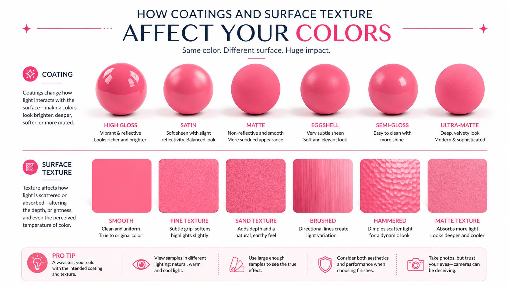
A paper can match the right GSM and still perform badly if the surface works against the medium. For coloring books, uncoated paper is still the safest default because it accepts pencils, crayons, and markers without a slick film sitting on top of the sheet.
Uncoated interiors stay friendlier to color tools
Glossy interiors may look polished, but they usually work against coloring use. Coating can make crayons skid, slow marker absorption, and leave color sitting on the surface longer than you want. In print terms, a coated sheet changes how the line art and fill behave together, which is why coloring-book interiors are usually specified as uncoated offset-style stock Promotion Choice guide.
Surface texture matters just as much. A little tooth gives colored pencils something to grip, which helps with layering and control. Too much texture breaks up smooth marker fills, while a very smooth but coated sheet can reduce the blending behavior alcohol-marker users often want. The practical target is usually a smooth, uncoated interior with enough bite for dry media and enough openness for marker work.
Why finish changes the way marker work feels
A heavier sheet can still perform poorly if the finish is wrong. Coated or highly treated paper can interfere with alcohol-marker blending, while smooth uncoated stock often gives a more predictable laydown for coloring books. Guidance from production specialists also keeps returning to uncoated paper in the 120 to 180 gsm range for general coloring books, with higher weights reserved for layouts and media that specifically need them Yuen Printing guide.
A paper's finish can make two identical marker swatches look like they came from different sets.
That happens because the surface changes how quickly ink sits, spreads, and settles. One sheet may read richer and more even, while another looks streakier or flatter with the same marker. If the finish does not match the intended tool, extra thickness alone will not solve the problem.
Single-Sided Versus Double-Sided Page Layouts
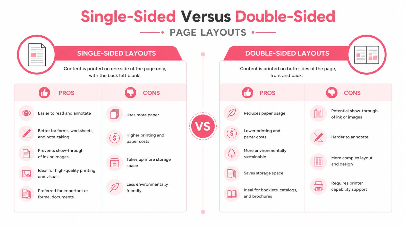
Layout changes the reading experience as much as paper weight does. For marker-based coloring, single-sided pages usually give the cleaner result because they reduce backside contamination and let the artist color without worrying about the next image underneath.
When single-sided pages earn their place
Alcohol markers are where single-sided layouts make the most sense. Printing on one side, at 140 gsm or above, is a common way to limit bleed transfer and keep adjacent pages clean. If you want a lighter build without giving up usability, blank backing pages can preserve the feel of a dedicated coloring book while avoiding full heavyweight stock.
Double-sided pages still have a place. They work better for crayons, colored pencils, and lighter dry media, where bleed risk is lower and users may care more about page efficiency than marker isolation. The trade-off is simple. Once the back side matters, the first page's ink behavior can affect the second page's artwork.
Cost, thickness, and user expectations
Single-sided layouts cost more in paper and can make a book feel shorter at the same page count. Double-sided layouts reduce material use and keep the book slimmer, but they are less forgiving for wet media. That is why many retail coloring books settle into familiar format choices instead of chasing the heaviest paper available.
For creators who are deciding format and palette together, a digital preview pass can cut down on waste before printing. A planning step with ColorBestie theme preview can show how a page's colors may read before ink ever touches the interior stock.
Print Setup Details That Affect Marker Performance
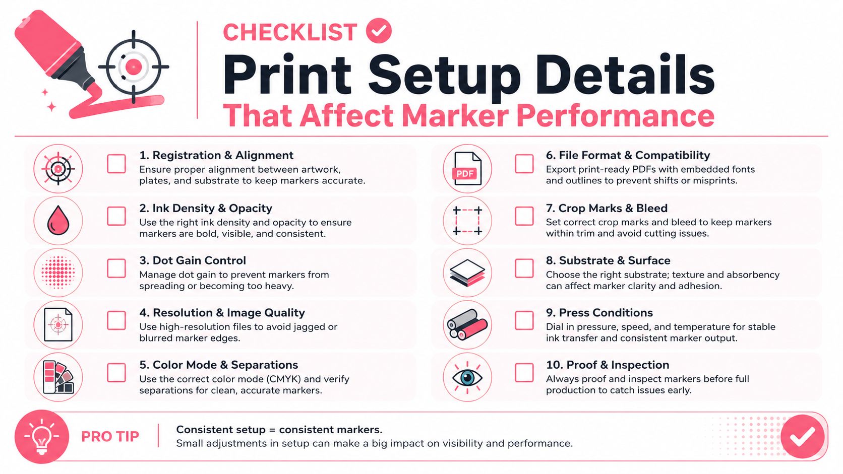
Paper can be the right weight and still produce a disappointing book if the production files are careless. Marker performance is shaped by how sharp the line art prints, how cleanly edges hold, and whether the page was prepared with the paper stock in mind.
Resolution and bleed are not optional details
A practical file target is 300 DPI artwork, which keeps fine line art crisp enough that marker edges do not turn muddy during printing. The Printing Center USA design guide also recommends 0.125-inch bleed on all sides and keeping important content inside safe margins so trim cuts do not clip borders or artwork. While these are print basics, their importance is amplified in coloring books where the line art itself is the core product.
Why file prep changes the way paper behaves
Soft, fuzzy, or crowded artwork can make a page feel less precise even on decent stock. Marker fills then read as less controlled, especially around tight interior shapes and detailed borders. File setup will not rescue a poor paper choice, but it can keep a good stock from looking worse than it should.
For marker work, the checklist is straightforward.
- Use 300 DPI line art: Crisp edges help the coloring area stay clean after printing.
- Include 0.125-inch bleed: Edge art will not get clipped during trimming.
- Keep critical art inside the safe zone: Borders, captions, and faces stay intact.
- Print single pages for marker work: Wet media has more room to breathe.
- Match layout to the paper weight: Heavy stock and single-sided pages usually work together.
For layout and swatch planning, the Marker Comparison tool helps compare marker families before a print run is committed. Good file setup will not make weak paper stronger, but it can stop solid stock from being undermined by sloppy prep.
Planning Your Color Palette Before You Commit Ink to Paper
Paper testing is easier when the color plan is already clear. If you know whether you're aiming for soft neutrals, saturated fantasy tones, or a warm cozy palette, you can judge paper performance against a real visual target instead of guessing on the fly.
Digital previews reduce wasted pages
Color planning tools are useful because they let you see a palette before you touch the page. One practical workflow is to upload a sketch or line page, preview a marker-style treatment, and then compare themes or mood options before printing. That's where the Palette Generator fits into a production mindset, especially if you're deciding how a page might look with alcohol markers from sets like Ohuhu, Copic, or Prismacolor.
ColorBestie is one option for that planning step. It turns a black-and-white sketch into a marker-style color preview and lets you compare palette ideas before you commit ink to paper. That kind of preview is especially useful when you're trying to figure out whether your page needs a smoother stock, more tooth, or a single-sided layout.
Theme planning and paper planning work together
The useful part isn't just the color preview itself, it's the decision it supports. A soft pastel palette may mask some paper texture, while bold saturated fills can expose ghosting, feathering, or poor holdout much faster. If the digital preview tells you the page depends on layered blending, that should push you toward smoother uncoated interiors and a more careful marker test.
Don't choose paper in isolation. Choose it against the colors the page is going to carry.
That's especially true for adult coloring books, manga-inspired pages, and cozy hobby books where the finished mood matters. A paper stock that looks fine for line-only samples can fail once the palette becomes rich and layered. Planning the palette first helps you avoid buying the wrong stock for the artwork's actual personality.
How to Test Any Paper Stock Before a Full Print Run
A paper sample only matters if you test it under real use, with the same markers, pencils, or crayons your buyers will pick up. Print a sample square or a sample page, then push it the way a finished coloring book will be used, because the stock that looks good in a catalog can fail fast on the bench.
A small test can save a large order
Start with one light pass, then repeat over the same area. If the reverse side shows clear ink, a dark halo, or a ghost ring after that second pass, the sheet is too porous or too lightly sized for alcohol-marker work. That single check usually tells you more than a sales sheet ever will.
Watch for three problems as you test:
- Ghosting: Color shadows visible from the back side.
- Wrinkling: The sheet buckles or pills after wet passes.
- Feathering: Edges spread beyond the line art instead of staying clean.
How to score the stock before you commit
Use the actual markers you plan to ship with, because different brands flow differently. A stock that handles pencils well can still fail with alcohol markers, and a sheet that looks fine after one pass can break down when you layer color. If you compare several papers, label each sample clearly, keep the test shape the same, and judge which one works with your real medium with the fewest trade-offs.
A simple decision flow helps. For crayons or pencils, uncoated stock in the lower interior range may be enough. For alcohol markers, move into the 140 to 180 gsm range or higher, favor single-sided layouts, and check that the reverse side stays clean under repeated passes.
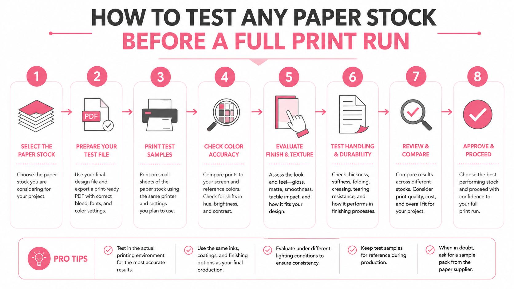
The testing plan should cover the stock, the layout, and the palette together. Use ColorBestie to compare color ideas before you buy in bulk, then judge whether the previewed style calls for smoother paper, more tooth, heavier weight, or a different page structure.

