
You're sitting in front of a case full of markers, turning caps in your hand, lining up swatches, and still feeling stuck. The pink looks fun, the teal looks fresh, the yellow looks happy, but together they somehow turn into chaos on the page. That blank coloring page or sketchbook spread starts to feel less exciting and more like a test you didn't study for.
That's where triadic color schemes help. They give you a simple structure for choosing three colors that feel lively without feeling random. Think of them like a sturdy three-legged stool. Each leg is different, but together they hold the whole thing up. For marker artists, that kind of built-in balance is useful because alcohol markers are bold, fast, and not always forgiving once the ink is down.
This guide keeps one foot in color theory and one foot on your marker desk. You'll learn what a triadic palette is, how to keep it balanced, and how to translate the idea into real marker choices for Copic, Ohuhu, and Prismacolor users.
Your Guide to Vibrant Color Harmony
Some of the most frustrating coloring sessions start with too much freedom. You open your Copic wallet or Ohuhu case, see dozens of beautiful options, and suddenly every choice feels equally possible and equally risky. Many hobbyists don't struggle because they lack good markers. They struggle because they need a system.
A triadic palette gives you that system. Instead of trying to make ten colors behave, you work with three hues that naturally relate to each other. That doesn't make your art boring. It usually makes it more energetic, because the colors are spaced far apart and each one brings a different personality.
Why marker artists love structure
Alcohol markers are a little like cooking with strong spices. A tiny shift changes the whole result. If every color on the page shouts at full volume, nothing stands out. If your choices are too similar, the work can look muddy or flat.
Triads solve that by giving you contrast and harmony at the same time. You can make comics feel punchy, fantasy scenes feel magical, and coloring book pages feel polished without guessing your way through every decision.
Practical rule: When your page feels busy before it even feels finished, the problem usually isn't your blending. It's palette balance.
What makes this guide different
Most color theory articles stop at “pick three evenly spaced colors.” That's useful, but it leaves marker artists with one big question: Which actual markers should I pull?
So this guide stays practical. You'll see real palette examples and marker-code suggestions for Copic Sketch, Ohuhu Honolulu, and Prismacolor Premier. Treat those codes as starting points, not rigid law. Marker lines vary, and your own swatch chart is always the final judge.
Color Theory Essentials for Marker Artists
The color wheel without the jargon
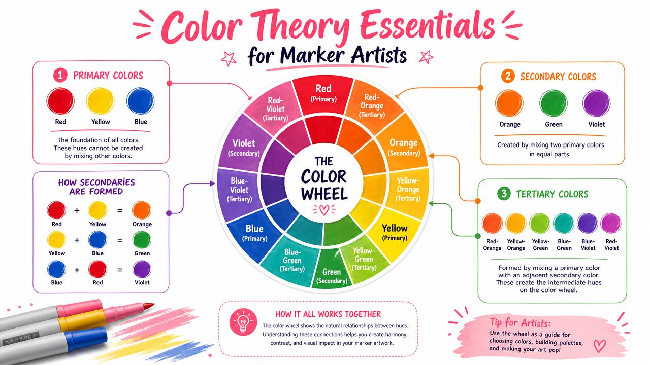
The color wheel is just a map. It shows where hues sit and who their neighbors are. If you can read a clock face or a pizza cut into slices, you can read a color wheel.
The basic families are easy to remember:
- Primary colors are red, yellow, and blue.
- Secondary colors are orange, green, and violet.
- Tertiary colors sit between them, like red-orange, yellow-green, and blue-violet.
For a marker artist, this matters because the wheel helps you predict relationships before you touch paper. If you know where your marker color sits on the wheel, you can make smarter choices about what to pair with it.
Here is a simplified perspective:
| Color group | What it means | Marker artist shortcut |
|---|---|---|
| Primary | Core hues | Bold, classic, graphic looks |
| Secondary | Mixes of primaries | Strong but slightly more nuanced |
| Tertiary | In-between hues | Softer, more modern, more natural-feeling palettes |
Hue saturation and value in plain English
These three ideas confuse beginners because they sound technical. They're very simple.
- Hue is the color family. Red is a hue. Blue-green is a hue.
- Saturation is how intense the color feels. A loud cherry red is more saturated than a dusty brick red.
- Value is how light or dark the color is. Pale blue and navy can belong to similar hue families but have very different values.
Imagine it as soup.
- Hue is the kind of soup. Tomato, mushroom, corn.
- Saturation is how strongly seasoned it is.
- Value is whether it's a light broth or a thick dark stew.
Marker artists use these three controls constantly, even if they don't name them. Maybe your red is technically correct in the palette, but it feels too aggressive. Lower the saturation by choosing a duller red. Maybe your green and violet blend nicely as ideas, but they merge visually on paper. Separate them by value so one is lighter and one is darker.
If your colors are “right” on the wheel but still don't work, check value first. Two very different hues can still look too similar if they share the same lightness.
Why this matters before you build a triad
A triadic scheme starts with hue placement, but the finished artwork depends on value and saturation control. That's where beginners often get tripped up. They think the palette failed, when really all three colors were too bright, too dark, or too equal.
Keep that in mind as you work. The wheel chooses the team. Value and saturation decide how well the team plays together.
Defining Triadic Color Schemes
The triangle trick
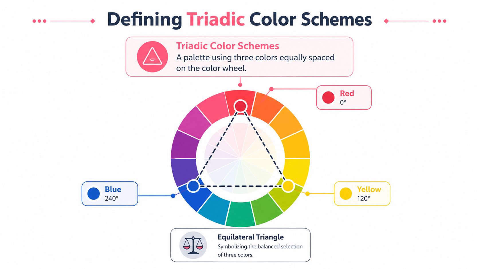
A triadic color scheme is one of the clearest systems in color theory. Geometrically, it uses three hues spaced 120 degrees apart on the color wheel, forming an equilateral triangle. Canonical examples include red-yellow-blue, orange-green-violet, and tertiary sets such as red-orange-yellow-green-blue-violet, as explained in this overview of triadic colors.
If that sounds formal, here's the hobby version. Put your finger on one color on the wheel. Then hop evenly around the circle twice more. The three landing spots become your triad.
That even spacing is the whole secret. It keeps the palette spread out, so each hue feels distinct.
Why triads feel lively but not wild
Triads are colorful, but they aren't random. They have a built-in sense of order because the spacing is balanced. You get more variety than an analogous palette, where everything sits close together, but less direct tension than a simple complementary pair.
Think of a triad like a band with three instruments. Each one has a different sound. If they all play the same note, it's dull. If they all fight for the solo, it's noise. A good triad gives each color room to be heard.
Here are the classic triad families many beginners start with:
- Red, yellow, blue for comic-book energy and graphic impact
- Orange, green, violet for playful or decorative work
- Red-orange, yellow-green, blue-violet for a more layered, less elementary feel
A common point of confusion
Many readers think a triadic scheme means three colors used equally. It doesn't. The triad tells you which hues belong together, not how much of each hue to use.
That's why some triads look polished and others look like party confetti exploded on the page. The hue relationship may be correct in both cases. The difference is control.
A triad is a map, not a finished painting. You still need to choose who leads and who supports.
How to Build and Balance Your Triadic Palette
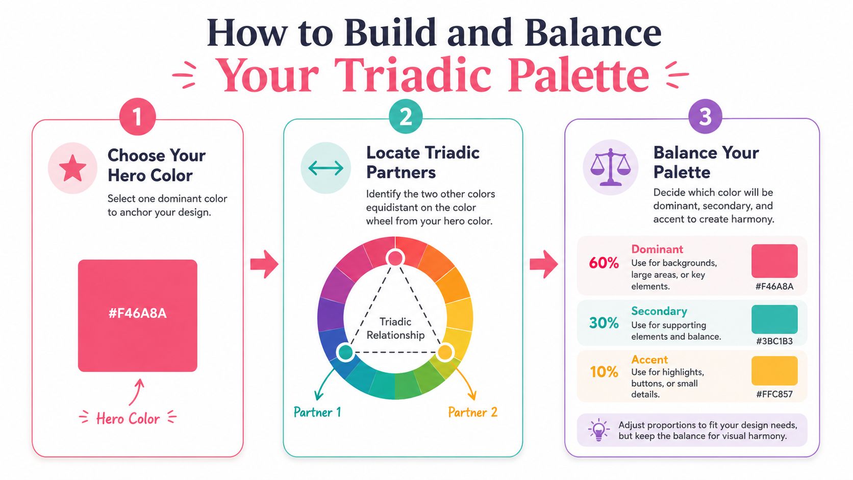
The easiest way to build a triad is to stop thinking in terms of “three equal stars.” A stronger mindset is “one lead actor, two supporting roles.” That small shift keeps your page from feeling noisy.
Start with one hero color
Pick the color you most want people to notice. That's your hero color. Maybe it's a blue dress, a green dragon, or an orange sunset.
Once you've chosen that hero, find the two hues that complete the triangle on the wheel. If you want help testing combinations digitally before pulling markers, a palette generator for color planning can speed up the trial-and-error stage.
A good hero color often comes from the subject itself:
- Characters often start with hair, clothing, or magical effects
- Scenery often start with foliage, sky, or architecture
- Coloring pages often start with the biggest shape on the page
Give each color a job
Triadic color schemes become usable rather than theoretical through effective control strategies. A common control strategy is the 60-30-10 distribution: 60% dominant color, 30% secondary color, and 10% accent color, which helps prevent equal-area triads from becoming visually noisy. The same guidance notes that reducing saturation on at least two hues or separating them by lightness helps preserve legibility and balance in practical design work, as described in LogRocket's explanation of triadic palette balance.
You can treat that like a recipe:
- Use the dominant color for the largest shapes. Backgrounds, clothing, foliage, walls.
- Use the secondary color to support the scene. Smaller objects, shadows, patterns, side elements.
- Use the accent color like seasoning. Eyes, jewelry, magic glow, flowers, trim, tiny highlights.
A page feels calmer when one color clearly owns the space.
Here's a quick planning table:
| Role | What it does | Good places to use it |
|---|---|---|
| Dominant | Sets the mood | Background, main outfit, large object |
| Secondary | Supports the scene | Mid-size forms, props, texture areas |
| Accent | Pulls the eye | Details, focal points, small pops |
Later in the process, this short video can help you visualize how artists think through color relationships in practice.
Use value and saturation to calm things down
A triad can still go wrong if all three colors are loud and equal. That's the “why does this look childish?” moment many artists run into.
Try one of these fixes:
- Mute two colors and let one stay bright.
- Spread the values apart so one hue is light, one is mid-tone, and one is dark.
- Keep accents tiny if the hues are strong.
- Test swatches side by side before committing to a full page.
If you're working with alcohol markers, this usually means choosing families instead of exact cap matches. A yellow-green can be soft and mossy or sharp and neon. A blue-violet can be dusky or electric. Same triad. Very different mood.
Triadic Palettes in Practice with Marker Codes
Finally, theory turns into a marker tray. The palettes below aren't the only valid options, but they show how triadic color schemes can move from the wheel to real tools in your hand. Because marker lines differ by set and region, treat these as practical starting matches.
If you want to compare marker families before buying or substituting, a marker comparison tool for popular brands can help you line up close alternatives.
Palette one superhero pop
This is the classic red-yellow-blue triad. It's bold, graphic, and great for comics, toys, retro posters, and pages that need clear visual separation.
Use it when you want a strong, upbeat feel.
| Color role | Hue | Copic Sketch | Ohuhu Honolulu | Prismacolor Premier |
|---|---|---|---|---|
| Dominant | Blue | B24 | B260 | True Blue |
| Secondary | Red | R29 | R180 | Crimson Red |
| Accent | Yellow | Y15 | Y050 | Canary Yellow |
Mini-recipe for use:
- Let blue carry the largest area, such as a jacket, sky block, or shadow-heavy background.
- Use red on mid-size shapes like boots, hair accessories, or banners.
- Keep yellow for tiny sparks, logos, stars, trim, or reflected light.
This palette gets loud fast. If it feels too toy-like, swap the bright red for a duller red and keep yellow in very small amounts.
Small hits of yellow can do more work than a large yellow area. Treat it like glitter, not wallpaper.
Palette two enchanted forest
This version leans toward a more storybook mood by using a tertiary triad: red-orange, yellow-green, blue-violet. It still feels lively, but it's less obvious than the primary triad.
For fantasy pages, woodland characters, mushrooms, potion shelves, and magical creatures, this one is especially fun.
| Color Role | Hue | Copic Sketch | Ohuhu Honolulu | Prismacolor Premier |
|---|---|---|---|---|
| Dominant | Yellow-Green | YG63 | YG040 | Chartreuse |
| Secondary | Blue-Violet | BV13 | V250 | Violet Blue |
| Accent | Red-Orange | R08 | YR190 | Poppy Red |
How it works on a page:
- Use yellow-green for moss, leaves, cloaks, or a soft background wash.
- Bring in blue-violet for deep shadows, night details, mushrooms, crystals, or hair.
- Add red-orange on berries, lanterns, fox fur, flower centers, or tiny magical effects.
This palette is a good reminder that triads don't have to scream. If you pick earthier or duskier versions of each hue, the result feels refined and cozy rather than flashy.
Palette three candy neon
This one is playful and modern: orange, green, violet. It works for stickers, candy themes, fashion doodles, party scenes, and stylized lettering.
| Color role | Hue | Copic Sketch | Ohuhu Honolulu | Prismacolor Premier |
|---|---|---|---|---|
| Dominant | Violet | V17 | V270 | Violet |
| Secondary | Green | G14 | G220 | Grass Green |
| Accent | Orange | YR07 | YR170 | Orange |
A simple application idea:
- Make violet the stage by using it in backgrounds, hair, or the largest object.
- Put green into secondary props, leaves, packaging, or layered shadows.
- Tap orange into candy wrappers, cheeks, fruit slices, or spark accents.
If you color cute characters, this triad can be charming. If you use every hue at full intensity across equal space, it can also turn hectic. A pale blender layer or a softer companion marker in the same family can help you tame it.
Advanced Triadic Variations and Common Pitfalls
Once you understand the basic triad, you don't have to stay locked into the pure textbook version. Many artists find their favorite results by loosening the formula while keeping the underlying balance.
Try a softer cousin of the triad
One useful variation is the split triad. Instead of using the exact three points of a perfect triangle, you nudge one point and work with nearby hues. The effect often feels more natural and less rigid.
Another option is the muted triad. You still choose hues from triadic positions, but you pick dustier, grayer, or lower-saturation versions. This is often what separates a beginner palette from a polished one.
A triadic scheme is defined by three hues spaced exactly 120° apart, and in practice that spacing creates high chromatic contrast while keeping more harmony than a complementary pair. Designers also commonly recommend giving one hue the dominant field role and letting the other two support it, as explained in Atmos's triadic color glossary.
That advice matters a lot when you start bending the rules. Even in a looser variation, hierarchy keeps the page readable.
Mistakes that make triads harder than they need to be
Beginners often run into the same three issues.
Using all three colors equally
This is the biggest one. When each hue covers similar space, your eye doesn't know where to rest.Choosing three colors with similar value
Even if the hues differ, the page can still look flat if all three are mid-tone.Picking the brightest version of everything
Full-strength red, yellow, and blue can feel like a children's toy aisle unless you intentionally want that look.
Here are easy fixes:
| Problem | What it looks like | Better move |
|---|---|---|
| No dominant color | Busy, scattered page | Choose one hue to lead |
| Similar values | Flat shapes, weak focus | Make one lighter and one darker |
| Too much saturation | Harsh, clownish result | Mute at least two hues |
A good triad doesn't mean strict obedience. It means intentional choices. Once you understand why the colors work, you can bend them with confidence.
Bringing Vibrant Harmony to Your Art
Triadic color schemes are one of the friendliest ways to make color feel less mysterious. You pick three hues with a built-in relationship, give one of them the lead role, and use value and saturation to keep the page balanced.
That's the heart of it. Not perfection. Not memorizing every wheel. Just learning how to make three colors cooperate.
If you've been overwhelmed by your marker collection, try this on your next page: choose one marker you already love, find its two triadic partners, and plan the page like a simple recipe. Large area, medium area, tiny accent. You'll learn more from one finished experiment than from staring at a cap chart for an hour.
For artists who want a little help previewing ideas before committing ink, a theme preview tool for color exploration can make that process easier.
Color planning gets easier when you can test moods before you color. ColorBestie gives hobbyists and marker artists a cozy way to preview palettes, compare marker-friendly options, and turn black-and-white sketches into alcohol-marker inspiration without the usual guesswork.
Powered by Outrank app
