
You've probably done this before. You pull three marker caps that look gorgeous on their own, maybe a bright teal, a cheerful coral, and a sunny yellow. Then you start coloring, step back, and the page feels noisy instead of polished.
That frustration usually isn't about your taste. It's about relationship. Good color choices aren't only about finding pretty markers. They're about choosing colors that know how to share space.
That's where triadic color schemes become useful. They give you a simple structure for building pages that feel lively, balanced, and intentional. If color theory has ever felt stiff or intimidating, don't worry. Think of this as learning a few kitchen rules so your ingredients stop fighting in the pan.
From Clashing Colors to Perfect Harmony
A lot of hobbyists think color problems mean they need more markers. Usually, they need a better system.
Triadic color schemes work well because they create contrast without feeling random. Instead of grabbing colors by instinct alone, you're choosing a set that already has built-in balance. That's why a page can feel bold and still look organized.
For marker artists, this matters even more. Alcohol markers go down strong. They don't whisper. If your palette is off, the clash shows up fast. If your palette is planned, even simple coloring starts to look more deliberate.
Why hobbyists get stuck
Individuals often learn one of two habits. They either stay safe with similar colors, or they overcorrect and use too many bright opposites. One approach can feel flat. The other can feel like a toy box exploded.
A triad sits in the middle. It has energy, but it still has a structure you can lean on.
Practical rule: Don't ask, “Which three colors do I like?” Ask, “Which one color leads, and which two support it?”
That small shift changes everything. You stop treating every marker like it deserves equal screen time. Your page gets hierarchy. The eye knows where to land first.
Why this matters on a real desk
On paper, color theory can sound abstract. On your desk, it becomes very practical. You're deciding which marker handles the dress, which one becomes the background, and which one only appears in small accents like bows, flowers, gems, or shadows.
That's the core of triadic color schemes. They aren't just a wheel exercise. They're a way to make faster, calmer decisions with the tools you already own.
Understanding Harmony on the Color Wheel
Color wheels can look academic at first, but they're easier to understand if you treat them like a clock.
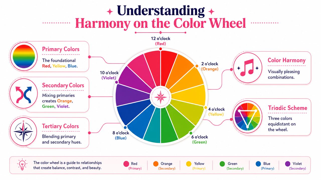
The color wheel as a clock
If you place colors around a circle, each spot shows how one hue relates to another. Nearby colors tend to feel close and gentle together. Colors farther apart bring more contrast.
A triadic color scheme is defined as three hues placed at equal intervals on the color wheel. The classic example is the primary triad of red, yellow, and blue, and the idea is historically tied to Sir Isaac Newton's 1666 color wheel, which helped shape the modern visual model artists still use today, as explained by the Interaction Design Foundation's overview of triadic color schemes.
If that sounds formal, use a simple picture in your mind. Draw a triangle inside the wheel. Each corner touches a color. That's your triad.
The three marker-friendly terms that matter
You don't need a full color-science lecture. For marker work, three words do most of the heavy lifting:
- Hue means the actual color family. Red, green, violet, orange.
- Saturation means how intense that color feels. Fresh-from-the-cap bright is high saturation. Dusty, softened, or grayed-down color is lower saturation.
- Value means how light or dark the color is.
These three are why two markers that seem “basically blue” can behave very differently in a palette. One may be pale and airy. Another may be deep and electric. Same hue family, very different job.
When readers struggle with triads, the issue usually isn't the wheel. It's forgetting that equal spacing on the wheel doesn't guarantee equal visual strength on the page.
What makes a triad a triad
The easiest triad to remember is red, yellow, and blue. It's the classroom example for a reason. You can see the contrast immediately, yet the set still feels complete.
For a marker artist, the useful part isn't memorizing the textbook example. It's learning to recognize the pattern. Once you understand the triangle shape, you can rotate it around the wheel and discover new combinations that feel less obvious than the primary set.
A bright orange, a green, and a violet can form another lively triad. So can softer, more muted relatives of those hues. The wheel gives the structure. Your marker choices decide the mood.
How to Build a Balanced Triadic Palette
A good triad isn't three colors shouting at the same volume. It's more like casting a scene.
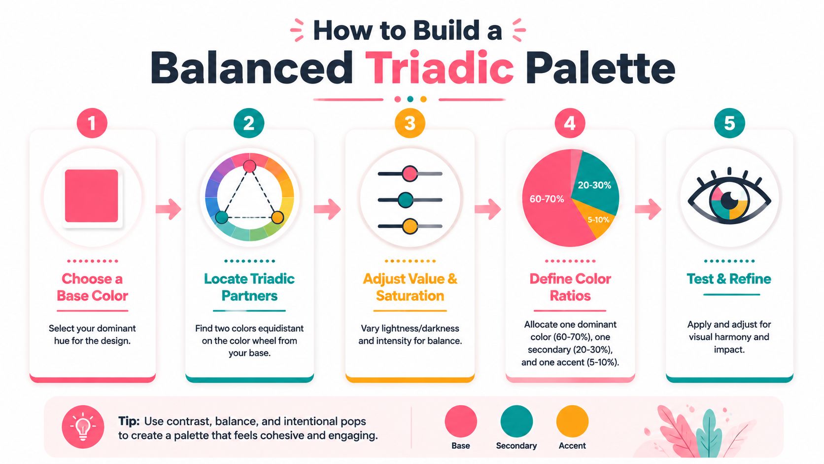
Choose the lead actor
Start with the color you most want people to notice. That's your dominant hue. Maybe it's the main outfit in a character drawing. Maybe it's the floral cluster in an adult coloring page. Maybe it's the sky in a fantasy scene.
Don't start with all three at once. Pick the hero first.
Once you've got that lead color, find the two hues that complete the triangle on the wheel. If you use a digital helper, a palette generator for testing triadic relationships can make this step faster, especially if you're translating the idea into marker-friendly options.
Give the other two colors supporting roles
This is the part many beginners skip. They choose the right hues, then use them in equal amounts.
That usually creates visual competition. Better guidance recommends a 60-30-10 distribution, where one color takes about 60%, the second about 30%, and the third about 10%, because full-strength triads can become aggressive unless you reduce saturation and vary brightness on at least two hues, as noted in LogRocket's triadic palette guidance.
Here's how that looks in practice:
- Dominant color handles large areas like clothing, background wash, or a major object.
- Secondary color supports the scene in medium areas.
- Accent color appears in tiny sparks, details, accessories, or small shadow notes.
Think movie cast, not group interview. One lead. Two supporting roles.
Calm the palette before you ink
Even when the hue relationship is correct, a triad can still feel harsh if all three markers are bright and pure. That's why seasoned artists often soften at least part of the set before coloring.
Try one or more of these adjustments:
- Drop the saturation by choosing a dustier marker in one or two hue families.
- Change the value so one color is pale, one mid-tone, and one darker.
- Use neutrals around the triad so the eye gets resting space.
- Test textural placement by keeping the sharpest color for tiny accents only.
A triad becomes elegant when the colors stop competing for first place.
If your first swatch feels loud, don't abandon the scheme. Tune it. Most triads don't fail because the wheel was wrong. They fail because the artist used three equally intense markers with no hierarchy.
Example Palettes for Popular Marker Brands
Theory finally applies to the marker case. The examples below are meant as practical starting points, not rigid rules. Marker lines vary by set and ink batch, and swatches on your paper matter more than cap color.
A practical note before you swatch
Brand coding systems don't map perfectly across lines. A Copic blue-green won't always have a one-to-one match in Ohuhu or Prismacolor. That's normal. Your goal is to match the role of the color, not chase a perfect twin.
If you want to compare families side by side before choosing substitutes, a marker comparison tool for popular alcohol marker brands is useful for narrowing options.
Triadic marker palettes
| Palette Name | Dominant (60%) | Secondary (30%) | Accent (10%) |
|---|---|---|---|
| Retro Diner | Copic RV13 / Ohuhu RV190 / Prismacolor PC1009 | Copic Y15 / Ohuhu Y120 / Prismacolor PC1034 | Copic B24 / Ohuhu B180 / Prismacolor PC1027 |
| Enchanted Forest | Copic G07 / Ohuhu GY43 / Prismacolor PC1090 | Copic V17 / Ohuhu V270 / Prismacolor PC932 | Copic YR16 / Ohuhu YR190 / Prismacolor PC1033 |
| Candy Carnival | Copic B63 / Ohuhu PB7 / Prismacolor PC1086 | Copic R32 / Ohuhu R190 / Prismacolor PC929 | Copic Y06 / Ohuhu Y070 / Prismacolor PC915 |
| Storybook Garden | Copic YG23 / Ohuhu G130 / Prismacolor PC989 | Copic BV02 / Ohuhu V050 / Prismacolor PC956 | Copic YR02 / Ohuhu YR240 / Prismacolor PC1032 |
A few quick ways to use them:
- Retro Diner suits playful fashion, stickers, and pop-art pages.
- Enchanted Forest works for magical creatures, mushrooms, and fantasy props.
- Candy Carnival feels airy and cheerful for sweets, spring florals, and kawaii designs.
- Storybook Garden is softer and easier to control when you want charm without full neon energy.
These palettes work best when you let the dominant marker cover most of the composition and save the accent for punctuation marks. Tiny earrings. Flower centers. Buttons. Reflected light. That's often enough.
Exploring Softer Triadic Variations
Some artists try triadic color schemes once, pick three loud markers, and decide the whole idea is too intense. Usually the problem isn't the structure. It's the calibration.
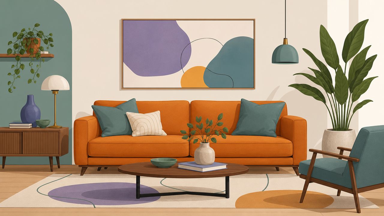
When a classic triad feels too loud
A triadic color scheme is built from three hues spaced 120° apart on the color wheel, forming an equilateral triangle. That spacing creates both contrast and cohesion, but expert use depends on choosing one dominant hue and letting the other two support it so the page doesn't tip into overload, as described in NeuroInteractive's explanation of triadic design.
That technical rule has a very practical takeaway. You don't need three equally bold markers to enjoy triadic harmony. You need three related hue positions, then enough restraint to keep them organized.
A softer variation many artists naturally drift toward is a split-triad feel. In plain language, instead of choosing the most obvious, punchy version of each corner, you slide one or two choices slightly toward neighboring hues. The result often feels gentler and more modern.
Muted triads for a more natural look
Muted triads are where many hobbyists suddenly feel at home. The harmony stays, but the page loses the toy-like intensity of full primary color.
Try these adjustments when your first pass feels too loud:
- Pick grayer versions of the same hue families. A dusty rose, olive-leaning green, and smoky violet can still feel triadic without screaming.
- Let paper white do part of the work. Large uncolored areas calm the whole composition.
- Use one crisp accent only. Keep just one clean, bright marker in the trio and soften the others.
- Layer neutrals nearby. Warm gray or cool gray around the palette helps the colors feel intentional.
Softer triads often look more advanced because they leave room for atmosphere.
This is especially useful for cozy interiors, botanical pages, vintage themes, and character art where you want personality without full cartoon intensity.
Quick Recipes for Coloring with Triads
Recipes help because they turn theory into action. You don't need to memorize rules while you're coloring. You just need a workable starting pattern.

Recipe for fantasy hair
Choose one main hair color, then let the other two hues appear in shine bands, ribbons, clips, or magical lighting. For example, if the hair is mostly blue-violet, use a warm yellow accent in accessories and a red-orange whisper in reflected light or background florals.
This works because the dominant hue stays in charge. The other two colors make the hair feel magical instead of flat.
Try this order:
- Lay down the dominant color in the largest hair masses.
- Deepen shadows with a darker marker from the same family, not with the other triad colors.
- Add tiny triadic accents only near focal areas like bangs, curls, or ornaments.
Recipe for playful creatures
Triads shine in stylized creatures because they already feel lively. A dragon, bird, sea critter, or mascot character can hold more contrast than realistic skin or fur.
Use one hue for the body, another for wings, horns, fins, or belly plates, and the smallest accent for eyes, spikes, jewelry, or spots. If you want a fast planning aid before committing to ink, a theme preview tool for testing color directions on sketches can help you check whether the distribution feels balanced.
A short demo can also help you see how triadic choices behave in real coloring workflows:
Recipe for atmospheric backgrounds
Backgrounds are where many triads fall apart. Artists often try to blend all three colors directly together until the result goes dull.
A cleaner method is to zone the colors. Let one hue dominate the sky or wall. Use the second in medium shapes like clouds, foliage, curtains, or distant objects. Save the third for tiny sparks such as windows, stars, flowers, signage, or reflected highlights.
For sunset-like or dreamy scenes, lower the saturation of at least one hue family. Soft transitions feel more believable when the triad isn't all at full intensity.
Coloring shortcut: Use triads more for placement and rhythm than for heavy mixing. They often work best as a map for where color goes.
That single idea can save a lot of paper.
Common Triadic Pitfalls and How to Fix Them
Most advice about triadic color schemes stops after the wheel diagram. The harder part is making the idea usable on real illustrations and marker pages. That's the gap highlighted in Parallel's discussion of practical calibration for triadic schemes.
The rainbow chaos effect
This happens when all three colors are bright, pure, and used in similar amounts. The page doesn't feel harmonious. It feels crowded.
The fix is simple. Let one hue lead. Reduce the presence of the other two. If needed, swap one bright marker for a dustier version in the same family.
Muddy blending
Triads are excellent for color blocking, but direct blending between all three can get messy fast. If you scrub unrelated hues into each other on the page, the result often loses clarity.
Use same-family markers for smooth blends inside each object. Use your triadic partners in separate shapes, reflected light, cast shadows, patterns, or accessories.
Ignoring value
You can choose the right hue relationship and still end up with a weak page if all three colors sit at the same lightness. The eye needs contrast in value, not just hue.
Check your swatches in grayscale if you can, or just squint at the page. If everything feels equally mid-tone, choose one lighter marker and one darker one before you start again.
Triads get easier with repetition. A few test swatches, a better sense of hierarchy, and a little restraint go further than buying another set.
If you want a low-pressure way to test palettes before ink hits paper, ColorBestie lets you preview marker-style color ideas on black-and-white sketches and compare options across brands like Ohuhu, Copic, and Prismacolor. It's a practical way to try triadic directions, check balance, and translate digital ideas into real markers on your desk.
Enhanced by Outrank app
