
Pastel means two related but different things, a soft, low-saturation color family, and a dry pigment stick used for drawing. If you've been trying to decide whether you need pastel colors for a palette or pastel sticks for artwork, this guide covers both.
You might be staring at a set of marker caps, a coloring page, or a product listing that says “pastel” and wondering why the word seems to describe both a mood and a material. That confusion is normal, and it's easy to clear up once you separate the color from the medium.
Two Meanings of Pastel You Should Know First
You've probably seen the word pastel on a coloring palette, a fashion ad, and an art supply label, then wondered why it seems to mean two different things. That's because it does. One meaning is a color family, the other is an art medium made from pigment.
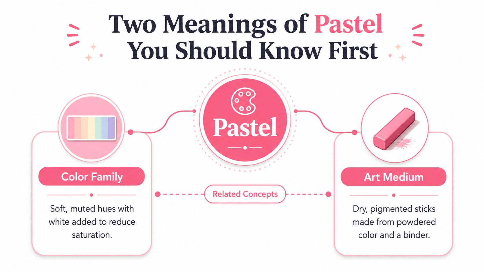
The color meaning
When people say a color is pastel, they usually mean it looks soft, light, and muted. Think of blush pink, mint, powder blue, butter yellow, or lavender that's been gently softened. In color terms, that look comes from adding white and reducing saturation, which is why pastel colors feel calm and airy rather than bold or intense.
The medium meaning
When artists talk about pastel as a medium, they mean a dry stick of powdered pigment held together with just enough binder to stay in shape. Britannica describes pastel as finely ground pigment plus a binder, often with a filler, formed into finger-size sticks that must hold together in the hand but still release color onto textured paper Britannica. That's a completely different thing from a pastel-colored sweater or marker cap.
Simple rule: if someone is talking about hue, they mean the color. If they're talking about sticks, paper, or smudging, they mean the art medium.
The name overlap is historical, not technical. Once you separate those two meanings, the rest becomes much easier to read, shop for, and use.
What Makes a Color Pastel
A pastel color is usually just a tint, which means a pure hue mixed with white so it gets lighter and less saturated. That's why pastel red becomes soft pink, pastel green becomes mint, and pastel blue becomes a pale sky tone. The color hasn't turned into a different species, it's just been lightened and softened.
The visual recipe
Color references commonly describe pastel colors as sitting around 20-60% saturation and 60-90% brightness or value on HSB and HSL scales ColorWithLeo. You don't need to memorize those scales to use the idea well. The practical takeaway is simple, the more white you mix in, the farther the color moves toward a gentle, low-chroma look.
That's why pastel palettes feel so at home in baby products, spring illustrations, and cozy décor. They suggest light instead of weight, softness instead of sharp contrast, and a kind of visual breathing room that stronger colors don't always give you.
A quick eye test
If you're checking whether a color counts as pastel, ask three questions.
- Is the color noticeably lighter than the pure hue? If yes, it's moving toward pastel territory.
- Does it feel muted rather than saturated? If yes, you're likely looking at a pastel tint.
- Would it still read as soft if placed next to a brighter version of the same hue? If yes, the pastel effect is doing its job.
A palette tool can help you test those shifts quickly, especially if you're comparing several soft combinations at once. A useful starting point is this palette generator, which can help you explore muted variations without guessing.
How Pastel Sticks Are Actually Made
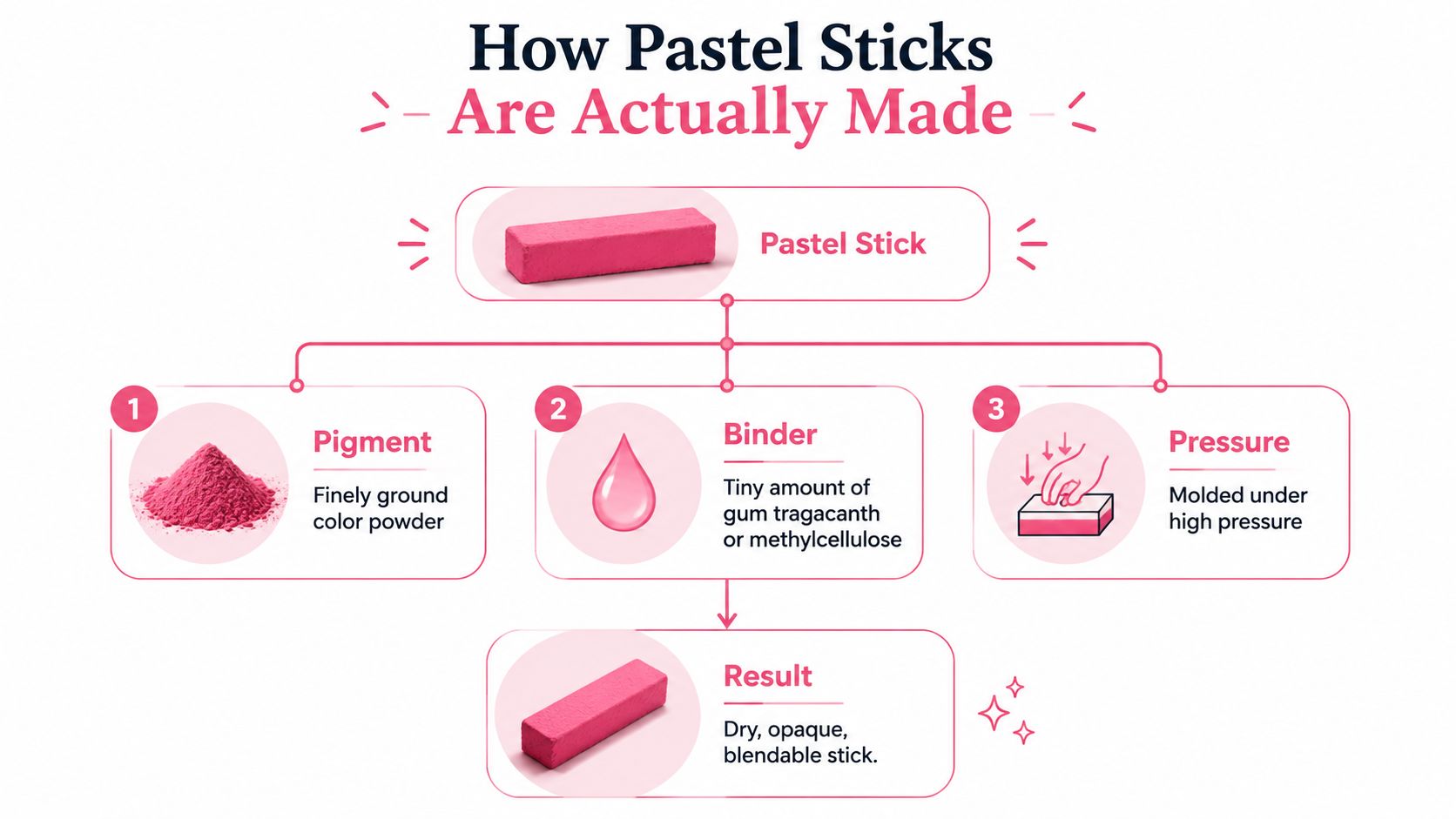
Pastel sticks sound delicate because they are, but the recipe is surprisingly direct. Britannica describes them as finely ground pigment with a binder, usually gum tragacanth or methyl cellulose, and often a filler such as calcium carbonate or kaolin Britannica. The mixture is shaped into a stick that's cohesive enough to hold, yet crumbly enough to release color onto paper.
Why the ingredients matter
The pigment gives pastel its intense color. The binder is only there to hold the stick together, and the filler helps adjust texture and handling. Because the binder load stays low, pastel can look very vivid the moment it touches the page, but that same low binder content also makes it fragile and easy to smudge.
That's the core tradeoff of the medium. More binder would make it tougher, but it would also reduce that immediate, luminous color payoff. Less binder would turn the stick into dust before it could function as a tool.
Why paper matters so much
Pastel needs paper with tooth, which means a little surface texture for the pigment to catch on. Smooth paper doesn't give the powder enough grip, so the color can slide around, fill in unevenly, or wipe off too easily. The medium's structure explains the whole handling experience, vivid, powdery, and beautifully sensitive to the surface underneath.
Practical rule: pastel behaves best when the paper can grab it. If the surface is too smooth, the medium loses part of what makes it work.
For a visual breakdown of the manufacturing idea, the following illustration makes the structure easy to picture.
Soft, Hard, and Oil Pastels Compared
Once you know the basic recipe, the differences between pastel types make a lot more sense. They're all built around color, but they behave differently because the binder and texture change the way they feel in your hand and on the page.
Pastel types at a glance
| Type | Feel | Blending | Mess Level | Best For |
|---|---|---|---|---|
| Soft pastel | Velvety, chalky, crumbly | Blends easily | High | Rich color, painterly effects |
| Hard pastel | Firmer, cleaner, more controlled | Blends more tightly | Lower | Details, outlines, travel sketching |
| Oil pastel | Waxier, creamy, crayon-like | Smears and layers differently | Moderate | Bold marks, quick color work |
Soft pastels are the classic option people picture first. They lay down color with a plush, powdery feel and blend beautifully, which is why artists love them for luminous transitions and atmospheric work. Hard pastels contain more binder, so they're less fragile and better for tighter marks.
Oil pastels are their own branch of the family. They don't rely on the same dry binder system, so they feel closer to crayons but still let you layer and blend in a painterly way.
Which one should a beginner start with
If you want the softest look and don't mind dust, soft pastels are the most expressive. If you prefer control and cleaner lines, hard pastels are easier to manage. If you're after a richer, less dusty tool that still gives you a painterly feel, oil pastels may suit you better.
Where Pastel Shows Up in Art and Design
Pastel has a long art history, but it also lives everywhere in modern visual culture. Pastel emerged in Renaissance Italy in the 15th and 16th centuries, became a distinct painting practice by the 17th century, and by the 18th century commercially usable crayon sets had become more common as synthetic pigments expanded the color range Behind the Masterpiece. That history helps explain why the word feels both classic and modern at the same time.
From portrait studies to digital palettes
In fine art, pastel sticks let artists work directly with intense color and soft edges, which is why they've been valued for portraits and atmospheric scenes. In adult coloring books, pastel palettes often create a calmer page because the colors feel gentle instead of loud. In manga and illustration, soft pastel backgrounds can support strong line art without stealing attention from the character.
Digital and print design use the same language in a different way. Pastel hues can suggest friendliness, nostalgia, sweetness, or calm without needing a single brush stroke. That's why the same word can describe a Renaissance portrait tool and a modern sticker palette without contradiction.
Why the overlap helps hobby artists
For hobby colorists, the overlap is useful. If you already like pastel moods in layouts, characters, or planner pages, that same sensitivity to softness can guide your marker choices too. A quick theme preview like this theme preview can help you test that mood before you commit to a page or project.
The important part is not memorizing the history. It's noticing that pastel has always been about gentle color presence, whether it appears as a powdery mark on paper or a muted tone in a digital composition.
Paper, Fixatives, and Layering Basics
Pastel work rises or falls on the surface underneath it. Because the medium depends on loose pigment catching in paper texture, the right paper does a lot of the heavy lifting for you. The wrong paper can make even beautiful color feel weak, patchy, or unstable.
Paper tooth first
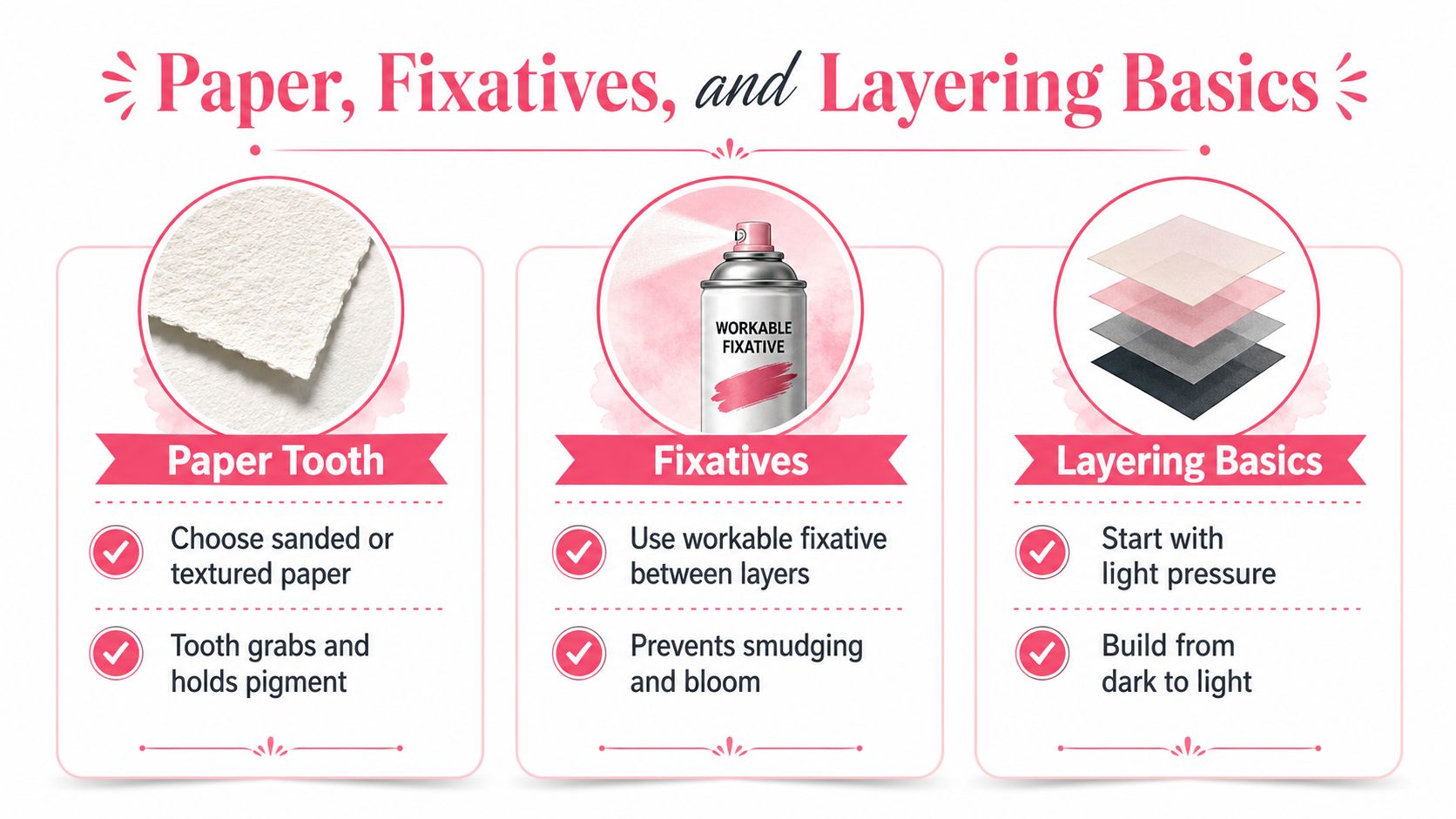
Paper tooth is the tiny surface texture that grabs pastel dust and holds it in place. Textured papers, sanded pastel card, and other toothy surfaces let pigment build up more evenly than smooth paper does. If the surface is too slick, the pigment can sit on top instead of settling in.
Fixative and layering
Fixative helps lock down pigment between layers or after a drawing is finished. Use it sparingly, because any spray can slightly shift the look of delicate color. If you're layering, start light, build gradually, and save your brightest highlights for the end so they stay clean.
A simple working habit
- Choose a toothy surface: textured paper gives the pigment something to hold onto.
- Build in light passes: soft layers keep the color fresh longer.
- Protect the surface when needed: a careful fixative pass can reduce smudging.
- Finish with highlights last: this keeps the brightest notes from getting buried.
Once you think about pastel as pigment that needs something to cling to, the technique stops feeling mysterious. The surface, the spray, and the layering all make sense together.
Recreating Pastel Palettes with Alcohol Markers
You don't need a stick of chalky pigment to get a pastel look. With alcohol markers, pastel is mainly about choosing light tints, keeping saturation low, and avoiding heavy layering that pushes the color back toward a stronger, fuller tone. The goal is the same as in color theory, a hue that feels softened by white and freed from visual heaviness.
How to build the look
Start with the lightest marker in a color family, then use the next-lightest shade only where you want a little shadow or form. If you keep blending gentle, the result stays airy instead of turning muddy or overworked. This is why marker artists often get pastel effects from the pale end of a family rather than from pushing mid-tones too far.
A pastel pink usually starts with a blush or shell tone. Mint often comes from the palest green in the set. Butter yellow, sky blue, and lavender all work the same way, you want the quietest version of the hue, not the deepest one.
What to look for on marker sets
On many alcohol marker charts, the lightest colors sit near the low end of the numbering system within a family. Those are the shades most likely to read as pastel once they're placed on white paper. If you preview combinations before coloring, you can avoid ending up with a palette that feels too saturated for the mood you want.
A practical way to compare marker families side by side is this marker comparison tool. It's helpful when you're deciding whether a set has enough pale tints for soft, pastel-friendly pages.
Quick Tips and Pastel FAQs
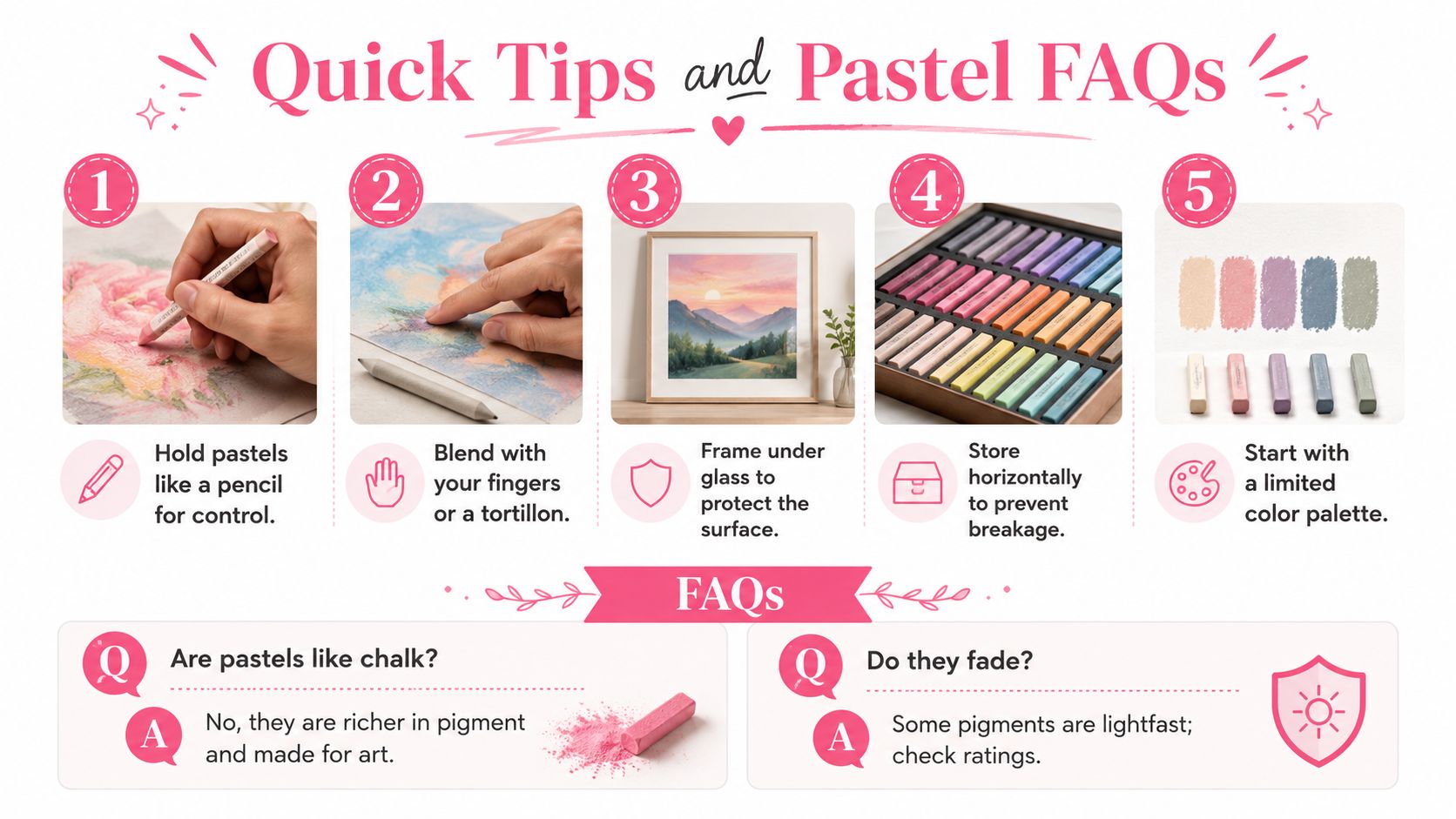
A few habits make pastel easier right away, whether you're working with a soft color palette or an actual pastel medium.
Five quick tips
- Hold sticks like a pencil: a lighter grip gives you better control.
- Blend gently: fingers or a tortillon can soften edges without overworking them.
- Protect finished work under glass: this helps keep the surface from picking up dust.
- Store supplies horizontally: it reduces breakage in softer sticks.
- Start with a limited palette: fewer colors make it easier to keep the mood consistent.
FAQ
Are pastels like chalk? Not really. Pastels are richer in pigment and designed as art materials, while chalk is a different kind of drawing material.
Do pastel colors always look pale? Yes, the look comes from reduced saturation and added lightness, so the color feels softened rather than intense.
Can pastel artwork fade? Some pigments are more lightfast than others, so finish quality depends on the materials used.
The simplest way to remember it is this. Pastel as color is a pale, muted hue. Pastel as medium is a pigment stick that behaves very differently in the hand.
If you want to keep exploring soft palettes, marker pairings, and beginner-friendly color planning, visit ColorBestie. It's a calm place to test pastel moods before you commit to a page, and it can help you move from “I like this look” to “I know how to build it.”

