
You've chosen beautiful colors, found a subject you're excited to draw, and made the first confident stroke. Then the oil pastel skids across the sheet instead of settling into it. A second layer pushes the first one away, blending turns patchy, and the paper may buckle or tear when you press harder.
That frustrating result usually isn't a sign that you lack skill. The surface is part of the technique. Once you understand how paper tooth and paper weight work together, choosing a sheet becomes much easier. The best paper for oil pastels depends on whether you're sketching lightly, building several layers, scraping color, or making a heavily blended finished piece.
Why Your Oil Pastels Keep Sliding Off
A beginner often blames the pastel first. Perhaps the stick feels too soft, the color looks weak, or the hand pressure seems wrong. But oil pastel can behave perfectly on one sheet and frustratingly on another, even when you use the same color and the same stroke.
Smooth paper creates the sensation of drawing on ice. The pastel touches the surface, but there aren't enough tiny irregularities to hold the waxy pigment in place. Your line may look acceptable at first, yet the next stroke has nowhere to settle. Instead of adding color, it drags across the earlier mark.
Printer paper is a familiar example. It can handle a quick color test, but it usually isn't a dependable surface for finished oil pastel work. It's too light for firm blending and often too smooth for comfortable layering. A glossy sheet creates an even more slippery experience.
The paper is your silent partner
Think of paper as the quiet partner underneath every mark. Your pastel supplies the pigment, wax, and pressure, but the sheet decides how much of that material stays where you put it. A surface with moderate texture gives the color something to grip without making every stroke feel scratchy.
That's why the first mark can be misleading. Oil pastels will often leave color on many surfaces, so a sheet may seem suitable until you try to add highlights, blend a gradient, or deepen a shadow. The true test begins when the drawing needs more than one pass.
A useful change in mindset: If your pastel keeps sliding, test the paper before you question your hands.
For light sketches, a textured drawing sheet or mixed-media paper may give you enough control. For dense, painterly work, you'll need more support and a surface that can keep accepting pigment. The goal isn't to find the roughest paper available. It's to find a surface whose grip matches the way you draw.
What Makes Paper Right for Oil Pastels
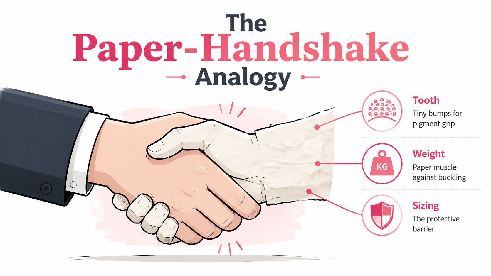
Four paper properties shape the experience: tooth, weight, sizing, and absorbency. You don't need to become a paper specialist to use them. Treat the sheet like a handshake between the pastel and the support.
Tooth gives the pastel a grip
Tooth is the microscopic roughness on the paper's surface. Those tiny high and low points catch the waxy pigment, much like the ridges in a firm handshake keep two hands from slipping apart. With too little tooth, oil pastel skates. With a moderate tooth, the pigment settles into the surface and leaves room for additional marks.
Major art guides commonly recommend at least 160 gsm for reliable oil pastel layering, while 200 to 240 gsm is preferred for finished work and 300 gsm is common for heavier blending or more durable sheets, as outlined in this oil pastel paper guide. Medium-toothed paper typically holds roughly 2 to 5 layers before the surface starts reaching saturation, so your technique and pressure still matter.
Weight is the paper's muscle
Paper weight, measured in gsm, describes how substantial the sheet is. It doesn't tell you how rough the surface feels. A heavy, smooth sheet can still be slippery, while a lighter, textured sheet can still provide useful grip.
Weight helps the paper resist tearing, denting, and buckling when you press, blend, scrape, or work repeatedly over one area. Think of it as the sheet's muscle. Tooth controls how the pigment behaves on top, while weight helps the support survive what your hands do to it.
Sizing creates a protective layer
Sizing is a coating that changes how the paper receives materials. The handshake analogy works here too. Sizing is like a thin protective glove between the paper fibers and the pastel. It can help the surface stay intact and influence whether marks sit prominently on top or sink into the sheet.
Absorbency changes the finish
Absorbency describes how thirsty the paper is. A less absorbent surface keeps more pastel visible at the top, while a more absorbent one may make the mark feel quieter or more embedded. For oil pastels, you generally want enough surface grip without a sheet that swallows the character of every stroke.
When you shop, rub a clean finger lightly over a sample if the store allows it. Look for moderate texture, sturdy construction, and a surface intended for pastel, mixed media, or watercolor rather than a glossy finish.
Comparing Common Oil Pastel Papers
Paper types overlap, so labels shouldn't make the decision for you. A watercolor sheet can work beautifully for oil pastels, and a dedicated pastel sheet can still feel wrong if its texture doesn't suit your pressure. Compare each option by the four properties above, then match it to the marks you want.
| Paper Type | Tooth Level | Typical Weight | Best For |
|---|---|---|---|
| Sanded paper | High to very high | Heavy or board-like | Aggressive layering, strong texture, and bold pigment pickup |
| Pastel paper | Moderate to high | Often heavyweight | Layered drawings, blended passages, and toned surfaces |
| Watercolor paper | Low to moderate, depending on finish | Medium to heavyweight | Blended studies, landscapes, and versatile finished work |
| Mixed-media paper | Low to moderate | Light to heavyweight | Practice, travel sketches, and everyday studies |
| Primed paper or board | Adjustable, depending on primer | Rigid or heavyweight | Controlled surfaces, scraping, and durable finished pieces |
Sanded paper has a powerful bite. It can hold pigment firmly, which makes it useful when you want a textured, layered result. The trade-off is that a very rough surface can wear down soft sticks quickly and make smooth blending more difficult.
Pastel paper offers a purpose-built middle ground. Many modern pastel-paper ranges sit around 300 to 399 gsm, and Sennelier's oil pastel paper is listed at 340 gsm, or 160 lb, in its product specifications on Jackson's Art's Sennelier oil pastel paper listing. That kind of support suits artists who want a sheet that feels substantial under pressure.
Watercolor paper is often a friendly choice because its surface texture and sturdiness make it adaptable. Cold-press paper gives visible tooth, while a smoother finish supports cleaner edges but may fill faster. Mixed-media paper is convenient for experiments, especially when you're learning how much pressure your sticks need.
If you're comparing other art surfaces or testing how different media behave, the marker comparison tool can help you think in terms of surface compatibility rather than choosing the thickest option.
Prep and Finishing Your Paper
A good sheet still benefits from simple preparation. The aim is to keep it stable while you work and protected once you stop.
Prepare the support
Start by placing the paper on a firm board. Tape the edges with low-tack artist's tape, leaving enough of the sheet visible for your composition. Taping won't transform an unsuitable sheet into heavyweight paper, but it can reduce movement and make your pressure more consistent.
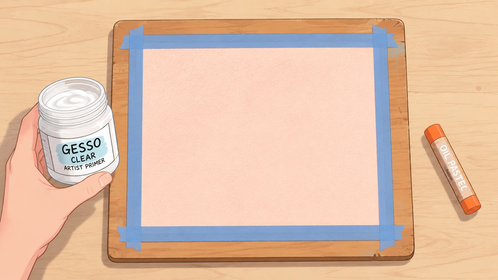
If you're working on an unusual surface, apply a light primer designed for art materials and let it dry fully before drawing. Test the primer and pastel combination on a scrap first. A primer can alter the tooth, so the finished surface may feel more like a prepared board than ordinary paper.
Use a repeatable studio routine
Try this sequence for a finished study:
- Secure the sheet. Tape it to a rigid board before making the first mark.
- Test the surface. Add a small dark patch, blend it, and place a light color over it.
- Build gently. Use light layers before increasing pressure in selected areas.
- Rest the artwork flat. Give the surface time to settle before handling or stacking it.
- Protect the drawing. Use a fixative only if it's compatible with your oil pastel materials and your intended finish.
- Frame with care. Use archival materials and enough spacing so the pastel surface doesn't rub against glazing.
Don't rush to stack a fresh oil pastel drawing with another artwork. The surface can remain delicate, especially where you've built thick passages. A loose protective interleaf can help prevent accidental contact while you decide how to frame it.
For a particularly important piece, choose an acid-free sheet or prepared board. That choice supports the artwork's physical stability, but it doesn't replace careful storage, suitable framing, and protection from rubbing.
Fixing Smudges and Layering Issues
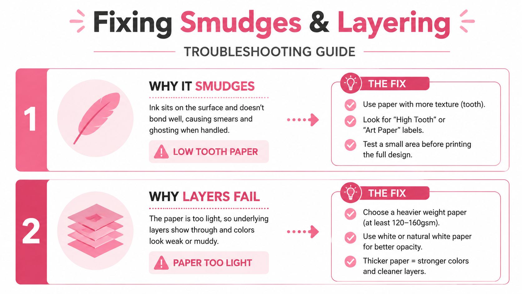
Smudging and failed layers often point to different paper problems. If the color moves with the slightest touch, the surface may have too little tooth for the amount of pastel you've applied. If the sheet pills, tears, or dents while you blend, the paper may be too light for your pressure.
A blended sky shows the difference clearly. You lay down blue, add pink near the horizon, and press with your finger to soften the transition. Instead of a gentle gradient, the colors turn into a dull patch because the surface has filled. Adding more pastel only makes the area slicker.
Diagnose the surface before changing the color
- Smudging: Reduce handling and test a more textured sheet. Low tooth gives the pastel less to grip.
- Patchy blending: Use lighter pressure at first. Heavy pressure can fill the texture before the gradient is complete.
- Layers sliding away: Switch to a surface with more tooth or stop pressing so firmly.
- Tearing or pilling: Move to a heavier sheet. The paper needs more physical support.
- Highlights disappearing: Reserve the lightest colors for later and test whether the surface still accepts them after earlier layers.
The practical threshold for many artists is 160 gsm as a minimum for reliable layering, according to the cited oil pastel paper recommendations. For demanding work, guidance also points toward 240 to 300 gsm or more, especially when professional handling or solvent-assisted techniques are involved, as described in the earlier Sennelier paper reference.
Historically, oil pastels became a standardized commercial art medium in the 20th century, and dedicated modern pastel papers developed to balance surface texture with resistance to heavy wax and blending. That history explains why contemporary pastel supports often feel very different from ordinary sketch paper.
Choosing Your Paper and Sample Workflows
The best choice isn't the paper with the biggest weight printed on the cover. Heavier paper resists tearing, while tooth controls pigment pickup, layering, and blending, so your technique should guide the purchase, as discussed in this practical oil pastel surface guide.
For quick sketching, begin with 160 gsm mixed-media paper. It's sturdy enough for light marks and convenient for portable studies. Choose a moderate tooth, keep the layers thin, and avoid pressing hard to make the first patch look opaque.
For heavy blending, choose 300 gsm sanded paper or pastel board. The stronger support gives you room to work with more pressure, while the tooth helps hold pigment during repeated passes. A very rough surface can create a broken, grainy finish, so select it because you want that texture, not because rougher automatically means better.
Workflow for a quick travel sketch
- Secure a sheet of 160 gsm mixed-media paper to a portable board.
- Block in the main shapes with light, quick layers.
- Keep the brightest accents for the end.
- Use a compatible workable spray only when you need to preserve the surface for continued work.
- Store the sketch flat and separated from other drawings.
Workflow for a heavy blending study
- Choose 300 gsm sanded paper or pastel board.
- Tape the support down and test a small blended patch.
- Establish broad color areas before pressing into the surface.
- Build rich, blended layers gradually.
- Add crisp accents after the soft transitions are complete.
- Use a final fixative only after testing it on a separate sample.
You can also use the ColorBestie blog for broader color-planning ideas, but the paper decision should remain technique-led. If your drawings are light and exploratory, portability matters. If they're dense and tactile, stability and tooth deserve priority.
Your Next Pastel Session Made Simple
When you ask what paper is best for oil pastels, start with the way you plan to draw, not with a brand list.
Tooth controls how firmly the pigment grips and how many additional marks the surface can accept. Weight helps the sheet withstand pressure, blending, and scraping. Sizing changes how the surface receives the pastel, while absorbency influences whether the mark stays prominent or settles into the paper.
For a light sketch, choose a moderately textured mixed-media sheet. For a finished drawing with more blending, move toward a heavier watercolor, pastel, sanded, or prepared surface. Test a small patch before committing, and pay attention to whether the second layer adds color or just pushes the first one around.
You don't need to buy every paper type at once. Pick one sheet that matches your usual pressure, make a small study, and write down what happened. If you want help planning color combinations before you begin, try the palette generator, then test those colors on your chosen surface.
ColorBestie helps you turn sketches into marker-style color inspiration, compare palettes, and explore harmonious combinations before you commit them to paper. Visit ColorBestie to create your next color plan and make your pastel practice feel more relaxed and intentional.

