
To reduce alcohol-marker streaks in a large area, try a connected fill with the broadest suitable part of your nib, overlapping neighboring strokes while the ink is still workable. Test that approach with one marker on your actual paper before changing supplies. A smooth fill depends on more than the marker brand, and a second coat is not a guaranteed repair.
This guide is for a wall, sky or other area you want to keep one fairly even color. It answers the practical question raised by a beginner struggling with a large café wall and another reader asking whether to change paper, markers or technique. The comparison below helps you choose your next adjustment without assuming that you need a new set.
Check what kind of mark you are seeing
Look at the dry page before adding anything else. Is there a darker band where two patches meet, a pale gap between strokes, a general speckled texture, or ink spreading beyond an outline? Write down the visible pattern. These descriptions are more useful than deciding immediately that the marker is bad.
A dark overlap is different from a planned shadow. Copic demonstrates that repeated applications deepen its colors, so covering one patch several times can change its value. The aim of a flat fill is to make the coverage more consistent, rather than keep darkening whichever bit looks uneven.
If the main problem is ink reaching the back or the following drawing, use the separate coloring-book bleed-through check. If you want a deliberate light-to-dark transition, continue to the existing marker shading guide.
Plan one connected route through the shape
In its basic usage guide, Copic shows broad nib contact for larger areas and explains that blending before drying changes the finish. Use that as a reason to test a connected route, rather than a promise that one motion will remove every streak.
- Choose a manageable shape. Practice on a spare rectangle first. On a drawing, finish one clearly bounded object before moving to another. For a very large wall, plan the route around windows and other printed interruptions before starting.
- Use a nib face that fits. Try the flat face of a chisel nib or the broader side of a brush nib if your marker has one. Keep enough control to stay within the shape; a wide nib is less useful when it cannot fit around the details.
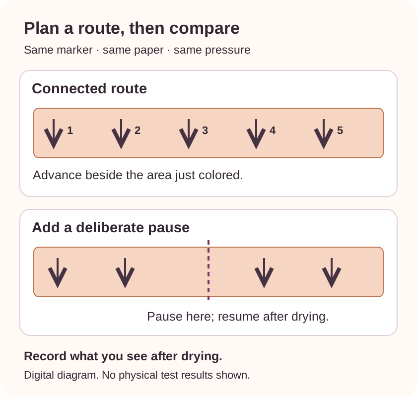
- Advance from the area you have just colored. Place the next stroke alongside the previous one with a small overlap. Work across the shape in an orderly route instead of starting separate islands that you must join later.
- Use the pressure needed for a clear mark. Do not press harder just to force the area to look uniform. Stop the trial if the surface starts breaking down or the ink spreads beyond the shape.
Small circles and straight strokes are both possible practice motions. Choose one for the first comparison so you can repeat it. Changing motion, pressure, paper and marker together makes the result hard to interpret.
Compare three patches with one marker
Use spare paper of the same type as your coloring page when available, with a protective sheet underneath. If you cannot get a spare sample, use the book's designated test area. A trial on different paper can still teach a hand motion, but it cannot establish how the book will behave.
Write down the marker code, the nib used and the paper before starting. Draw these three simple shapes, leaving space between them:
- A: small and continuous. Make a rectangle about 3 × 2 cm. Fill it with the connected route, keeping the chosen motion and pressure consistent.
- B: larger and continuous. Make a rectangle about 6 × 2 cm. Use the same marker, nib, motion and paper. Notice whether you can maintain the route across the extra width.
- C: larger with a pause. Repeat B's dimensions. Fill half, let that patch dry, and resume beside it. Mark where you paused so you can compare that boundary after drying.
The dimensions are suggested practice sizes. This is a reader-run comparison, not a laboratory test or a record of results we obtained. Let the patches dry before comparing them in the same light. Also check the reverse and protective sheet.
| Patch | What you see after drying | Next adjustment to try |
|---|---|---|
| A: small, continuous | ________________ | ________________ |
| B: larger, continuous | ________________ | ________________ |
| C: larger, paused | ________________ | ________________ |
Record: marker/code ______; nib ______; paper/book edition ______; motion ______; date ______. Keep the patches with these notes so the next session starts from something you can actually compare.
Change the part the comparison points toward
- A is more even than B: try a smaller object or a broader suitable nib on a new sample. The difference suggests that coverage over a larger area deserves attention; it does not prove a marker defect.
- B is more even than C: practice maintaining the connected route. Your own comparison gives you a reason to avoid a pause in the middle of that kind of fill.
- All three show the same uneven flow: try the same exercise on another paper sample, keeping the marker and motion. If only one marker behaves poorly across your samples, check its manufacturer's care guidance rather than assuming a whole brand needs replacing.
- The paper shows damage or unwanted transfer: stop adding ink and review the paper or medium choice. A flatter-looking front is not useful if it damages a reverse-side illustration you wanted to keep.
Paper deserves its own check: Ohuhu explains that its dye colors can appear different on different papers and provides support for dried-out or defective markers. A phone photo, a cap color or a stranger's finished page cannot diagnose your particular combination.
For your next trial, change just one factor and label it. If you change paper, use the same marker. If you change nib, keep the paper. A result from one combination is a useful personal note, not a universal verdict on that product.
Decide whether the existing page needs more ink
You can leave the dry fill as it is. If the streaks do not bother you at normal viewing distance, there is no requirement to make the area perfectly flat. You can also choose a pattern or texture for the remaining spaces without trying to erase what is already there.
If you want to try another layer, rehearse it on the sample first and compare the dry value and reverse side. Crayola recommends light applications and avoiding excessive saturation to limit bleed-through. Adding ink until every line disappears is not a dependable stopping rule.
A colorless blender is optional. Copic describes it as an alcohol-based solvent with several uses, so treat it as a separate material to test, not a clear paint that will cover a dark band.
Keep a reference you can reuse
The free ColorBestie Swatch Chart Maker makes blank, printable A4 charts without an account or credits. Use one to record your actual ink colors, then keep this larger flat-fill comparison beside it. A small color box and a broad wall answer different questions.
If choosing a direction is the next obstacle, explore color ideas for your own page. A generated preview can suggest a palette or mood; it cannot predict paper absorption, nib condition, streaks or physical blending. Use your dry samples for those decisions.
Start your next attempt with patch A and the marker you already have. Move to the larger shape only after you have something useful to compare.